User Details
- User Since
- Nov 17 2021, 11:03 AM (126 w, 1 d)
- Availability
- Available
- LDAP User
- Unknown
- MediaWiki User
- BMartinezCalvo (WMF) [ Global Accounts ]
Yesterday
Resolving this task since all the acceptance criteria and subtasks have been completed.
Wed, Apr 17
@mwilliams @DTorsani-WMF, and I met today to discuss on the simplest version of the Table's pagination for the upcoming use cases (GUC, Metrics Platform, Wishlist, etc.) and we decided on this simplified version based on the one designed by @Sarai-WMDE.
Tue, Apr 16
Mon, Apr 15
This task is no longer needed since we updated the auto layout of these Figma components from 0 to -1, so there is no double border.
I think we no longer need to work on this task since the use of each library is clear. @CCiufo-WMF declining it for now, feel free to reopen if you think it's necessary.
Fri, Apr 12
Thu, Apr 11
@CCiufo-WMF during the last DST design sync we agreed on the new names for these tokens so moving this task to Up Next.
Wed, Apr 10
Tue, Apr 9
As outlined in T361734, we will use the border-color-progressive--focus for (#36c) in all the focus states of components. So there is no need to update the TextInput error-focus state, so removing it from the task description and acceptance criteria.
Mon, Apr 8
Thu, Apr 4
Wed, Mar 27
Tue, Mar 26
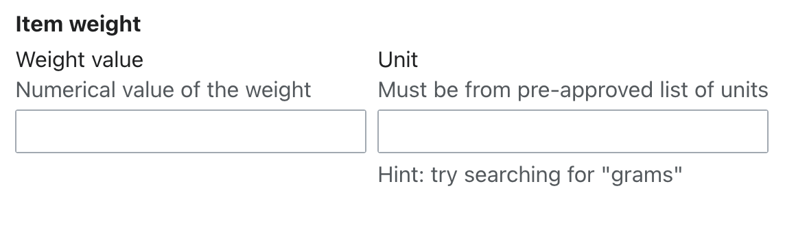
Following the new Constructing forms guidelines, the padding between elements within a module grouping multiple fields and/or actions should use the spacing-100 token (equivalent to 16px in the default Codex theme). So we should increase the padding between these 2 fields in the set:
Thu, Mar 21
Wed, Mar 20
Mar 19 2024
@CCiufo-WMF moving this task to the sprint to work on it as we discussed during the Sprint planning.
Mar 18 2024
Resolving this task since the new Guidelines have been documented in the Google doc and reviewed with the DST. I've also updated the Figma specs to match these new guidelines.