This post shows how we measure and interpret load times on Wikipedia. It also explains what real-user metrics are, and how percentiles work.
Navigation Timing
When a browser loads a page, the page can include program code (JavaScript). This program will run inside the browser, alongside the page. This makes it possible for a page to become dynamic (more than static text and images). When you search on Wikipedia.org, the suggestions that appear are made with JavaScript.
Browsers allow JavaScript to access some internal systems. One such system is Navigation Timing, which tracks how long each step takes. For example:
- How long to establish a connection to the server?
- When did the response from the server start arriving?
- When did the browser finish loading the page?
Where to measure: Real-user and synthetic
There are two ways to measure performance: Real user monitoring, and synthetic testing. Both play an important role in understanding performance, and in detecting changes.
Synthetic testing can give high confidence in change detection. To detect changes, we use an automated mechanism to continually load a page and extract a result (eg. load time). When there is a difference between results, it likely means that our website changed. This assumes other factors remained constant in the test environment. Factors such as network latency, operating system, browser version, and so on.
This is good for understanding relative change. But synthetic testing does not measure the performance as perceived by users. For that, we need to collect measurements from the user’s browser.
Our JavaScript code reads the measurements from Navigation Timing, and sends them back to Wikipedia.org. This is real-user monitoring.
How to measure: Percentiles
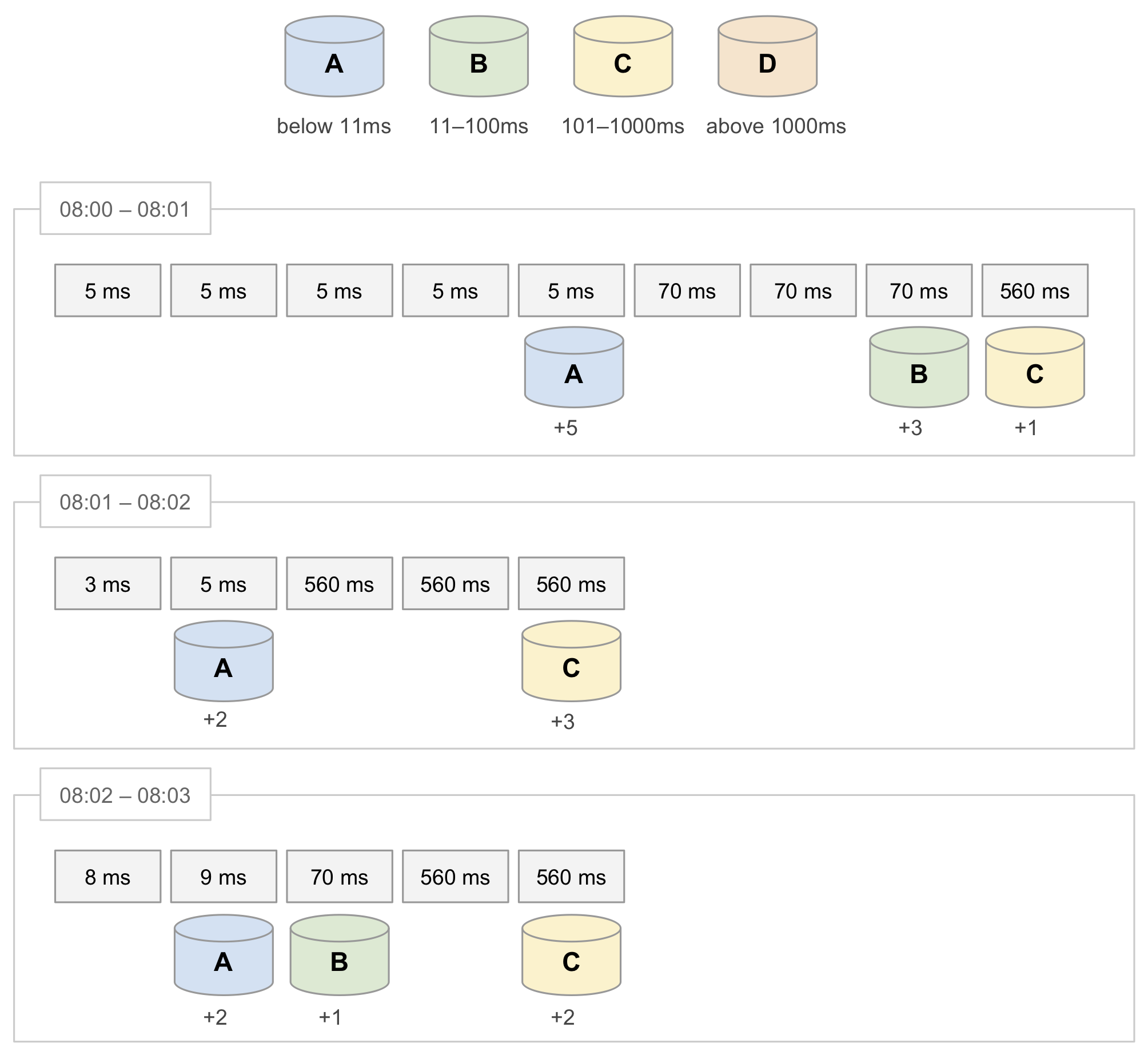
Imagine 9 users each send a request: 5 users get a result in 5ms, 3 users get a result in 70ms, and for one user the result took 560ms. The average is 88ms. But, the average does not match anyone’s real experience. Let’s explore percentiles!
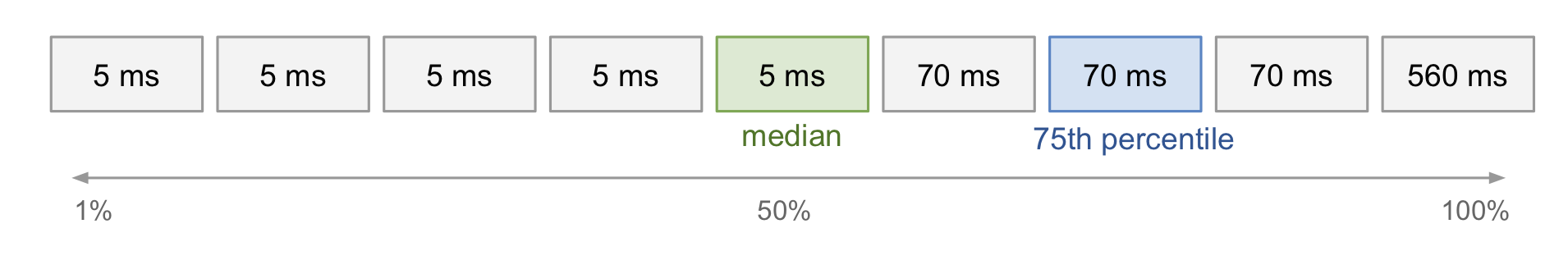
The first number after the lower half (or middle) is the median (or 50th percentile). Here, the median is 5ms. The first number after the lower 75% is 70ms (75th percentile). We can say that "for 75% of users, the service responded within 70ms". That’s more useful.
When working on a service used by millions, we focus on the 99th percentile and the highest value (100th percentile). Using medians, or percentiles lower than 99%, would exclude many users. A problem with 1% of requests is a serious problem. To understand why, it is important to understand that, 1% of requests does not mean 1% of page views, or even 1% of users.
A typical Wikipedia pageview makes 20 requests to the server (1 document, 3 stylesheets, 4 scripts, 12 images). A typical user views 3 pages during their session (on average).
This means our problem with 1% of requests, could affect 20% of pageviews (20 requests x 1% = 20% = ⅕). And 60% of users (3 pages x 20 objects x 1% = 60% ≈ ⅔). Even worse, over a long period of time, it is most likely that every user will experience the problem at least once. This is like rolling dice in a game. With a 16% (⅙) chance of rolling a six, if everyone keeps rolling, everyone should get a six eventually.
Real-user variables
The previous section focussed on performance as measured inside our servers. These measurements start when our servers receive a request, and end once we have sent a response. This is back-end performance. In this context, our servers are the back-end, and the user’s device is the front-end.
It takes time for the request to travel from the user’s device to our systems (through cellular or WiFi radio waves, and through wires.) It also takes time for our response to travel back over similar networks to the user’s device. Once there, it takes even more time for the device’s operating system and browser to process and display the information. Measuring this is part of front-end performance.
Differences in back-end performance may affect all users. But, differences in front-end performance are influenced by factors we don’t control. Such as network quality, device hardware capability, browser, browser version, and more.
Even when we make no changes, the front-end measurements do change. Possible causes:
- Network. ISPs and mobile network carriers can make changes that affect network performance. Existing users may switch carriers. New users come online with a different choice distribution of carrier than current users.
- Device. Operating system and browser vendors release upgrades that may affect page load performance. Existing users may switch browsers. New users may choose browsers or devices differently than current users.
- Content change. Especially for Wikipedia, the composition of an article may change at any moment.
- Content choice. Trends in news or social media may cause a shift towards different (kinds of) pages.
- Device choice. Users that own multiple devices may choose a different device to view the (same) content.
The most likely cause for a sudden change in metrics is ourselves. Given our scale, the above factors usually change only for a small number of users at once. Or the change might happen slowly.
Yet, sometimes these external factors do cause a sudden change in metrics.
Case in point: Mobile Safari 9
Shortly after Apple released iOS 9 (in 2015), our global measurements were higher than before. We found this was due to Mobile Safari 9 introducing support for Navigation Timing.
Before this event, our metrics only represented mobile users on Android. With iOS 9, our data increased its scope to include Mobile Safari.
iOS 9, or the networks of iOS 9 users, were not significantly faster or slower than Android’s. The iOS upgrade affected our metrics because we now include an extra 15% of users – those on Mobile Safari.
Where desktop latency is around 330ms; mobile latency is around 520ms. Having more metrics from mobile, skewed the global metrics toward that category.
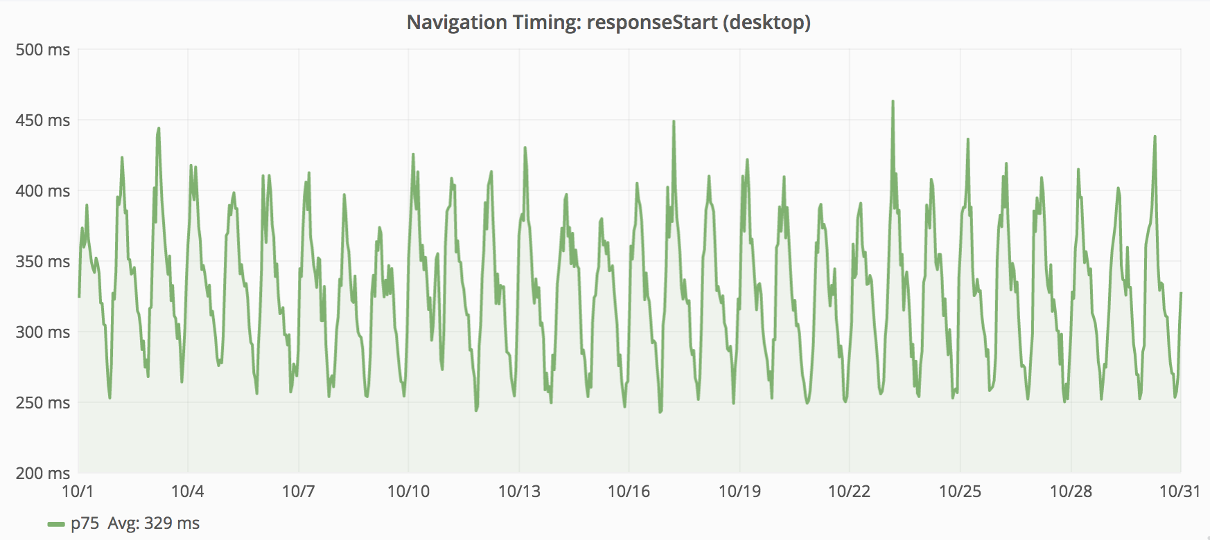 | 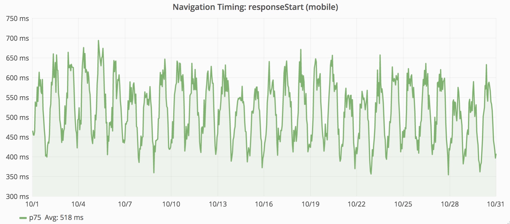 |
The above graphs plot the "75th percentile" of responseStart for desktop and mobile (from November 2015). We combine these metrics into one data point for each minute. The above graphs show data for one month. There is only enough space on the screen to have each point represent 3 hours. This works by taking the mean average of the per-minute values within each 3 hour block. While this provides a rough impression, this graph does not show the 75th percentile for November 2015. The next section explains why.
Average of percentiles
Opinions vary on how bad it is to take the average of percentiles over time. But one thing is clear: The average of many 1-minute percentiles is not the percentile for those minutes. Every minute is different, and the number of values also varies each minute. To get the percentile for one hour, we need all values from that hour, not the percentile summary from each minute.
Below is an example with values from three minutes of time. Each value is the response time for one request. Within each minute, the values sort from low to high.
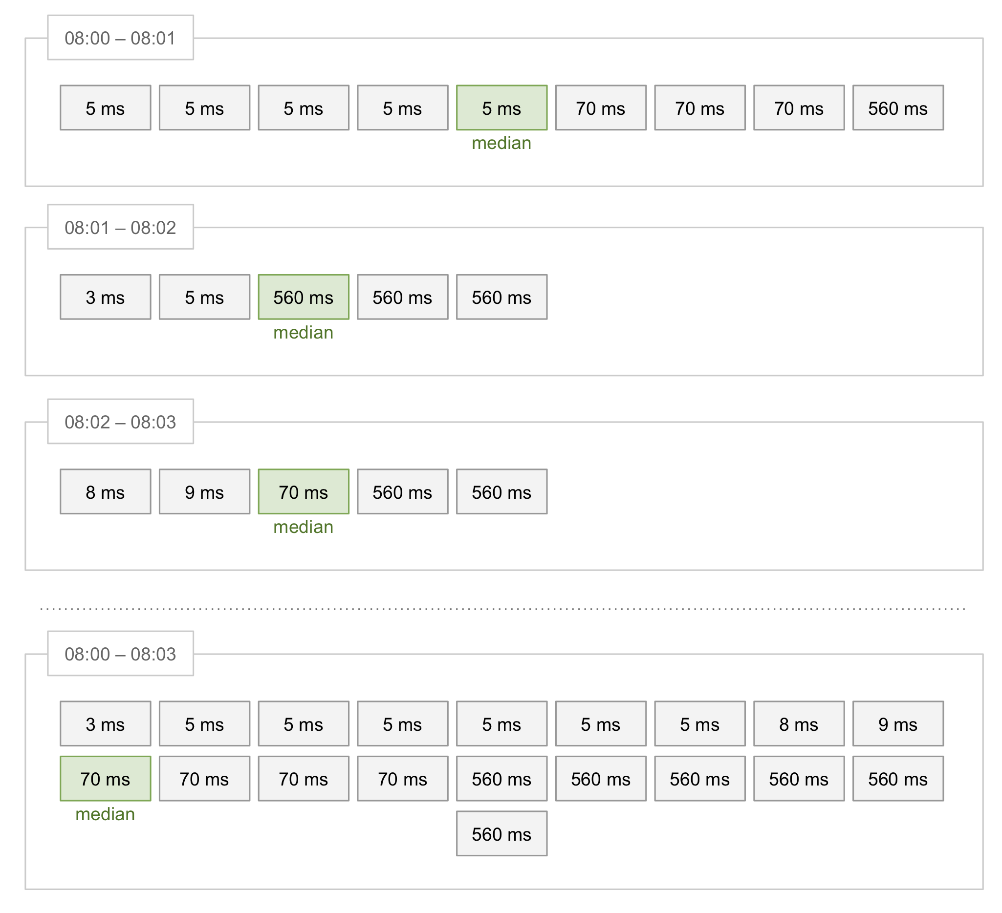
The average of the three separate medians is 211ms. This is the result of (5 + 560 + 70) / 3. The actual median of these values combined, is 70ms.
Buckets
To compute the percentile over a large period, we must have all original values. But, it’s not efficient to store data about every visit to Wikipedia for a long time. We could not quickly compute percentiles either.
A different way of summarising data is by using buckets. We can create one bucket for each range of values. Then, when we process a time value, we only increment the counter for that bucket. When using a bucket in this way, it is also called a histogram bin.
Let’s process the same example values as before, but this time using buckets.
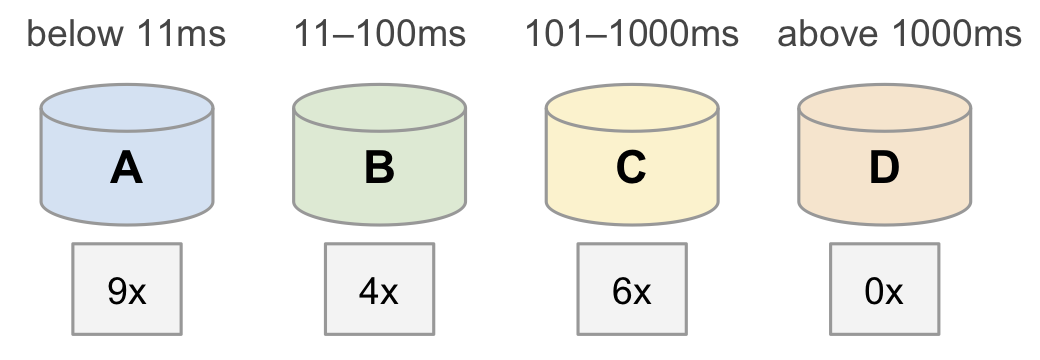
Based on the total count (19) we know that the median (10th value) must be in bucket B, because bucket B contains values 10 to 13. And that the 75th percentile (15th value) must be in bucket C because it contains values 14 to 19.
We cannot know the exact millisecond value of the median, but we know the median must be between 11ms and 100ms. (This matches our previous calculation, which produced 70ms.)
When we use exact percentiles, our goal was for that percentile to be a certain number. For example, if our 75th percentile today is 560ms, this means for 75% of users a response takes 560ms or less. Our goal could be to reduce the 75th percentile to below 500ms.
When using buckets, goals are defined differently. In our example, 6 out of 19 responses (32%) are above 100ms (bucket C and D), and 13 of 19 (68%) are below 100ms (bucket A and B). Our goal could be to reduce the percentage of responses above 100ms. Or the opposite, to increase the percentage of responses within 100ms.
Rise of mobile
Traffic trends are generally moving towards mobile. In fact, April 2017 was the first month where Wikimedia mobile pageviews reached 50% of all Wikimedia pageviews. And after June 2017, mobile traffic has stayed above 50%.
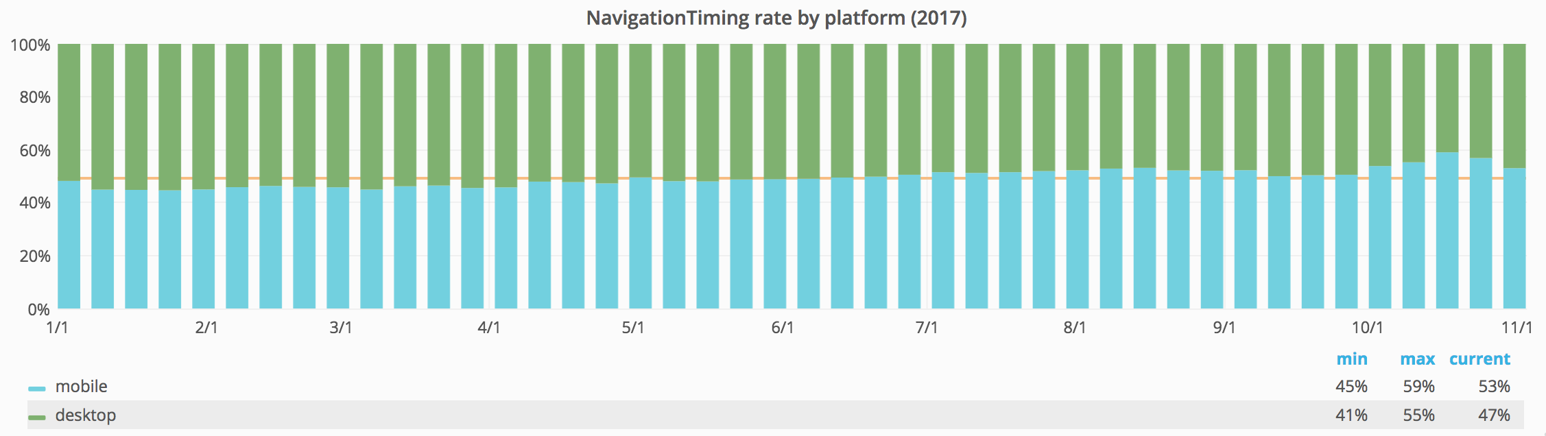
Global changes like this have a big impact on our measurements. This is the kind of change that drives us to rethink how we measure performance, and (more importantly) what we monitor.
Further reading
- Wikimedia Performance Team – overview of our projects, tools, and data.
- Navigation Timing Level 2, specification at W3C.
- "How Not To Measure Latency", a tech talk by Gil Tene.
- How DNS Works, a comic explaining how computers use domain names.
- "Domain Name System (DNS)", at Wikipedia.
- "Transmission Control Protocol (TCP)", at Wikipedia.
- "HTTPS", at Wikipedia.
- Projects
- None
- Subscribers
- • Imarlier, sr229, bd808
Event Timeline
The short answer is that they measure different things. Synthetic is good for measuring ideal performance, and helps to identify regressions and changes. It's a much steadier metric. RUM shows you what performance actually looks like to end users, which helps to identify where to spend time optimizing.
Nice to know! But in your opinion, basing from these datas, which part in the current Wikimedia do you think has the most pinpointed issues when it comes to load times?
@sr229 Synthetic testing and real-user metrics, each, pinpoint different issues. In my opinion, you need both. The below table is simplified (not completely accurate), but might help:
| Range of scenarios | Precision | Confidence delay | |
|---|---|---|---|
| Real-user metrics | All. | Mostly bigger issues. | Takes time. |
| Synthetic testing | Limited. | Small and big issues. | Immediate. |
Synthetic testing can detect both small and big changes, and with high confidence (e.g. as small as 10ms or 50ms difference), because we know the previous and current results came from exact same scenario. This finds issues that are invisible in RUM data.
On the other hand, we cannot test all possible combinations of internet connections, devices, browsers, different pages on the site, different geo location, etc. So synthetic testing only reveals issues that affect everybody, or that specifically affect our scenarios.
Real-user metrics pinpoints all other issues. But, real-user metrics are not consistent, because users never do exactly the same thing twice. For that reason, changes in RUM data only pinpoint issues if the change is big or if it persists over a longer time (e.g. multiple days or weeks)