Page MenuHomePhabricator

OOUI ButtonSelectWidget/ButtonGroupWidget not fluid - breaks surveys with multiple buttons
Closed, ResolvedPublic

Description

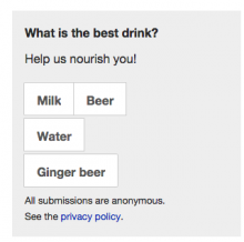
Given a containing element with width restricted to 300px a ButtonSelectWidget containing 4 elements overflows its container.
I suspect the desired outcomes is they become stacked under these conditions.

This prevents us running surveys with more than 2 small buttons so please advise on how best to work around this...

Screen Shot 2015-09-17 at 11.52.49 AM.png (771×920 px, 583 KB)

Can be seen here:
http://en.m.wikipedia.beta.wmflabs.org/wiki/Headings?quicksurvey=internal-survey-drink-survey

Related Objects

Event Timeline

There are a very large number of changes, so older changes are hidden. Show Older Changes

It would be possible to get rid of white-space: nowrap; on the parent .oo-ui-buttonSelectWidget and go for .ltr ... { margin-right: -1px; } and .rtl ... { margin-left: -1px; }.
Getting rid of white-space property would cause the inline-block elements to simple just take up as much horizontal space as possible and then wrap automatically.

As this is an edge case, I don't know how such a change would affect that widget on other views -- might lead to regressions.

This comes up in VisualEditor's image settings dialog in some languages (at least Polish), too:

pasted_file (593×704 px, 46 KB)

(I could swear a bug for that was filed, but can't find one now.)

Just removing white-space: nowrap seems like it would mostly work:

pasted_file (593×704 px, 46 KB)

The "wrapped" button looks a bit disconnected from the rest, though. We could tweak the line height maybe, or text-indent the subsequent lines?

(By the way, any fix should also be applied to ButtonGroupWidget.)

@matmarex In your example you haven't changed margin, right? Because leaving the current margin-right: -1px; makes the button also not in line with the first line. Therefore I'd suggest to go for :last-child (only current important browser that doesn't support it, is IE8) and changing to margin-left/-right depending on reading direction.

T112982-ButtonSelectWidget-line-break.png (106×202 px, 3 KB)
(example without white-space: nowrap; and margin-left unchanged)

Volker_E renamed this task from ButtonSelectWidget not fluid to ButtonSelectWidget/ButtonGroupWidget not fluid.Sep 20 2015, 9:29 AM
Jdlrobson renamed this task from ButtonSelectWidget/ButtonGroupWidget not fluid to OOjs ui ButtonSelectWidget/ButtonGroupWidget not fluid - breaks surveys with multiple buttons.Oct 26 2015, 10:30 PM

We may have additional tags beyond 2 or 4 - will the fixes allow multiple lines of buttons? Would the box expand to fit them @Jdlrobson?

Change 249295 had a related patch set uploaded (by Jdlrobson):
Allow buttons to spill on to new lines if needed

https://gerrit.wikimedia.org/r/249295

It seems like we're coming up with a way to make this fail a little less badly, but this widget is not designed to wrap (it has vertical margins and rounded corners on the first and last buttons). Shouldn't we allow users to specify a different layout when the buttons don't fit horizontally (e.g. vertical).

Someone with a +2 right should review the patch.

@Esanders - my expectation is that widgets should work in mobile browsers. Maybe we could introduce some media queries to change behaviour on mobile screens to be stacked. What do you think?

I'm concerned about major design changes, as we are planning to run a survey in 2-3 weeks, so am looking for a short term fix in the mean time so any help with that appreciated. With that in mind would you recommend we use mediawiki ui buttons instead?

If you are doing this for a particular deadline/use case - I'd just write some CSS to change the beahviour to a vertical layout (in a media query if you so wish). I don't think we should do anything upstream until we have something more robust though.

I think the current nowrap behaviour is correct, and is the same you get with other libraries like Bootstrap:

pasted_file (98×206 px, 5 KB)

It's pretty common for narrow surveys to just use a vertical layout (Google image search "website poll"). If you wanted to keep the vertical height down I you could also code up a grid layout.

Change 249795 had a related patch set uploaded (by Jdlrobson):
Stack buttons in quick surveys vertically

https://gerrit.wikimedia.org/r/249795

If you are doing this for a particular deadline/use case - I'd just write some CSS to change the beahviour to a vertical layout (in a media query if you so wish). I don't think we should do anything upstream until we have something more robust though.

Fair enough. I'ved solve for this particular case, so @bmansurov let's get that merged and then keep this bug open so we can discuss some more: https://gerrit.wikimedia.org/r/249795

Making the survey vertical makes sense. I'd like to see us use some media queries to achieve this and do something better than Bootstrap :)

Change 249795 merged by jenkins-bot:
Stack buttons in quick surveys vertically

https://gerrit.wikimedia.org/r/249795

Citing @Esanders from https://gerrit.wikimedia.org/r/#/c/249295/

I don't think is a good design for a widget and it feels hacky. If you need a hack for a particular deadline overwrite the CSS downstream, not in the library.

I agree that it is not the cleanest possible solution (which would be a container-width dependent vertical stacking of buttons when overflow is happening). CSS flexbox opens up such solutions. But the browsers we need to support aren't there yet.
Media queries wouldn't help in this case, as @matmarex has pointed out, overflow of ButtonGroup-/ButtonSelectWidget is also currently happening in certain cases, and media query dependent solutions don't apply there.
If we want to give users in those (rare) cases full functionality (I agree, it's not necessarily the cleanest UI) by showing all buttons to them completely, the 'hacky' way of resolving overflow by spilling buttons on the next line as implemented in PS 2 above seems to be a valueable compromise to me.

We still have to take care about if small overlaps of just a few pixels of buttons within boxes could lead to a few regressions on buttons suddenly spilling in the next lines.

The approach taken by Bootstrap and others is from my experience coming from having a bulletproof solution to explicitly not letting buttons spill into the next line due to the pixel overlap issue and that spilling buttons is the least wanted outcome due to higher control of most developers of their button contents and button container widths.

This no longer blocks the first survey or any of the quick surveys work, so done from my perspective but the bug still remains.

If you are doing this for a particular deadline/use case - I'd just write some CSS to change the beahviour to a vertical layout (in a media query if you so wish). I don't think we should do anything upstream until we have something more robust though.

The problem with a media query in example of above's screenshot is, that it wouldn't fire as it takes viewport width in account and not container width. So my latest approach in the patch is (misusing a term) degrading gracefully with CSS only in those edge cases. And as it's pretty clear for years, horizontal scrolling is a major pain on desktop. Invoking vertical scrolling by spilling buttons therefore presents an improvement.

Change 249295 abandoned by Jdlrobson:
Allow ButtonGroupWidget/SelectWidget buttons to spill on to new lines

Reason:
I have no plans to work on this anymore. Feel free to reassign author to someone else.

https://gerrit.wikimedia.org/r/249295

Volker_E renamed this task from OOjs ui ButtonSelectWidget/ButtonGroupWidget not fluid - breaks surveys with multiple buttons to OOjs UI ButtonSelectWidget/ButtonGroupWidget not fluid - breaks surveys with multiple buttons.Mar 10 2017, 11:38 PM
Volker_E renamed this task from OOjs UI ButtonSelectWidget/ButtonGroupWidget not fluid - breaks surveys with multiple buttons to OOUI ButtonSelectWidget/ButtonGroupWidget not fluid - breaks surveys with multiple buttons.Jan 10 2018, 1:08 AM

I agree that it is not the cleanest possible solution (which would be a container-width dependent vertical stacking of buttons when overflow is happening). CSS flexbox opens up such solutions. But the browsers we need to support aren't there yet.

We have dropped IE9 and 10 so this is probably feasible now: https://www.caniuse.com/#search=flex, we just need to work around the known issues in IE11 and Safari10.

I don't see how you can achieve anything better here with flexbox than what can be achieved by just removing white-space: nowrap, which was already proposed?

Change 463382 had a related patch set uploaded (by Bartosz Dziewoński; owner: Bartosz Dziewoński):
[oojs/ui@master] Allow ButtonGroupWidget/SelectWidget buttons to spill on to new lines

https://gerrit.wikimedia.org/r/463382

Maybe you might find this useful: we’ve dealed with this in a gadget in Russian Wikipedia (with mw-ui-button, however; you can see it under a summary field in any editing interface) and the solution we found for overflowing was adding a margin-left of 1px on parent and having margin-left: -1px for every button. That way there won’t be unevenness in position of the buttons on the next line.

Is it possible to see a screenshot of an implementation of that fix @stjn?

I think we should probably just add a vertical mode. For any horizontal layout with more than a few short options it should either be converted to a vertical layout or a dropdown.

Is it possible to see a screenshot of an implementation of that fix @stjn?

Sure (zoomed in to show it more clearly):

image.png (398×1 px, 28 KB)

@stijn @iamjessklein This was the original proposal in the patch https://gerrit.wikimedia.org/r/#/c/oojs/ui/+/249295/ which can result in a situation where you've got three buttons on first line and one button on the next line.
@Esanders and myself were discussing this recently and we were musing about a Flexbox solution (without any reference or even a technical implementation yet), where as soon as the container size doesn't provide enough width for all buttons, they all spill into lines of their own with full width (especially aiming for mobile).
Imagine a similar treatment to action items in dialogs:

image.png (468×606 px, 34 KB)

Your example, @stijn, surfaces well that this can't be a one-for-all solution as we also don't want to end up, where 19 buttons are underneath each other taking up 100% width.

@Esanders and myself were discussing this recently and we were musing about a Flexbox solution (without any reference or even a technical implementation yet), where as soon as the container size doesn't provide enough width for all buttons, they all spill into lines of their own with full width (especially aiming for mobile).

I don't think this is a good idea. The options are going to take up silly amounts of space, especially on mobile. Let's take this example from the WIP maps dialog patch (T203473):

CurrentProposed: vertical (mockup)Proposed: wrapping (mockup)
localhost_3080_wiki_Maps_uselang=pl(iPhone 6_7_8).png (1×750 px, 207 KB)
localhost_3080_wiki_Maps_uselang=pl(iPhone 6_7_8) (1).png (1×750 px, 201 KB)
localhost_3080_wiki_Maps_uselang=pl(iPhone 6_7_8) (2).png (1×750 px, 204 KB)

(please ignore if something in the mockups is off by a pixel or two, it's just a rough example)

I was thinking that for a vertical layout that the labels would be left aligned and the width of the widget would be determined by the longest message, not 100%

@matmarex A few comments:

  • You could always provide a max-width on the parent element.
  • The icons should be centered too, clearly. T178424
  • In a combination of three buttons I do see, apart from above two items, vertical as ButtonSelectWidget advantageous as it tells much clearer that those three options are equal

Change 463382 merged by jenkins-bot:
[oojs/ui@master] Allow ButtonGroupWidget/SelectWidget buttons to spill on to new lines

https://gerrit.wikimedia.org/r/463382

Volker_E lowered the priority of this task from High to Medium.Nov 1 2018, 1:34 AM
Volker_E removed a project: Patch-For-Review.

Change 470967 had a related patch set uploaded (by VolkerE; owner: VolkerE):
[mediawiki/core@master] Update OOUI to v0.29.3

https://gerrit.wikimedia.org/r/470967

Change 470967 merged by jenkins-bot:
[mediawiki/core@master] Update OOUI to v0.29.3

https://gerrit.wikimedia.org/r/470967

matmarex edited projects, added OOUI (OOUI-0.29.3); removed Patch-For-Review, OOUI.

Well… it can wrap now 🤷

If that is undesirable, then the interface should probably use a different widget. Your options are:

  • If it is crucial that the widget only take a single line: DropdownWidget
  • If you'd rather have each option on a separate line: RadioSelectWidget

For reference, this caused a few issues in places where existing code relied on these widgets never wrapping:

Sorry about that.

All of them were fixed by adding white-space: nowrap somewhere. If any more similar issues are found, they can probably also be fixed in the same way.