None of our widgets are solid blue (except for primary buttons which are explicitly tagged as progressive) so this stands out like a sore thumb
Description
Description
Details
Details
Customize query in gerrit
| Status | Subtype | Assigned | Task | ||
|---|---|---|---|---|---|
| Open | None | T113560 Standardize MediaWiki components (tracking) | |||
| Resolved | None | T114026 Minimize differences between implemented components and in pholio mock-ups | |||
| Resolved | Volker_E | T113225 Getting ToggleSwitchWidget to design spec | |||
| Resolved | Volker_E | T115293 Standardize on component focus states | |||
| Resolved | matmarex | T133429 ButtonSelectWidget (ButtonOptionWidget) should receive a custom focus appearance |
Event Timeline
Comment Actions
This came out of the discussion from T88973 where @Ricordisamoa gave an effective suggestion to use color. In this case, color meant that it's switched on with blue.
There are a few discussions that are still on-going that could affect this, namely, T110555 (consolidation between progressive/constructive) and T109915 (color swatches).
We'll keep our eyes on this, however, to be clear, we're currently focusing on mainly tasks related to T111117.
Comment Actions
You've linked to version one of the mocks, for which have have the same styles for checkboxes:
however all of these went through more revisions and the final versions look like this
so this look like a simple implementation error
Comment Actions
Change 243403 had a related patch set uploaded (by Esanders):
ToggleSwitchWidget: Fix mediawiki theme
Comment Actions
Not sure, but @matmarex linked to it above, which is what I was referring to. I assume whoever implemented it made the same mistake.
Comment Actions
@violetto You added the M61 mock to task T88973, and @Prtksxna and I assumed that is the current design when working on it. Unless it was current then, but no longer is now…?
It would be helpful to have a "master" list of up-to-date mocks/designs somewhere, or at least mark the outdated ones as outdated (just adding a comment would be fine).
Comment Actions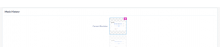
@matmarex, your implementation was right.
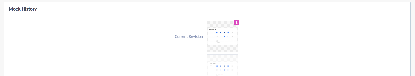
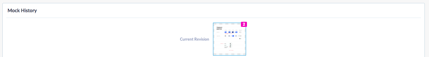
Under "mock up history," it tells you which is the current revision.
We made the decision here T88973 started by @TheDJ to use color. There were some very valid points:
The current enabled state is 'dark', where disabled uses a 'light' background. To me this feels inverted. -TheDJ
using colors to strengthen the "on" state - Ricordisamoa
The fact that the blue active state is too obvious is a less of a concern compared to a toggle switch not looking "switched on." We said we'll use color where it will help. This is an instance where color will help based on concerns TheDJ brought up.
Comment Actions
A note about color, we've iterated the color in task T109915 to #165C91. Perhaps you can feel better that this color is less bright.
Comment Actions
@Esanders The most recent mockup with inputs by @TheDJ includes solid color on active (switched on) widgets (ToggleSwitch, Radio, Checkbox...) to help users. This one was standing out, because it was the first one which got implemented. I'll try to come up with patch sets for all changed input widgets within this week to reflect former discussions and the most recent mockup.
Comment Actions
Both @violetto and @Esanders agreed that the blue mockup for toggle, which I pointed out as correct, was the wrong one, and that seemed reasonable single the blue mockup for checkbox (which I haven't seen before) definitely is wrong, and neither is marked as outdated.
…unless the blue checkbox one isn't wrong? @violetto, you seem to be saying that it is current… I am completely lost now, please sort out the blasted mockups. Tasks are closed when we're done with them, mockups should be too.
Comment Actions
If anyone is confused about what version they might be looking at, you can see under "Mock history," the current one will be labelled as "Current revision" (pictured below).
I always refer mock-ups to their original URL phabricator.wikimedia.org/M61 which always points to the most current revision. The mock up has been untouched for a few months, but Phabricator pholio does have a confusing interface.
This task to my knowledge isn't about toggle not being up to spec.
Comment Actions
Change 244050 had a related patch set uploaded (by Bartosz Dziewoński):
Revert "ToggleSwitchWidget: Fix mediawiki theme"
Comment Actions
Change 244050 merged by jenkins-bot:
Revert "ToggleSwitchWidget: Fix mediawiki theme"
Comment Actions
@Jdforrester-WMF Thanks, a patch by myself with bringing the ToggleSwitch, Radio and Checkbox on par with design spec is in "doing".
Comment Actions
Change 244835 had a related patch set uploaded (by VolkerE):
Get ToggleSwitchWidget to MediaWiki theme's design spec
Comment Actions
I find this redesign rather confusing. Previously we only used blue to indicate focus, or on a progressive primary actions. By using blue to indicate checked, these controls will appear much brighter than other filled out items on the page, and it will be less clear which item is currently selected.
Comment Actions
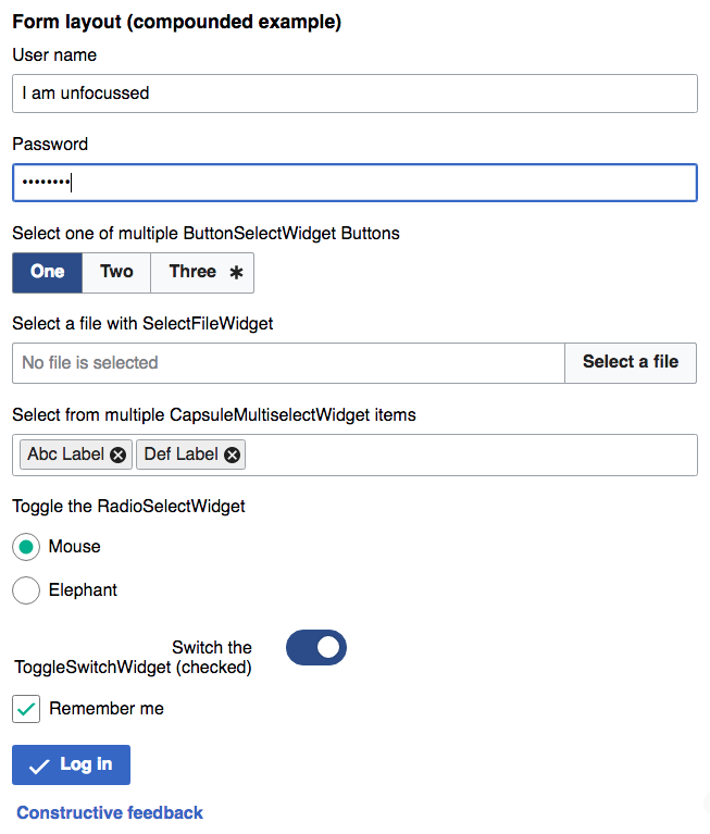
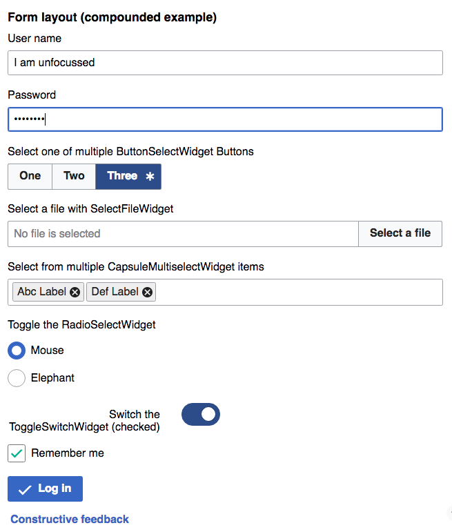
Here are the check controls in the context of other controls as they are more likely to appear in a form. As you can see the blue makes the check controls unnecessarily stand out against other controls, and makes it less clear where the focus is:
| Before | After |
Comment Actions
That is actually a great observation @Esanders that the focus state can be misinterpreted. I created a task to revisit focus state components - T115293.
As for this task and its outcome with blue for switched on, it should be based on the purpose and issues of the toggle switch instead of focus state confusion of the component library. That way we can be sure that the toggle switch is solved based on the needs around toggle switch as opposed to issues based on another task.
Comment Actions
I think causing a problem to fix a problem is just kicking the can down the road. Is this really a required fix to the toggle widget? Is it really the best fix? Instead of saying well fix focus later we should address the appearance of the form layout as a whole otherwise we're just playing and endless game of whack-a-mole.
Also I didn't point out in my last comment the inconsistency between ToggleSwitchWidget and ButtonSelectWidget in the new design.
Comment Actions
@Esanders I agree, that your concerns here are legit, we'll first look at a solution for unifying the much bigger :focus disparities on various widgets throughout the library (as used in a compounded form) and I'll get back and update the ToggleSwitch-/Radio-/CheckboxWidget as soon as T115293 gets solved.
Comment Actions
Change 244835 merged by jenkins-bot:
MediaWiki theme: Adjust ToggleSwitchWidget to match M61 design
Comment Actions
@Jdforrester-WMF actually, this should be on hold like T114049: Get CheckboxInputWidget to design spec and T114050: Get RadioSelectInputWidget to design spec as well, as long as :focus states of compounded elements in forms are not solved -> T115293
Comment Actions
Change 287002 had a related patch set uploaded (by Jforrester):
Align focus state of toggleSwitchWidget with other widgets
Comment Actions
Change 287002 merged by jenkins-bot:
Align focus state of toggleSwitchWidget with other widgets
Comment Actions
I notice the patches have been updated, but I haven't heard anything more here about the re-use of blue for focus and selected, as shown in https://phabricator.wikimedia.org/T113225#1718231
Comment Actions
Updated shots:
| Before (as of 2016-09-12) | After |
 |  |
I think it's OK, but perhaps we could use the selected (dark) blue rather than the progressive (mid) blue, yes.