Page MenuHomePhabricator

As a first time user, I want to see information about new and most used features of the app
Closed, ResolvedPublic5 Estimated Story Points

Assigned To
Authored By
JMinor
Oct 2 2015, 4:46 AM
Referenced Files
F3110672: IMG_0030.PNG
Dec 17 2015, 12:02 AM
F3110685: IMG_0036.PNG
Dec 17 2015, 12:02 AM
F3110691: IMG_0031.PNG
Dec 17 2015, 12:02 AM
F3110712: IMG_0038.PNG
Dec 17 2015, 12:02 AM
F3110678: IMG_0034.PNG
Dec 17 2015, 12:02 AM
F3110687: IMG_0037.PNG
Dec 17 2015, 12:02 AM
F3110676: IMG_0033.PNG
Dec 17 2015, 12:02 AM
F3110669: IMG_0028.PNG
Dec 17 2015, 12:02 AM

Description

On first install we need to inform the user about key and new features of the app. We also might want to create variants for updating users vs. fresh install.

Specifically we want to highlight and explain:

  • Discovery Feed
  • Saved pages and offline support
  • [Where available] Wikipedia Zero

We should also show the user where to find:

  • Search
  • Nearby
  • Random
  • Privacy Settings
  • Language Settings

These overlays/cards and info may also be reused via a help option in the Settings/More screen.

  • Related Objects

    Event Timeline

    JMinor raised the priority of this task from to Medium.
    JMinor updated the task description. (Show Details)
    JMinor added subscribers: JMinor, Nirzar.

    Next iteration.

    In this flow instead of investing 3 steps to educate about new features. we can learn more about the user in 3 steps and then show the UI elements with coach marks

    1-welcome.png (1×750 px, 95 KB)

    2-interests.png (1×750 px, 81 KB)

    3-language.png (1×750 px, 63 KB)

    4-couchmars.png (1×750 px, 260 KB)

    By learning more about user will help us better serve with relevant content on feed and articles.

    @JMinor as discussed. we can do three things in first run

    1. welcome with feature description
    2. ask for languages
    3. ask for analytics
    4. show coach marks

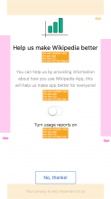
    here's the missing mock for analytics. communication is rough now. need to talk to comms

    3-analytics.png (1×750 px, 82 KB)

    Merging related task around user permissions opt-in screen per comment above about final flow for this.

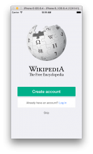
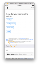
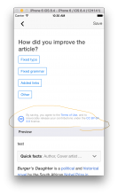
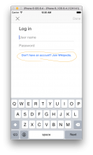
    Since we'll be removing the login/acct creation "splash" screen, keep in mind that the only way to login or create acct remaining will be through the editing workflow.

    Old splash screen:

    Screen Shot 2015-11-23 at 10.19.33 AM.png (1×974 px, 342 KB)

    Login link on editing workflow - only shown if user is not logged in:

    Screen Shot 2015-11-23 at 10.20.01 AM.png (1×974 px, 173 KB)

    Same area on editing workflow if user is already logged in:

    Screen Shot 2015-11-23 at 10.30.19 AM.png (1×974 px, 182 KB)

    Login interface w create acct button:

    Screen Shot 2015-11-23 at 10.20.08 AM.png (1×974 px, 146 KB)

    Create acct interface w login button:

    Screen Shot 2015-11-23 at 10.20.12 AM.png (1×974 px, 157 KB)

    Only way to log out at the moment is via settings, but note that it's broken in that if you tap log out nothing happens, even though it *does* log you out - the next time you tap settings there will be no "log out" line. We'll need to fix this.

    Screen Shot 2015-11-23 at 10.21.00 AM.png (1×974 px, 176 KB)

    @Nirzar quick questions:

    • on wide screens are these intended to stretch edge to edge? - i.e. on iPad, or do we keep fixed width for actual elements and just stretch backgrounds to edges?
    • does this show only in portrait orientation? or maybe only in portrait on phones, but landscape as well on non-phones?

    Just to clarify, this flow should REPLACE the existing log-in modal for first time user. We will need to put log-in into settings.

    Also per legal, we need to add a localizable string to the feed description card or to the feed overlay:

    "HOW THIS WORKS: When you visit an article, related articles are automatically added to your feed. This doesn’t change how we collect your information, and your reading history is still private."

    ^To @Mhurd comments:

    • suggest we not support landscape (people can rotate their phones, and people mostly expect non-games to start in portrait)
    • for ipad prpose we just center these designs, but defer to Nirzar

    @JMinor sounds good. @Nirzar quick reminder - whatever contains that localized legal copy will potentially have to account for a much longer string than the default English copy.

    @JMinor the legal language is a lot of text, i suggest we create a card for it on the feed. it will be easy to implement. and it will have a primary action of "dismiss" and it won't show after that again.

    legal.png (844×640 px, 54 KB)

    this card can sit on top of the thing the first time you come to the feed. we can remove it implicitly for the second time.

    @JMinor other blocking issues as mentioned in planning are below. I'm not expecting answers - probably best to discus on hangout so I can cover tradeoffs and issues better than my text below:

    • If the user adds a lot of languages, do we scroll the whole screen, or just the area below the image and above the "continue" button?
    • Can a user delete a language?
    • If a user can delete languages, that means they can delete the OS language. Which we don't allow. So we have to prevent from doing that. Which is easy, but would need some copy and/or design to communicate that it is un-deletable. (alternatively we can redesign the language architecture to give OS languages special standing so they can be handled differently)
    • If we allow deletion, then UIKit automatically displays the delete button on the left side of the cell in lieu of swipe-to-delete. (In other words, it isn't possible to allow both re-ordering and swipe to delete - when re-ording is enabled, deletion only happens through using the delete button on the left side of the cell)
    • If we really, really want swipe to delete and re-ordering, we can do it, but we have to build some non-trivial custom views to support it. (not a lot of work, but not a little work)
    • Do we use this language picker to select the language for the feed? If so, I assume it is whiter language is first in the list?

    Thanks @Fjalapeno lets discuss these in our 1-on-1 tomorrow.

    Copy
    Screen 1
    Title: Welcome to Wikipedia
    Banner: What's New
    Sub title: A new way to Explore
    Bullet text: Discover new and interesting articles just for you on the Explore screen.
    Footnote: How this works... [Tapable and should push modal see below]
    Sub title: Designed for reading
    Bullet text: Updated design focused on providing a great reading experience.

    Button: Get started

    Modal for "How this works..."
    "When you visit an article, related articles are automatically added to your feed. This doesn’t change how we collect your information, and your reading history is still private."

    Screen 2
    Title: Pick your languages
    Button: Add more languages [Tapable and should push language picker view]
    Button: Continue
    Footnote: Don't worry you can change this later.

    Screen 3
    Title: Help us make Wikipedia better
    Switch label: Send usage reports
    Body: You can help us make the app better by allowing us to collect information about how you use the app.
    Button: Done
    Footnote: Your privacy is important to us [tappable click to pricvacy policy page]

    @Fjalapeno

    If the user adds a lot of languages, do we scroll the whole screen, or just the area below the image and above the "continue" button?

    scroll area above the continue button

    Can a user delete a language?

    swipe to delete would be nice to have

    If a user can delete languages, that means they can delete the OS language. Which we don't allow. So we have to prevent from doing that. Which is easy, but would need some copy and/or design to communicate that it is un-deletable. (alternatively we can redesign the language architecture to give OS languages special standing so they can be handled differently)

    deleting the language is just deleting the preference of language. nothing else changes. on app or os level

    If we allow deletion, then UIKit automatically displays the delete button on the left side of the cell in lieu of swipe-to-delete. (In other words, it isn't possible to allow both re-ordering and swipe to delete - when re-ording is enabled, deletion only happens through using the delete button on the left side of the cell)

    can we control the look and position of it?

    If we really, really want swipe to delete and re-ordering, we can do it, but we have to build some non-trivial custom views to support it. (not a lot of work, but not a little work)

    given the dates that we have, maybe we save this to another card and tag it with production and not beta.

    Do we use this language picker to select the language for the feed? If so, I assume it is whiter language is first in the list?

    yes first one should be default language

    @Fjalapeno

    Here's the spec and assets that you need

    spec-1.png (1×750 px, 119 KB)

    spec2.png (1×750 px, 141 KB)

    updated-spec.png (2×1 px, 367 KB)

    Sub title: A new way to Explore --> this should replace the "explore and learn" in the mockup.
    looks like Josh removed the second point "designed for reading" which is fine.

    @Fjalapeno sorry about the confusion about the items on slide 1. I've added back the "What's New" and second bullet to the first screen. I updated the comment so all the copy is still in one place. The amount/type of copy items should now match the elements in the visual Nirzat put in T114460#1843316, though the specific text is slightly modified.

    1-welcome.png (1×750 px, 125 KB)

    1-dialog.png (1×750 px, 151 KB)

    @Fjalapeno here's how it will look. i also put up the spec for what's new above https://phabricator.wikimedia.org/T114460#1845237

    here's a small spec for the buttons

    height: 44pt
    border: 1px solid #wmfblue
    color: wmfblue
    font-size: 15pt

    there seems to be a bug with the spec software i use. the font size spec i have put it up above says 40pt, 30pt, 28pt in font sizes. they should be 20, 15, 14
    the paddings are correct.

    do you want to manually spec the font sizes again?

    @Nirzar - no need to update the font sizes… I figured that out. Yeah that happens a lot between the 1x 2x stuff and the fact we work on 2x retina macs now.

    @Fjalapeno great. yeah plus my artboards are 2x . I should start switching over to 1x artboards.

    @Nirzar @Fjalapeno

    For the language selector. I agree with most of Nnirzar's responses, which means the real issue we haven't resolved is that both re-ordering and deletion are useful, but iOS doesn't allow simultaneous access to both actions on a standard tableview. I would prioritize re-ordering above deletion (you can effectively "ignore" a language by making it low priority, though that may not be grok'able by users.)

    In order to keep the rest of this epic moving, I've carved deletion out of this ticket and into this one: T120127

    So the acceptance criteria for this ticket should include only reordering and adding of languages.

    Checked with 5.0.0.562 - many aspects of this tickets have been checked as part of other tickets.
    The screenshots taken from iPhone 6S+ 9.1

    IMG_0028.PNG (2×1 px, 192 KB)

    IMG_0038.PNG (2×1 px, 253 KB)

    IMG_0031.PNG (2×1 px, 107 KB)

    IMG_0030.PNG (2×1 px, 101 KB)

    IMG_0032.PNG (2×1 px, 111 KB)

    IMG_0033.PNG (1×720 px, 473 KB)

    IMG_0034.PNG (1×720 px, 548 KB)

    IMG_0035.PNG (1×720 px, 763 KB)

    IMG_0036.PNG (1×720 px, 186 KB)

    IMG_0037.PNG (2×1 px, 378 KB)

    Lots of improvements needed, but as a beta v1 I think this is all shippable.