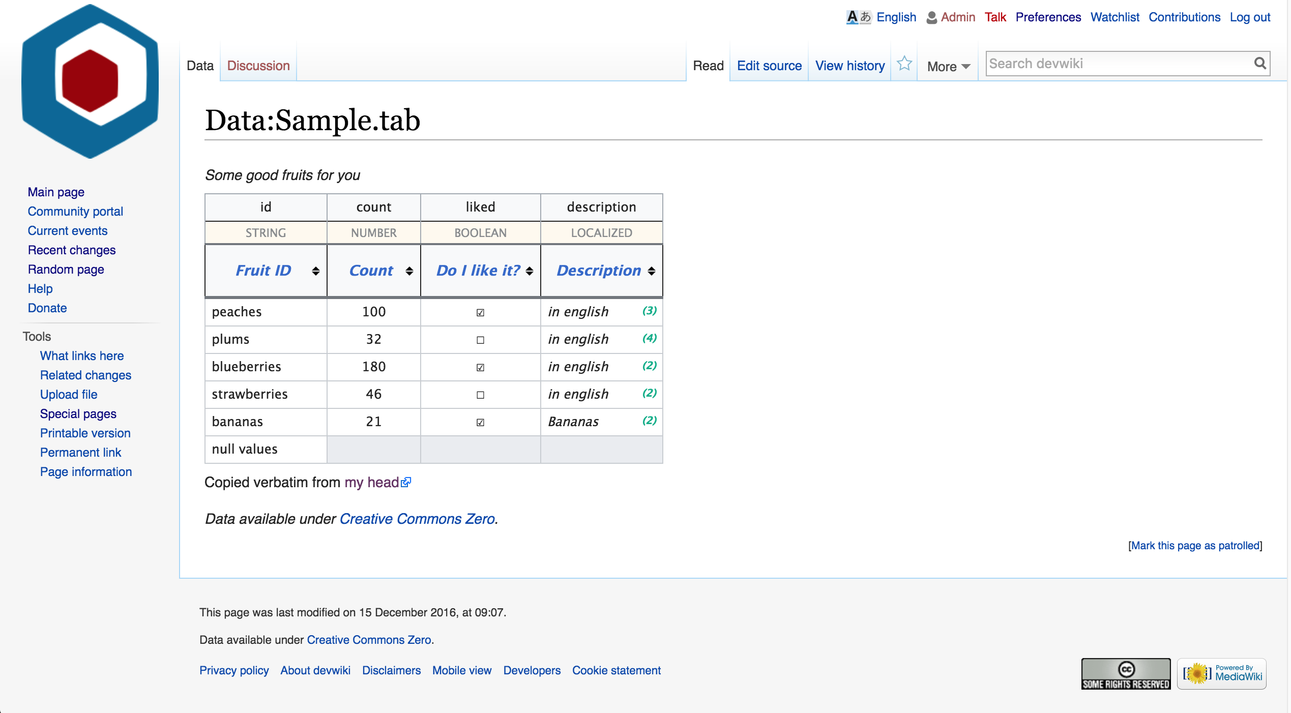
We should make the new tabular data feature consistent with Wikimedia UI and UX guidelines.
Initial style:
| Full page | Table only |
|---|---|
 |  |
| • JGirault | |
| Dec 12 2016, 7:34 PM |
| F7597831: Screen Shot 2017-04-17 at 1.04.03 PM.png | |
| Apr 17 2017, 8:07 PM |
| F5063766: Screen Shot 2016-12-15 at 4.20.59 PM@2x.png | |
| Dec 16 2016, 12:21 AM |
| F5063740: Screen Shot 2016-12-15 at 4.17.51 PM@2x.png | |
| Dec 16 2016, 12:18 AM |
| F5063708: Screen Shot 2016-12-15 at 4.11.45 PM.png | |
| Dec 16 2016, 12:13 AM |
| F5063706: Screen Shot 2016-12-15 at 4.11.28 PM.png | |
| Dec 16 2016, 12:13 AM |
| F5062488: Screen Shot 2016-12-15 at 10.57.43 AM.png | |
| Dec 15 2016, 6:58 PM |
| F5062454: Screen Shot 2016-12-15 at 10.50.38 AM.png | |
| Dec 15 2016, 6:51 PM |
| F5062456: Screen Shot 2016-12-15 at 10.51.02 AM.png | |
| Dec 15 2016, 6:51 PM |
We should make the new tabular data feature consistent with Wikimedia UI and UX guidelines.
Initial style:
| Full page | Table only |
|---|---|
| |
| Subject | Repo | Branch | Lines +/- | |
|---|---|---|---|---|
| Improve tabular data styling and bring consistency with M82 | mediawiki/extensions/JsonConfig | master | +416 -75 |
| Status | Subtype | Assigned | Task | ||
|---|---|---|---|---|---|
| Resolved | • JGirault | T152998 Improve tabular data styling | |||
| Resolved | Yurik | T153290 Cleanup tabular data's page appearance / CSS |
Something else to consider: There may be a number of unusual usage cases that we should also consider for the design. For example, the table may be ultra wide, and have very few rows, or no rows at all. Usage example - I'm building a template, and need a translation table - "id" -> { "en":..., "fr":..., ... } -- for that I can simply use an empty table with localized headers. Or another use case - configuration values - a one row system, each column being another setting. Lots of options here :)
For these cases, I think we should do a vertical layout instead of horizontal. Ideally, it should switch dynamically, just like WDQS does with its results - if its too wide.
I'd like to emphasize that – when speaking about guidelines – we not only need to look at the presentational layer, but also the structural/semantical one in order to include elements for best-possibly serve assistive technology or bots.
And for the presentational layer responsiveness were a major win. Pau and I had some rudimentary conversations about this several months ago.
Change 327671 had a related patch set uploaded (by JGirault):
Improve tabular data styling and bring consistency with M82
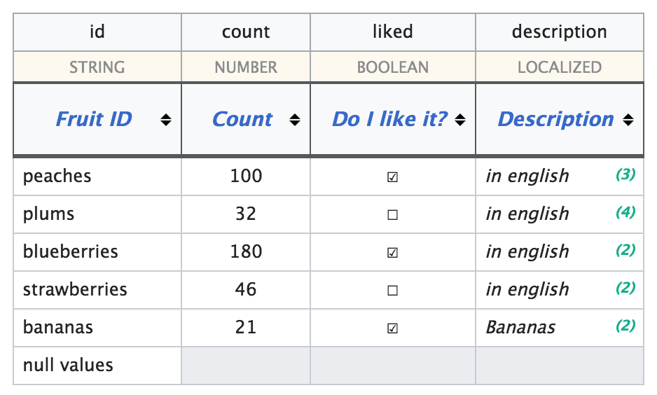
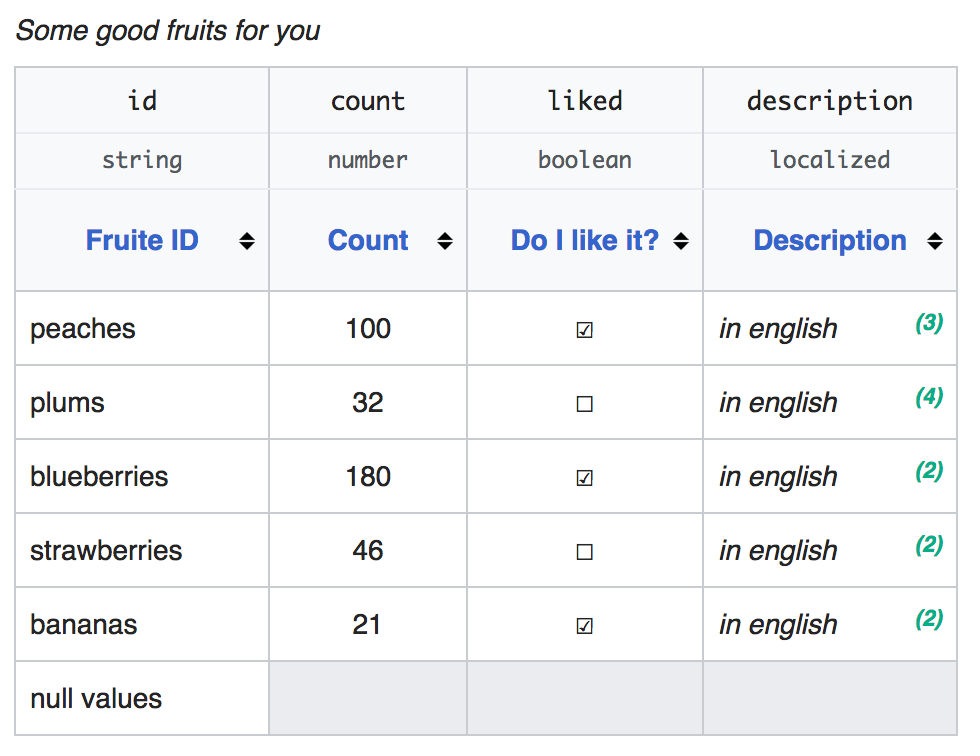
Thanks to great collaboration with @Nirzar, this is where we're at:
| Full page | table only |
|---|---|
 |  |
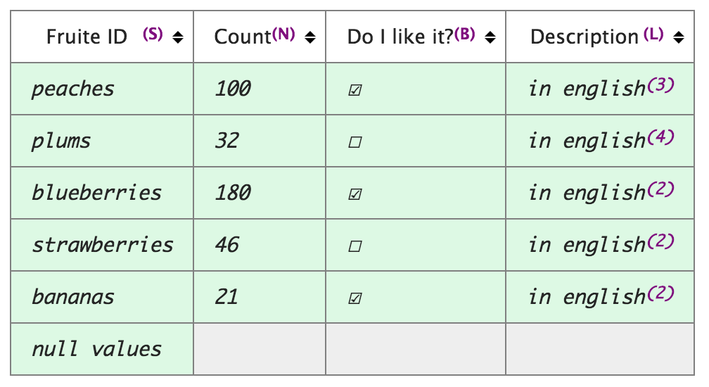
| Another example : BEFORE | AFTER |
|---|---|
 |  |
Change 327671 merged by jenkins-bot:
Improve tabular data styling and bring consistency with M82
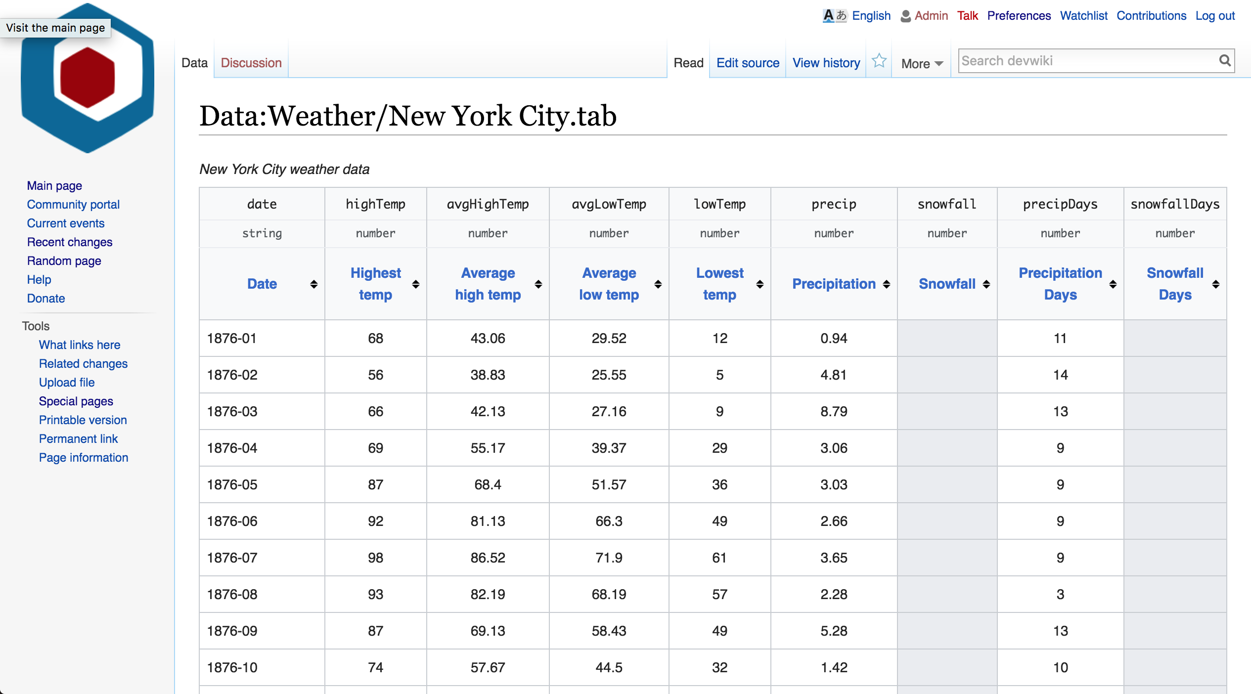
Another table - this time very wide: http://data.wmflabs.org/wiki/Data:Bea.gov/GDP_by_state.tab
I like the progress!
One thing that I'd consider as optional flag/class for a table for desktop/mouse users, especially on large data tables is a lightweight :hover effect on the table row/column to find their way through the data.
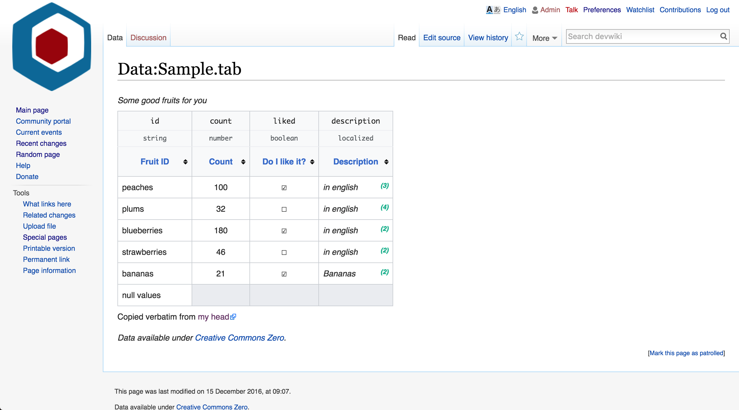
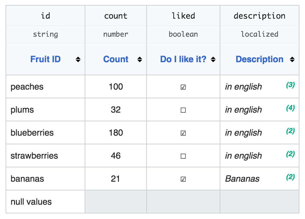
This is how it looks now, I'm gonna mark the ticket as resolved. I think it's gotten much better, it's consistent with the new color palette, and there hasn't been any activity for a while.
Screenshot:
/cc @Volker_E
@JGirault I think it's good to change it to resolved. One last comment though, I'd remove italics in descriptions to respect CJK languages.