The triangles are grey:
Whereas in MW dropdowns they are black:
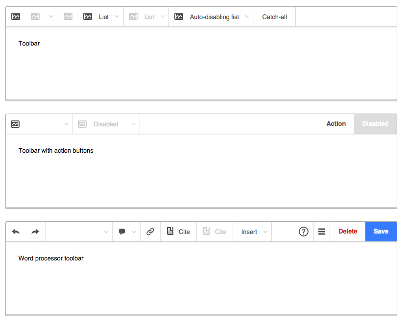
As are toolbars in Apex:
Proposed solution:
| Esanders | |
| Feb 4 2017, 3:04 PM |
| F2540541: Screen Shot 2015-09-04 at 11.49.12 PM.png | |
| Feb 9 2017, 4:45 AM |
| F5477839: pasted_file | |
| Feb 4 2017, 3:04 PM |
| F5477816: pasted_file | |
| Feb 4 2017, 3:04 PM |
| F5477854: pasted_file | |
| Feb 4 2017, 3:04 PM |
The triangles are grey:
Whereas in MW dropdowns they are black:
As are toolbars in Apex:
Proposed solution:
| Subject | Repo | Branch | Lines +/- | |
|---|---|---|---|---|
| MediaWiki theme: Replace arrows with chevrons and increase contrast | oojs/ui | master | +15 -18 |
| Status | Subtype | Assigned | Task | ||
|---|---|---|---|---|---|
| Open | None | T113560 Standardize MediaWiki components (tracking) | |||
| Resolved | Volker_E | T157190 Consider whether MediaWiki theme's toolbar arrow indicator should be greyed out (inconsistent with drop-down widgets) |
ISTR we did this to stop them feeling too "strong" on the toolbar. Not sure I care either way.
@Esanders I'm glad you've filed this. We've been discussing that specific issue at our UI Standardization offsite in January and came together to an agreement that is targeted to solve it.
Change 336745 had a related patch set uploaded (by VolkerE):
MediaWiki theme: Replace arrows with chevrons and increase contrast
Change 336745 merged by jenkins-bot:
[oojs/ui@master] MediaWiki theme: Replace arrows with chevrons and increase contrast