Fields take up a lot of space, and if you want to fill everything, you have to scroll the window often. I want to suggest a little design change of the page:
- Reference content: Render it to normal text. When you click on 'Reference', you can open edit menu.
- All fields must have half width. Only marked fields should have full width.
- Add a 'dropdown arrow' for 'Cite template'.
| Current one | New one |
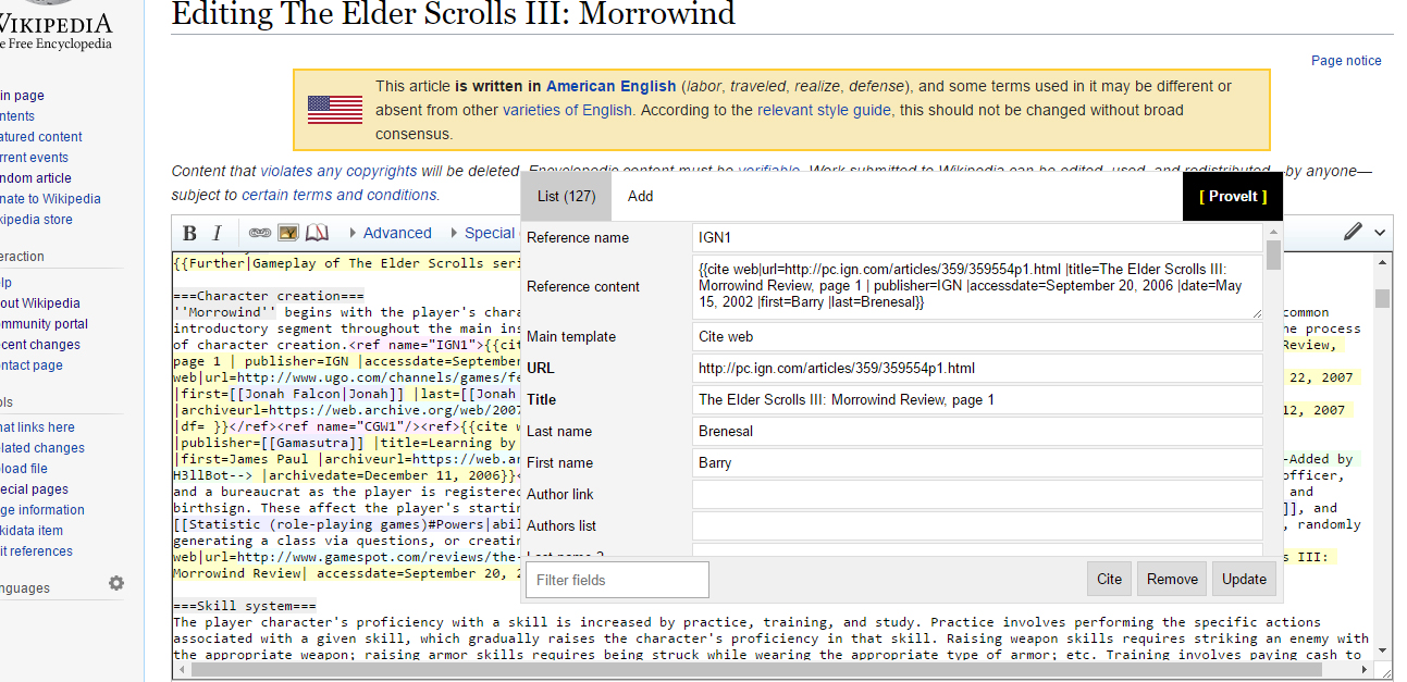 | 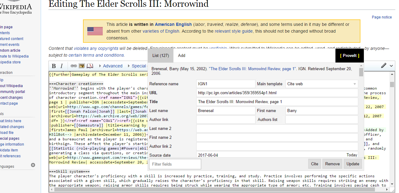 |