Currently in the restyled preferences all labels are top aligned (except for checkboxes/radio buttons). While I don't mind this for most of the settings, it looks very strange to me in the first section with the basic information.
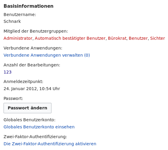
Especially for the unlinked information, you have to actually read the label to distinguish between label and data (while for labels that are followed by an input element you can tell the difference at first glance).
I wonder whether left aligned labels would be an option:
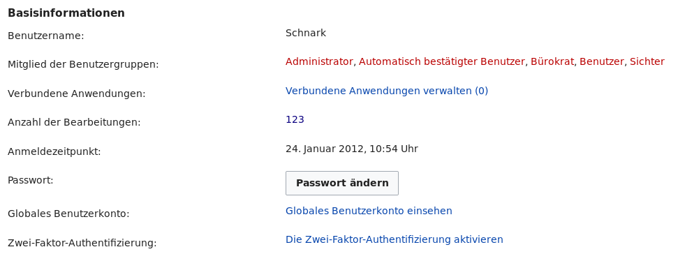
For the information section it improves at least for me the readability quite a lot.