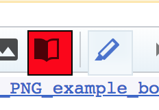
The icon to activate CodeMirror-based syntax highlighting is bigger than the toolbar it's in and has a box around it:

| • MichaelSchoenitzer_WMDE | |
| Jun 14 2018, 1:56 PM |
| F22329157: Screen Shot 2018-06-17 at 22.54.28.png | |
| Jun 17 2018, 8:55 PM |
| F22227458: Bildschirmfoto zu 2018-06-14 15-49-55.png | |
| Jun 14 2018, 1:56 PM |
The icon to activate CodeMirror-based syntax highlighting is bigger than the toolbar it's in and has a box around it:
@MichaelSchoenitzer_WMDE Is the page zoomed in or out beyond the standard zoom?
No.
And correction: The above behavior only happens with Chromium. On Firefox there also is a box around the icon (is that on purpose?) but it isn't bigger than the toolbar.
After further digging: The page isn't zoomed but my Chromium if set to "fontsize = big" in the settings. When setting back to normal it works. All other icons work however with all fontsize-settings.
The box around the icon - does that also appear when syntax highlighting is off? i.e. when you click that button and it goes to the "off" state, do you still see it protruding outside the toolbar?
I've checked. The other buttons have the same issue, it's just that they don't have an outline and backgroundcolor set as this button does in the active state.
This is basically a side effect of the old buttons being fixed at 22x22px, and the new OOUI icons being font-size relative due to:
.oo-ui-buttonElement-frameless.oo-ui-iconElement > .oo-ui-buttonElement-button {
    min-width: 1.42857143em;
    min-height: 1.42857143em;
}
This is therefor a WikiEditor issue introduced by the OOUI restyling, of which the CodeMirror button is simply the first victim.
The box around the icon - does that also appear when syntax highlighting is off? i.e. when you click that button and it goes to the "off" state, do you still see it protruding outside the toolbar?
No, only when it's on.
@MichaelSchoenitzer_WMDE is this still an issue ? I remember this got fixed in OOUI at some point. The element no longer has that
.oo-ui-buttonElement-frameless.oo-ui-iconElement > .oo-ui-buttonElement-button {
    min-width: 1.42857143em;
    min-height: 1.42857143em;
}
so i'm unless you say otherwise, i'll close this.
The element no longer has that
ah, I was mistaken, it's still there, just in a 2nd block of CSS definitions.
@MichaelSchoenitzer_WMDE The box was removed as part of T223155. Does this button look okay now?
It looks fine now. The only thing that is still weird: sometimes the icon is black like the others and sometimes it's blue. Maybe some CSS rule on the wikis global.css?
The colour change is the new way to indicate whether the syntax highlighting is enabled.