Page MenuHomePhabricator

Implement redesign of contact form
Closed, ResolvedPublic3 Estimated Story Points

Assigned To
None
Authored By
kai.nissen
Jun 25 2018, 6:53 AM
Referenced Files
F23556593: kontaktFormular_Frame2.png
Jul 10 2018, 3:19 PM
F23556450: Screenshot_20180710_165853.png
Jul 10 2018, 3:19 PM
F23556589: kontaktFormular_Frame1.png
Jul 10 2018, 3:19 PM
F23218328: desktopMitIDMobile.png
Jul 2 2018, 1:30 PM
F23218313: desktopMitID.png
Jul 2 2018, 1:30 PM
F23218326: desktopMitIDschmal.png
Jul 2 2018, 1:30 PM
F23216905: desktopMitIDschmal.png
Jul 2 2018, 11:21 AM
F23216902: desktopMitID.png
Jul 2 2018, 11:21 AM

Description

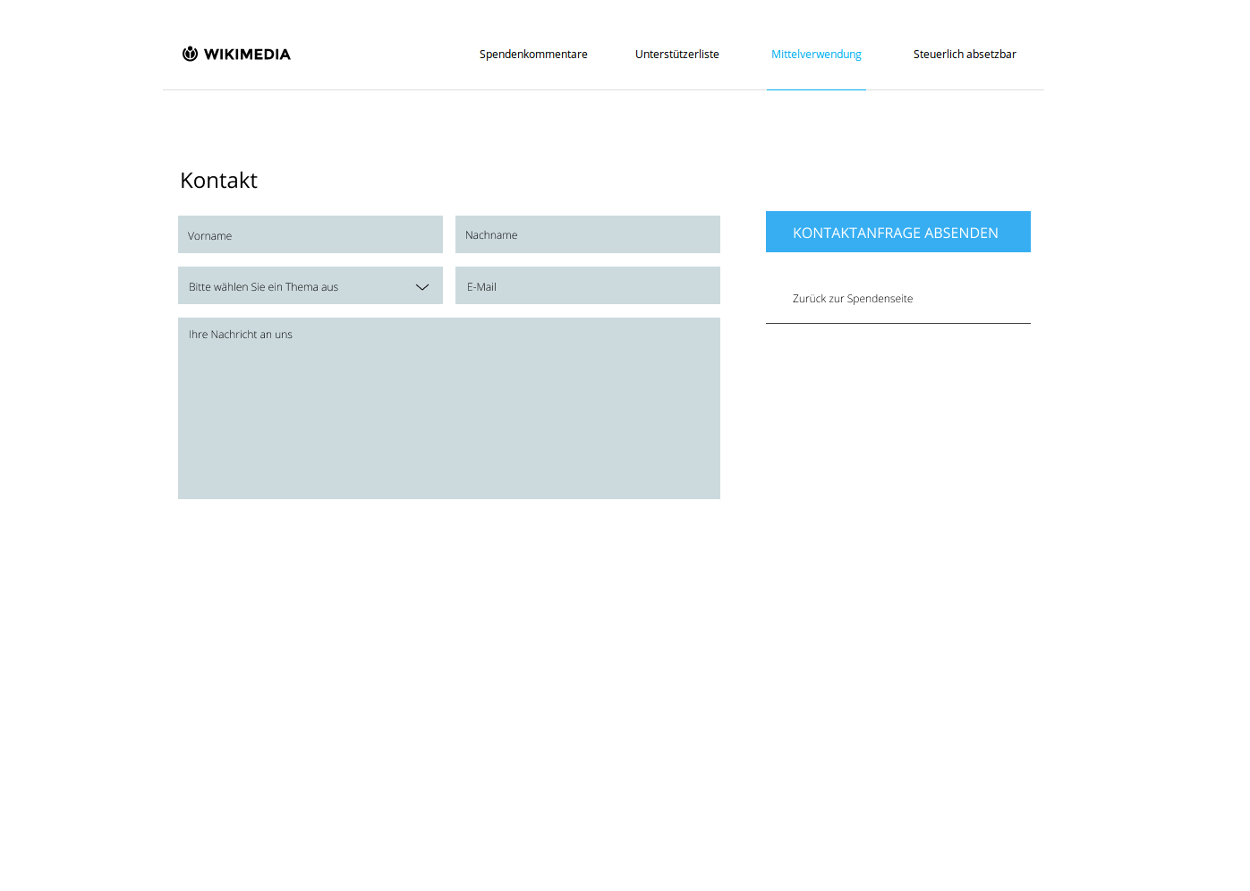
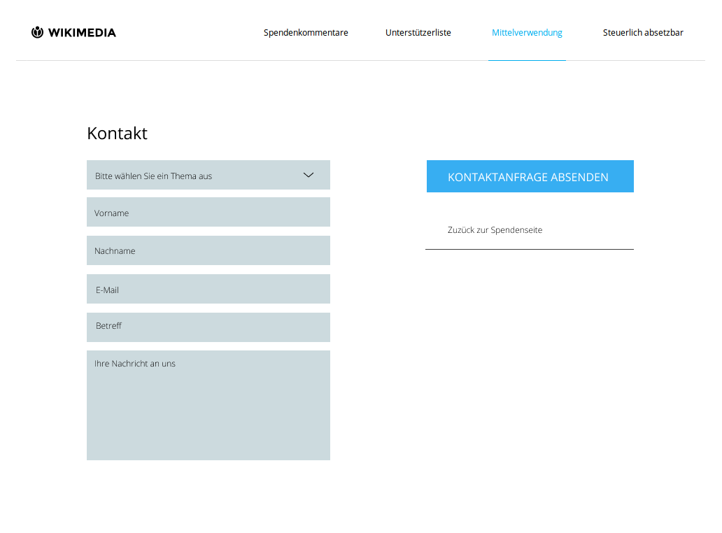
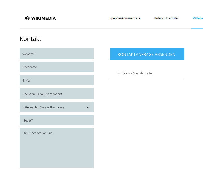
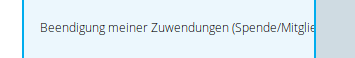
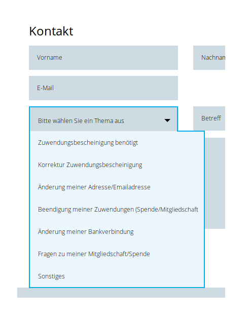
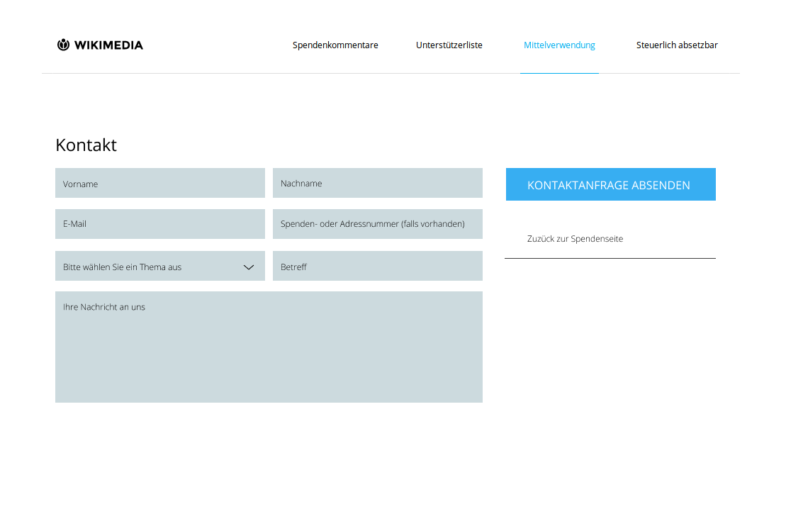
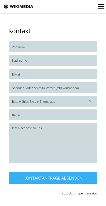
The contact form got an overhaul from our design team after functionality for a contact topic field has been introduced. See images below for how it is supposed to look like in narrow and wide viewports:

desktop:

desktopMitID.png (718×1 px, 22 KB)

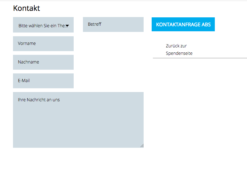
screen is too narrow to display original field sizes
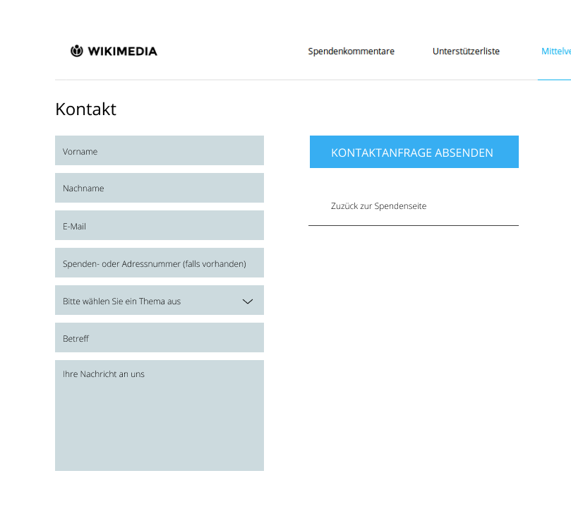
desktopMitIDschmal.png (728×809 px, 25 KB)

mobile

desktopMitIDMobile.png (802×412 px, 17 KB)

Note:
Try to implement this with bootstrap classes, if that's not possible, use CSS flexbox (order, etc)

Event Timeline

kai.nissen added subscribers: Jan_Dittrich, Charlie_WMDE.

@Jan_Dittrich, @Charlie_WMDE: We talked about having the subject field always visible. Does that have implications on the design (especially in wider viewports)?

gabriel-wmde set the point value for this task to 3.

Hi @kai.nissen ,

I actually want to suggest that we rethink whether "betreff" should be there at all.

When looking at other contact forms, the vast majority completely abstains from using such a field when the topic selection field exists. I also don't see a good reason for including this field when the other option is provided. It also won't help sort through "sonstiges" since they will be all different anyway.

Additionally it helps the user focus on what's relevant and reduces unnecessary fields they have to concern themselves.

Instead the form could look like this:

kontaktformular Desktop_ohneBetreff.png (996×1 px, 22 KB)

Thank you, @Charlie_WMDE. Do you strongly oppose keeping this field? Both fields actually serve an improvement on the end of the responding people. The selected topic will be processed by our ticket system to sort messages into sub-queues for better prioritization, while the subject line helps the service team to easily identify messages in a list view.

Can you tell me in how far the topic is used to identify the messages? My assumption would be that the subject lines are often quite vague like "Question" for example and that the names are rather used to find a certain question.

The question is also whether adding the selected topic will improve structure in such a way that the subject line won't yield much additional benefit. Would it maybe be possible to talk to someone from the fundraising and have them show us a typical workflow? I think that would be best.

So far my design decision was based mostly from the users' perspective but I would like to better understand the other side to find the best possible compromise.

hi @Charlie_WMDE first of all, you do not need permission to talk to us. Just do. Second, yesterday I talked with "our service" who works with OTRS the most. The main help of an additional subject line is the appearance of the e-mails in the respective queues. If we do not have a subject line, every e-Mail would have the same subject line. And subject line is (in addition to the categories and especially for "sonstiges") an important filter for prioritization of which emails to answer first (please keep in mind that during the banner campaign we have few thousand emails). people actually use the subject line for their cause (esp. if it is urgent). I bet that the subject line will have additional content to the categories.

So, pragmatic approach: We add a "Betreff" form field, but not as a mandatory field (and maybe add a "Optional" to it) and next year we see if the user really uses this field. In favor of synonymity, we could add another optional field like "SpendenID oder Adressnummer" or "Titel"

The mockups are missing one case where the screen resolution is kind of "in between" and the screen columns are very small, which leads to the drop-down and button texts to be cut off. What should we do for this screen size, @Charlie_WMDE ?

Bildschirmfoto 2018-06-28 um 18.01.24.png (552×798 px, 30 KB)

Vvjjkkii renamed this task from Implement redesign of contact form to vdaaaaaaaa.Jul 1 2018, 1:02 AM
Vvjjkkii triaged this task as High priority.
Vvjjkkii updated the task description. (Show Details)
Vvjjkkii removed the point value for this task.
Vvjjkkii removed a subscriber: Aklapper.
kai.nissen renamed this task from vdaaaaaaaa to Implement redesign of contact form.Jul 2 2018, 7:07 AM
kai.nissen lowered the priority of this task from High to Medium.
kai.nissen updated the task description. (Show Details)
kai.nissen set the point value for this task to 3.

@gabriel-wmde

If we drop below the screensize where the 3 column view works we switch to 2 columns, kind of like so:

formularSmall.png (762×1 px, 20 KB)

So instead of collapsing the fields you re-align them and collapse a column so to speak. Is that possible?

@tmletzko Is the SpendenID helpful in identifying the person contacting you? If so, I would definitely recommend adding it to the form. If I have such an ID i'd expect to be able to input it somewhere, similarly to a customer ID in an online shop for example or an order number. I would have a field called Spenden-Id (falls vorhanden) for example.

If not, then I would not add it just to make things more symmetrical.

desktopMitID.png (718×1 px, 22 KB)

desktopMitIDschmal.png (728×809 px, 24 KB)

@gabriel-wmde since it looks like we're adding "betreff" back in I would suggest rearranging the order of the fields since it doesn't make much sense to have the topic and the subject separate. Also in these mocks it's easier to see how the fields should move into each other. The ones on the right, should move below their counterparts on the left, so the order still stays the same.

edit: should spenden-ID not be a helpful field, just leave it out. Everything else can stay the same.

@Charlie_WMDE well, yes. this is a unique ID of the respective donations. But to make it a little bit more complicated, the id of the person itself is the "Adressnummer" in the other database. So both ids are unique and we communicate both ids in different contexts (spendenID for transaction confirmation) and Adressnummer for other contexts. Ideally, we would have both cases here: "Spenden- oder Adressnummer (falls vorhanden)", otherwise it is wild guessing which number is more known to the donor (I guess it is Adressnummer).

If that would work for you, then I'd change the mock and ticket accordingly and we'd have one field for both? @tmletzko

done. ping @gabriel-wmde is this still in scope and are there any questions/remarks from your side?

@Charlie_WMDE Adding a new field would require a re-estimation of this ticket since it is additional work which was not included in our estimation. I have implemented all other changes, so now the form design is fixed and prepared for this new element but I would make a separate ticket where we only add that field.

CommunityTechBot raised the priority of this task from Medium to Needs Triage.Jul 5 2018, 7:06 PM

Hello @Tim_WMDE @kai.nissen ! Just looked at https://spenden.wikimedia.de/contact/get-in-touch and it looks very nice.

Just one little thing, the drop down should match the size of the text, not the size of the field it drops down from. only up until a certain line length, then the line should break, but i assume that won't be relevant for us.

Screenshot_20180710_165853.png (58×355 px, 2 KB)

instead it should look like this according to the current design:

kontaktFormular_Frame1.png (638×489 px, 21 KB)

preferably the frame wouldn't go around the whole field though like so:

kontaktFormular_Frame2.png (618×492 px, 21 KB)

but i'm not sure how far you can deviate from the given design patterns

Yo @Charlie_WMDE @kai.nissen, this is not really related to the changes of this ticket and rather belongs to T192053. Either way, I think changing this is somewhat of a pain which is why I think it would be best if we could estimate it as part of a separate ticket and pick it up if we find the time. Generally, drop downs are meant to be exactly as wide as the clickable drop-down element and I think the JavaScript library we use for the custom forms (JCF) does not support this out of the box, so we would have to implement that or come up with a compromise solution.

An alternative quick fix would be to rename it to make it shorter, for example:

"Beendigung meiner Zuwendung (Spende/Mitgliedschaft)"

->

"Zuwendung beenden (Spende/Mitgliedschaft)"

That way we would not have to hack around in the form library.

yo @Tim_WMDE , thank you for your input.

Generally, drop downs are meant to be exactly as wide as the clickable drop-down element and I think the JavaScript library we use for the custom forms (JCF) does not support this out of the box

Common practice for drop-downs is to have the text field as wide as it needs to be (to a certain extent), regardless of the clickable drop-down element or at least have it be able to break the line. And it's definitely bad practice to cut text off. It is very unfortunate that your library does not support this behavior, but that is a problem with the library that we should solve, not the UI pattern.

so we would have to implement that or come up with a compromise solution.

This is a fair point and we do want to avoid hacking stuff into widgets. Long-term we should probably be talking about using a library that allows for easier manipulation of modules because a library that implements all current/common practice UI patterns is probably unrealistic.

Thanks @kai.nissen for solving the issue by shortening the label, but we should also have structures to solve such issues otherwise as well, since it won't always be possible to shorten a text to avoid such problem.

I second Charlie here but want to highlight that the labels are indeed quite long due to their "Nominalstil". Kai’s change is in my opinion in the right direction, but it should actually be a UX, or better, a writer's job to go over the texts and make them terse and graspable.