Page MenuHomePhabricator

Improper CSS of standard-toolbox-dropdown in wiki Skin Refreshed
Closed, ResolvedPublic

Description

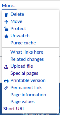
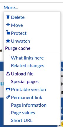
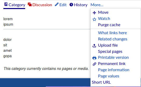
In the MediaWiki skin Refreshed in the standard-toolbox-dropdown, there are two issues:

  • When clicked on the Watch/Un-Watch the text is overlapping with the Icon as shown in the Image

Before Click

Selection_020.png (336×544 px, 29 KB)

After Clicking on Watch
Selection_019.png (333×537 px, 29 KB)

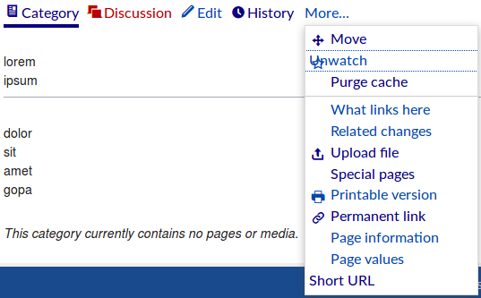
  • Short URL is miss aligned in the toolbox-dropdown as shown in the above image.

This will be the good task for Google-Code-in-2018, I will mentor this task.

To Install and config the MediaWiki skin "Refreshed", follow https://www.mediawiki.org/wiki/Skin:Refreshed

Event Timeline

This would be a good task to include in T200303, so if anyone wants to contribute for Google Code-in, consider working on the refreshed4-beta branch. Thank you!

Change 472788 had a related patch set uploaded (by Shreyasminocha; owner: Shreyasminocha):
[mediawiki/skins/Refreshed@master] Fix styling of watch/unwatch button

https://gerrit.wikimedia.org/r/472788

Oops, I worked off master rather than refreshed4-beta as @MtMNC suggested.

There's too much difference between master and refreshed4-beta for a rebase to solve the issue.

Even reworking has its own issues. The textual content of all dropdown actions was originally in a span. When watch/unwatch is clicked, a JQuery method is called which deletes subnodes of the link element (including the span) and adds innerText to the link element itself. Earlier (in master), since the icons were implemented as pseudo elements, I removed the span for all page actions and adjusted the styling accordingly such that even if the link's subtree were cleared by JQuery, nothing would be lost. However, in refreshed4-beta icons are implemented as SVG elements within the link element, so my patch is broken. I'm not sure how the issue can be resolved in refreshed4-beta.

How do I proceed from here? Do I abandon my patch on Gerrit?

@Shreyasminocha There are few minor things encountered after testing your patch,

Before testing:

Selection_006.png (386×203 px, 17 KB)

After testing your patch:

Selection_009.png (431×214 px, 20 KB)

  • Above the "What links here" all the items were spaced little left than actual
  • "Purge cache" is misbehaving.
  • Ahh I guess "Short URL" works fine.

Please update your patch by following above-mentioned comments.

Urbanecm and I couldn't reproduce Gopa's first bullet point (as discussed in #wikimedia-dev) and I addressed the second one.

Like I noted on #wikimedia-dev, while this solves the points mentioned, I feel it's not a complete fix. I suspect that any extensions that adds buttons to the "More..." menu will have the alignment of its buttons broken (which I fixed for two extensions by hardcoding the alignment for them), so a more permanent fix needs to be made. I'll leave this unresolved for now.

Change 472788 merged by jenkins-bot:
[mediawiki/skins/Refreshed@master] Fix styling of "Watch"/"Unwatch" and "Short URL"

https://gerrit.wikimedia.org/r/472788

MtMNC claimed this task.

I believe both parts of this task are resolved in the refreshed4-beta branch as of 488f4149ab7a.