Page MenuHomePhabricator

Create a rounded button widget for Floating action buttons
Closed, DeclinedPublic

Description

Use case

Coming out of the work on the help panel (see T206717) was a need for a floating action button that is:

  1. anchored to a fixed position
  2. appears in front of *all content* on the screen.
Proposal:

Since the button should appear more prominently and clearly seen as 'above' all other content, it is proposed we could add a config option to make the primary button have rounded corners and a more prominent drop shadow.
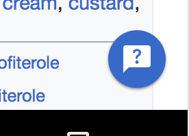
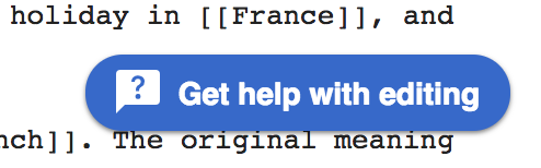
Example:

image.png (154×494 px, 24 KB)

(prototype here: http://reetssydney.github.io/prototypes/help-pane-v1/index.html)

This task is meant for a general discussion and collection of this pattern need and to decide if it

  • should be implemented only context-specific or
  • be part of the library and (in follow-up tasks) how to best implement it

Event Timeline

Restricted Application added a subscriber: Aklapper. · View Herald Transcript

I'd be inclined to keep any code for this downstream in MediaWiki, in a suitably named widget (e.g. FloatingButtonWidget) to discourage it being used in other contexts :)

How would an icon-only version look, I'd assume circular? (in which case you may want to increase the height of the labelled version).

I'd be inclined to keep any code for this downstream in MediaWiki, in a suitably named widget (e.g. FloatingButtonWidget) to discourage it being used in other contexts :)

That's a fair point.

How would an icon-only version look, I'd assume circular? (in which case you may want to increase the height of the labelled version).

  • Yes it should look circular like so:

image.png (198×276 px, 13 KB)

Declined for now. We'll keep requests for such buttons on the radar, but from current use cases there's only the Help panel featuring this treatment and – from library maintenance and performance perspective – it is better to have this treatment code-wise living in the extension.