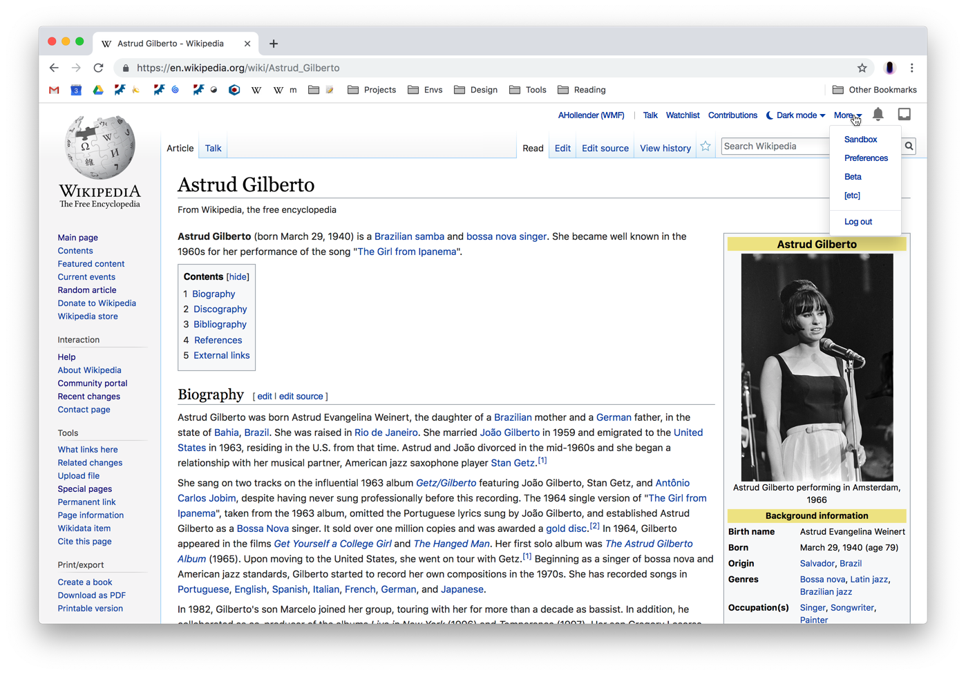
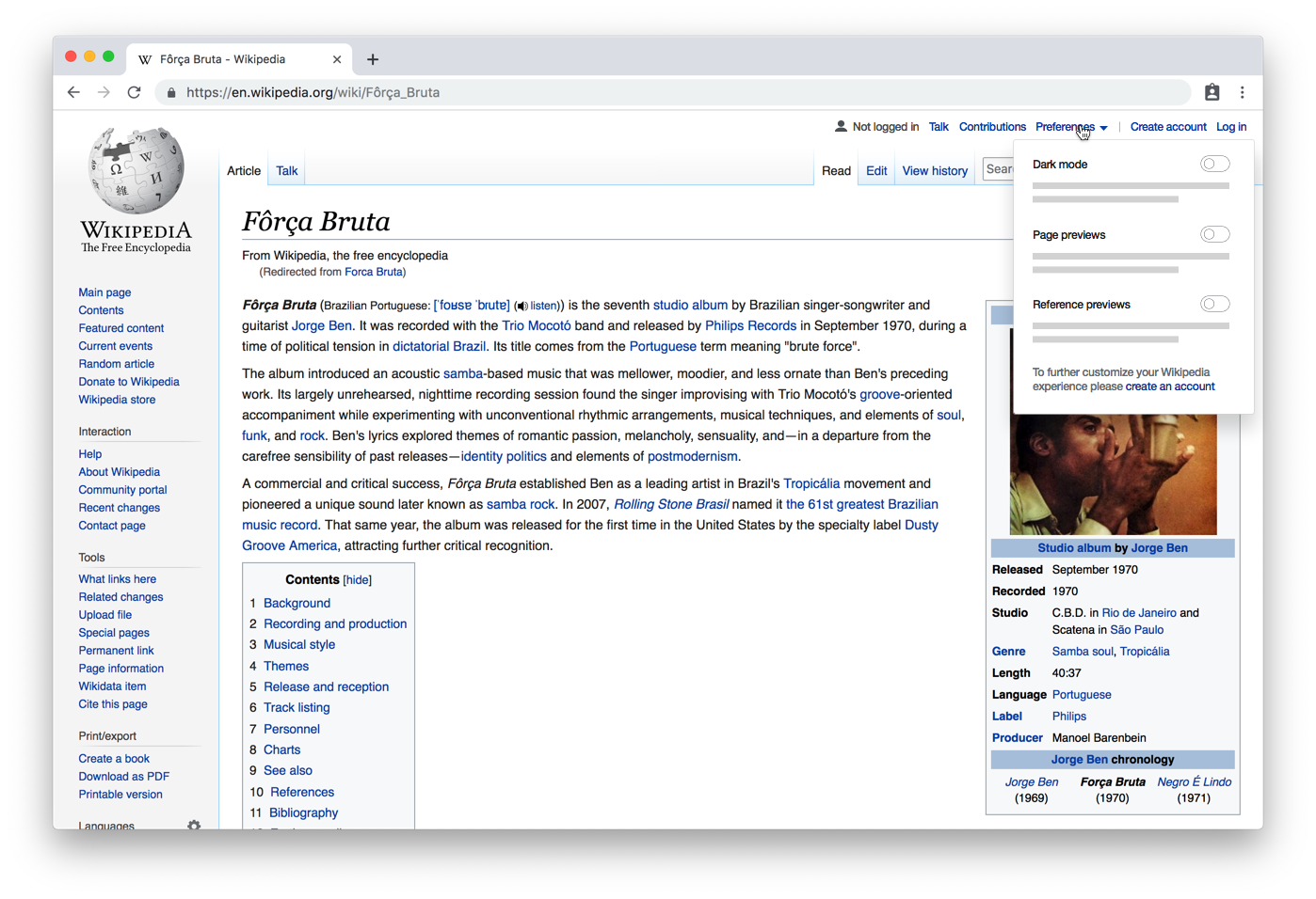
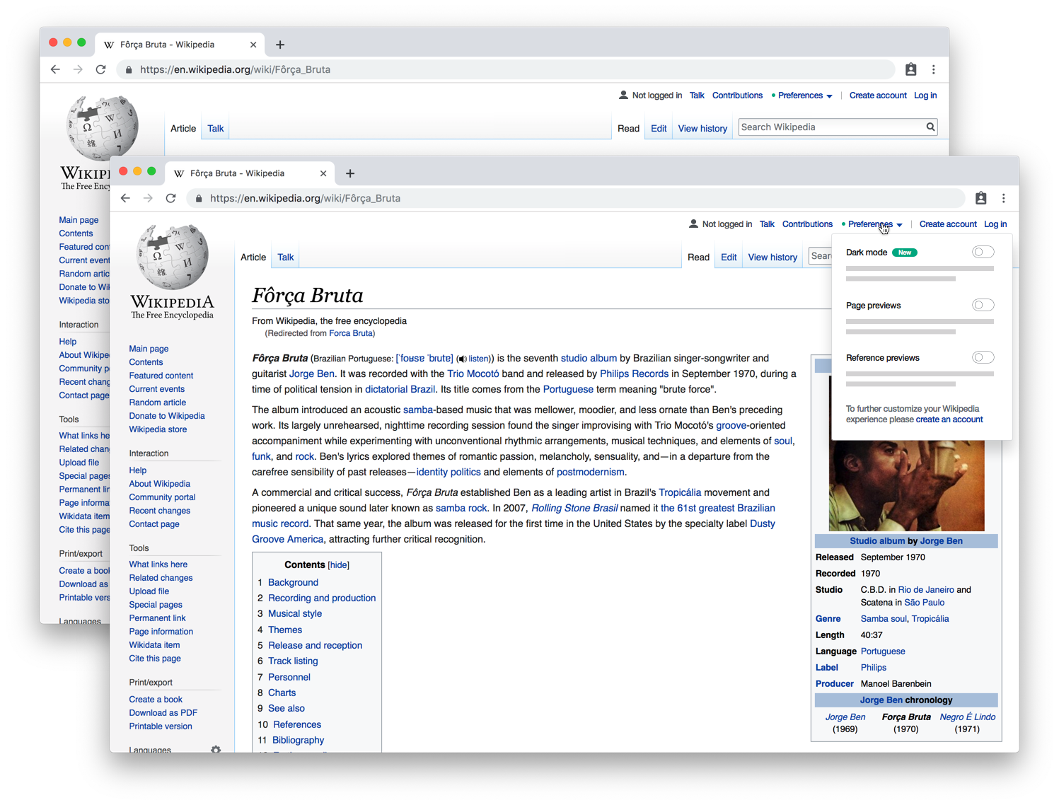
Page MenuHomePhabricator

Night mode design for MediaWiki
Closed, DeclinedPublic

Authored By
Niharika
Mar 20 2019, 4:19 PM
Referenced Files
F28598609: image.png
Apr 9 2019, 4:08 PM
F28596025: image.png
Apr 8 2019, 8:45 PM
F28596217: image.png
Apr 8 2019, 8:45 PM
F28596013: image.png
Apr 8 2019, 8:45 PM
F28596021: image.png
Apr 8 2019, 8:45 PM
F28596019: image.png
Apr 8 2019, 8:45 PM
F28580290: image.png
Apr 4 2019, 4:22 PM
F28580297: image.png
Apr 4 2019, 4:22 PM
Tokens
"Mountain of Wealth" token, awarded by Capt_Swing.

Description

Description

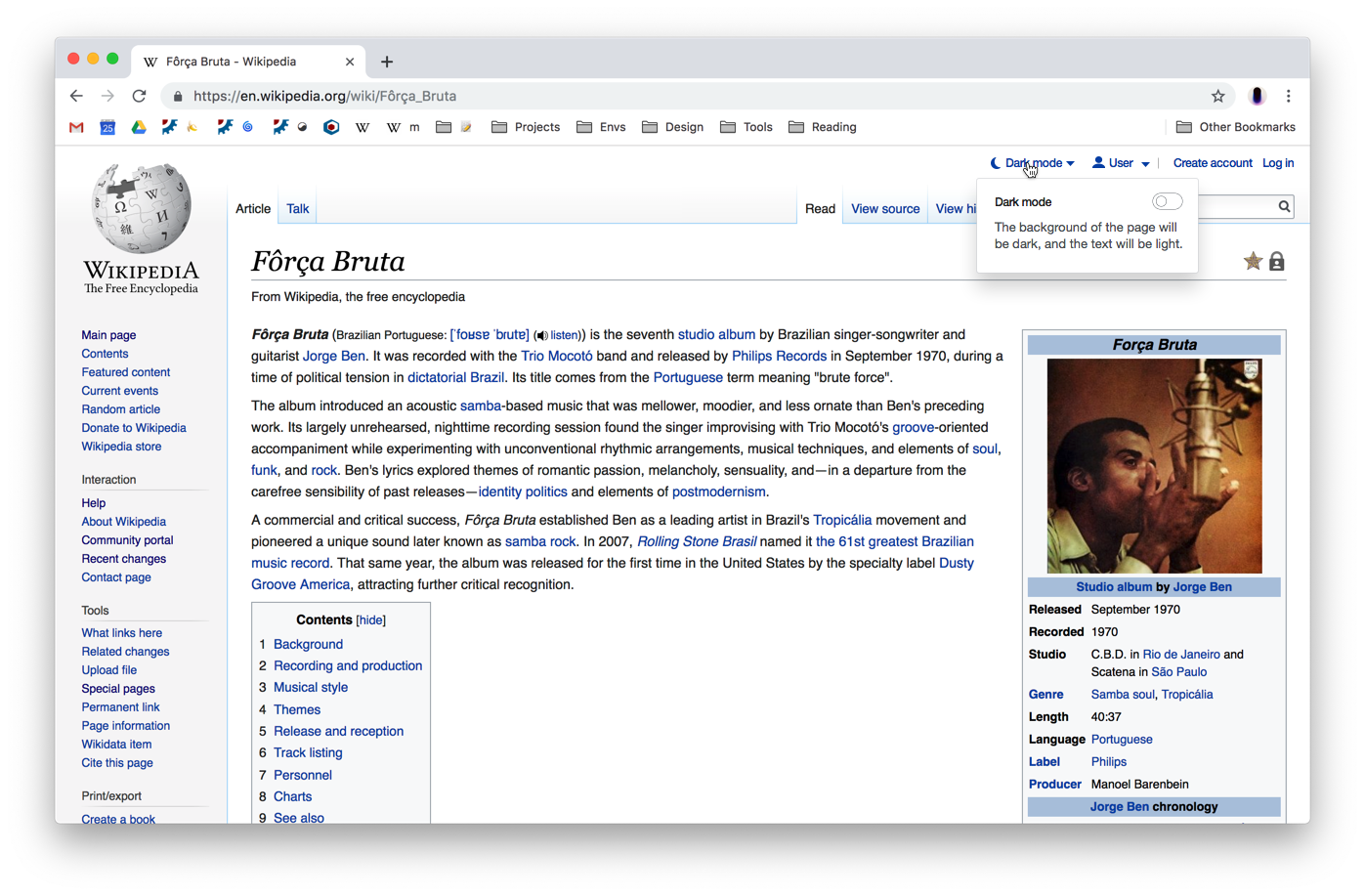
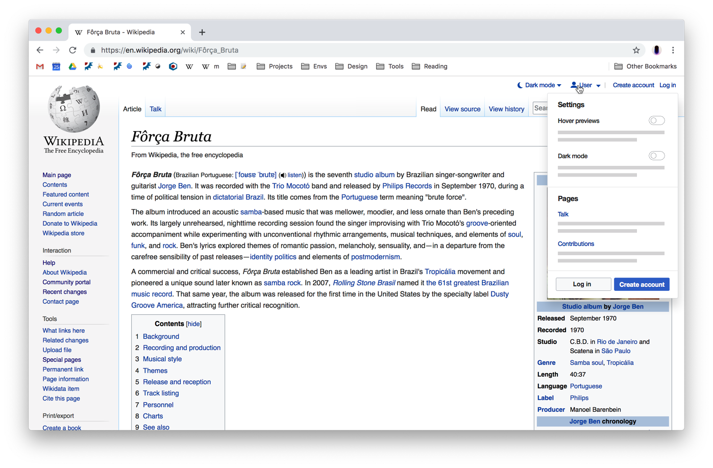
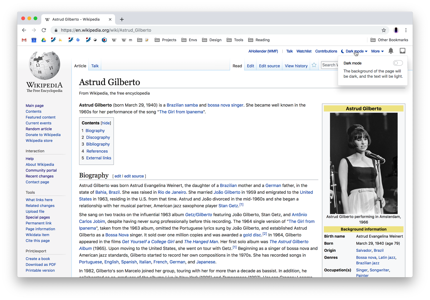
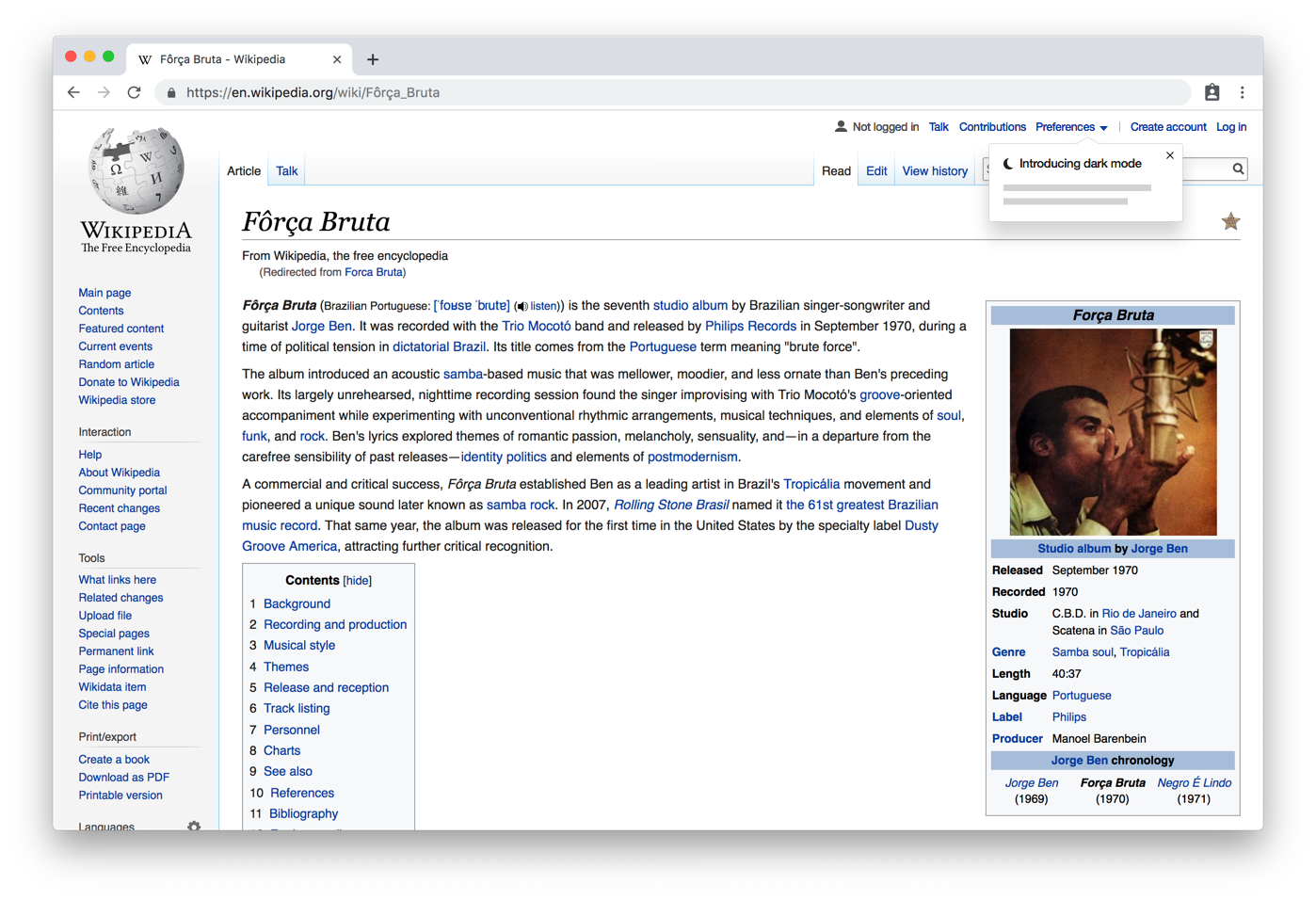
The second most popular 2019 community wish is night mode. We will be introducing this in the coming year.

Scope

This feature will be available for:

  • desktop, logged-in & logged-out
  • (mobile, logged-in & logged-out?)

Designs

[coming soon, see comments for now]

Event Timeline

Niharika triaged this task as Medium priority.Mar 20 2019, 4:19 PM
Niharika created this task.

Which software project is this about?

@Aklapper Night mode. :)

I will create a project board for it when we are closer kicking it off.

Aklapper renamed this task from Night mode design to Night mode design for MediaWiki.Mar 21 2019, 8:48 AM

Thanks, so this is about a website and not about an app. :)

@Niharika I've just pinged @Nirzar and @Prtksxna off-thread to comment on the sketch below. I'm also curious about your thoughts. I will aim to collect design feedback and post an update here with an opinionated rationale within the next week.

FYI @MMiller_WMF — having a more consolidated user menu on web (here it's only suggested for logged-out users, though you could imagine us doing something similar for logged-in users) is possibly aligned with your thinking for the newcomer homepage.

@alexhollender I like the idea of consolidating all the settings for logged-out users in one menu. This de-clutters the existing scattered interface and also makes it possible for future settings to be in the same place and more discoverable.
The path 2 - A design is nice but I am not sure if it's a good idea to use the Personal bar (top bar) for the settings. That bar can usually be very long for people because of the fact that a lot of on-wiki gadgets and user-scripts add their settings there.
Here's what mine looks like:

image.png (194×2 px, 161 KB)

Maybe we can use the personal bar but have a smaller link to access it. Other folks might have better ideas to handle this. :)

Aside, @jmatazzoni is going to be taking over this project as PM and will be managing this project going forth.

@Niharika thanks for the notes. I'm realizing that I should work on a sketch for the logged-in experience, which I will do shortly.

@jmatazzoni I wanted to clarify the scope we're taking on here, and perhaps add it to the description of this task. Are we planning to offer this feature both on desktop and mobile, for logged-in and logged-out users?

@jmatazzoni @Nirzar I've sketched out the logged-in experience, and refined the logged-out experience a bit. Please review when you have a moment.

logged out
image.png (917×1 px, 683 KB)
image.png (917×1 px, 691 KB)
image.png (917×1 px, 582 KB)
logged in
image.png (977×1 px, 728 KB)
image.png (977×1 px, 740 KB)

For logged-in users:

  • I figure after several months we can move the Night mode setting into the "More" menu, and run some kind of popup panel that announces the new location
  • In the sketches above I've moved Sandbox, Preferences, Beta, and Logout into a "More" menu. It would be useful to look at data so we can be confident in which items belong in the menu vs. exposed directly on the page.

Updated sketches based on a review with @Nirzar.

Notes

The sketches in T218800#5085632 propose the consolidation of various user links into a menu (both for logged in and logged out users). This consolidation, while providing certain general benefits, is not necessary in order to introduce Dark mode. So to simplify things I've de-coupled the user link consolidation from the introduction of a Dark mode setting. In these designs the Dark mode setting is located in a Settings menu, which is consistent between logged-in and logged-out (the only difference being that for logged-in users there is a "View all preferences" link at the top):

logged out
image.png (956×1 px, 719 KB)
image.png (956×1 px, 664 KB)
logged in
image.png (1×1 px, 689 KB)
image.png (956×1 px, 688 KB)

A secondary consideration is how people will discover this new feature. It would be great if for a limited amount of time after the launch we could direct their attention to the Settings menu > Dark mode setting. There are several patterns we could use to do this, here are two examples:

image.png (1×1 px, 837 KB)

image.png (956×1 px, 700 KB)

Hi! We actually have an RfC (and patch) in to support exactly this (among other things): T122924! Perhaps you would be interested in commenting? What sort of approach were you considering, technically?

jmatazzoni added a subscriber: gh87.

Hi @gh87. Thanks for adding the Night Mode tag to this ticket, but I've actually created a new ticket for the Night Mode project specifically, which more narrowly defines the UI goals. That ticket is T221809. The work on this ticket, especially the idea of combining night mode with various other reading preferences, is all interesting but won't be part of the current CommTech project, for which the Night Mode tag was created. I encourage anyone interested in this UI to follow T221809

@alexhollender is going to create a new ticket to preserve this discussion, called something like "Consolidate logged-out reading settings." So I am closing this ticket which, as noted above, is a dupe of T221809.