Background
During our hackday and in follow up conversations, we studied the changes needed to made the recent changes filters functional on mobile. This task will study the viability of the proposed changes and with the goal of creating a task for making the changes themselves
Acceptance criteria
Investigate the viability and relative difficulty of each of the following items:
- Other review tools section will be collapsed. When uncollapsed, the section will contain all links available on the desktop site.
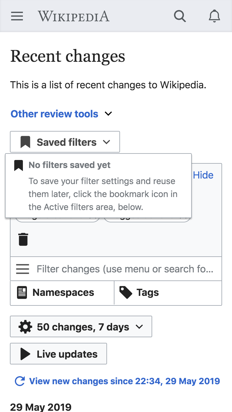
- Saved filter functionality will be identical to desktop. User will have the ability to:
- Save filters
- Rename saved filters
- Delete saved filters
- Load saved filters
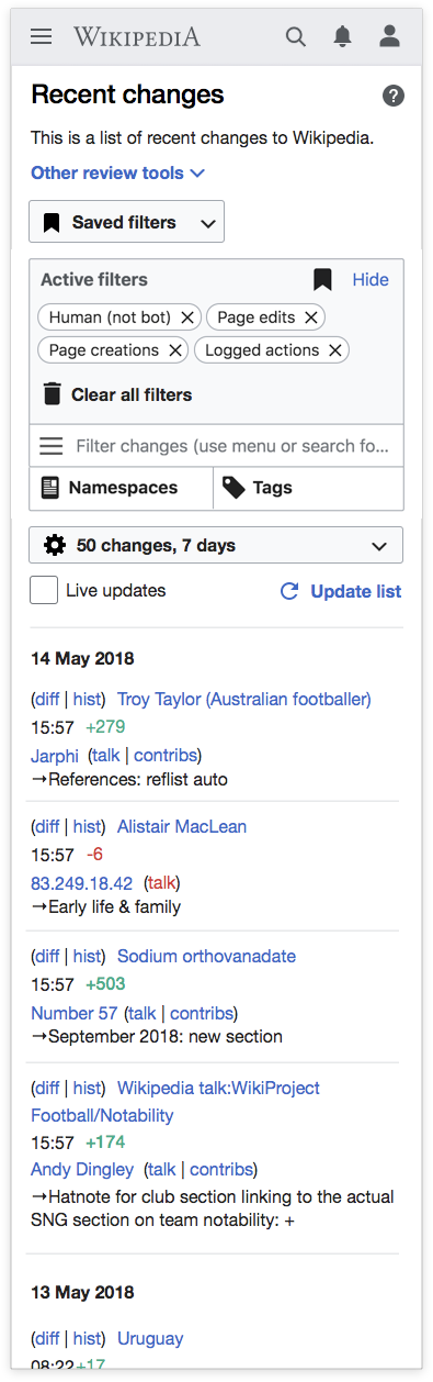
- The following active filters will be available:
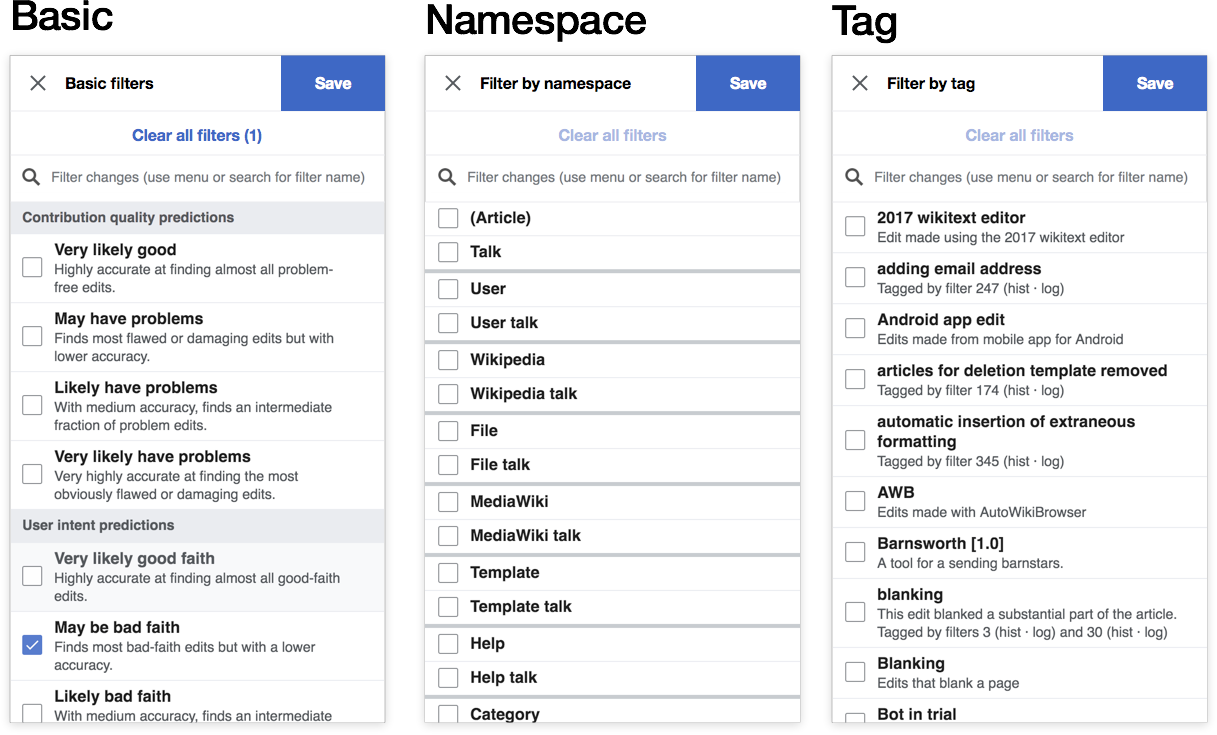
- Basic
- If possible, type ahead will be in modal of filter selection
- Tags
- Namespaces
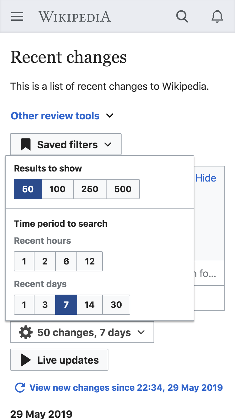
- Time filter (gear icon)
- Users will have the ability to group icons by page
- If a user has the grouping as a user preference, we will not suppress the preference and display the results as a list
- Users will NOT be able to highlight results
- The active filters section will be collapsible
- Basic
- Minimal fixes will be made to the “Use non-JavaScript interface” setting
- New changes and live updates buttons will function as they do on desktop
- The list of abbreviations will be hidden. If we cannot hide it, we can collapse by default
- Other open questions:
- can we display filters in a modal or should we try to use the native multi-select element?
- How do these work links on filter headings will be removed
- Tell us what you think about these filter headings will be removed
Design notes
(from T223922: [EPIC] Display core version of recent changes page for AMC users):
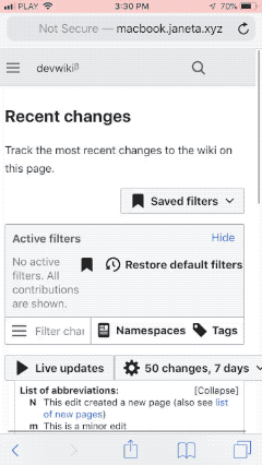
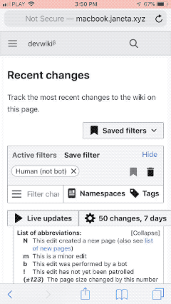
Basic mockup - these mockups show what's possible with relatively little CSS overrides. Below there is a "refined mockup" that goes a bit further in terms of cleaning up the filter section and naturally would require more CSS.
| full page | time range and # of results filter menu | saved filters menu |
 |  |  |
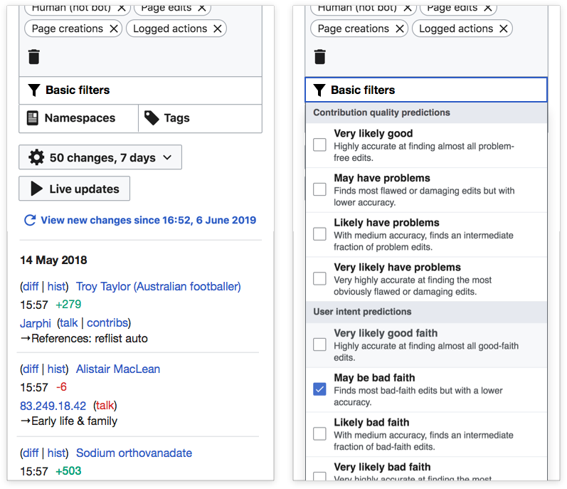
The two main components to consider here are:
| filters as native select elements | filters in a modal |
 |  |
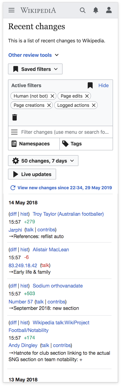
Refined mockup
Developer notes
Potentially helpful CSS here T223922#5222606