Page MenuHomePhabricator

Internal quick survey: allow entering free text
Closed, ResolvedPublic

Description

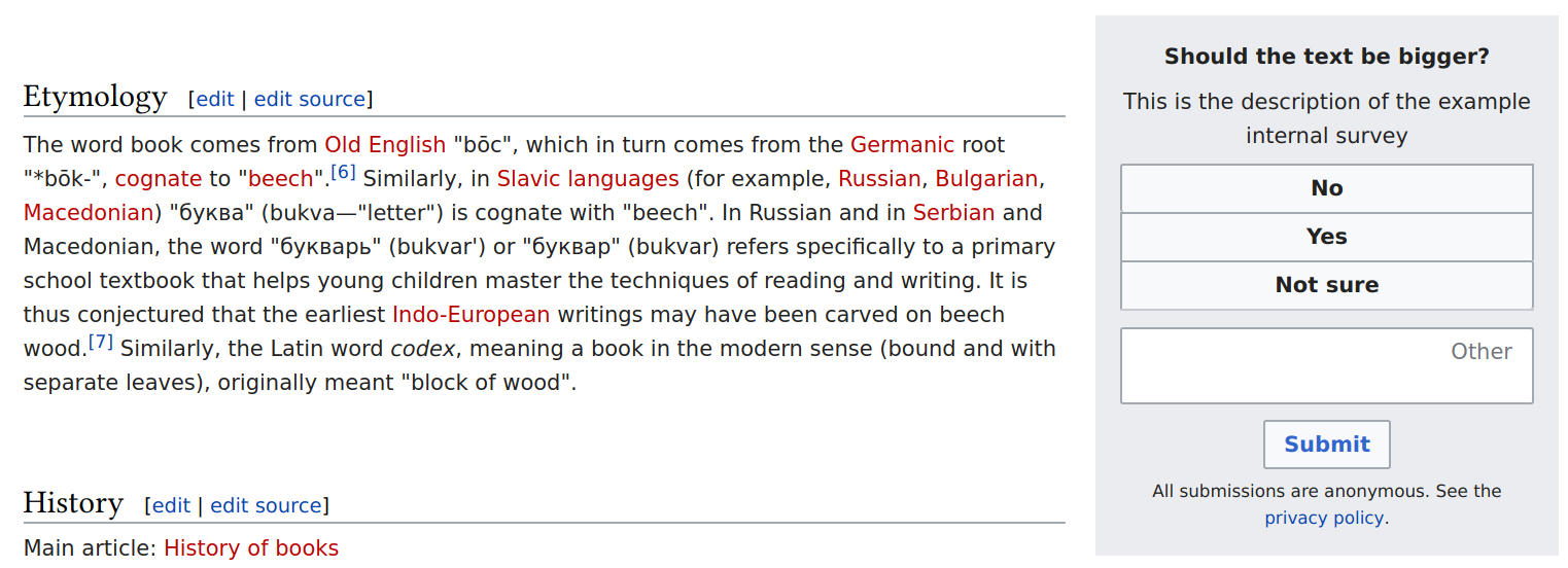
Something like this:

Question 1: What is a survey

answer one
answer two
other: _______

See T224552: [SPIKE] Assess risk for various quicksurvey improvements for more info.
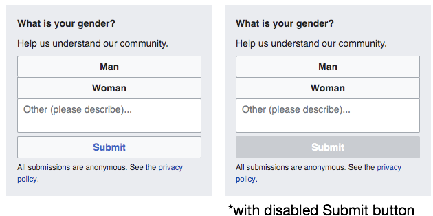
Update

Unfortunately, we cannot use the solution proposed by the spike, i.e. the combination of radio buttons and a text input, because of a long standing bug: T177617: Not able to type in RadioSelectWidget with text input in a label in OOUI. I'll try to find another solution.

Event Timeline

@leila, currently survey response buttons are optionally shuffled. Do we always want to put the free form text at the end of the button list or display it randomly at any position if shuffling is enabled?

@bmansurov in the case of the specific survey we're talking about: we want to always put it as the last option.

@Isaac FYI.

@Volker_E do you know why clicking on the text input inside the radio button here [1] doesn't work (Only the radio button is selected. I can focus on the text input by hitting tab, though)? I'm trying to create a similar thing, but I can't get it to work.

[1] https://doc.wikimedia.org/oojs-ui/master/demos/?page=widgets&theme=wikimediaui&direction=ltr&platform=desktop#RadioSelectWidget-with-text-input-in-a-label

Change 514669 had a related patch set uploaded (by Bmansurov; owner: Bmansurov):
[mediawiki/extensions/QuickSurveys@master] Add freeform text to internal surveys

https://gerrit.wikimedia.org/r/514669

bmansurov added a subscriber: Niedzielski.

@Niedzielski would you please review the above patch? Thanks!

@leila, @Isaac a couple of questions:

  1. Should the free form input be optional, i.e. some surveys can have it, if they want?
  2. Should the free form input be multiline?

@leila, @Isaac a couple of questions:

  1. Should the free form input be optional, i.e. some surveys can have it, if they want?

Yes.

  1. Should the free form input be multiline?

@Isaac my sense is that we should go with the more general solution (multi-line) even if for this survey we only need space for a couple of words and likely one line will suffice.

  1. Should the free form input be multiline?

my sense is that we should go with the more general solution (multi-line) even if for this survey we only need space for a couple of words and likely one line will suffice.

Yeah, I would agree with Leila that more general is better though we expect for this survey relatively short responses. From a UI perspective, I'll say that Google Forms just uses a single line that scrolls (example: https://docs.google.com/forms/d/e/1FAIpQLSfuvwe1QS8UOXRVO47h08TYTnT61NqWFlBDCvz-CMNlbZlcVg/viewform) and that seems to work well enough too. My understanding is that the 1000 character limit for EventLogging means we wouldn't get too fancy anyways in what we're asking. We only exceeded that twice for the pilot survey (user agent was very long in both cases) but still a concern.

And agree that other should always be last and optional to include on a survey.

@leila and @Isaac thanks for clarifying. Since a quick survey width is restricted to 300px on desktop, one liner text input will look too narrow for multi line responses. Currently, this is how big the input size is (two lines of text can be entered there):

scrot-area-2019-06-08_06:18:45.png (552×1 px, 143 KB)

As the user inputs text, the height grows to 5 lines maximum, after which a scroller is shown. Let me know if you want me to change it.

On another note, when the user doesn't select a button or input text, and tries to submit the form, what should the expected behavior be? Currently, I'm accepting user input (rather, non-input) and expecting the researcher to clean the up empty responses during data analysis. But, do you want me to force the user to input something or select a button? Also, do you want me to limit the number of characters text input can take?

On another note, when the user doesn't select a button or input text, and tries to submit the form, what should the expected behavior be? Currently, I'm accepting user input (rather, non-input) and expecting the researcher to clean the up empty responses during data analysis. But, do you want me to force the user to input something or select a button?

Ideally, the user should only be able to submit if they have selected an answer ("Yes", "No", etc.) or entered text into the "Other" box. It's not the end of the world if they can submit without this verification (we could easily just filter these responses out as you noted), but the user has the option to ignore the survey so there's no reason for them to submit a survey response unless they have answered it.

Also, do you want me to limit the number of characters text input can take?

No, that's not a problem from a Research standpoint. If they are answering w/ the Other box, I think a minimum of 1 character (no reason to try to do fancier verification that they have answered with a useful response) and a maximum of whatever is practical. Hopefully this is at least ~150 characters but higher does not cause any issues for us. I expect that some upper limit can be set to reduce the likelihood for EventLogging to throw an error due to the URL used to encode the answers being too long.

A few other thoughts:

  • We don't want a situation in which the user seems to submit both a button (e.g. "Yes") and the "Other" text field. Is there a way to make it clear if they type a response in and then decide to instead go with a button, that the button is what will be submitted? Some sort of highlighting perhaps?
  • I think @leila wanted to comment more about the design aspects too -- e.g., equal spacing between the buttons, left-alignment for the open-text box. Others might have more concrete suggestions as well.
  • I should have clarified this earlier, but can the "Yes", "No", etc. button labels be over-ridden for a survey? For instance, for the gender survey that is prompting this work, the labels would actually be "Man", "Woman", and maybe "Non-binary" or something related as well as the "Other" box.

We don't want a situation in which the user seems to submit both a button (e.g. "Yes") and the "Other" text field. Is there a way to make it clear if they type a response in and then decide to instead go with a button, that the button is what will be submitted? Some sort of highlighting perhaps?

The current behavior is that if the user selects a button, the text already entered into the text field is cleared. And if the user focuses on the text field, the already selected button is unselected.

I think @leila wanted to comment more about the design aspects too -- e.g., equal spacing between the buttons, left-alignment for the open-text box. Others might have more concrete suggestions as well.

OK. I haven't changed spacing between buttons. I just added spacing around the text field so that it's clear it doesn't belong to the group of buttons. The text box is already left aligned, the label inside isn't though. Stephen also suggested replacing this label with a placeholder that would align left and disappear when the user enters some text.

I should have clarified this earlier, but can the "Yes", "No", etc. button labels be over-ridden for a survey? For instance, for the gender survey that is prompting this work, the labels would actually be "Man", "Woman", and maybe "Non-binary" or something related as well as the "Other" box.

Yes, those buttons are configurable.

Change 514669 merged by jenkins-bot:
[mediawiki/extensions/QuickSurveys@master] Add freeform text to internal surveys

https://gerrit.wikimedia.org/r/514669

@Isaac, if I'm not mistaken, the change will go live on Thursday the 20th.

In the meantime we can test it on the beta cluster. Feel free to share your configuration and I'll enable the survey there for testing.

The current behavior is that if the user selects a button, the text already entered into the text field is cleared. And if the user focuses on the text field, the already selected button is unselected.

Yeah, that should at least be clear to the respondent which option is selected. It's probably not great to clear the text in case the person accidentally clicked a different answer or changes their mind, but this first survey at least we aren't expecting long answers. Really the best design is that of the radio buttons in F29285297 where the text would not have to be cleared because which radio button is selected is a clear signal. But I understand that the OOUI bug means that the radio buttons will not work for this.

OK. I haven't changed spacing between buttons. I just added spacing around the text field so that it's clear it doesn't belong to the group of buttons. The text box is already left aligned, the label inside isn't though. Stephen also suggested replacing this label with a placeholder that would align left and disappear when the user enters some text.

Yeah, again radio buttons w/ left alignment and equal spacing is ideal, but left-alignment looks odd for buttons so I think what Stephen suggested is a decent compromise (hopefully I'm not too late on adding my support for that).

Yes, those buttons are configurable.

Excellent! Saw the parameter updated in the documentation too so thanks!

the change will go live on Thursday the 20th.

Sounds good -- that's probably the earliest we would launch surveys anyways.

In the meantime we can test it on the beta cluster. Feel free to share your configuration and I'll enable the survey there for testing.

Awesome -- I'll put together one for an English survey and create a task. I'll probably do one for Hebrew too to test right-to-left languages.

Beta testing configuration (I haven't done an internal survey so good chance that I screwed up the key/values for this):

enwiki => [
    "enabled" => true,
    "type" => "internal", 
    "name" => "editor-gender-1-en",
    "question" => "Editor-gender-1-message",
    "description" => "Editor-gender-1-description",
    "answers" => [
        "Man",
        "Woman",
    ],
    "freeformTextLabel": "In another way...",
    "privacyPolicy" => "Editor-gender-1-privacy",
    "coverage" => 1, // for deployment, this will be lower
    "audience" => [
        "anons" => false,
    ],
    "platforms" => [
        "desktop"=> ["stable"],
        "mobile"=> ["stable"]
    ],
]

Pages created:

Change 517789 had a related patch set uploaded (by Bmansurov; owner: Bmansurov):
[operations/mediawiki-config@master] Labs: enable surveys for testing

https://gerrit.wikimedia.org/r/517789

Deploying this change on 06/20, at 11:00–12:00 UTC.

@Isaac can you create two more messages: "Editor-gender-1-answer-man" and "Editor-gender-1-answer-woman" with the values "man" and "woman", respectively.

can you create two more messages: "Editor-gender-1-answer-man" and "Editor-gender-1-answer-woman" with the values "man" and "woman", respectively.

Thanks and done -- realizing now that the answers for the survey must always be references to mediawiki pages or in the appropriate i18n json w/ QuickSurveys. Created:

Thanks, I forgot about the free form text label. Can you create one more (hopefully, last) message: "Editor-gender-1-free-form-text-label"?

Change 517789 merged by jenkins-bot:
[operations/mediawiki-config@master] Labs: enable surveys for testing

https://gerrit.wikimedia.org/r/517789

The survey will be live in about 30 mins.

Thanks, I forgot about the free form text label. Can you create one more (hopefully, last) message: "Editor-gender-1-free-form-text-label"?

Done: https://en.wikipedia.beta.wmflabs.org/wiki/MediaWiki:Editor-gender-1-free-form-text-label

@bmansurov Everything showed up as expected and when I submitted an open-text response, the EventLogging recorded correctly (among other fields): "surveyResponseValue":"test response"
Thanks!

@alexhollender if you would be willing to take a look at how the open-text field is currently rendered and let us know if there are any simple UI fixes, that would be much appreciated! The URL to load the survey is this: https://en.wikipedia.beta.wmflabs.org/wiki/Book?quicksurvey=internal-survey-editor-gender-1-en
It should have the options "Man", "Woman", and "In another way..." as the prompt text in the open-text field. The link should continue to work even after you've responded to the survey. If you don't see the survey, it's likely because you have "Do not track" turned on. The unfortunate caveat of UI improvements is that though we would prefer a radio button design ourselves (for example F29285297), a bug with the radio buttons prevents us from using that design pattern right now.

@Isaac the open-text field generally looks fine to me. Are there specific questions/concerns you had? A few other small things I noticed:

  • Submit button should have some margin/padding above it (5px looks good to me)
  • Submit button can match the width of the other buttons in the form (not sure what the proper OOUI way to do this is, I just set width=100%)
  • "Other" option could have more clear placeholder text — "What is your gender?" is the question, so "In another way..." is a confusing prompt to me. Perhaps a more appropriate placeholder text would be "Other (please describe)...".
  • "Other" option could be flush against other two options (though this seems to require adding a negative margin of -2px to the input element)
  • If a response is required the "Submit" button could be disabled until a response has been given

image.png (314×630 px, 30 KB)

@alexhollender thanks for the feedback! all of that makes sense to me. only one comment:

If a response is required the "Submit" button could be disabled until a response has been given

Yeah, I'll leave it to the developers to determine how easy this is. That'd be ideal but because people can just ignore the survey, I don't expect us to get many empty responses (especially with the additional space you suggested adding around the submit button).

@bmansurov see the UX suggestions in the comment above. easy fixes? One other thought -- is there a way to dismiss the survey if someone does not want to take it? Given that these surveys often run for a week or longer, for people who do not wish to answer, it's nice to be able to dismiss the widget (there is a "No" button for the external surveys that does this).

During code review we discussed disabling the button, but because it would require more coding time and because that would complicate the codebase we decided to use an alert box instead. So the user will be alerted when sending an empty response.

I don't think you can dismiss an internal survey. However, you can create a button labeled "Dismiss" (like "Man" or "Woman"). Without the free form text, the dismiss button acts just like any other button, thus disables the survey upon click. With the free form text, the user has to submit the form to not see it again.

During code review we discussed disabling the button, but because it would require more coding time and because that would complicate the codebase we decided to use an alert box instead. So the user will be alerted when sending an empty response.

Great, that's fine by me.

I don't think you can dismiss an internal survey. However, you can create a button labeled "Dismiss" (like "Man" or "Woman"). Without the free form text, the dismiss button acts just like any other button, thus disables the survey upon click. With the free form text, the user has to submit the form to not see it again.

Ahh...okay, we will probably include the "Prefer not to say" option as well to serve as a means of dismissing the survey. Thanks @bmansurov