Page MenuHomePhabricator

"Restore Default Settings" design requires significant improvement
Closed, ResolvedPublic

Description

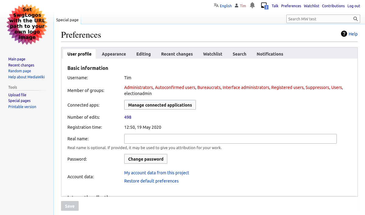
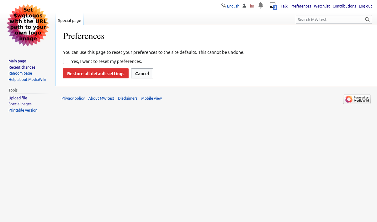
Special:Preferences contains a big fat red link, "Restore all default settings (in all sections)" right next to the "Save" button. Thankfully, clicking that link brings you to a confirmation step instead of actually executing. However, this is extraordinarily bad user experience design.

I actually know what I'm doing and I spent a full 60 seconds deciding whether or not I should click that button before doing so. I was pretty sure that no one would be dumb enough to develop a feature like that without requiring a confirmation step, but I couldn't be sure.

  1. This feature should be inside of its own tab, "Restore Default", which consists of a single block of text and a large warning icon. The button itself should be bright red, and there should be a "No thanks, take me out of here" link.
  1. Clicking the big red button still shouldn't flatten the user's preferences; it should go to an additional confirmation step before that happens.

Some thoughts:

  • There's a reason you haven't seen <input type="reset" /> used anywhere since 1998
  • There's a reason "Restore to factory default settings" is buried deeply on mobile devices
  • This should be a rare action, so making it front and center (bright red on every page) doesn't make any sense
  • A destructive action of this type should never be placed in such close proximity to a constructive action ("Save" [save _what_, I might add])
  • A destructive action of this type should always be quarantined and isolated.

Event Timeline

Does "restore default settings" mean "restore to factory defaults, before I made changes"? Or does it mean "throw away my changes and restore my settings as I previously had saved them?" That's my first question, and I'm a native English speaker who is also a professional designer. It's dangerous and confusing!

There was originally (beginning in Lee's original prototype) a reset button next to the save button, labeled "Reset preferences", which worked like <input type=reset>, except it was emulated by reloading preferences from the database. In 2009 155ddf6de4a2aa68dcdd8ca7d0f9db21ced4b228 the feature was removed, and instead a link was provided to reset the preferences to the default, with a confirmation page. The placement of the link was the same as the old button.

I can't believe I never noticed this before. Seriously. I'm kicking myself about it.

It's been a year since this bug was filed. Is there any chance that anyone cares at all?

Checking in on my bug that has now seen over three years of inaction!

There's already so many tabs, I don't know why you want another tab. I would put a button in the "basic information" section, like change password. Then add a checkbox to the confirmation page to implement the desired three levels of confirmation.

I don't want another tab. I want you to remove the button. Add the link/button somewhere else, inside the General tab. Just don't put the "erase everything" button right next to the "Save" button.

Change 790568 had a related patch set uploaded (by Tim Starling; author: Tim Starling):

[mediawiki/core@master] Bury the reset preferences link

https://gerrit.wikimedia.org/r/790568

Screenshots showing proposed change:

prefs-buried-link.png (708×1 px, 131 KB)

prefs-new-confirmation.png (708×1 px, 92 KB)

Tim, you rule. Seriously. This is p. perfect.

Change 790568 merged by jenkins-bot:

[mediawiki/core@master] Bury the reset preferences link

https://gerrit.wikimedia.org/r/790568

matmarex assigned this task to tstarling.
matmarex subscribed.

There is a comment about the wording of the new label "Delete account data" at https://meta.wikimedia.org/wiki/Tech#Misleading_user_settings_option_regarding_data_deletion -- In a nutshell, the editor describes why the new label is confusing and misleading, and should perhaps be reconsidered before it becomes widely translated.

I see in the Gerrit comments that Tim wrote:

"Done. I used the label "delete account data" since I didn't want to just duplicate the link text, and it may be useful to put some sort of GDPR-compliant data deletion tool here in future."

That rationale makes sense, but I'm worried that the current label is more confusing-now than beneficial-for-the-future.

I find the label especially confusing because it comes right after the Preferences line for "Access account data", but that 'account data' will not all be reset via the "Restore default preferences" link. E.g. it won't delete our user-group memberships!

TLDR: I'd hesitantly suggest changing the label to "Reset settings" for now. This would avoid duplicating the English keywords in the link itself, and thus be more informative/intuitive as to what the link will do.

Change 808341 had a related patch set uploaded (by Bartosz Dziewoński; author: Bartosz Dziewoński):

[mediawiki/core@master] Change "Delete account data" to "Reset settings" in preferences

https://gerrit.wikimedia.org/r/808341

Change 808341 merged by jenkins-bot:

[mediawiki/core@master] Change "Delete account data" to "Reset settings" in preferences

https://gerrit.wikimedia.org/r/808341

Change 910028 had a related patch set uploaded (by Bartosz Dziewoński; author: Bartosz Dziewoński):

[mediawiki/extensions/GlobalPreferences@master] Update the reset preferences link to match changes in MediaWiki

https://gerrit.wikimedia.org/r/910028

Change 910028 merged by jenkins-bot:

[mediawiki/extensions/GlobalPreferences@master] Update the reset preferences link to match changes in MediaWiki

https://gerrit.wikimedia.org/r/910028