Page MenuHomePhabricator

Create a VE-based text input for replying
Closed, ResolvedPublic

Description

This task is about making it possible for contributors to write replies in using a rich text editing mode.

Open questions

Requirements

Mockups can be found in this task: T235593

  • Contributors are able to write comments using a rich text editor
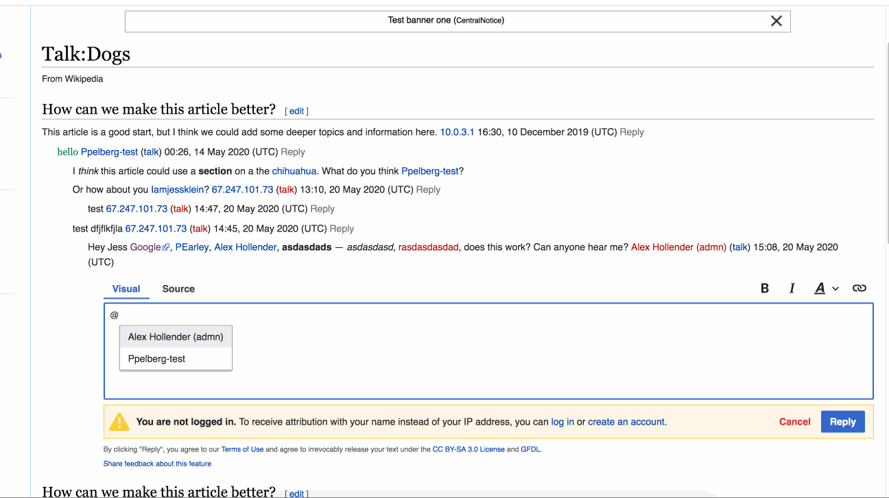
  • The following editing tools should be visible in the rich text editing mode: bold, italic and link, (the "mention" tool should be hidden until T232601 is finished)
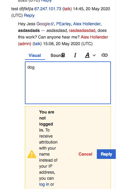
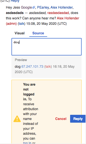
  • Contributors should be able to switch between the Source and Visual editing modes without losing what they have already written
  • The Source mode should remain a plain text area
  • Contributors should not see the real-time preview while they are drafting a reply in the Visual mode; the real-time preview should remain visible to contributors drafting a reply in the Source mode

Design review

Below are the issues that surfaced during design review and the tickets associated with said issues.

#ISSUEACTION
1.Make dialog for warning message less aggressiveT255443
2.Fix the tab padding and left align it flushT255445
3.Create intermediate state for Reply button (replying) - it's currently hiddenT254208#6224211
4.Reduce Warning icon sizeT2555558
5.Increase Font size of legal message (10.5 -> 12?)no ticket needed
6.Reposition the language selector (keyboard icon)T255191
7.Maintain the “double preview” or should we port over some of the features from preview and put that into visual mode?see T234403#6228650
8.Create a visual cue or signal for @ mention affordanceT254366
9.Remove "from Wikipedia" (or "from devwiki") from interfaceT255451
10.Consider changing the segmented navigation titles (visual/source)T255448
11.Consider creating a guide or cheat sheet for WikitextT255452
12.Visually differentiate a reply from an initial messageT255454
13.Create a styled button for replyingT255560
14.Consider showing the signature and timestamp as a hint text suffix.see T234403#6228650

Testing

The Reply tool's new visual mode can be tested on beta here: https://en.wikipedia.beta.wmflabs.org/wiki/Talk:Dogs?dtvisual=1

Note: it can be tested on any talk page on beta so long as you append ?dtvisual=1 to the page's URL.

Done

  • The functionality listed in the "Requirements" section above have been implemented
  • The questions listed in the "Open questions" section are answered

Related Objects

Event Timeline

There are a very large number of changes, so older changes are hidden. Show Older Changes

About defaults: If I'm at a https://www.mediawiki.org/wiki/VisualEditor/Single_edit_tab wiki, and my prefs are "always X", then I might want/expect X to be the first editing environment I encounter.

If I have "last used" or "two tabs", then the per-wiki config might be the right starting point.

In Planning, @Esanders shared that he is working on switching between modes and he is going to put it up on patch demo. This is the last outstanding thing.

Change 577601 had a related patch set uploaded (by Esanders; owner: Esanders):
[mediawiki/extensions/DiscussionTools@master] Switching between VE & wikitext (plain)

https://gerrit.wikimedia.org/r/577601

Change 577601 merged by jenkins-bot:
[mediawiki/extensions/DiscussionTools@master] Switching between VE & wikitext (plain)

https://gerrit.wikimedia.org/r/577601

matmarex moved this task from Code Review to QA on the Editing-team (Q3 2019-2020 Kanban Board) board.

This covers all the requirements. It looks like the open questions are being handled in T250523: Determine which Reply text input should be shown by default now.

It looks like the open questions are being handled in T250523: Determine which Reply text input should be shown by default now.

Yep – I've updated this task's description to indicate as much.

@ppelberg: Tested this on Beta cluster.

Posted this feedback: T252445.
Also found this issue today regarding Reply button staying disabled, not sure if that's related to this work but mentioning it here anyways for tracking: T252439

I will revisit this after deployment to test on production.

I am not seeing this on production yet, it looks like it should have landed by now since group2 has already been updated to 1.35.0-wmf.32.

I am not seeing this on production yet, it looks like it should have landed by now since group2 has already been updated to 1.35.0-wmf.32.

Moving this from "Blocked..." to "Design review":

  • The main outstanding work on this task is design review
  • The reason this work hasn't landed is b/c the deployment of wmf.32 is blocked; see: T249964.

Thanks for the update Peter! Will check when the train is unblocked.

  1. Transition Animations - there are a few things happening here. In terms of the user journey, there's the point when:
    • a) you click to switch modes
    • b) you've switched into the new mode but the the mode is still loading
    • c) the text input box finishes loading and is capable of input
    • d) you are inputting content/ styling etc.
    • e) you post your reply
    • f) the post is published

Right now, there's the diagonal animation, the text input box size change (with preview) and the text highlight after publish. There's an opportunity to accentuate the entire experience a bit more with small animated tweaks such as the underline in the text under the mode names, the preview box reveal, the moment that you click reply. Additionally, the diagonal pattern appears a bit heavy. That said, I'm not sure what the constraints are. Will these kind of tweaks slow down the experience even more? The experience already feels a touch sluggish and I wouldn't do anything to add to that. So before we go into thinking about solutions, I think I need to better understand those constraints.

  1. Switching from source to visual is smoother than switching between visual to source. I believe this is because of the preview block. I think this is due to the flash that happens in the "Reply" button which could be due to the delayed appearance of the preview box. I am wondering if the preview mode is necessary now that we have two modes in place. Is this just extra? If it's not extra, then I think the solution here would be to maintain the input box size (and position of reply).
  1. Tabs - still don't look quite right to me, I think that the text should be left aligned with the text input box edge. Additionally, the underline seems to blink (I assume because of loading). Is there anything we can do to minimize that?
  1. Bug? I believe that this is a bug:
    • I typed an @ mention in visual mode
    • I clicked the "visual" tab
    • The visual text gets converted into wikitext

bug.gif (727×1 px, 421 KB)

  1. Proper CSS animations generally shouldn't slow down the UI. As we are mostly using standard components we should try to make any changes upstream.
  2. With content in the widget, there will always be an unknown difference in height between the wikitext and visual mode. As we are not using VE for the source mode it would be pretty difficult at this stage to do any transitions between the modes as source mode is a completely different widget.
  3. We should re-open T235593 to discuss. The padding is part of the OOUI, but we could override it.
  4. Yup, this is a bug.

it would be pretty difficult at this stage to do any transitions between the modes as source mode is a completely different widget

Does this mean that we can't do any transitions anywhere in the interface? For example: moving the underline bar between modes

After reviewing this another time, we should also probably take a look at the responsiveness. I noticed that the toolbar and some of the buttons get funky at small viewports. Is it possible to change the modes into icons at this size?

See:

Screen Shot 2020-05-20 at 12.19.49 PM.png (628×387 px, 61 KB)

Screen Shot 2020-05-20 at 12.19.33 PM.png (587×352 px, 57 KB)

Change 597866 had a related patch set uploaded (by Bartosz Dziewoński; owner: Bartosz Dziewoński):
[mediawiki/extensions/DiscussionTools@master] ReplyWidget: Avoid buttons shifting when switching to source

https://gerrit.wikimedia.org/r/597866

This patch should improve problem 2, by waiting for the preview to be ready before switching editors.

  1. Bug? I believe that this is a bug:
    • I typed an @ mention in visual mode
    • I clicked the "visual" tab
    • The visual text gets converted into wikitext

@Esanders does this need a ticket?

I'm assuming it doesn't as it looks like the issue has been fixed...I have not been able to reproduce it on beta: https://en.wikipedia.beta.wmflabs.org/wiki/Talk:Cats?dtvisual=1.

Change 597866 merged by jenkins-bot:
[mediawiki/extensions/DiscussionTools@master] ReplyWidget: Avoid buttons shifting when switching to source

https://gerrit.wikimedia.org/r/597866

  1. Bug? I believe that this is a bug:
    • I typed an @ mention in visual mode
    • I clicked the "visual" tab
    • The visual text gets converted into wikitext

@Esanders does this need a ticket?

Fixed in https://gerrit.wikimedia.org/r/#/c/mediawiki/extensions/DiscussionTools/+/597834/, very small fix.

Change 598029 had a related patch set uploaded (by Esanders; owner: Esanders):
[mediawiki/extensions/DiscussionTools@master] Initialize tab state to avoid flicker

https://gerrit.wikimedia.org/r/598029

Change 598029 merged by jenkins-bot:
[mediawiki/extensions/DiscussionTools@master] Initialize tab state to avoid flicker

https://gerrit.wikimedia.org/r/598029

Is there anything left for Jess to do on this? @matmarex @iamjessklein

Is there anything left for Jess to do on this? @matmarex @iamjessklein

As I currently understand, the following is needed from Jess:

  • Review the two patches Ed posted on Friday (I believe these can be tested on Beta [1] considering they've both been +2'd)
  • File new tickets for the additional feedback Jess had on v2.0.

  1. https://en.wikipedia.beta.wmflabs.org/wiki/Talk:Cats?dtvisual=1

I'm listing the items here that should be made into tickets:

  • Make dialog for warning message less aggressive
  • Fix the tab padding and left align it flush
  • Create intermediate state for Reply button (replying) - it's currently hidden
  • Reduce Warning icon size ?
  • Increase Font size of legal message (10.5 -> 12?)
  • Reposition the language selector (keyboard icon)
  • Maintain the “double preview” or should we port over some of the features from preview and put that into visual mode?
  • Create a visual cue or signal for @ mention affordance
  • Remove "from Wikipedia" (or "from devwiki") from interface
  • Consider changing the segmented navigation titles (visual/source)
  • Consider creating a guide or cheat sheet for Wikitext
  • Visually differentiate a reply from an initial message
  • Create a styled button for replying
  • Consider showing the signature and timestamp as a hint text suffix

I'm listing the items here that should be made into tickets:

Thank you for pulling these together, @iamjessklein. Below are the pre-existing tickets that I think correspond to the issues you've identified below as well as some next steps.

Next steps

  • 1. For the tickets I've linked in the table:
    • Confirm the issue you've identified is described by the tickets I've associated it with.
    • Comment any additional information you think should be considered when we work on said ticket.
  • 2. Create tickets for issues that do not have tickets and comment the newly created ticket here.
ISSUEACTION
Make dialog for warning message less aggressiveCreate ticket
Fix the tab padding and left align it flushCreate ticket [i]
Create intermediate state for Reply button (replying) - it's currently hiddenCan you confirm whether the issue being described here is the same as "Issue 2a." being described here: T254208?
Reduce Warning icon sizeCreate ticket
Increase Font size of legal message (10.5 -> 12?)Create ticket
Reposition the language selector (keyboard icon)Create ticket
Maintain the “double preview” or should we port over some of the features from preview and put that into visual mode?Create ticket
Create a visual cue or signal for @ mention affordanceReview T254366
Remove "from Wikipedia" (or "from devwiki") from interfaceCreate ticket
Consider changing the segmented navigation titles (visual/source)Create ticket
Consider creating a guide or cheat sheet for WikitextCreate ticket
Visually differentiate a reply from an initial messageAdd to "Reported issues" within T249579's task description [ii]
Create a styled button for replyingCreate ticket as child of T249579
Consider showing the signature and timestamp as a hint text suffix.Create ticket

i. So you're aware: T252445 is the ticket where we've been tracking and will consider more "structural" changes to the toolbar (e.g. the toolbar's location).
ii. I understood "Visually differentiate a reply from an initial message" as being about improvements to read mode, although if this is about something else (e.g. making it easier for people to identify their recently-posted comment), please create a new ticket for this issue.

The plain text vs blue link color issue that was reported by a vision-impaired user is documented in T255188

Repositioning the language selector (ULS IME icon) is now documented in T255191

De-emphasizing loss of content dialog message is now documented in T255443

Fix the tab padding and left align it flush is documented in T255445

Change segmented nav titles is documented in T255448

"from Wikipedia" interface element confuses junior contributors documented in T255451

added jr contributor searching for wikitext support guide to: T255452

added distinguishing topic from thread of message to: T255454

Thank you for writing these up, @iamjessklein. Below is a table mapping issues to the tickets that have been created to represent them.

Based on this table, it looks like the issues 4., 5., 7., 13., and 14. still need tickets...does that look right to you?

For context: I assume you are still working through creating these tickets...I updated the table below in an effort to help me understand what's left to do.

#ISSUEACTION
1.Make dialog for warning message less aggressiveT255443
2.Fix the tab padding and left align it flushT255445
3.Create intermediate state for Reply button (replying) - it's currently hiddenT254208#6224211
4.Reduce Warning icon sizeCreate ticket
5.Increase Font size of legal message (10.5 -> 12?)Create ticket
6.Reposition the language selector (keyboard icon)T255191
7.Maintain the “double preview” or should we port over some of the features from preview and put that into visual mode?Create ticket
8.Create a visual cue or signal for @ mention affordanceT254366
9.Remove "from Wikipedia" (or "from devwiki") from interfaceT255451
10.Consider changing the segmented navigation titles (visual/source)T255448
11.Consider creating a guide or cheat sheet for WikitextT255452
12.Visually differentiate a reply from an initial messageT255454
13.Create a styled button for replyingCreate ticket as child of T249579
14.Consider showing the signature and timestamp as a hint text suffix.Create ticket

(Moving this task to "Required after release" considering the remaining tickets being filed does not need to block the tool's deployment as a Beta Feature).

I created a ticket for 13. on T255560
I created a ticket for 4. on T255558

After some thinking, I'm going to hold off on making tickets for # 5, 7 and 14 as those tickets. 5 - isn't an issue, 7 and 14 are ideas that we can surface through the conversations on the @ mention affordance T254366

I believe that we can now close this ticket.

cc/@ppelberg

I created a ticket for 13. on T255560
I created a ticket for 4. on T255558

Excellent. Table updated and added to the task description.

After some thinking, I'm going to hold off on making tickets for # 5, 7 and 14 as those tickets. 5 - isn't an issue, 7 and 14 are ideas that we can surface through the conversations on the @ mention affordance T254366

  • Not doing anything for #5: sounds good.
  • Talk about #7 and #14 in the context of T254366: waiting on these sounds good. With this said, are you able to share how you see them relating to T254366? I ask this because it's not clear to me how they do which leads me to wonder whether you're seeing something I'm not...
ppelberg updated the task description. (Show Details)
This comment was removed by ppelberg.

Maintain the “double preview” or should we port over some of the features from preview and put that into visual mode?

I think that this is a higher level question that we need to be discussing before adding into a ticket (because it will be an EPIC). The question here is if we need the preview mode now that we have source and visual mode because for many users, visual serves as a preview.

Consider showing the signature and timestamp as a hint text suffix.

This relates to the double preview issue because in my head it's solving the problem of "how do we make sure that visual mode conveys all the necessary information to a user who is treating it as a preview?" So I think it's a bit pre-mature to commit to as a ticket because it's based on an assumption that we should get rid of the "double preview."

That said, I associated these tickets with T254366 incorrectly.

@ppelberg - let me know if you still think these should be turned into tickets.

What you shared in T234403#6244958 answered the questions I posed in T234403#6228650...thank you for clarifying this, @iamjessklein.