Description
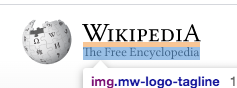
The tagline should be centered beneath the wordmark like so:

Currently:


The logo+wordmark+tagline is using flexbox. We want to ensure that the logo still looks good on browsers that don't support flexbox.
I think one solution would be:
- make the .mw-logo-container element a flexbox with the following CSS
display: flex;
flex-direction: column;
align-items: center;
align-self: center;
- add margin: 0 auto to the tagline (and make sure it comes before the margin-top: 5px
QA
Skipping QA steps here? We need to ensure this on a code-only level, we don't have any example to test the impact of this change
- https://nv.wikipedia.org/wiki/%C3%8Diyis%C3%AD%C3%AD_Naaltsoos would be one in prod
- "ceb" another one in @Jdrewniak's overview page https://people.wikimedia.org/~jdrewniak/dip-logos/index.html
That's probably better of done as separate story in storybook