Page MenuHomePhabricator

Build a pre-library loading indicator for Vue.js search
Closed, ResolvedPublic5 Estimated Story Points

Description

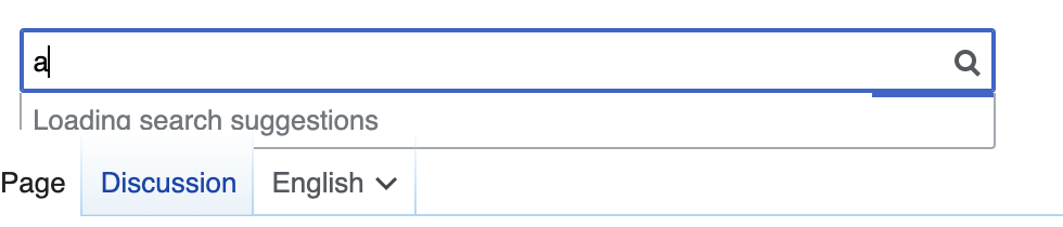
#Vue.js-Search, must both avoid changing the on-focus loading strategy used by the existing implementation and download significantly more bytes (see T249306). The increase is due largely to a new dependency on the Vue.js framework itself without replacing many existing dependencies that are used at least in part elsewhere. As more projects migrate to Vue.js, this loading strategy may be changed (e.g., it may be more like Popups) but #Vue.js-Search is the first in the main namespace and has few options. As such, the wait time from when the user interacts with search to when they see typeahead results may be remarkably greater.

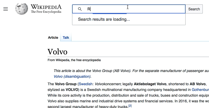
Both the new and existing search implementations allow typing to occur during this window of dependency load time, but the existing experience gives no indication that results will be presented. Given the greater bandwidth needs, the new experience should give responsive feedback to the user that their input has been received, that work is indeed happening, and promise that results will be presented as quickly as possible. Setting user expectations this way may improve the perception of performance, which is an important part of the overall experience, and may help derisk the new loading requirements.

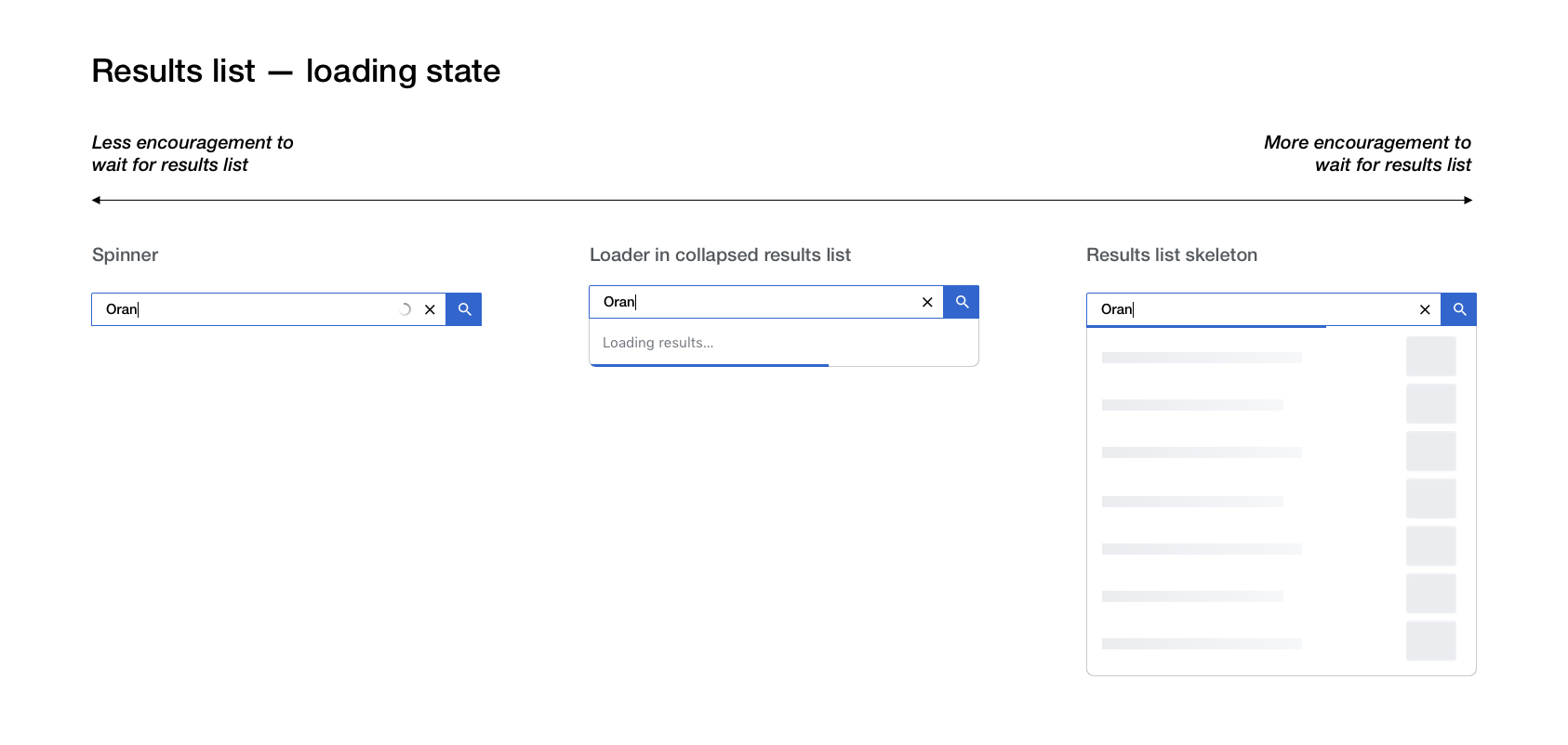
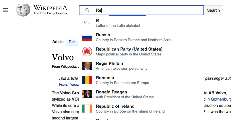
This task is to create a slim placeholder shim animation that has no dependencies and can be bundled directly into the skins.vector.js. The following GIF demonstrates the idea of the new workflow but suggests little design or implementation detail:

Peek 2020-06-07 08-31.gif (1×1 px, 3 MB)

The intent of the above GIF is to show the following workflow:

  1. On pageview, the shim is loaded is with all other Vector JavaScript and styles such as the sidebar. It is available to any other JavaScript immediately.
  2. On focus, WVUI, Vue.js, and any other dependencies needed are requested.
  3. On nonblank key input, if WVUI is unavailable, an initial loading state is presented within 200 milliseconds. In the GIF, it's a mini-placeholder area. The intent is to indicate that the input has been received by the machine and is currently being processed.
  4. After 200 milliseconds and within one second, if WVUI is unavailable, a second loading state is shown. In the GIF, it's a larger placeholder transition that sports the final size and background of the Vue.js search form. The intent is to optimistically indicate that further computation is occurring and the user can be assured that their request is in flight; results will be served soon.
  5. After five seconds, if WVUI is still unavailable, a final loading state is shown. In the GIF, an emphatic optimistic promise is made that the machine is working as hard as is possible to present results soon. It is hoped this will be a rare scenario.

The final design may differ dramatically. For example, the last two loading states may be omitted entirely.

On input clear or focus loss, the shim is dismissed (but the dependency network requests continue). If the user reengages the input, the animation starts over as if no prior loading has happened. However, the implementation may wish to check if previous network request failed.

An objective is to keep this shim minimal both for bandwidth and development costs so supporting additional states or logic should be scrutinized.

Once WVUI and its dependencies are fully loaded, the placeholder shim razzle-dazzle should be effectively discarded. If search is still focused, the new search form should be gracefully transitioned to by tweening from the current user interface state to the final search form state.

The implementation can live within WVUI if potentially useful to any search consumer or directly within Vector if not.

The shim shown in the GIF is made via CSS animations to avoid state management and improve simplicity. The JavaScript and CSS are embedded below for reference but are not representative of the design or technical quality wanted in the production version.

JavaScript
const input = /** @type {HTMLInputElement} */ (document.getElementById('searchInput'))
input.addEventListener('input', updatePlaceholderState)

const preLibPlaceholderParent = document.getElementById('wvui-typeahead-search');
const preLibPlaceholder = document.createElement('div')
preLibPlaceholder.className = 'wvui-pre-lib-placeholder'

const size = {
  start: {w: '256px', h: '24px'},
  end: {w: '640px', h: '480px'}
}
const loadingClass = 'wvui-pre-lib-placeholder--loading';

function updatePlaceholderState() {
  if ((document.activeElement !== input || !input.value.trim())) {
    if (preLibPlaceholder.parentNode) {
      preLibPlaceholder.classList.remove(loadingClass)
      preLibPlaceholder.parentNode.removeChild(preLibPlaceholder)
    }
  } else {
    // Set the initial placeholder state.
    preLibPlaceholder.style.width = size.start.w;
    preLibPlaceholder.style.height = size.start.h;
    preLibPlaceholderParent.appendChild(preLibPlaceholder)

    // Force layout so the transition kicks in.
    preLibPlaceholder.scrollTop

    preLibPlaceholder.style.width = size.end.w;
    preLibPlaceholder.style.height = size.end.h;
    preLibPlaceholder.classList.add(loadingClass)
  }
}

document.addEventListener('focusout', updatePlaceholderState)
document.addEventListener('focusin', onFocusInLoadLibrary)

function onFocusInLoadLibrary() {
  // if (the the actual WVUI library, Vue.js, and any other dependencies needed have not been
  //     loaded, request them)
  {
    setTimeout(() => {
      import('/vue.js ').then(() => {
        console.log('loaded')
        // Mount into the wvui-typeahead-search container
        // Unregister and delete the placeholder. It won't be needed again.
      })
    }, Math.random() * 5000)

    updatePlaceholderState()
  }
  // else this function is unregistered and the WVUI Vue.js library is in control.
}

updatePlaceholderState()
CSS
.wvui-pre-lib-placeholder {
  position: absolute;
  border: 1px solid rgba( 0, 0, 0, .1 );
  border-radius: 4px;
  padding: 4px;
  opacity: 0;
  background:#f8f9fa;
  box-shadow: 2px 2px 2px 0 rgba( 0, 0, 0, .1 );
  transition:
    all 250ms 750ms,
    opacity 250ms ease-in,
    transform 100ms ease-in;
}

.wvui-pre-lib-placeholder--loading {
  opacity: 1;
  transform: translateY(4px);
  /* Delay four seconds then start the loading animation. The duration is three seconds which is a
     nice speed for the size. */
  animation: wvui-pre-lib-placeholder--loading_animation 3s 4s linear infinite;
}

@keyframes wvui-pre-lib-placeholder--loading_animation {
  0%, 100% {
    /* The background is part of the animation so that it's not shown until after the delay. */
    background:
    #f8f9fa
     repeating-linear-gradient(
       -45deg,
       #f8f9fa,
       #f8f9fa 18px,
       #eaecf080 18px,
       #eaecf080 32px
     ) 0 / 200%;
  }
  100% {
    background-position: 100%;
  }
}

See the respository for the above code and GIF.

This is not a replacement for skeletal placeholder content, perhaps similar to T124811, that would be shown while search results themselves were pending.

The shim can't depend on Vue.js but WVUI can depend on the shim. For example, if the indicator was a generic spinner that should be shown while waiting for search results to come in, it could be a tightly scoped common chunk that is expected by other chunks in the WVUI library.

This task was made based on an understanding of Jean-Pierre Vincent's performance recommendations given in the 2020-06-05 training session, section 15, "user perception" arranged by @Gilles.

Acceptance criteria

  • Performance marks are recorded for notable steps (e.g., focus / dependency loading, first loading state shown, second loading state shown, third loading state shown, dependencies loaded, search form shown, search results shown, and focus loss / dismissal). -- @nray has added a mark for dependency loading which is all we think we'll need for this out the gate.
  • The shim is small enough to be bundled with every-pageview Vector JavaScript.
  • The loading strategy adheres to T249306 (this task shouldn't change how code actually loads)
  • No changes to user input before and after library loads
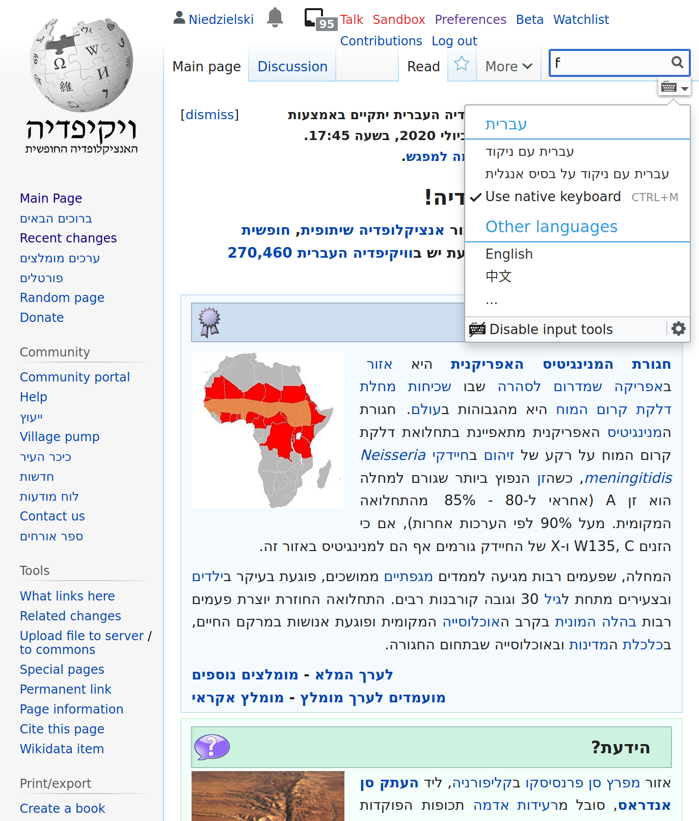
  • Don't break UniversalLanguageSelector input tools (note: mw.config.get( 'wgULSImeSelectors' ))
    image.png (1×1 px, 604 KB)

Event Timeline

... demonstrates the idea of the new workflow but suggests little design or implementation detail

The huge animation below is quite suggestive... even hypnotic, I'd say :-)
Though the image is claimed to focus on the workflow, I'd suggest a design at this time, that avoids the danger of triggering epilepsy: a common thin progressbar-design, such as one in Vuetify.
https://vuetifyjs.com/en/components/progress-linear/#toolbar-loader

The dropdown would be max 10px high, containing only the progressbar until results arrive.

@Demian, this is good feedback. I'm looking forward to hearing @alexhollender's thoughts on whether he thinks a third contingency loading state is even wanted. I think at least one immediate loading indicator will be desirable, though it may differ significantly from what's in the GIF.

Note, that we have several styles used in projects parts for loading states, see discussion at T75972:
Standard animation to be considered here is 'bouncing dots'.

I hope we can use something more natural and common than the bouncing dots. In my personal experience: I don't recognize those as a progressbar, in fact, usually I don't notice those at all for seconds and when I do, I think for seconds whether that's a loading indicator. Often the 3 small dots show up in a huge white area and I find myself thinking even more, whether it will be loading the content to that area or something else. In short: it does not communicate its intended meaning to me.

However this is not my product, so in case we stick to the 3 dots I've tuned the timing of the animation to get a more natural and fluent animation: codepen. I propose to update the current bouncing dots animation with these timings.

@Niedzielski thanks for raising this question. I admittedly know very little about search currently (in terms of user behavior, how we measure success, and technical capabilities) however I hope to learn more in the coming weeks. My initial question is: do we believe that people will have a better search experience if they wait for the results list to populate? If the answer is yes I think the next question is: how long is it worth waiting for the results list to populate (versus just submitting a "blind" search)? I believe that the design of the loading state has the ability to influence how long a person waits. Here are three initial sketches:

results list loading stage.jpg (802×1 px, 154 KB)

My initial question is: do we believe that people will have a better search experience if they wait for the results list to populate?

Thanks, @alexhollender. Always, is my opinion. I wouldn't want the UI to sometimes show results on the same page and other times navigate away from the page beyond my control. For example, sometimes I use search just to see if a page exists or see the description. I could see encouraging manual search form submission after some period of time though.

The mocks look promising! It would be helpful if we can pick one or two progress and intermediate styles, and produce guidelines for when to use which that even someone like me can follow!

... and promise that results will be presented as quickly as possible.

Well our licence does say that the program comes "without warranty of any kind, either expressed or implied" ... But GNU jokes aside, I'd error on the side of lowering expectation with the loading spinner. Not out of fear that the results won't appear (in reality that is rare) but to position the search-suggestions as non-essential & non-blocking to the users current task (that of typing a search query).

That's why I think the skeleton might be a bit distracting. To @alexhollender's point, I think the skeleton will encourage people to wait longer for the suggestions, but because the suggestions are non-critical in this workflow, I don't think it's necessary to do that.

The implementation can live within WVUI if potentially useful to any search consumer or directly within Vector if not.

I assumed since this loader should kick in before the Vue library loads, that it should live in Vector.

Anyway, the way I see this being implemented as a class that take in an element, a promise ( or jQuery Deferred), and a class-name.
If the promise is pending, it appends the classname to the element, and if the promise resolves or rejects, it removes the class-name from the element (if the element still exists at that point).

I hope a class-name is enough to implement the spinner. We can use an :after pseudo-element if we have to create a box with an image (or css-only spinner, I think @Volker_E made something like that once).

I assumed since this loader should kick in before the Vue library loads, that it should live in Vector.

Either way works for me. If this is something all clients can use, I think the library makes more sense but we don't need to figure that out to begin.

Anyway, the way I see this being implemented as a class that take in an element, a promise ( or jQuery Deferred), and a class-name.

This is complicated. On user focus, the appropriate search implementation ResourceLoader module (new or old) is requested by the search loader in Core. In the old experience, it's searchSuggest (which lives in Core). In the experience, it's a new Vector module. See the dependencies of https://gerrit.wikimedia.org/r/c/mediawiki/skins/Vector/+/616311.

I hope a class-name is enough to implement the spinner.

I was thinking the "loading experience" would be mostly CSS.

I'm struggling to get the client-side hydration to line up correctly. As far as I understand it, it is expected to pass in the initial input value to the component. I want to experiment further and find some good references for the SSR to client hand-off. https://github.com/wikimedia/wvui/pull/67 https://gerrit.wikimedia.org/r/c/mediawiki/skins/Vector/+/616312

Jdlrobson subscribed.

We talked about this during our developer-only meeting and it seems this should be prioritized.

Change 618282 had a related patch set uploaded (by Jdrewniak; owner: Jdrewniak):
[mediawiki/skins/Vector@master] [WIP] Adds loading indicator for new search module

https://gerrit.wikimedia.org/r/618282

Pointed as a large by Web devs asynchronously.

@Niedzielski @Jdrewniak following up on our chat last week I've wired up a simple prototype to show the loading behavior I'm currently imagining: link to prototype.

There are two states:

initial loading experiencesubsequent loading experience (if needed / slow API?)
Screen Shot 2020-08-05 at 4.52.37 PM.png (417×803 px, 165 KB)
Screen Shot 2020-08-05 at 4.52.55 PM.png (420×805 px, 162 KB)

cc @RHo @Volker_E

Looks nice! I would advise only showing the animation if the user has had to wait X amount of time. In the general case, like in the prototype, where the search takes less than 2 seconds, the animation may draw too much attention to an otherwise negligible waiting period. There's no magic threshold to recommend, but you get the idea, there's no point adding an extra animated waiting step to an otherwise smooth experience with very little waiting involved. But when things are taking "a while", it's definitely great to have that animation convey that something time consuming is happening.

Looks nice! I would advise only showing the animation if the user has had to wait X amount of time.

Great point and I totally agree. In the demo everything is faked using setTimeout — I've just updated it so that there's a delay before the loading state appears: https://di-searchland-2.web.app/

@alexhollender Hopping on top of your initial sketches. We need to make sure to either not invent another loading style or invent a good, useful and generalizable one, as Design Style Guide component and for other products as well, again pointing to T75972: Loading indicators / Progress indicators are inconsistent. .
I like your early sketches, we're only missing a tad stronger emphasis or a distance to the focus state IMO. Not sure if that is working out as intended.

@alexhollender Hopping on top of your initial sketches. We need to make sure to either not invent another loading style or invent a good, useful and generalizable one, as Design Style Guide component and for other products as well, again pointing to T75972: Loading indicators / Progress indicators are inconsistent. .

FWIW, I think this is fairly good adaptation consistent with design of the indeterminate progress loading animation used in OOUI currently as referenced for use in T75972: Loading indicators / Progress indicators are inconsistent. .

Change 618282 merged by jenkins-bot:
[mediawiki/skins/Vector@master] Adds loading indicator for new search module

https://gerrit.wikimedia.org/r/618282

@Jdrewniak Looks good, but I noticed that part of the loading element is being hidden by the tabs on my local instance:

search-suggestion.png (210×980 px, 27 KB)

Change 628750 had a related patch set uploaded (by Jdrewniak; owner: Jdrewniak):
[mediawiki/skins/Vector@master] Prevent Vector tabs from overlapping search loader

https://gerrit.wikimedia.org/r/628750

Change 628750 merged by jenkins-bot:
[mediawiki/skins/Vector@master] Prevent Vector tabs from overlapping search loader

https://gerrit.wikimedia.org/r/628750

Latest patch from @Jdrewniak fixes the tab overlapping the loading box. I did notice a somewhat interesting state when the viewport is resized to the point that the personal tools drops to the next line. When that happens, the loading indicator overlap the personal tools but that might be the expected/desired behavior (see below)? /cc @alexhollender

Screen Shot 2020-09-28 at 4.44.31 PM.png (276×962 px, 42 KB)

I'm assuming that is okay though and signing off

thanks for calling this out — screenshot looks like what I would expect