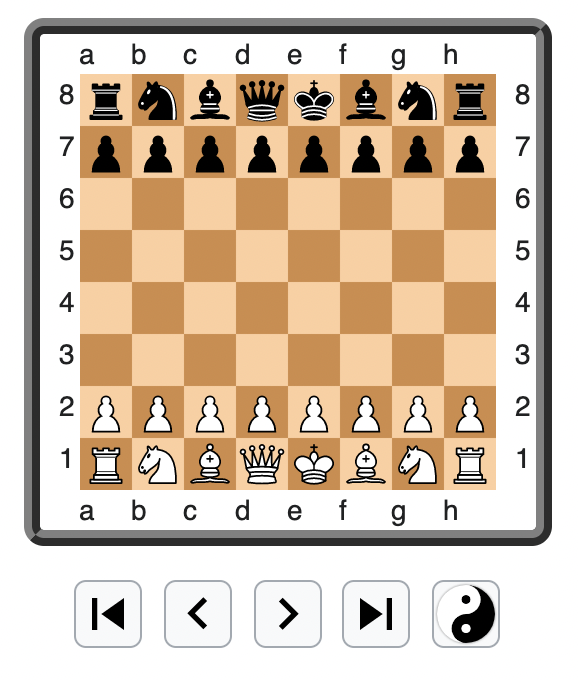
I suggest we remove the autoplay feature from ChessBrowser. Doing so would allow us to remove three buttons from the chessboard toolbar, which will simplify the UI on all devices, and make it easier to provide a good user experience on touch interfaces, where dense clustering of controls is undesirable. It would also reduce the surface for bugs, because every change on the board would be triggered by a user action, instead of sometime being user-driven, and sometime being driven by a timer.
Current board UI:

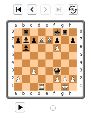
Proposed:
@Wugapodes, @Kipod please let me know your thoughts.
