Background
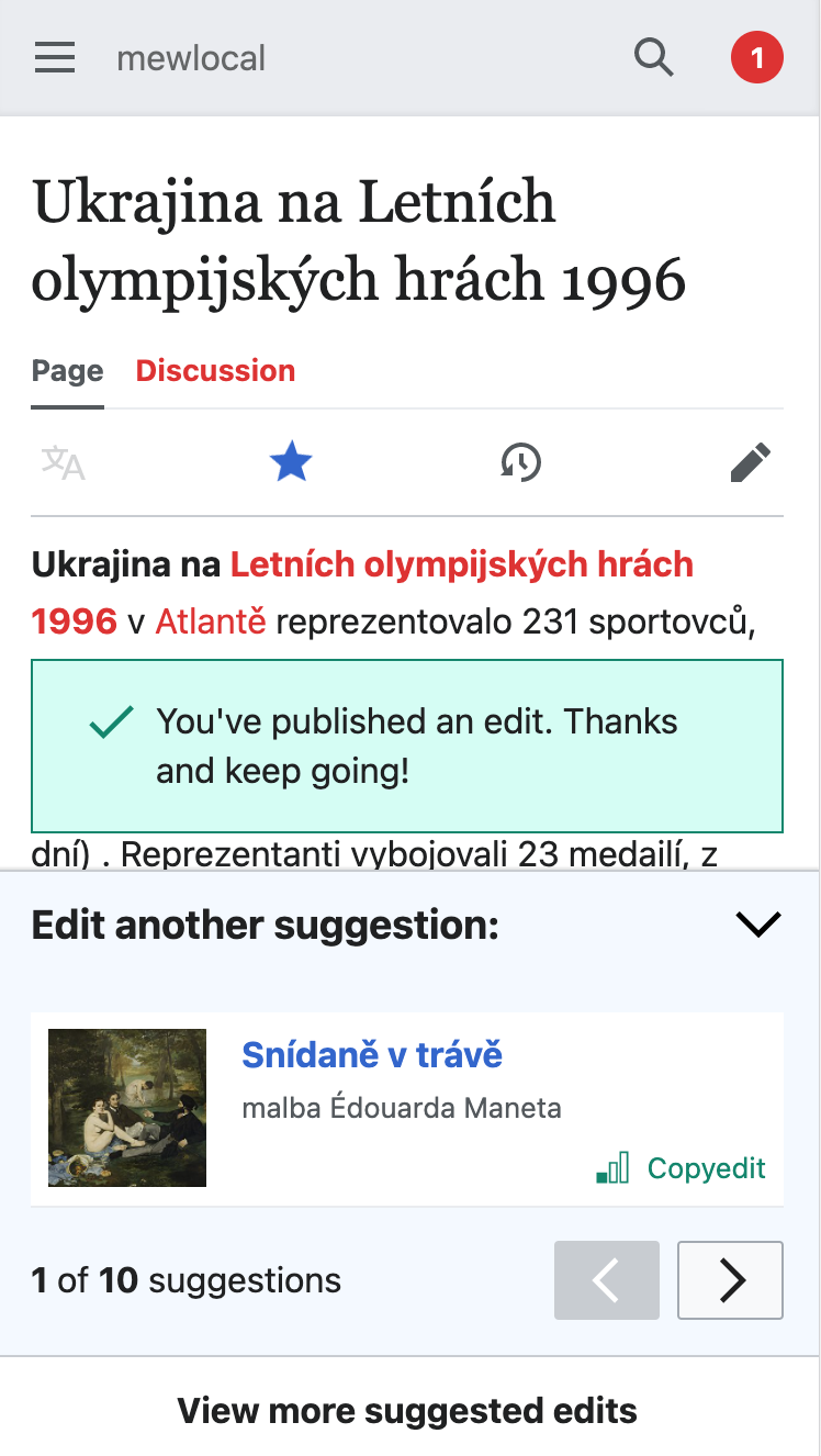
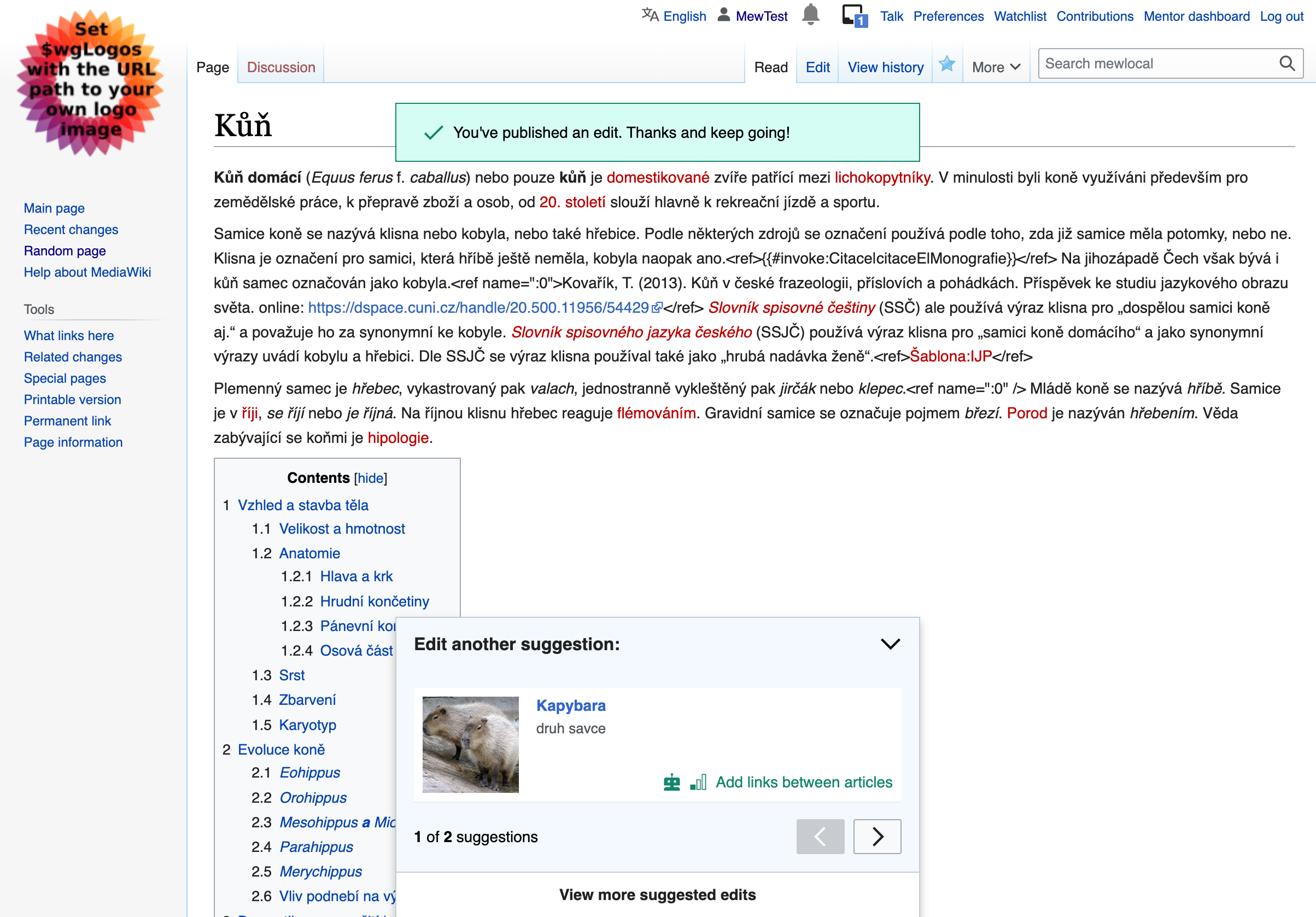
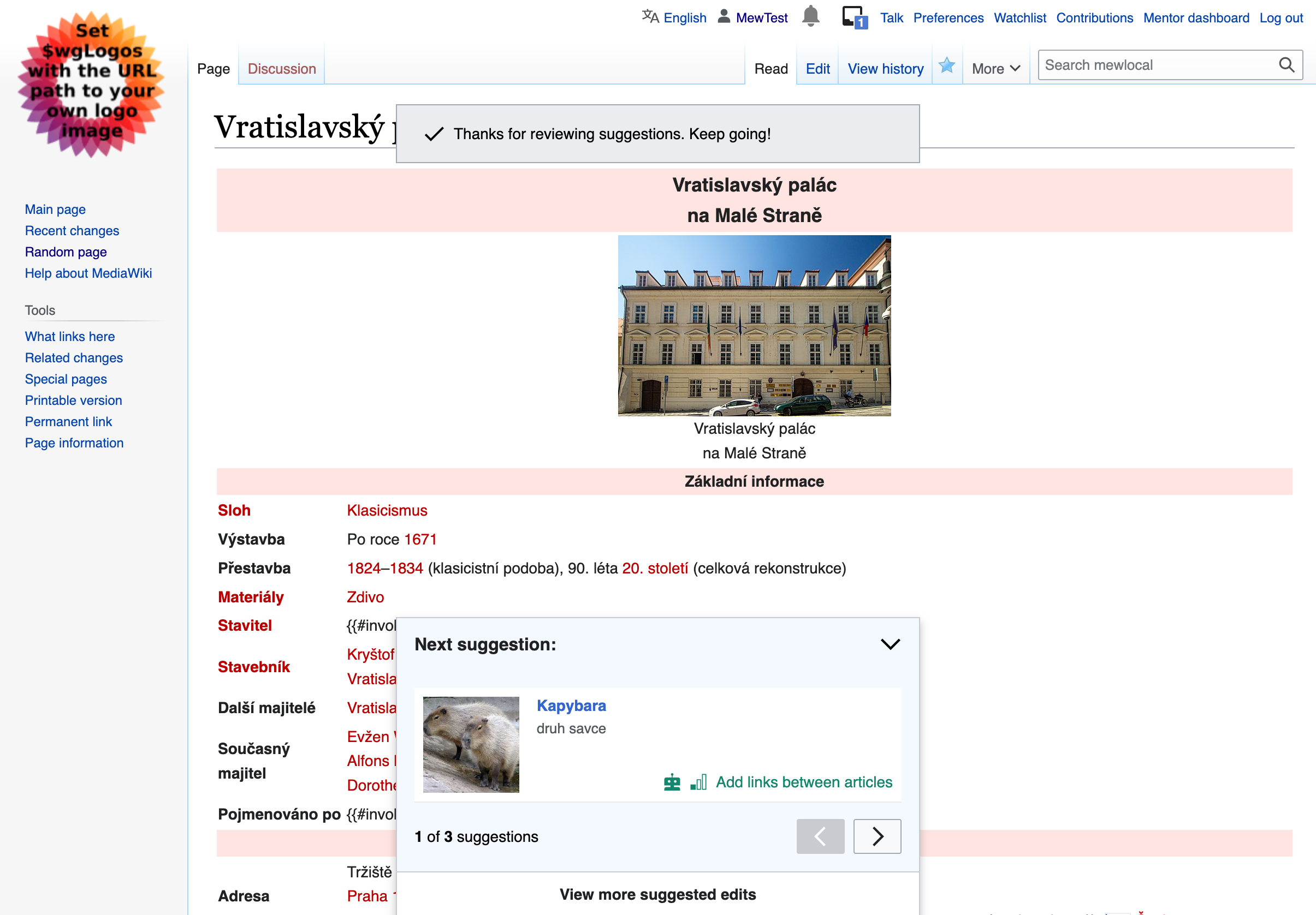
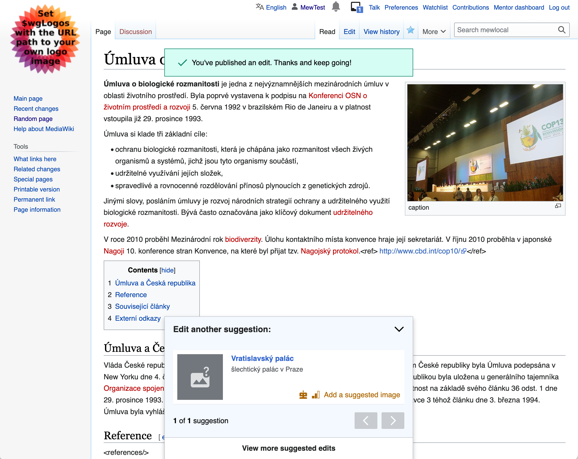
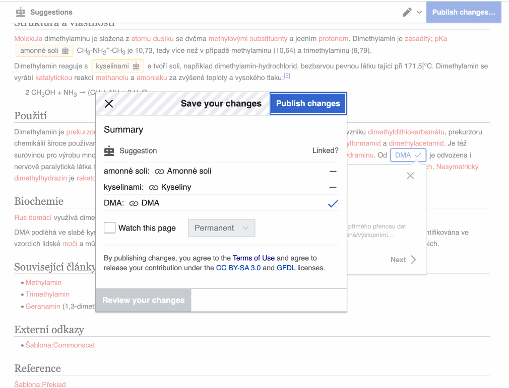
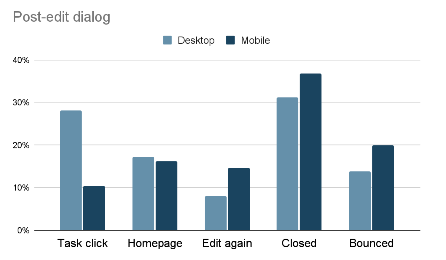
In our analysis of the "add a link" funnel, we saw that in a user's first session through "add a link", only 28% of desktop users and 11% of mobile users choose to do another task from the "post-edit dialog". The most common action was to close the dialog by clicking or tapping outside of it (or clicking the "X" on desktop).
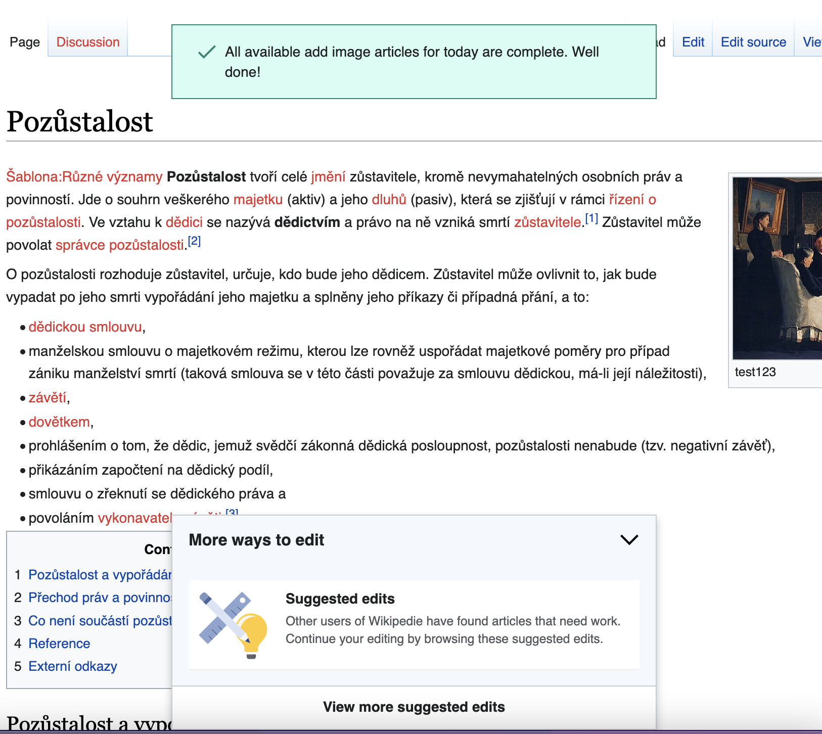
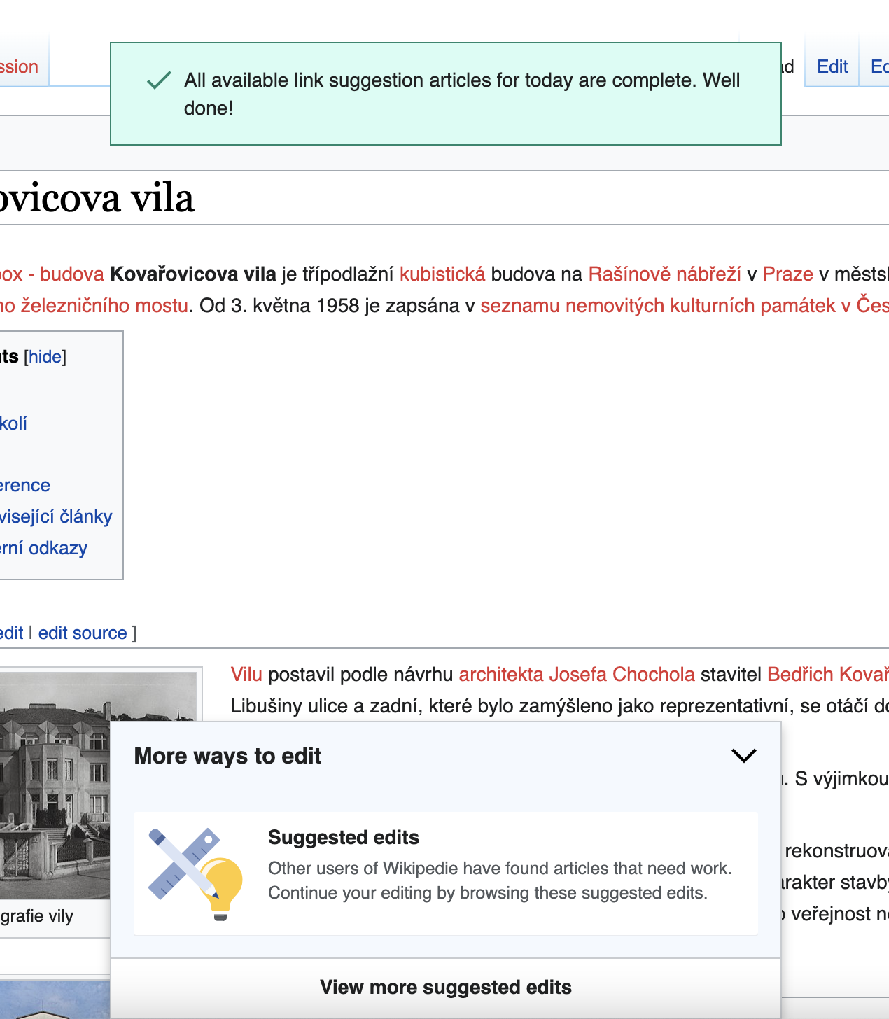
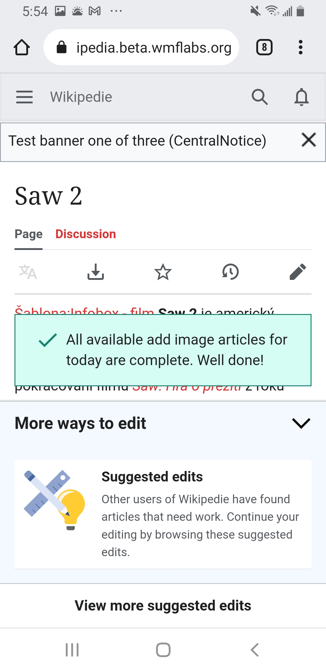
We think that many users may be closing the dialog because they want to look at the edited article to confirm/admire the changes they made to it. Once they close the dialog, they can't open it back up, and so have lost the opportunity to edit the next article.
Hypothesis
If we affirmatively design for that "admiring" behavior by encouraging it, but then still allow users to return to the dialog to choose a next article, they will both admire their work and edit another article.
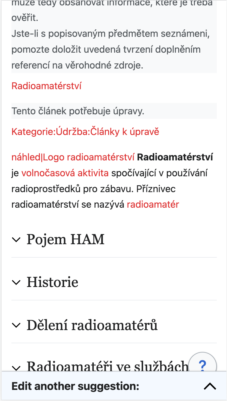
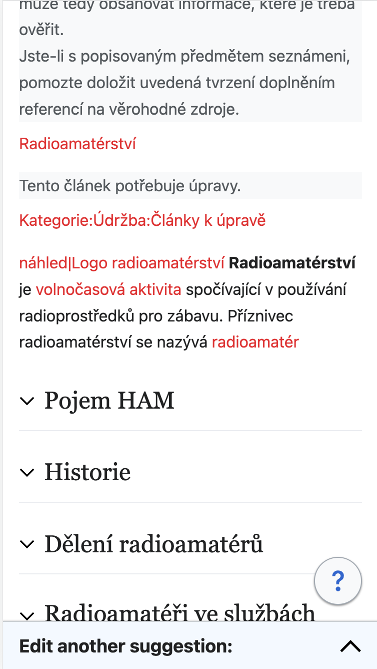
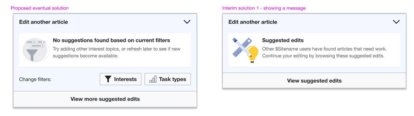
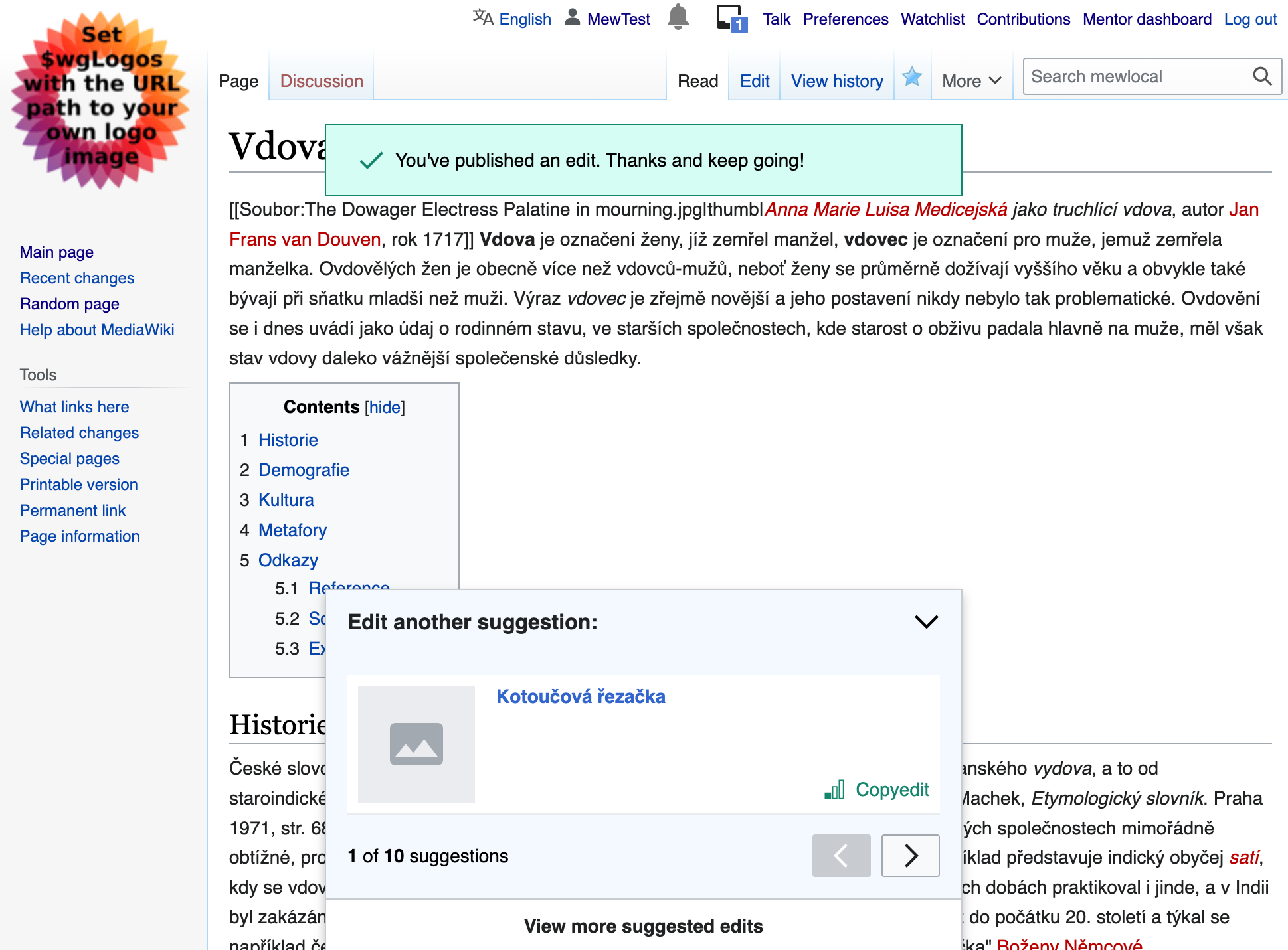
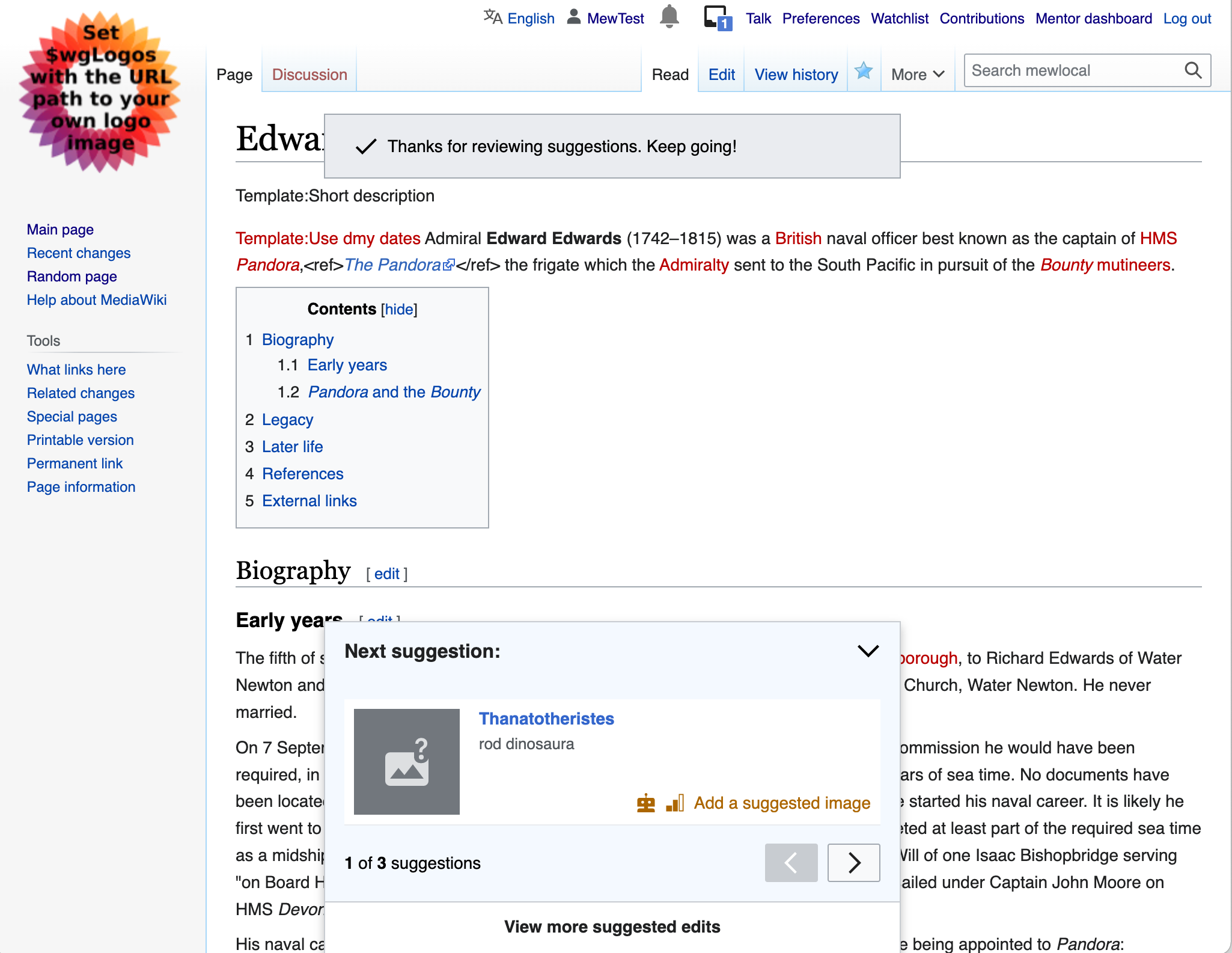
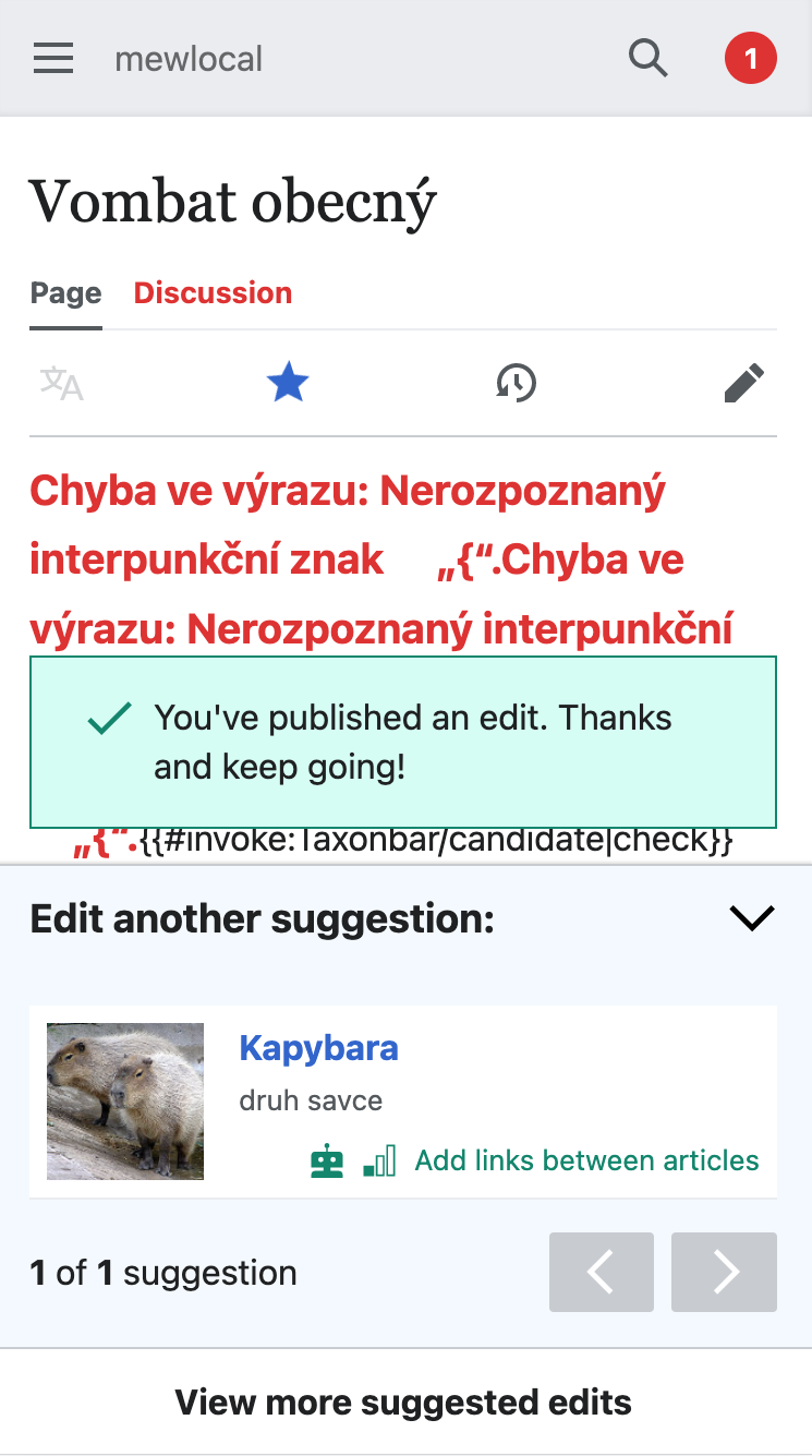
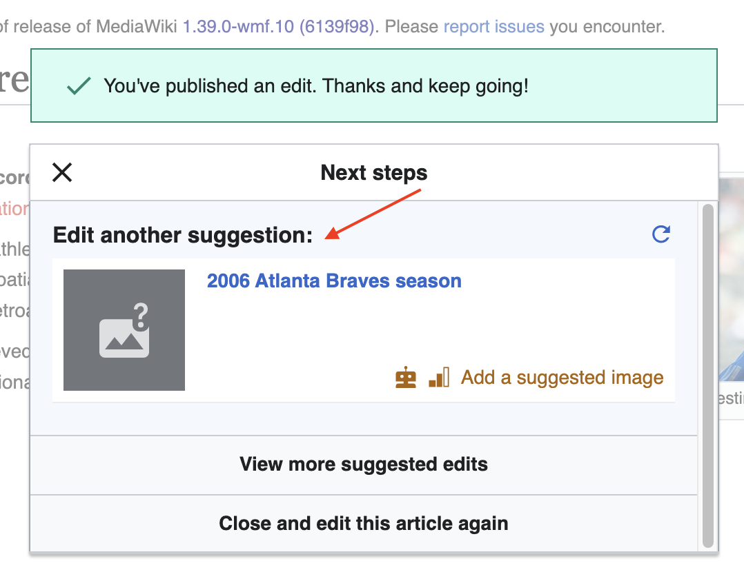
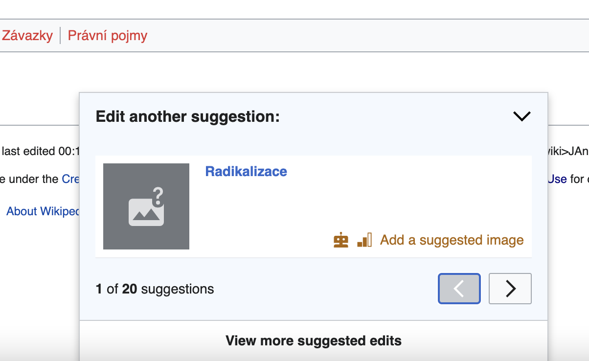
Proposed design B: Separate success message & next edit
This proposal firstly decouples the post-edit message from the next task. The second main change is that the next suggestion takes the form of a collapsible drawer akin to the ‘inspector’ component in structured tasks.
- Pros
- Removes likelihood of accidentally closing the dialog
- Collapsed version of next edit inspector doesn’t obscure any article content.
- Removing the modal and separating the success is more in consistent with “normal” edits (where only the success message appears as a toast)
- Separating the success message enables more flexibility with other Positive reinforcement experiments related to “celebration” vs specific recommended next actions.
- Cons
- Separating the two makes the review my edit aspect less overt as a an action for users
- Physical removal of the “close” button makes it less obvious how one could minimise the view to see the article they have just edited
- Other notes on design
- Users will not be able to remove this next edit UI unless they refresh the page.
- The random/reload new suggestion action will be replaced with navigation buttons to flip through solutions as per T302335
- On Desktop, the next suggestion dialog is transformed into the same bottom drawer as the Desktop Add image card. The success message will be more separated at the top of the screen similar to other other Visual editor success messages.
Mobile 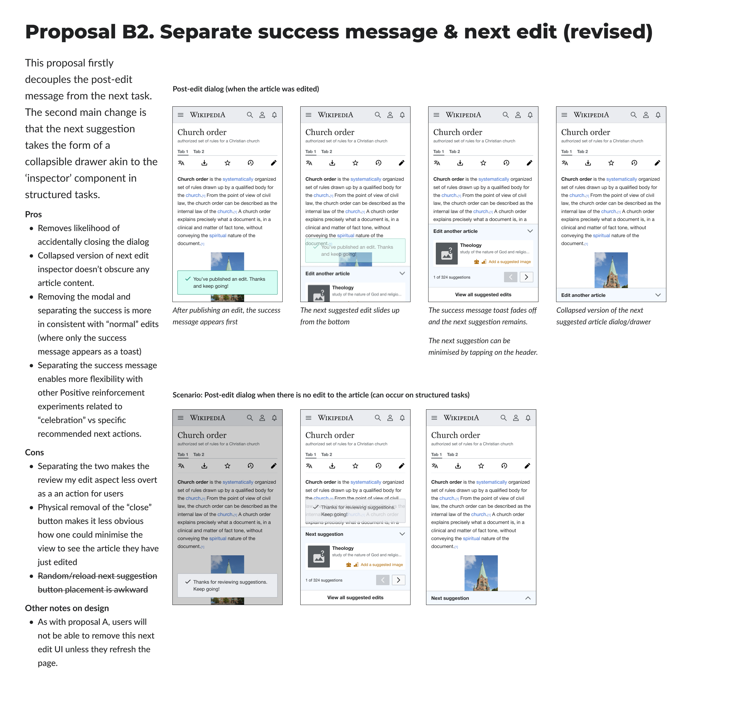 | Desktop 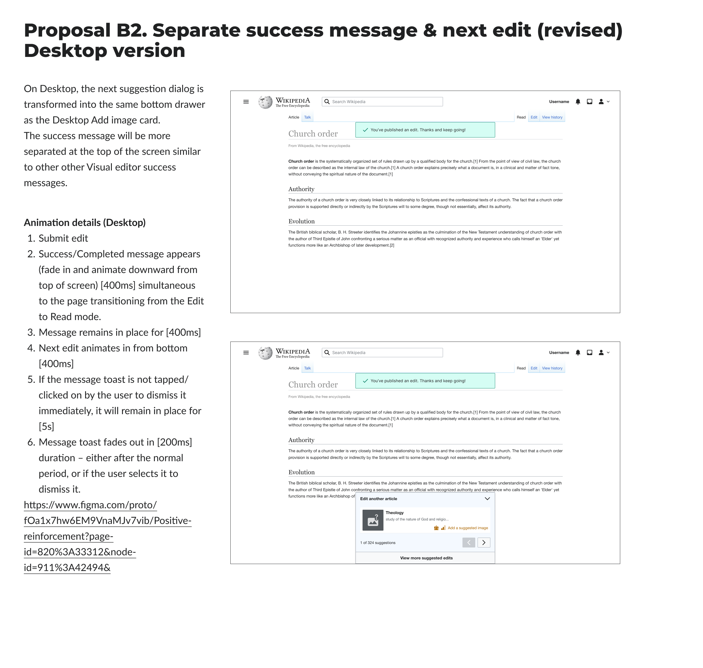 |
| Mobile Figma | Desktop figma page |
Additional animation/transition details
Mobile
- Submit edit
- Success/Completed message appears (fade up and animate in from bottom of screen) [200ms]
- Message remains in place for [400ms]
- Next edit animates in from bottom, “pushing” up the message toast. [400ms]
- If the message toast is not tapped/clicked on by the user to dismiss it immediately, it will remain in place for [5s]
- Message toast fades out in [200ms] duration – either after the normal period, or if the user selects it to dismiss it.
Mock showing sequence  | Recording of prototype |
Mobile keyframes start in this Figma frame
Desktop animation
- Submit edit
- Success/Completed message appears (fade in and animate downward from top of screen) [400ms] simultaneous to the page transitioning from the Edit to Read mode.
- Message remains in place for [400ms]
- Next edit animates in from bottom [400ms]
- If the message toast is not tapped/clicked on by the user to dismiss it immediately, it will remain in place for [5s]
- Message toast fades out in [200ms] duration – either after the normal period, or if the user selects it to dismiss it.
| {F34970426} |
Desktop animation available here | Keyframes start in this Figma frame
Apply changes to
- Mobile and Desktop Post-edit UI on structured tasks (Add links and Add image) when there has been an edit made
- Mobile and Desktop Post-edit UI on structured tasks (Add links and Add image) when there has been NO edit made (e.g., link is rejected)
- Mobile and Desktop Post-edit UI on the Add image task when the quality gate quote is reached (with and without an edit)
[x ] Mobile and Desktop Post-edit UI on all other suggested edits tasks (e.g., copyedit, add references, etc)
Related changes
- Instrumentation
| Use case | Existing event | New (proposed) event | Notes |
| Toast message | None (message is part of dialog) | postedit-toast-message-impression | |
| Expanding and collapsing dialog | None (new feature) | postedit-expand and postedit-collapse | |
| Clicking on "view all suggested edits" | postedit-link-click with homepage action data | postedit-link-click with suggested-edits action data | |
| Clicking on task | postedit-task-click | unchanged | |
| Clicking on navigation arrows to navigate through task feed | None (new feature replacing refresh icon) | postedit-task-navigation with dir (next, prev) and navigation_type (swipe, click) action data | Similar to se-task-navigation for suggested edits |
| Closing dialog | postedit-close | unchanged | |
| Task shown | postedit-impression with newcomerTaskToken action_data and newcomertask event | unchanged | |
- Showing the suggested edits feed in the post-edit dialog T302335: Suggested edits: show the full task feed on post-edit dialog
With this task, the post-edit dialog will show the same tasks as before (with the refresh button). Full task feed will come as part of T302335.
- Enabling closing the collapsed dialog/drawer T303416: Newcomer Tasks: Enable closing collapsed Post-edit dialog
Edge cases
- Structured task flow on desktop currently relies on the post-edit dialog closing to reload the page in order to tear down the StructuredTaskArticleTarget to show the default VE ArticleTarget instead. For structured tasks, the page will now be re-loaded after saving (like mobile).
- For unstructured tasks, the user can edit the same article again and the post-edit dialog is shown each time the edit is saved. When the user edits again, the drawer should be removed.
- When there are no more suggestions, the graphic introducing suggested edits should be shown.