Why are we doing this?
Different notification types currently lead to different places, how might we make it easier for editors to tell what is going to happen when they click on a notification?
Contributor story
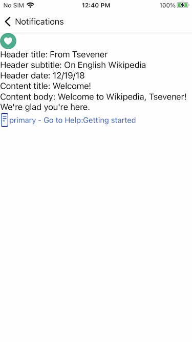
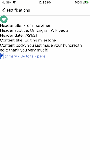
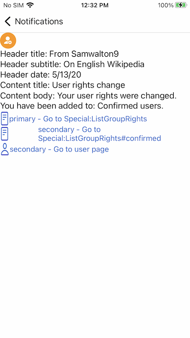
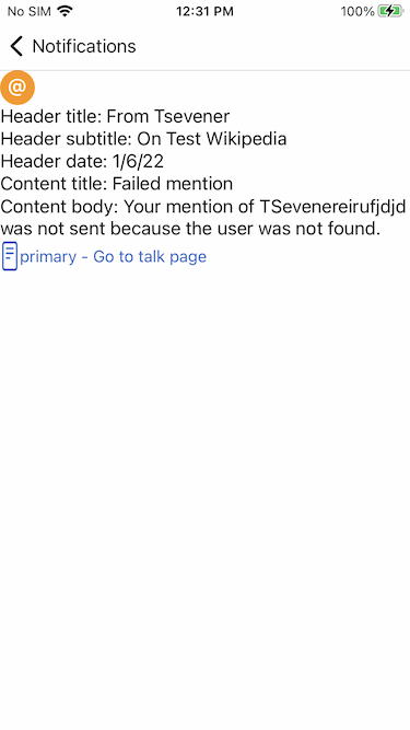
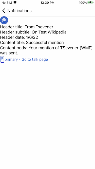
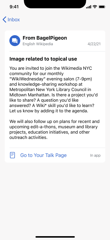
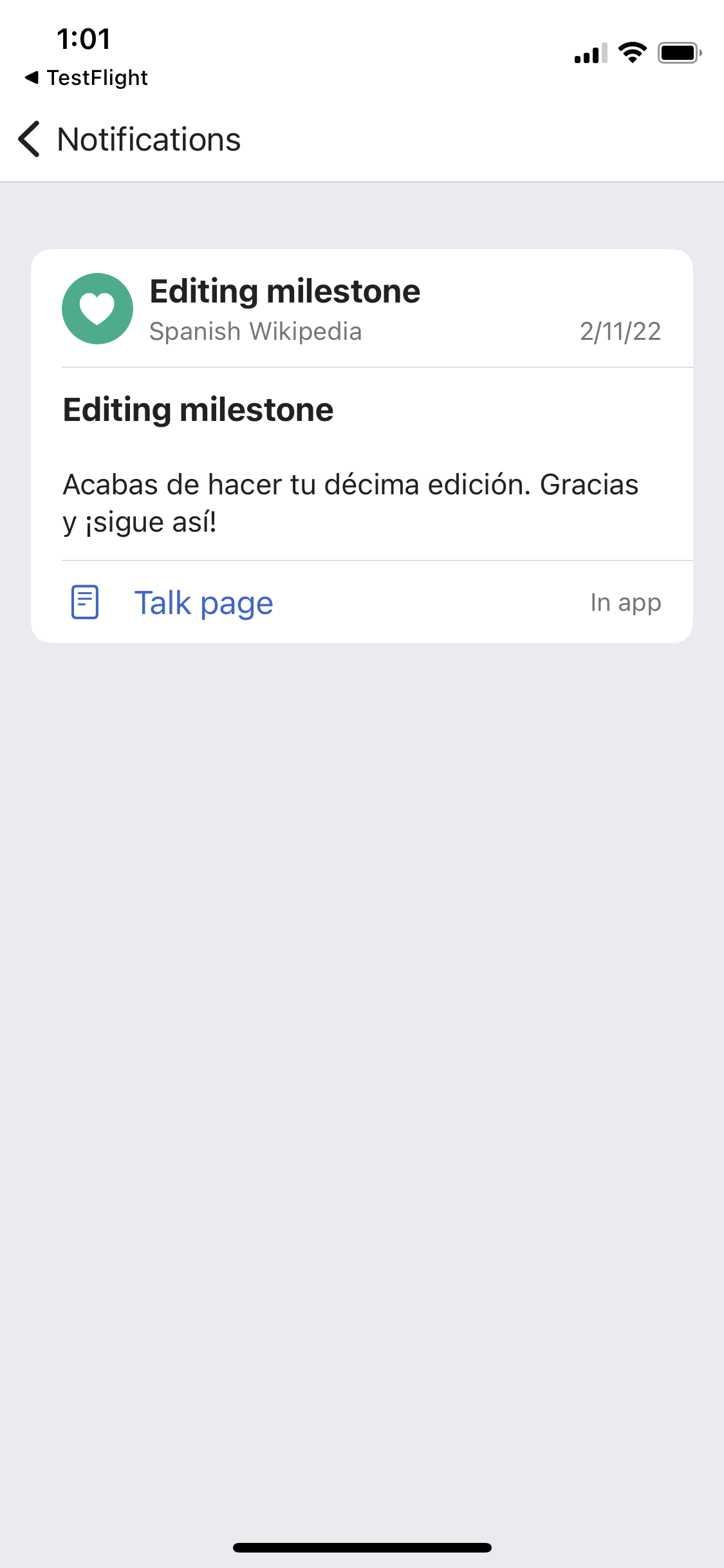
As an editor, it's confusing to not know where a notification tap through is going to lead to, I want to have a way to anticipate what page will open when I tap on a notification
Quotes from Diary study
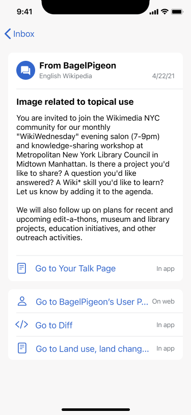
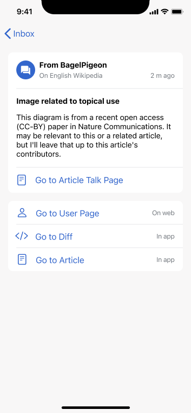
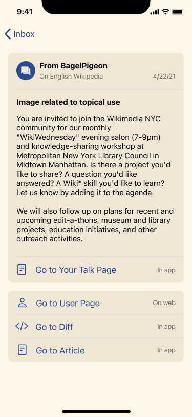
- Notifications where [articles I edited] are mentioned in some other article …should give you [the] option to go to both pages, written previously and new one.
- Regarding page links notification, I found [it] not helpful to read [the] new article instead of the [article I edited] that is mentioned
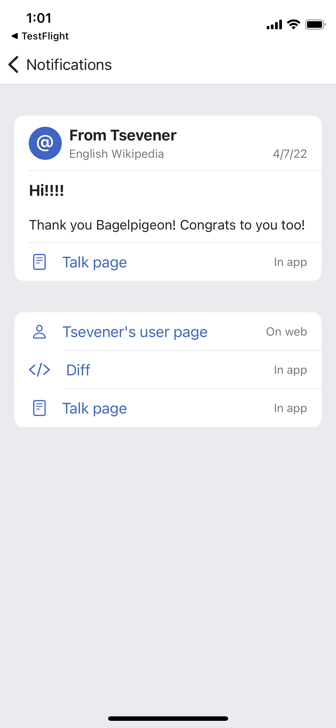
- It lead to my talk page, but not to the message I received directly. I had to scroll down to see it.
- For a talk page notification, it took me to the top of the page (which is long) rather than the bottom or the relevant section.
- A talk page notification went to a different section with the same title.
- Working fine so far! Still, the transitions between mobile version, desktop version and app are a bit messy and undesired
- General comment about notifications is that I really did not find useful notifications about page links, because when I clicked on that notification, the link is to the new article. Maybe, this is the case only with editors with thousands of articles (I have more than 10,000 articles written), so I really did not remember every article that I wrote in the past, and I would like to see my previous article in the past. I don`t know how this can be solved, but it would be nice to have links to both articles, not just to the new one.
Proposed design solutions
Figma file: https://www.figma.com/file/cedgOU5CyOR0UVqtjDOvzE/iOS-Notifications?node-id=2086%3A21095
| Default - Article talk message | Sepia - User talk message (long) | Dark - Edit reverted | Default - Alert |
|---|---|---|---|
 |  | 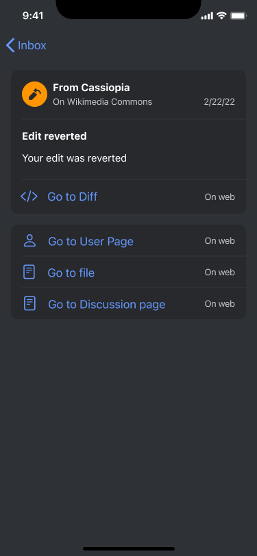 | 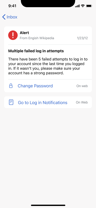 |
NOTE: Note for QA, text may be truncated after just a few lines due to API constraints.
Design details
- Secondary actions are sticky to the bottom of the content area (16pt below main message area)
- Secondary actions should not contain a duplicate of the primary action
- Message body should NOT scroll, message area to grow/shrink in height to accommodate message length
- For assets, please see Figma