Background
Description:
A group of regular Buttons (ActionButtonGroup) or ToggleButtons (ToggleButtonGroup). A ToggleButtonGroup can be multi-select or single-select.
History:
Commonly used component that exists in OOUI and is documented in the Design Style Guide; see links below.
Known use case(s):
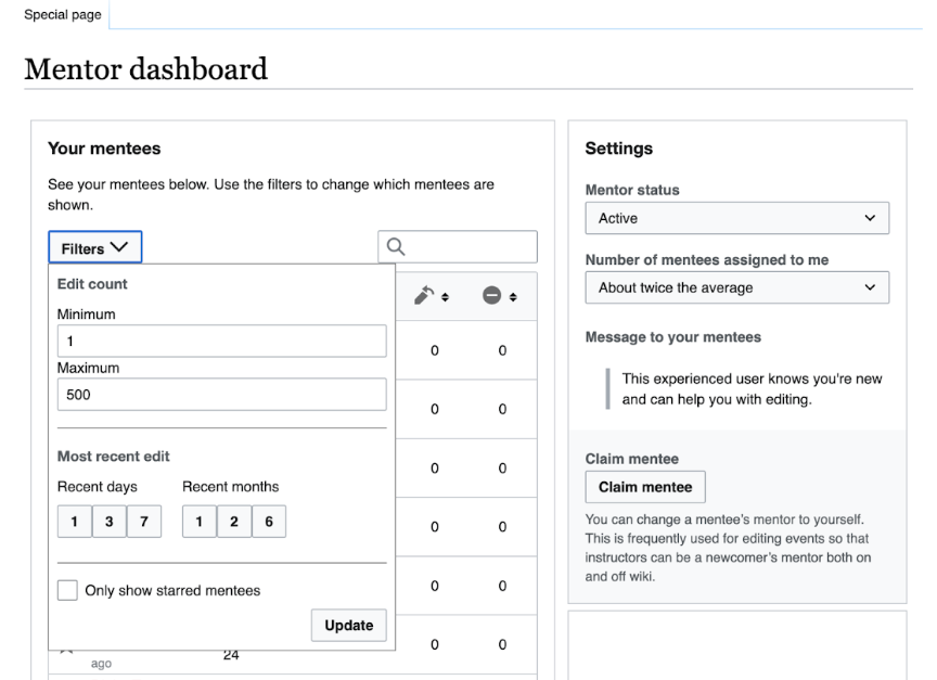
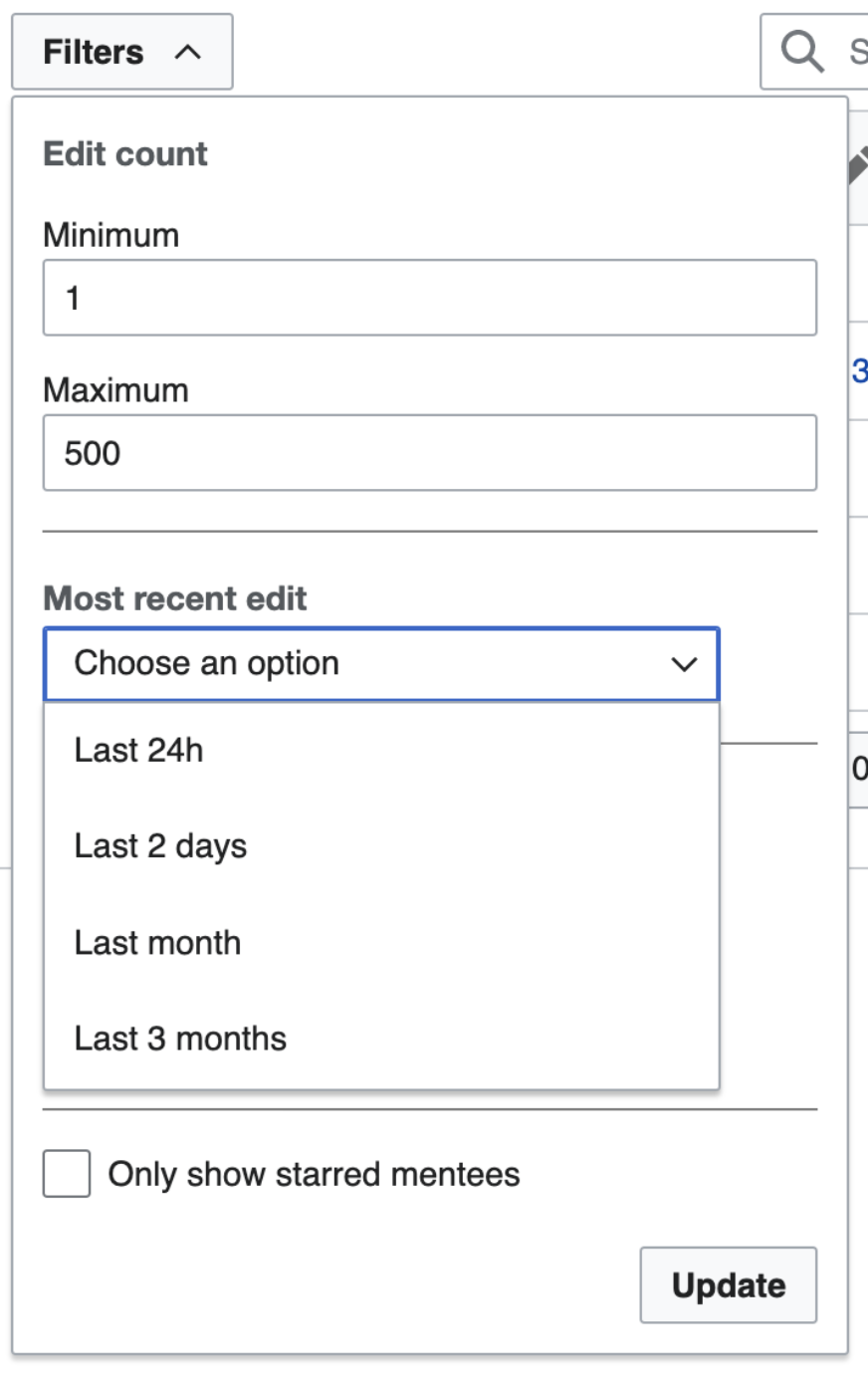
GrowthExperiments - note: the current use-case will be made obselete by a new design
- Current
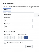
- Proposed revision is removing this component and replacing with a single dropdown - see T311228 for detailed reasons for moving away from using ButtonGroup.


Recent Changes:
WikiLambda:
Currently need a group of regular buttons with mutually-exclusive actions. Multiselect would be nice in the future.
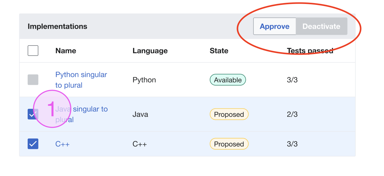
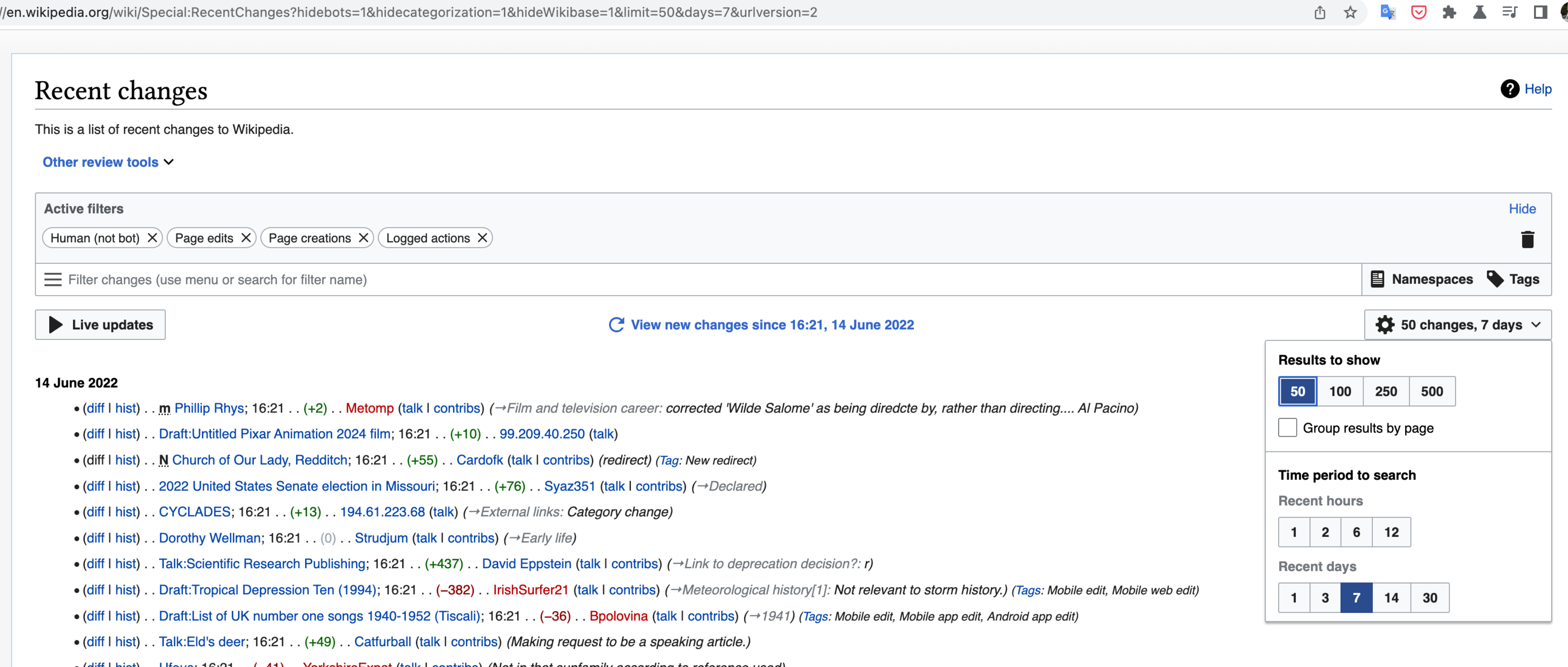
Function Page:
Selectable button group with quiet buttons will be needed to create the table pagination:
Considerations:**
- Any changes to the Button component will also impact ButtonGroup, e.g. T305437: [Design Spike] Audit all use cases for "disabled" buttons to identify inconsistencies
- OOUI has ButtonGroupWidget, which is just a group of Buttons or ToggleButtons. There is also ButtonSelectWidget, which has several Button or ToggleButton options that are mutually exclusive.
User stories
- As a designer/developer I need to create group of clickable buttons to use them as group of actions in my projects.
- As a designer/developer I need to create group of selectable buttons to filter information in my projects.
Previous implementations
These artifacts are listed for historical context. The figma spec, linked below, is the source of truth for the new component.
- Design style guide: see Button groups
- OOUI: see "button sets" section, Figma spec
- Vue: ContentTranslation
Codex implementation
Component task owners
- Designer: @bmartinezcalvo
- Developer: @Catrope (temporarily @AnneT)
Design spec
Stage 1: Minimum viable product (MVP)
MVP includes basic layout, default states, and most important functionality.
Acceptance criteria
- Determine what MVP includes for this component and document this in a subtask. Assign task to designer.
- Design MVP spec sheet. Once complete, assign task to developer.
- Implement MVP
Stage 2: Additional states, features, and variants
This might include a disabled state, framed/frameless designs, transitions, supporting different use cases, etc., which will be captured in separate subtasks.
Acceptance criteria
- Document design and implementation of additional states and features in individual subtasks
- Complete each additional state/feature subtask
Stage 3: Refinement
This stage includes any final touches or bug fixes needed before the component can be deemed complete, which will be captured in separate subtasks.
Acceptance criteria
- Finalize docs: open and complete a subtask for any additional demos that need to be added or documentation that needs work
- Meet accessibility standards: open and complete a subtask for any necessary accessibility improvements
- Meet internationalization standards: open and complete a subtask to fix any i18n bugs
- Complete testing: open and complete a subtask for any additional unit or functional tests that are needed