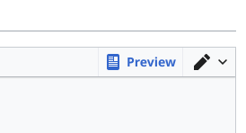
| Status | State | UI | Blocking |
| ⚠️ | Hover (default) – background: Base80 | 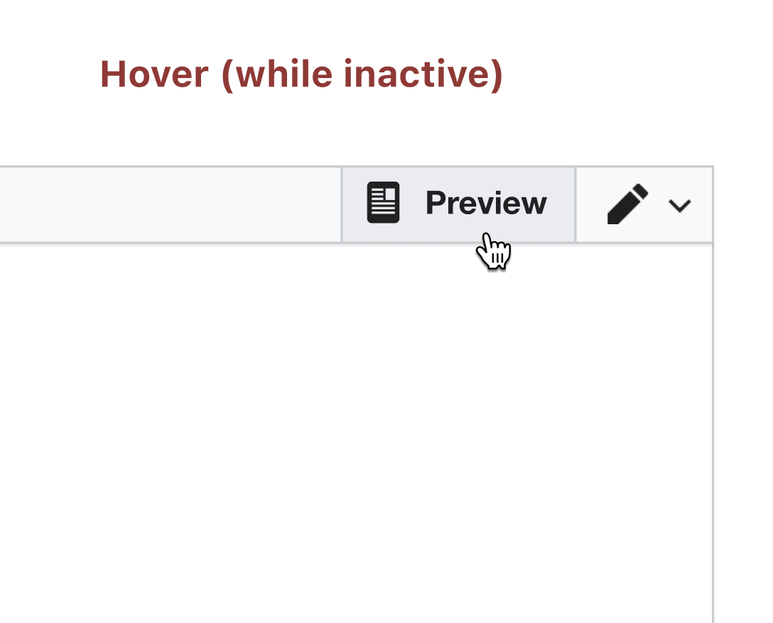 | True |
| ⚠️ | Active – label should be blue as well |  | True |
| ⚠️ | Hover (while active) – background: Base80 | 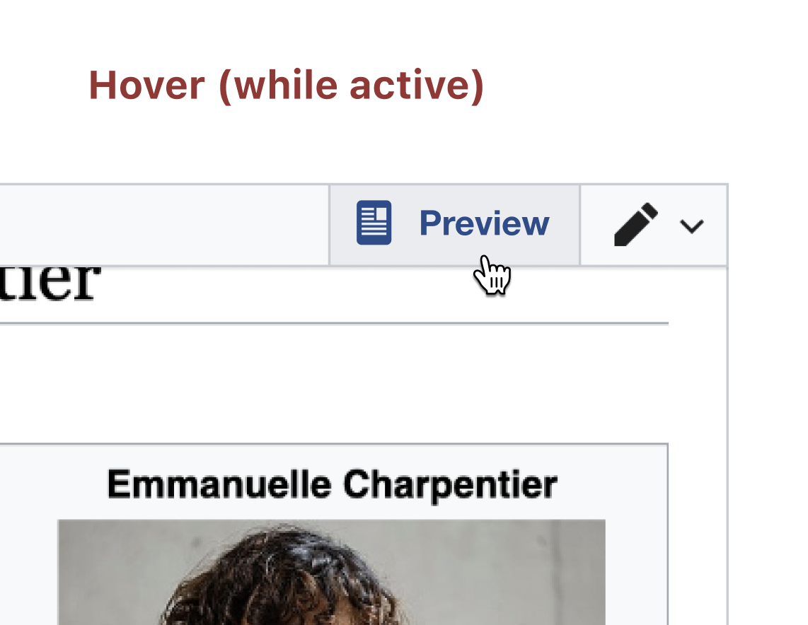 | True |
Description
Description
| Status | Subtype | Assigned | Task | ||
|---|---|---|---|---|---|
| Resolved | TheresNoTime | T303991 Design QA on testwiki | |||
| Resolved | Samwilson | T307106 Improve preview button look and feel in the Editor toolbar |
Event Timeline
Comment Actions
@TheresNoTime thanks for reviewing and merging this! I actually forgot to update the commit message with this (new) task number (the one on it is for the parent task), so here it is for posterity: https://gerrit.wikimedia.org/r/c/mediawiki/extensions/WikiEditor/+/784084
Also, rather than closing directly, after review we move things to the QA column so that they can be checked by the Test engineers can find the bugs we wrote take a look at our work. There's some more info about the workflow at https://meta.wikimedia.org/wiki/Community_Tech/Development
Comment Actions
Hi @TheresNoTime and @Samwilson, I wanted to make sure that we're also adding the same small border on the other edge of the button – currently it's not visible on Pl-Wiki but maybe you already added to this patch, in that case forget I said anything :) thanks!
| Currently – Without border | With Border |
 |  |