Description
When you click a link in the table of contents you get scrolled to the respective section. Currently there is no offset between the section heading and the top of the viewport (aside from clearing the sticky header when logged-in). For example:
| logged-out | logged-in |
|---|---|
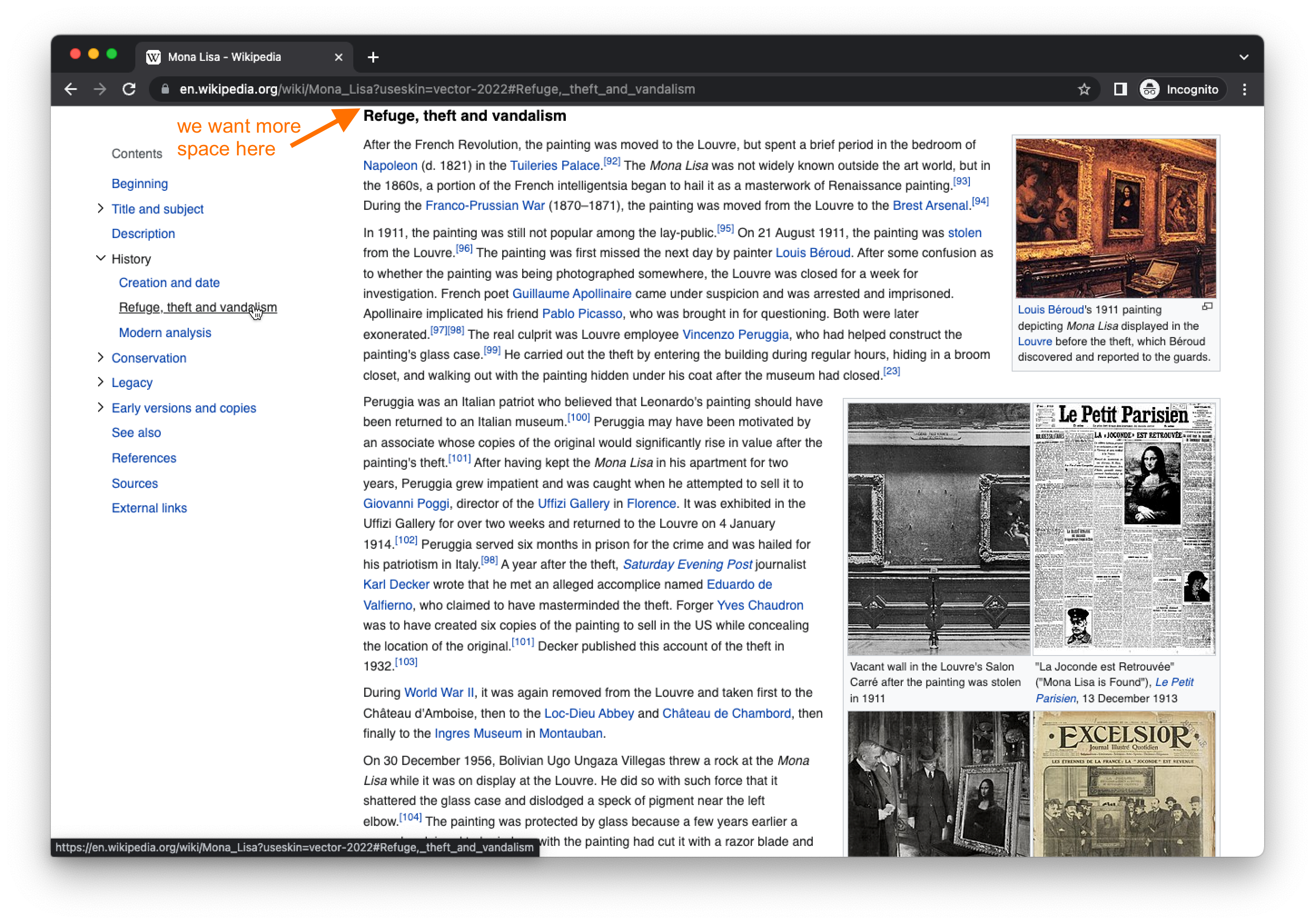 | 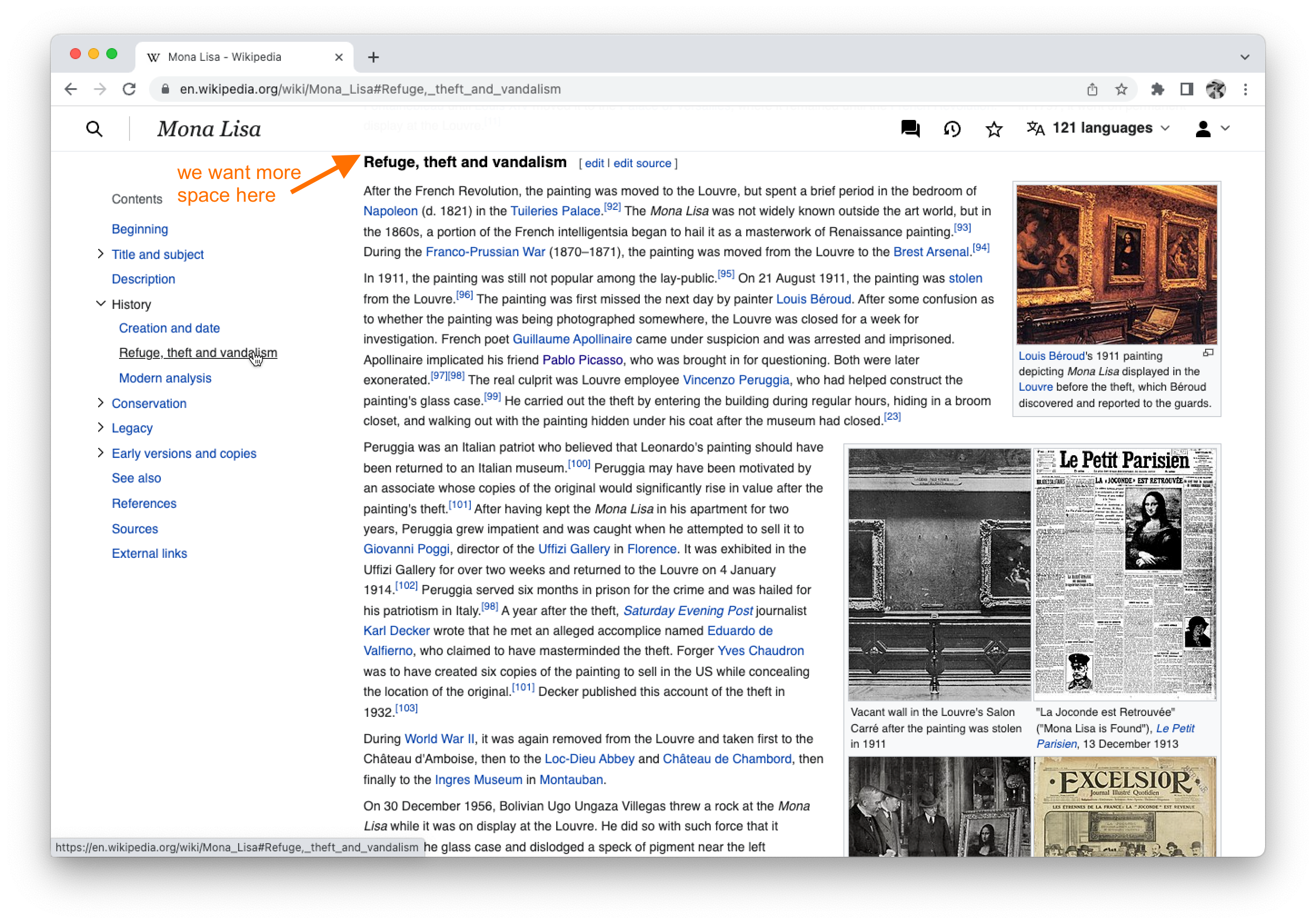 |
To-do
Add an offset so that when you click a link in the table of contents the respective section heading is ~50px below the top of the viewport (or sticky header, if logged in):
| logged-out | logged-in |
|---|---|
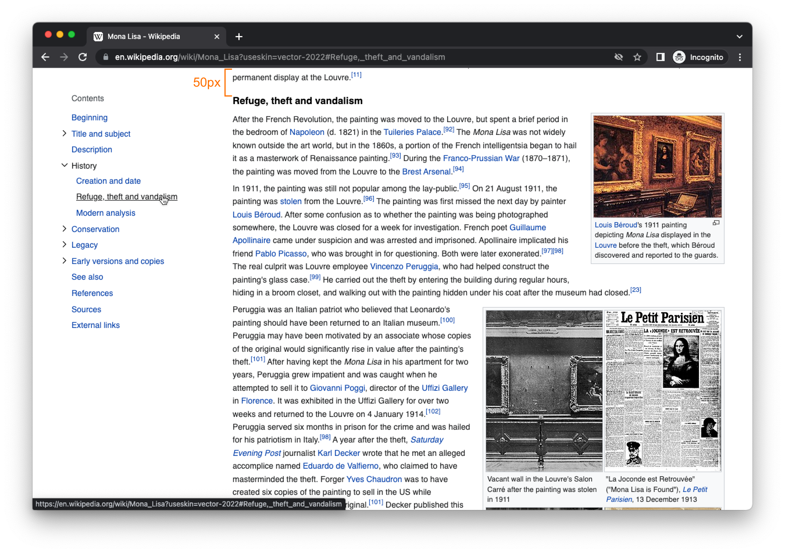 |  |
Notes
- In the past @nray had discussed using scroll padding to do this (link to spec)
- I think we would need to update the root margin on the intersection observer to keep everything in sync
- I assume this would handle the situation where you follow a link to a specific section (e.g. https://en.wikipedia.org/wiki/Mona_Lisa#Refuge,_theft_and_vandalism)
QA Results - Beta
| AC | Status | Details |
|---|---|---|
| 1 | ✅ | T314419#8674766 |
| 2 | ✅ | T314419#8674766 |
QA Results - Prod
| AC | Status | Details |
|---|---|---|
| 1 | ✅ | T314419#8719822 |
| 2 | ✅ | T314419#8719822 |