Page MenuHomePhabricator

Reconsider the amount of whitespace between Topic Container and first comment (desktop)
Closed, ResolvedPublic

Assigned To
Authored By
ppelberg
Aug 2 2022, 10:54 PM
Referenced Files
F35512866: Whitespace_New_Dimensions.png
Sep 8 2022, 4:16 AM
F35512863: Whitespace_New.png
Sep 8 2022, 4:16 AM
F35512861: Whitespace_Current.png
Sep 8 2022, 4:16 AM
F35497412: image.png
Aug 30 2022, 12:37 PM
F35491862: Screen Shot 2022-08-26 at 10.18.11.png
Aug 26 2022, 5:19 PM
F35486000: Screen Shot 2022-08-23 at 13.00.39.png
Aug 23 2022, 8:03 PM
F35485998: Screen Shot 2022-08-23 at 13.00.47.png
Aug 23 2022, 8:03 PM
F35385643: image.png
Aug 2 2022, 10:54 PM

Description

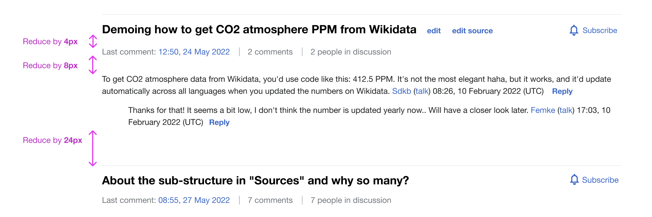
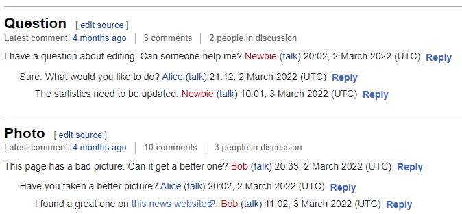
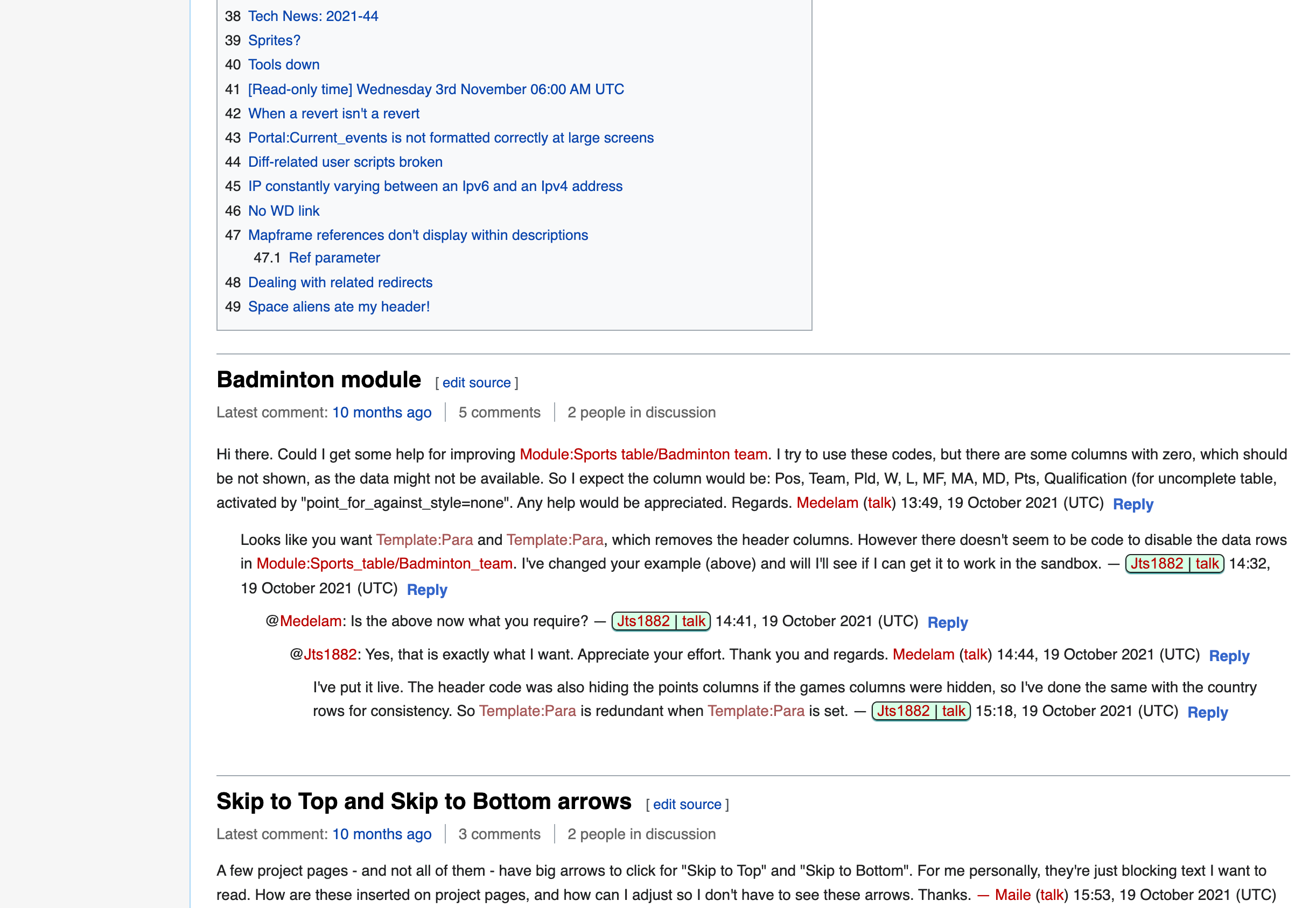
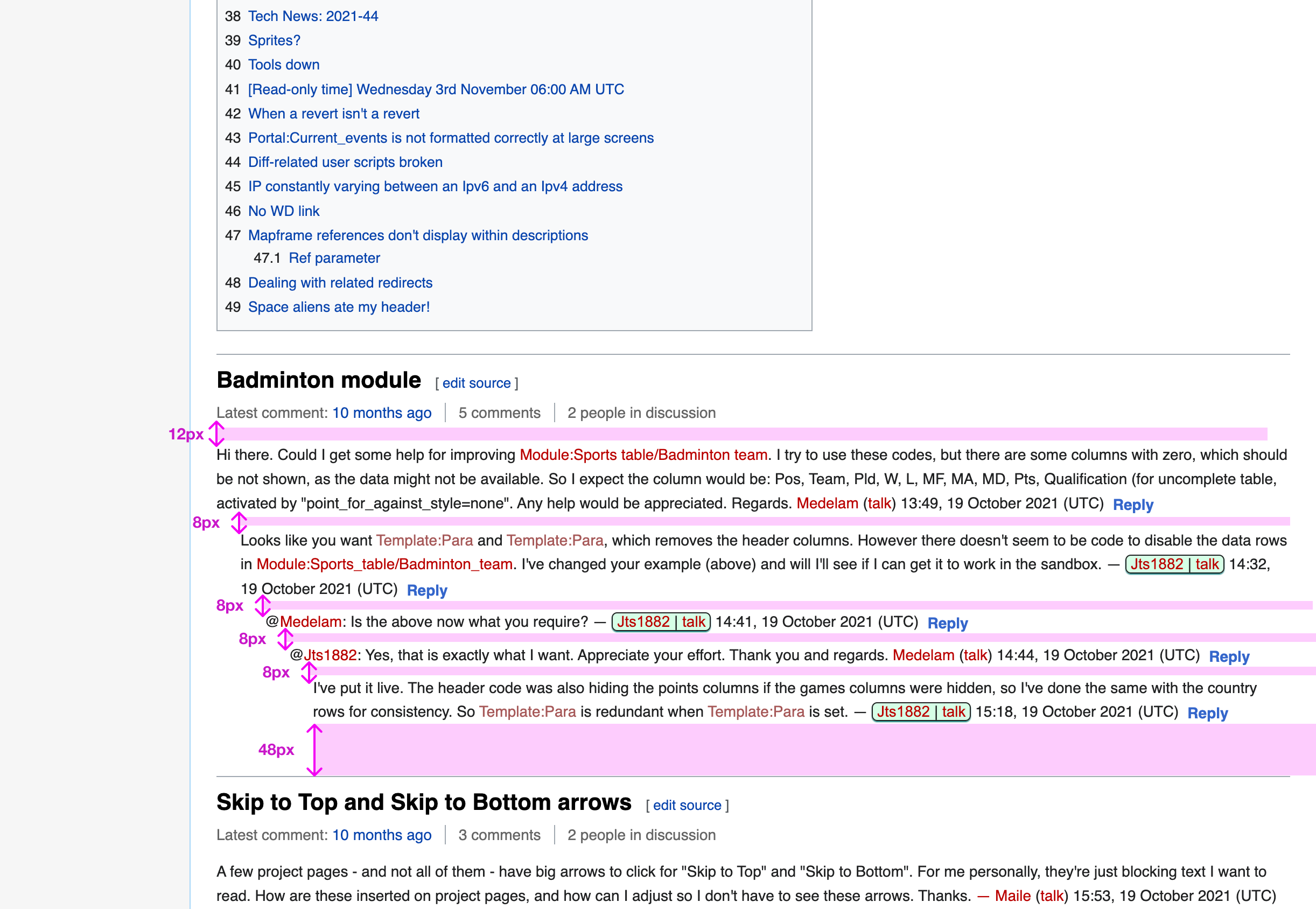
This task involves the work with revising (read: diminishing) the amount of whitespace between Topic Containers and the first comment beneath them.

This ticket was inspired by the feedback @Ahecht shared on en.wiki here.

Behavior

Current spacingProposed spacing (via @Ahecht)Desired spacing (via @nayoub)
Screen Shot 2022-08-23 at 13.00.47.png (1×1 px, 292 KB)
image.png (313×674 px, 45 KB)
Whitespace_New.png (1×2 px, 466 KB)

Requirements

Whitespace_New_Dimensions.png (1×2 px, 477 KB)

Done

  • Desired behavior is implemented

Event Timeline

As a note, my proposed image also reduced the font size of the "Latest comment" line to help distinguish it from the first comment.

I like the current amount of whitespace. The proposed spacing looks too tight, and it looks odd that the spacing between comments is equal or greater than the spacing between the comment area and the heading.

I agree @Esanders the previous proposal was slightly too tight – I've added a new one that's sort of a hybrid. Let me know what you think, thanks!

I agree @Esanders the previous proposal was slightly too tight – I've added a new one that's sort of a hybrid. Let me know what you think, thanks!

@nayoub the design you posted looks great. Assuming @Esanders has no blocking concerns, I think this is ready to be implemented. I'm adjusting the task description accordingly.

@nayoub Can you give the exact size of the spacing you are aiming for? It's not clear from the pixel scaling.

Relative numbers would be most helpful (e.g. make the top margin 4px narrower)

Hi @Esanders, here are the relative measures for the spacings – hopefully the original Figma file is well coordinated with what's in production, otherwise will refine :)

Screen Shot 2022-08-26 at 10.18.11.png (734×2 px, 190 KB)

nayoub updated the task description. (Show Details)
nayoub subscribed.

Hi @Esanders, here are the relative measures for the spacings – hopefully the original Figma file is well coordinated with what's in production, otherwise will refine :)

Screen Shot 2022-08-26 at 10.18.11.png (734×2 px, 190 KB)

I'm not sure where you got this screengrab from, but that large gap between topics does not exist in general:

image.png (267×1 px, 65 KB)

I assume that gap doesn't actually need adjusting?

Change 828000 had a related patch set uploaded (by Esanders; author: Esanders):

[mediawiki/extensions/DiscussionTools@master] Tweak topic container margins on desktop

https://gerrit.wikimedia.org/r/828000

The other gaps (-4px/-8px) had actual margins of 5px/10px, so I've just set these to 0, which is slightly more that you've specified.

@nayoub Does the above patch demo look ok?

nayoub removed nayoub as the assignee of this task.Sep 8 2022, 4:16 AM

@Esanders thanks for the patch demo! I noticed some discrepancies between the original Figma and the patch demo so I adjusted directly on the demo:

Patch DemoNew whitespaceDimensions (tentative)
Whitespace_Current.png (1×2 px, 494 KB)
Whitespace_New.png (1×2 px, 466 KB)
Whitespace_New_Dimensions.png (1×2 px, 477 KB)

Please let me know if that works – we can also hop on a call if that's easier :) thanks!

The "current spacing" in the original task looks wrong to me: The spacing between the last comment and the next heading is much bigger that it actually is, and as a result your proposed spacing is a large change. I'm not sure we want to make it that large.

Also I wouldn't want to change the spacing between individual comments, that is part of normal paragraph and list item spacing, and we haven't been touching that so far. It could have unintended consequences if we changed something so fundamental.

With that all said, what are the relative changes you think need to be made to the patchdemo?

The "current spacing" in the original task looks wrong to me: The spacing between the last comment and the next heading is much bigger that it actually is, and as a result your proposed spacing is a large change. I'm not sure we want to make it that large.

Yes exactly that's the discrepancy between Figma and production I was mentioning. I think it'd still be good to have more spacing between the last comment and next heading compared the last patch demo (screenshot below):

Whitespace_Current.png (1×2 px, 494 KB)

Also I wouldn't want to change the spacing between individual comments, that is part of normal paragraph and list item spacing, and we haven't been touching that so far. It could have unintended consequences if we changed something so fundamental.

Sounds good.

With that all said, what are the relative changes you think need to be made to the patchdemo?

I think we should then still increase the space between the metadata/first comment, as well as last comment/next heading.

Test wiki on Patch demo by ESanders (WMF) using patch(es) linked to this task was deleted:

https://patchdemo.wmflabs.org/wikis/6a8994401c/w/

I think we should then still increase the space between the metadata/first comment, as well as last comment/next heading.

In the above patchdemo I've increased the space between meta/first comment to 12px as requested. The 48px looked a bit large across the whole page. Also because the discussion thread is not wrapped in a single element we implement this spacing by adding a top margin to the heading, which means the spacing also appears between thread headings and other content (e.g. the TOC in vector classic, or talk page templates). As a result I reduced slightly to 36px. Let me know if this looks ok.

ppelberg moved this task from Ready to Be Worked On to Doing on the Editing-team (Kanban Board) board.

@Esanders: what – if any – work is left to be done to implement what you described in T314449#8226703 and you and @nayoub came to agree on in T314449#8227087?

If "nothing," would it be accurate for me to think this ticket is then ready for "Code review"?

Change 828000 merged by jenkins-bot:

[mediawiki/extensions/DiscussionTools@master] Tweak topic container margins on desktop

https://gerrit.wikimedia.org/r/828000

Test wiki on Patch demo by ESanders (WMF) using patch(es) linked to this task was deleted:

https://patchdemo.wmflabs.org/wikis/430b3c73d4/w/