Page MenuHomePhabricator

Style clustered markers
Closed, ResolvedPublic

Description

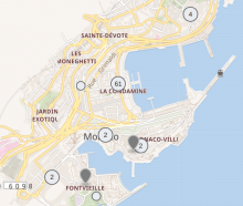
Style clustered markers according to the design spec.

  • Size: 32x32
  • Same colors as nearby points
  • Same hover, focus and selected effects as nearby points

Technical implementation

Outcome

Screenshot from 2023-02-02 15-25-46.png (548×647 px, 372 KB)

Event Timeline

Change 885292 had a related patch set uploaded (by WMDE-Fisch; author: WMDE-Fisch):

[mediawiki/extensions/Kartographer@master] Add custom styles for nearby cluster icons

https://gerrit.wikimedia.org/r/885292

I tested the markers locally and they look fine to me. Only issue we might want to fix: in dark mode (I use the browser extension dark reader) the numbers are hard to read. See screenshot:

Screenshot from 2023-01-31 15-07-01.png (810×1 px, 517 KB)

I tested the markers locally and they look fine to me. Only issue we might want to fix: in dark mode (I use the browser extension dark reader) the numbers are hard to read. See screenshot:

Screenshot from 2023-01-31 15-07-01.png (810×1 px, 517 KB)

Seems due to the white background SVG used for the markers. I took the opportunity to style the whole thing without using SVGs. Seem better like that.

Do you know we have a native CSS selector to support dark mode? https://developer.mozilla.org/en-US/docs/Web/CSS/@media/prefers-color-scheme It should be possible to use this to replace the .svg background with an inverted one. Or even simpler: Use it to make sure the text color doesn't change in dark mode.

While I can't find this mentioned anywhere in the DarkReader documentation it appears in the source code: https://github.com/darkreader/darkreader/search?q=prefers-color-scheme. Might be worth a try.

Fisch made a patch yesterday that replaces the SVG with a pure CSS approach and that looks pretty good to me:

Screenshot from 2023-02-01 10-36-19.png (569×1 px, 149 KB)

Layout with border for a normal marker:

Box.png (706×1 px, 271 KB)

Change 885292 merged by jenkins-bot:

[mediawiki/extensions/Kartographer@master] Add custom styles for nearby cluster icons

https://gerrit.wikimedia.org/r/885292

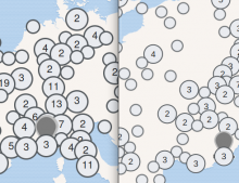
I guess this is not gravely important but I found that firefox and chrome have quite a different way of displaying the points. Looks like colors and fonts are different.

left: firefox, right: chrome

Screenshot from 2023-02-02 16-39-45.png (378×491 px, 117 KB)

Looks identical in my Firefox vs. Chrome. Maybe you accidentally have different zoom levels active? Maybe an effect of the darkmode extension?

I actually had different zoom levels which lead to some differences. Here is a screenshot with the same zoom levels. Still looks like the font is different.

Screenshot from 2023-02-03 16-48-06.png (336×379 px, 24 KB)

There is usually not much we can do about different font renderings on different operating systems and browsers. But I can confirm the weird vertical position. It should be possible to make this less obvious. Unfortunately I couldn't find a way to improve this. For some reason the vertical alignment for this font is just different in Firefox. Fiddling with line-height and such doesn't make it better.

@ECohen_WMDE, I found we must set maxClusterRadius to at least 32 because our gray cluster markers have a diameter of 32 pixels. Every extra pixel on top of 32 guarantees there will be at least so much whitespace around each marker. So let's say we want to make sure there are at least 2px whitespace the resulting maxClusterRadius is 34.

maxClusterRadius.png (499×400 px, 49 KB)

@thiemowmde This makes sense! Thanks for the diagram. When we look at it later today, I'll mention that we should start testing at 34 and go from there.

thiemowmde claimed this task.

Change 889504 had a related patch set uploaded (by Thiemo Kreuz (WMDE); author: Thiemo Kreuz (WMDE)):

[mediawiki/extensions/Kartographer@master] Fix z-index & opacity when tab-navigating clustered markers

https://gerrit.wikimedia.org/r/889504

Change 900665 had a related patch set uploaded (by Thiemo Kreuz (WMDE); author: Thiemo Kreuz (WMDE)):

[mediawiki/extensions/Kartographer@master] Make the spider lines of a cluster of nearby points visible again

https://gerrit.wikimedia.org/r/900665

Change 900665 abandoned by Thiemo Kreuz (WMDE):

[mediawiki/extensions/Kartographer@master] Make the spider lines of a cluster of nearby points visible again

Reason:

https://gerrit.wikimedia.org/r/900665

Change 889504 merged by jenkins-bot:

[mediawiki/extensions/Kartographer@master] Hide the center of a marker cluster when expanded

https://gerrit.wikimedia.org/r/889504