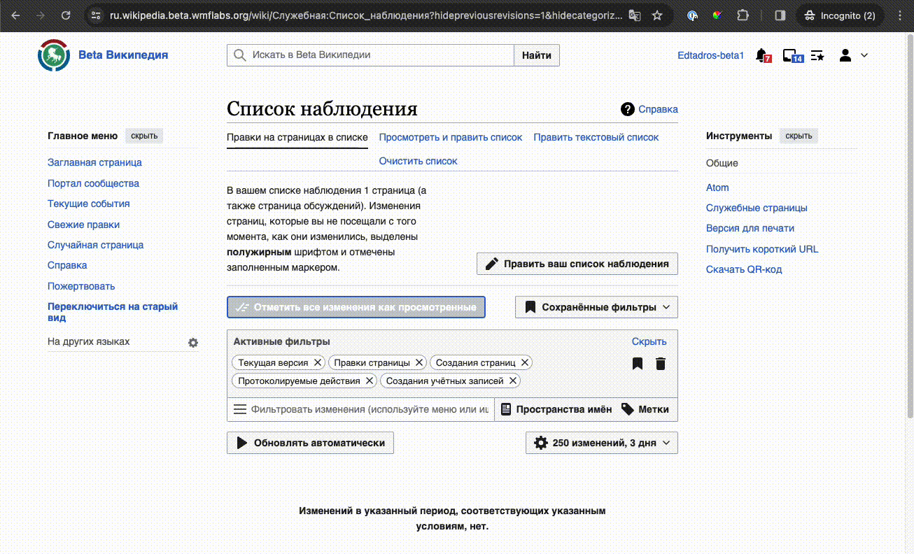
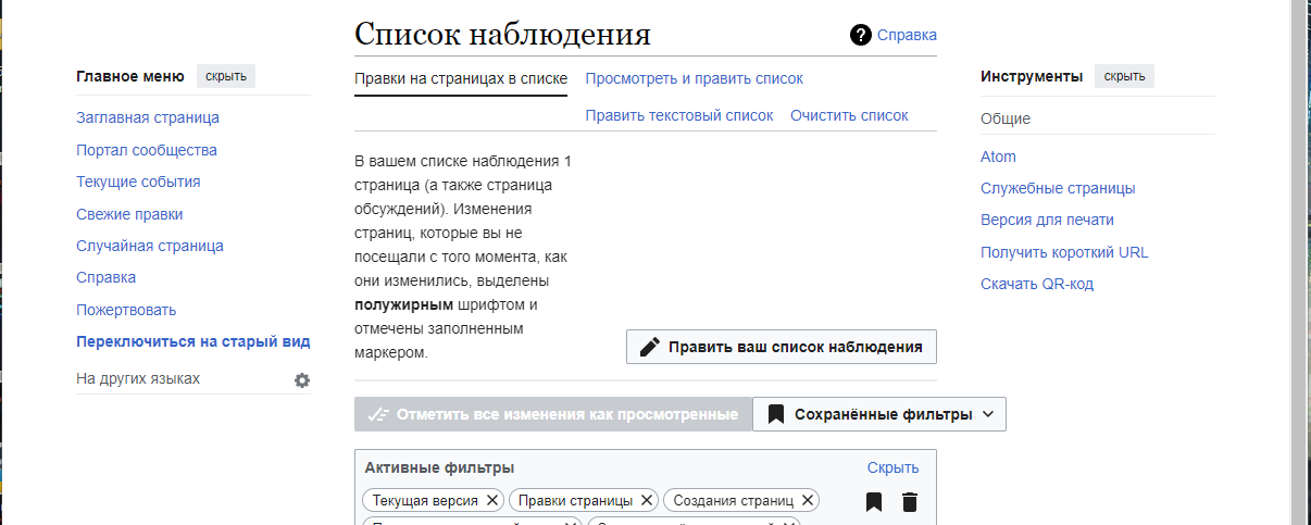
Steps to replicate the issue (include links if applicable):
- Open on mobile or with devtools https://ru.wikipedia.org/wiki/Служебная:Список_наблюдения?uselang=ru
- Look at filters
What happens?:

What should have happened instead?:
Buttons should be wrapped on a new line
Other information (browser name/version, screenshots, etc.):
iPhone 12 mini, latest OS, latest Chrome
QA Results - Beta
| AC | Status | Details |
|---|---|---|
| 1 | ✅ | T358424#9645826 |
QA Results - Prod
| AC | Status | Details |
|---|---|---|
| 1 | ✅ | T358424#9645832 |