Page MenuHomePhabricator

Add a MenuButton component to Codex
Open, MediumPublic5 Estimated Story Points

Description

Background

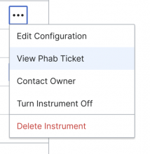
Currently the menu component can only be triggered by a Select or Lookup component. We want to expand this to include the ability to trigger a menu with a button.

screenshot_2024-04-25_at_1.16.43___pm.png (480×469 px, 40 KB)

Known use cases

  • The Catalog Table in the metrics platform will need this capability
  • Multi-blocks project

Existing implementations

Wikifunctions currently triggers a menu through a button, see under "Try this function": https://www.wikifunctions.org/view/en/Z10012

Screenshot 2024-04-25 at 3.11.59 PM.png (640×1 px, 55 KB)


Codex implementation

  • Should be implemented as a new standalone "MenuButton" component. This component will be built on top of the ToggleButton (in "quiet" state) and will use the existing Menu component for its menu, similar to other menu-based components (Select, ComboBox, etc).
  • Will be introduced as a WIP component initially
  • May need to expose props to accept MenuConfig and/or MenuItemData objects
  • useFloatingMenu composable should be used for positioning the fly-out menu; however, some tweaks may be needed because we don't want the width of the menu to be limited to the width of the triggering button. The composable may need to be updated to accept an additional argument for this usage. See how Select or Combobox use the composable to position their own Menus for examples.
  • Should follow guidelines for the Menu Button Pattern from the Aria Authoring Practices Guide as closely as possible

Open questions

  • What will be the minimum and maximum width of the menu when it is displayed?
  • What will be the position of the menu when it is displayed?
  • Can destructive actions be included within the menu if MenuButton? - Yes, destructive actions will be displayed just within the menu of MenuButton since the rest of the menus (Select, Combobox, Lookup...) contain options instead. We can make it so that the MenuButton accepts menu items with an additional option of whether to show up as "destructive".

Design spec

Component's Guidelines

Once the guidelines of this component have been documented, link them here.

Guidelines documentation

Acceptance criteria

  • A new MenuButton conforming to the above implementation has been added as a WIP component (not published yet).
  • A basic demo for the MenuButton has been added to the Codex sandbox page
  • Basic unit tests for the component have been added (more comprehensive ones can be added later)
  • (optional) If time allows, a page in the docs site can be added as well, but this is not a requirement.

Minimum viable product

TBD

MVP scope

  • List all parts of the MVP scope for this component

Design

  • Design the Figma spec sheet and add a link to it in this task
  • Include the main component in the Figma library. This step will be done by a DST member.
  • Document the component Guidelines and include them in Codex

Code

  • Implement the component in Codex

Future tasks

Details

Event Timeline

Restricted Application added a subscriber: Aklapper. · View Herald Transcript

@mwilliams is looking into the possibility of the Metrics Platform team contributing this component update.

CCiufo-WMF renamed this task from Expand the Menu component's capabilities in Codex to Support the ability to open a Menu from a Button in Codex.Mon, May 13, 4:15 PM
Catrope set the point value for this task to 5.Mon, May 13, 6:03 PM

A couple of design and implementation questions to consider:

  • We are talking about a button which toggles a menu between "open" and "closed" states. Codex already has a ToggleButton component which is "stateful" (either on or off) – would it make sense to use a ToggleButton instead of a regular button for this menu?
  • Do we want this to be handled as a new component ("MenuButton") or as a variant of an existing one? My understanding is that the DST designers would prefer the latter.
  • The menu itself should probably use the useFloatingMenu composable to handle the floating/positioning of the expanded menu element; this is the approach we use for other components which can pop open menus like Select, ComboBox, etc. But in the case of those other components, the width of the parent is used to control the size of the expanding menu. In this case, we want the menu to be wider than the button which triggers it – how wide, exactly? A fixed value, or a content-dependent one? We may need to update the behavior of the useFloatingMenu to allow for custom menu widths when they diverge from the width of the reference element.
  • What interface should be used here? Do we want to just allow Button or ToggleButton to accept a new prop for MenuConfig and MenuItemData, or would it make sense to add some kind of named or scoped slot to the Button component where a menu could be dropped in?
El T363858#9792306, @egardner escribió:

A couple of design and implementation questions to consider:

  • We are talking about a button which toggles a menu between "open" and "closed" states. Codex already has a ToggleButton component which is "stateful" (either on or off) – would it make sense to use a ToggleButton instead of a regular button for this menu?

@egardner it makes sense to use the ToggleButton to display this menu. Anyway, if we use the ToggleButton, I would always use the quiet version since the normal one is too prominent when toggled-on.

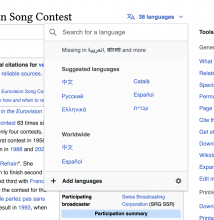
Captura de pantalla 2024-05-14 a las 15.12.58.png (1×1 px, 221 KB)

Please note that the current Language Selector in Wikipedia articles uses a Progressive Quiet Button to display this menu with the languages. I'm not sure if we should follow the same solution. In addition, if we plan to reuse this Button with Menu, we need to consider that the ToggleButton is just implemented with Normal and Quiet buttons at the moment, so this Progressive Quiet version would not be possible using the Codex Toggle Button.

  • Do we want this to be handled as a new component ("MenuButton") or as a variant of an existing one? My understanding is that the DST designers would prefer the latter.

At the moment we have to many Buttons to maintain in Codex, since there are too many different Button's flavours and different versions of ToggleButton. So, if possible, I would implement this Menu within Button as a prop/variant of one of the existing Button or ToggleButton components.

@Milimetric tagging you here since this is the upstream task for T363432. Some team members have weighed in on how to think about the design and implementation. We've set aside time this sprint (May 13 - 24) to help you contribute this new feature to Codex, assuming that's still the plan. Does that timing work? I noticed no one is actually assigned to T363432 but my understanding was that you were working on a patch.

I had considered this to be an expansion of the Menu component, which is already not a standalone component. So just like how Select and Lookup use it, a button could use this component internally.

I think the Language Selector is a more complicated topic that may or may not be related to this...it could end up being more of a popover since it has multiple columns, interactions, buttons, etc. I'd avoid trying to solve that in parallel with this as we have various straight forward use cases for this that map really closely to how the menu is currently used.

  • Do we want this to be handled as a new component ("MenuButton") or as a variant of an existing one? My understanding is that the DST designers would prefer the latter.

At the moment we have to many Buttons to maintain in Codex, since there are too many different Button's flavours and different versions of ToggleButton. So, if possible, I would implement this Menu within Button as a prop/variant of one of the existing Button or ToggleButton components.

From a technical perspective I think it would make much more sense to make this a separate component, since it's a straightforward composition of two existing components (Button+Menu). We didn't put menus for inputs in TextInput either, we made a new Lookup component that combines TextInput+Menu

quick update: resolved with Eric to work on this as a separate component. Will start on a patch now, keeping it in the Codex sandbox for now with T363432 as the goal.

egardner renamed this task from Support the ability to open a Menu from a Button in Codex to Add a MenuButton component to Codex.Thu, May 16, 7:02 PM
egardner assigned this task to Milimetric.
egardner updated the task description. (Show Details)

Change #1032560 had a related patch set uploaded (by Milimetric; author: Milimetric):

[design/codex@main] MenuButton: implement new component

https://gerrit.wikimedia.org/r/1032560

@Milimetric in case you need to check it, I've created the MenuButton Figma spec sheet. While working on it, some open have arisen:

  • What will be the minimum and maximum width of the menu when it is displayed?
  • What will be the position of the menu when it is displayed?
    • Down-right: I assume this will be the default position in case there is enough space.
    • Down-left: I guess this will be the second option in case there is no enough space for the down-right position.
    • Top-right: I assume this will be the default position in case there is no vertical space enough to display the menu.
    • Top-left: I guess this will be used to display the menu when there is no vertical and left space enough.
    • Right: do we want to include it?
    • Left: do we want to include it?

@Milimetric in case you need to check it, I've created the MenuButton Figma spec sheet. While working on it, some open have arisen:

  • What will be the minimum and maximum width of the menu when it is displayed?

I think that this is a design question – it might be good to define a max width and then we can set the menu to use the available space up to the max width. This will be more flexible than using a fixed value for every menu. We can use a reasonable max value for the WIP version of this component and then refine further after we have a live demo up.

  • What will be the position of the menu when it is displayed?

The library we use to handle floating menus, FloatingUI, actually supports a variety of "placement" options that we can use. bottom is the default but we can allow the user to specify any side: https://floating-ui.com/docs/tutorial#placements.

El T363858#9813430, @egardner escribió:

@Milimetric in case you need to check it, I've created the MenuButton Figma spec sheet. While working on it, some open have arisen:

  • What will be the minimum and maximum width of the menu when it is displayed?

I think that this is a design question – it might be good to define a max width and then we can set the menu to use the available space up to the max width. This will be more flexible than using a fixed value for every menu. We can use a reasonable max value for the WIP version of this component and then refine further after we have a live demo up.

I propose the following min and max-width:

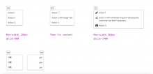
  • Min-width @size-800 (128px). It will work well with short text, including languages with shorter words such as Chinese, Japanese, or Arabic.
  • Once the text exceeds @size-800 (128px), the menu will expand to accommodate the content, up to a maximum width of @size-2400 (384px). I don't recommend a wider menu, as this MenuButton will primarily contain actions, and the action text should remain short, similar to text on buttons.

Captura de pantalla 2024-05-21 a las 12.04.33.png (1×2 px, 203 KB)

  • What will be the position of the menu when it is displayed?

The library we use to handle floating menus, FloatingUI, actually supports a variety of "placement" options that we can use. bottom is the default but we can allow the user to specify any side: https://floating-ui.com/docs/tutorial#placements.

Great, let's implement ths bottom-right (LTR) and bottom-left (RTL) as the default position and then let make the rest of the positions available just in case. As in Menu component, the displayed menu within MenuButton should change the position if the scroll position of the page changes, so it should change fro bottom to top if there is no enough space.