See screenshots:
| Jdforrester-WMF | |
| Dec 9 2014, 8:10 PM |
| F20702: Screen_Shot_2014-12-09_at_11.50.23.png | |
| Dec 10 2014, 8:10 PM |
| F20253: Screen_Shot_2014-12-09_at_11.50.23.png | |
| Dec 9 2014, 8:10 PM |
| F20255: Screen_Shot_2014-12-09_at_11.50.15.png | |
| Dec 9 2014, 8:10 PM |
See screenshots:
| Subject | Repo | Branch | Lines +/- | |
|---|---|---|---|---|
| [BREAKING CHANGE] Split primary flag into primary and progressive | oojs/ui | master | +132 -75 |
Seems like destructive + primary should be the only case where a red fill is used. But this is a call for May.
We should just use different constructive/destructive/progressive styling based on whether the button is the primary action or not. Essentially, only the primary button should have such a colored background and inverted icon, and other buttons should have much quieter appearance with a white background and colored text.
For example:
Change 179000 had a related patch set uploaded (by Trevor Parscal):
Split primary flag into primary and progressive
Change 179000 merged by jenkins-bot:
[BREAKING CHANGE] Split primary flag into primary and progressive
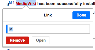
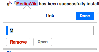
It seems like the main action upon clicking on the red link is the "Done" action. I've come to this conclusion because the main task is to fill in the form field. Not to mention also, clicking on the red link, we hope that users resolve the red link issue and "removing" a link isn't always the resolution, but giving it a new destination either gives it a blue link or retains a red link. Red link does not mean bad news, but it's better linked than not, right? Correct me if I'm wrong.
On the other hand, when this link is blue, the "Remove" action being secondary still makes sense because there isn't a reason to remove other than a change of link, which makes "Done" a constructive action.
With that said, "Done" should remain progressive (if there is another confirmation step after) or constructive (if this window marks the last step to completing task). "Remove" should be a quite destructive action and it goes the same for "Open," which I have an issue with by being in the same hierarchy as "Remove." But that's out of the scope of this issue.