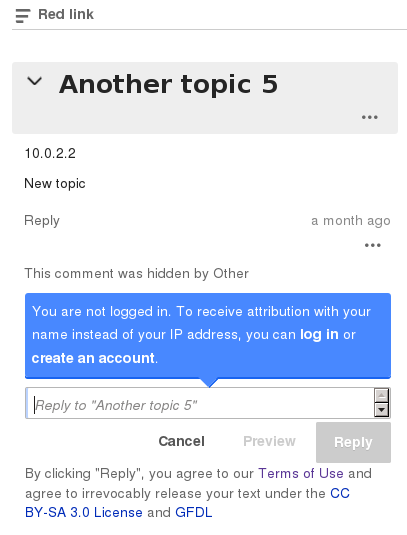
In the mobilefrontend, the Terms of Use message appears very squashed, and even overlaps the "Cancel" button.
(also a problem in desktop view, at reduced widths, eg. increasingly at less than ~700px)
| Quiddity | |
| Feb 10 2015, 8:31 PM |
| F39194: TOS_Immediately_After_Button_Row.png | |
| Feb 11 2015, 2:31 AM |
| F39076: Screenshot_from_2015-02-10_11:35:34.png | |
| Feb 10 2015, 8:31 PM |
In the mobilefrontend, the Terms of Use message appears very squashed, and even overlaps the "Cancel" button.
(also a problem in desktop view, at reduced widths, eg. increasingly at less than ~700px)
| Subject | Repo | Branch | Lines +/- | |
|---|---|---|---|---|
| Fix scrunching of TOS on low-width windows | mediawiki/extensions/Flow | master | +8 -1 |
Change 189890 had a related patch set uploaded (by Mattflaschen):
Fix scrunching of TOS on low-width windows
^ That's the easy solution, if it's okay to have the TOS after the buttons.
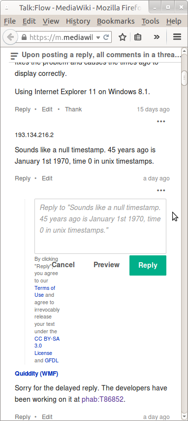
Screenshot (desktop remains the same):