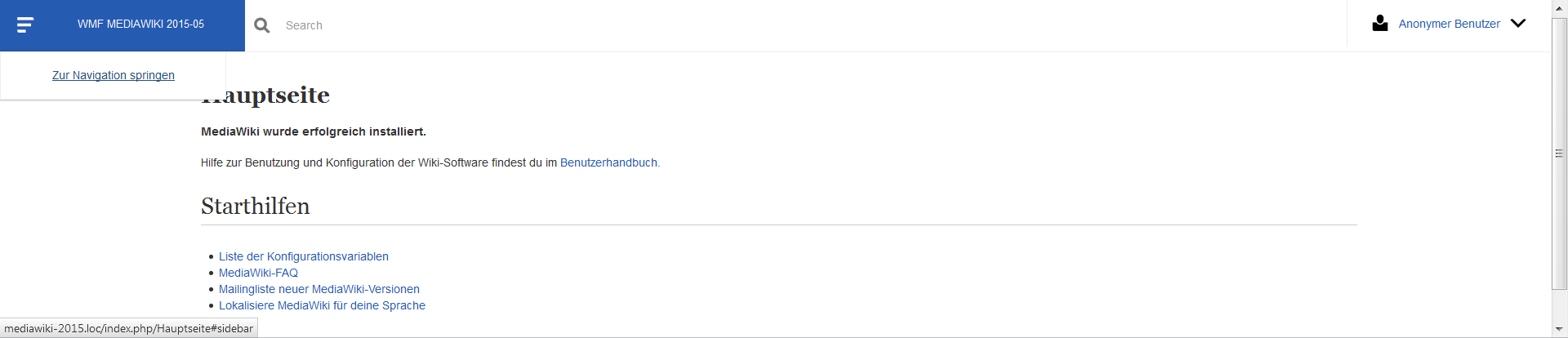
Despite the rise and continuously growing support of WAI-ARIA accessibility features like roles, it's still seen as good practice to include "skip-to" links (skip-to-nav depending where it is located, skip-to-content) in web documents to support keyboard users and screen readers. We should reflect that in Blueprint.
Description
Description
Details
Details
| Subject | Repo | Branch | Lines +/- | |
|---|---|---|---|---|
| Implement skip-to links and importing mediawiki.stateful-classes.less | mediawiki/skins/Blueprint | master | +66 -9 |
Event Timeline
Comment Actions
The current markup widely used by myself based on knowledge gathered over a long time.
HTML:
<a href="#side-menu" class="is-aural is-focusable">Skip to navigation</a>
CSS:
/* Text for Screen Readers only */
.is-aural {
	display: block;
	position: absolute !important;
	clip: rect( 1px, 1px, 1px, 1px );
	width: 1px;
	height: 1px;
	margin: -1px;
	border: 0;
	padding: 0;
	overflow: hidden;
}
	.is-aural.is-focusable:active,
	.is-aural.is-focusable:focus {
		position: static !important;
		clip: auto !important;
		width: auto;
		height: auto;
		margin: 0;
		text-decoration: underline;
		overflow: visible;
	}
This is an IE8+ complete solution due to clip property standards notation. Well, in IE6+7 it's 1 square pixel that's visible, not too bad.
It makes use of a [[ https://smacss.com/book/type-state | stateful CSS class namespace (is-) ]], as first seen in SMACSS.
Questions that might need further clarification:
- If the link description (text node) gets too long, does a title attribute help? Screen readers wouldn't be affected as the title content gets preference over the description, but keyboard users.
- overflow: hidden; seems to be inaccessible in some VoiceOver versions. We should possibly look into that.
- There's a problem stated on the WebAIM page, that some browsers "do not fully support in-page links". The authors recommend an additional JS function to take care about those. In my opinion, we'd need to clarify /which/ browsers are affected before putting effort into that.
Comment Actions
@Prtksxna has asked for further explanation of the is-aural and is-focusable classes, which would be a new concept in Blueprint.
Naming is hard and architecturing CSS for scalability is even harder. CSS namespaces (example) have in my experience a great potential to gain speed working with disperse people and projects on front-end side.
But there's factor involved, hardening our accessibility support. With this come things like ARIA roles and states or global properties like [[ https://developer.mozilla.org/en-US/docs/Web/HTML/Global_attributes/tabindex | tabindex ]]. Re-evaluating the classes and their usage from above, I think
HTML:
<a href="#side-menu" class="is-aural" tabindex="0">Skip to navigation</a>
CSS:
.is-aural {
	display: block;
	position: absolute !important;
	clip: rect( 1px, 1px, 1px, 1px );
	width: 1px;
	height: 1px;
	margin: -1px;
	border: 0;
	padding: 0;
	overflow: hidden;
}
	.is-aural[tabindex="0"]:active,
	.is-aural[tabindex="0"]:focus {
		position: static !important;
		clip: auto !important;
		width: auto;
		height: auto;
		margin: 0;
		text-decoration: underline;
		overflow: visible;
	}
including tabindex attribute is even more stateful.
See my CodePen for testing purposes.
Why tabindex="0": As stated in the MDN article "[a]n element with a 0 value, an invalid value, or no tabindex value should be placed after elements with a positive tabindex in the sequential keyboard navigation order."
So if for unknown reason we decide to put an element in some sub-template that should receive tabindex, we don't have to worry about with what value to start, as no positive tabindex is taken before. Therefore 0 seems the neutral and best way to include it in this environment/under these preconditions.
Comment Actions
Change 237870 had a related patch set uploaded (by VolkerE):
Implement skip-to link and .is-aural class
Comment Actions
The final version with even cleaner Less code.
CSS:
.is-aural {
	display: block;
	position: absolute !important;
	clip: rect( 1px, 1px, 1px, 1px );
	width: 1px;
	height: 1px;
	margin: -1px;
	border: 0;
	padding: 0;
	overflow: hidden;

	&[tabindex="0"]:active,
	&[tabindex="0"]:focus {
		position: static !important;
		clip: auto;
		width: auto;
		height: auto;
		margin: 0;
		overflow: visible;
	}
}
Updated by removing text-decoration from :focus state - that should be completely up to skin.
Comment Actions
My suggestion is to use a component we already have. In the example below, I'm using a neutral button:
Comment Actions
@violetto I could turn that easily in a neutral button, but the button would be visible on focus by tabbing through the page's links, which makes its sudden appearance 'hanging around without connection' pretty weird.
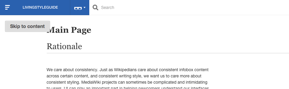
I was orientating myself on the account menu on the other side and thought of those two skip links 'Skip to navigation' and 'Skip to content' on a menu with box-shadow coming out of the site's title. Please try the current patch set to get a better feeling of the current behavior.
Comment Actions
Hitting on "Skip to navigation" skips users' cursor focus to the first item of table of contents on the page
Hitting on "Skip to content" skips users' cursor to content area
Hitting on "Search this guide" skips users' cursor to the Search field
Hitting on "How is your accessibility experience on this site?" opens up your OS email client with feedback email on the "Recipient" field.
Hitting on "x" closes the Accessibility bar
@Volker_E, we can use this as a start.
Comment Actions
Change 237870 merged by jenkins-bot:
Implement skip-to links and importing mediawiki.stateful-classes.less
Comment Actions
@violetto I'd urge for opening another task for the toolbar and stay with the two links as a starter, also for unblocking T118546: `#toctitle` shouldn't be set to `display: none`. Screen readers don't get it right.:
T122709: Implement accessibility "bar" in Blueprint