Page MenuHomePhabricator

Evaluate position of "Open in Media Viewer" button on file description page
Open, LowPublic

Description

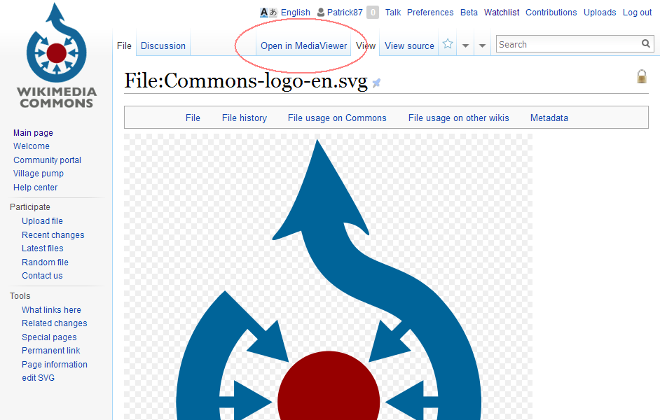
Right now MediaViewer's "Open in Media Viewer" button is placed directly below the preview image on file description pages. This needs to be changed!

Rationale: File description pages should contain information specific to a file (that's why they are called "file description" pages). Navigational elements that are not specific to the file should go into one of the designated navigational areas.

Right now (especially when other extensions/gadgets are active on a Wiki) file description pages often are structured like this:
"preview image > button > another button > MediaViewer buttton > button > description" (find the error...).

Please note that this change was already agreed on by WMF staff back when MediaViewer was first enabled, see
https://www.mediawiki.org/wiki/Extension_talk:Media_Viewer/About/Archive02#Link_to_Media_Viewer_on_Commons
https://www.mediawiki.org/wiki/Extension_talk:Media_Viewer/About#Media_Viewer_Update:_More_Improvements
https://wikimedia.mingle.thoughtworks.com/projects/multimedia/cards/463
Re-evaluation of the buttons position was promised multiple times by Fabrice Florin, however until today nothing has changed!

Event Timeline

Patrick87 raised the priority of this task from to High.
Patrick87 updated the task description. (Show Details)
Patrick87 added projects: MediaViewer, Multimedia.
Patrick87 added subscribers: Patrick87, Keegan, Tgr.
Aklapper renamed this task from Position of MediaViewer button on file description pages to Evaluate position of "Open inMedia Viewer" button on file description page.Sep 20 2015, 5:41 PM
Aklapper raised the priority of this task from High to Needs Triage.
Aklapper set Security to None.

Thanks for reporting this.
I don't see how this is an urgent request, so I've reset the priority to its initial value, in order to let the team triage the urgency/priority of requests towards them. Also see https://www.mediawiki.org/wiki/Phabricator/Project_management#Setting_task_priorities

I don't believe it was agreed; various alternatives were discussed, and we ended up with the current design (partly because it could accommodate an extra options button). That team has since been dissolved so it doesn't matter much either way.

The "hover" design you link to would have turned the whole preview image into a button to open Media Viewer; that would probably be very contentious without any clear benefit.

The area where the button is now is navigational; it contains links to different resolutions (plus whatever else gets put there via gadgets, like the ImageAnnotator button and the rotation request link). Arguably all of that is pretty bad, and the whole file page design is, but changing that would be a huge endeavor so my suggestion would be to address this whenever the layout of the file page is addressed (probably in the structured file data project?).

Mass-removing the Multimedia tag from MediaViewer tasks, as this is now being worked on by the Reading department, not Editing's Multimedia team.

The "hover" design you link to would have turned the whole preview image into a button to open Media Viewer; that would probably be very contentious without any clear benefit.

That design was never preferred by me and I agree it would probably be controversial, but I wanted to put the link, since this ticket represented the previous effort of the WMF team to solve the issue.

Arguably all of that is pretty bad, and the whole file page design is, [...]

Exactly my point! That's why I created the task. The whole area below the preview image has become an unsorted and unclear conglomeration of buttons and the like, which does not only look most unprofessional but is a disaster usability-wise.

If changes to file description pages were going to happen any time soon, this might be acceptable.
However I'm afraid we'll not see any such changes in years if I'm up-to-date on the road map of the Structured Data project, or do you have different information?

Therefore I still think that a change is mandatory!

A little bit of additional input from my side:
The reason why the "Open in Media Viewer" button bugs me most in the conglomerate is, that it's an official product developed by the WMF (read: by professionals). If even professional developers decide to "just put the button anywhere" - how should we expect any volunteer developer to put any thought into placement of UI elements?
As a result I'm afraid that we'll sooner rather then later attract even more unsorted additions into the area below the preview image, making our file description pages even messier and more complicated to use than they are now, which just does not meet Wikipedia's quality standard anymore...

To add a little prespective here's a mock-up of what I could envision to work pretty well usabilty-wise and blend in perfectly with the present UI

mockup.png (600×942 px, 44 KB)

Steinsplitter added a project: Commons.
Steinsplitter moved this task from Incoming to Backlog on the Commons board.
Steinsplitter subscribed.
Jdlrobson added subscribers: KHammerstein, Jdlrobson.

@Patrick87 we're still getting acquainted with the tool right now. Having no background with the issue I'd appreciate more insight to how this is impacting our users.

Do we have data showing this is negatively impacting user value in some way?
You say it "needs to be changed" but I'm missing the why... so right now it just reads as a personal distaste of an existing design so I would appreciate more explanation to what the problem is here so we can assess different designs.

I do agree with you that in general the whole file page design could do with a rethink. @KHammerstein are file pages something the design team has thought about previously?

However I'm afraid we'll not see any such changes in years if I'm up-to-date on the road map of the Structured Data project, or do you have different information?

That is correct as far as I know.

As a result I'm afraid that we'll sooner rather then later attract even more unsorted additions into the area below the preview image, making our file description pages even messier and more complicated to use than they are know, which just does not meet Wikipedia's quality standard anymore...

I don't see how moving one button would help that. I also don't think the tab bar is a good place - it's hard to notice, and there is little space while the list of potential "image actions" is large (at least on Commons - view/download in other sizes, annotate, credits, the five stockphoto links, rotate/rename requests... ). A box with links in the content area, above or next to the image would be better (similar to how the stockphoto gadget does it). Then again I don't know much about design - maybe @Pginer-WMF wants to comment on it.

You say it "needs to be changed" but I'm missing the why... so right now it just reads as a personal distaste of an existing design so I would appreciate more explanation to what the problem is here so we can assess different designs.

First of all we should not talk about an "existing design" here. The current position of the button was not the result of a careful design decision but only a result of a quick fix during one of the many iterations MediaViewer faced upon its initial introduction based on user feedback. Shortly thereafter the Multimedia team was dissolved and the button was just left behind where it was. So basically it's a WIP and I think we can safely treat it as unfinished work.

Besides the lack of design there are multiple reasons why I am convinced the position needs to be changed:

  • The most important problem which I already tried to explain in the task description is that the space between preview image and the actual file description (usually the {{Information}} template) is packed with far too many tools nowadays, pushing the file description down the page. Now we're talking about file description pages so obviously the file description is the most important content on that page! Therefore when looking at a file description page the user's view should be guided from the preview image to the description - which we effectively prevent by intercepting the users view with our too prominent tool links (the MediaViewer button being the most prominent of them all being an overly huge button that does not even fit the design of any other buttons).
  • Another big issue is that the button's position is not really intuitive. It's a navigational element on the highest level (it's as if we're leaving the page; we're starting a completely new tool!). As a user I'd not expect this to be hidden behind a button down the page, but implemented as a major navigational element either at the top of the page or somehow directly attached / next to the preview image. The current button does not seem closely related to the preview image but is rather detached. As a user I don't really know what I'll be opening in the MediaViewer since the button does not state any context (this is also in contrast to the much clearer textual links "Original file" or "Size of this preview: ... pixels. Other resolutions: ..." which achieve much more with much less effort while still fitting themselves seamlessly into the page).
  • One important fact we should also keep in mind: MediaViewer (as a tool developed by WMF) has exemplary function! There's currently a discussion on Commons regarding a "SVG help button" that provides the user with useful links regarding SVG editing. Also there I mentioned we should not put any more tools between preview image and file description. The users answer was "I'm asking to treat the SVG button equal to other gadets. If previous things got that place I have the same rights." with "gadgets" referring to the ImageAnnotator/rotate and especially the MediaViewer button! You probably can imagine where we end up if more gadgets find their place in this position with such an argument.

I don't see how moving one button would help that. I also don't think the tab bar is a good place - it's hard to notice, and there is little space while the list of potential "image actions" is large (at least on Commons - view/download in other sizes, annotate, credits, the five stockphoto links, rotate/rename requests... ). A box with links in the content area, above or next to the image would be better (similar to how the stockphoto gadget does it). Then again I don't know much about design - maybe @Pginer-WMF wants to comment on it.

Moving one single button surely won't help, but if every team/developer states this on their tool nothing changes. We need to start somewhere (and as I wrote above MediaViewer could (or rather should) lead by example.
Regarding exact implementation: I don't think the tab bar is hard to notice (quite the contrary - in my opinion it's the area with the highest visibility) but I'm not at all fixed to the mock-up I posted.
I somehow like the idea of a navigational area above the preview image as long as it's kept compact and all tools are unified in this designated area (view/download in other sizes might stay because they belong close to the preview image and have a very subtle design).

Patrick87 renamed this task from Evaluate position of "Open inMedia Viewer" button on file description page to Evaluate position of "Open in Media Viewer" button on file description page.Sep 24 2015, 6:17 PM

The top bar above the file preview looks like a good place to put this link (much better than the tabs or below the image, if you ask me), although it seems that various tools are fighting for that too. It seems that there's a gadget on Commons which throws out the entire thing and replaces it with its own one, because mine looks completely different than yours, compare:

mockup.png (600×942 px, 44 KB)

pasted_file (948×1 px, 156 KB)

Indeed, that's the Stockphoto gadget (in compact mode).

IMO there should be an "image options panel" where extensions and gadgets can easily add their buttons, much like mw.util.addPortletLink() for the toolbar, but as I said that's a bit beyond Media Viewer.

IMO there should be an "image options panel" where extensions and gadgets can easily add their buttons, much like mw.util.addPortletLink() for the toolbar, but as I said that's a bit beyond Media Viewer.

I think the whole file page layout needs a major overhaul – for example, there's no good reason to have something as important as Categories placed at the very bottom of the page T102776. The question is: Should this wait for Structured Data? Or would it maybe be better to start thinking about this now, so we can lay out the red carpet for Structured Data once it comes?

The area below the image was selected since it is an area where actions for image display and manipulation are available (e.g., view image in other resolutions, request rotation, etc.).

I think that an option to "view expanded" makes sense there (although other options are definitely possible). I also think that:

  • The whole area can be better organised. Currently you can find links of different sizes some of them with icons. Ideally we should define a clear framework where the different actions are presented more consistently, and can be extended without crowding the area. This is a project in itself.
  • Presenting it as "View in Media Viewer" requires users to know what Media Viewer is. In order to better align it with the purpose (which I see more as "view expanded"), we need to figure out how to align it with the main action when clicking the image which is to display the original file. Some explorations were made in that direction too: providing an "expand" action over the image or closer to it, or making it the default behaviour (with a secondary action to view the original file). In any case, we need to evaluate carefully how these changes would affect current workflows.

The top bar above the file preview looks like a good place to put this link (much better than the tabs or below the image, if you ask me), although it seems that various tools are fighting for that too.

The top area was also considered, and I agree that seems a good location. One of the issues we found was that it is different for logged-in and logged-out users. For logged-out users the top bar is used as a table of contents (with links to the page sections such as "File", "File history", etc.) while the the file actions are shown at the right side. For logged-in users, those file actions are shown in the top bar.

I think that better organising the different kinds of actions in a consistent framework may be a better approach than just trying to find in which of the existing elements we can add yet one more action.

Regarding the tabs approach, I don't think it fits well there. On the one hand, tabs are expected to switch views but remain visible, thus leading to a completely different view may generate confusion (since the element that tells you where you are and how to move to a different view is gone). On the other hand, the distinction between "view" and "view in media viewer" does not seem to be at the same level as the other layers (e.g., "view source" or "history").

The button is too big and imho disturbing. My two cents...

The button is too big and imho disturbing. My two cents...

Expressing personal/subjective preferences that do not refer to any specific points being made earlier in the discussion (e.g. the elaboration why and how specific design decisions were made) do not help moving a discussion forward.

Ramsey-WMF moved this task from Untriaged to Needs Design on the Multimedia board.
Ramsey-WMF subscribed.

We'll look into this as part of redesign efforts that are soon beginning for Structured Data on Commons.

Aklapper added a subscriber: PDrouin-WMF.

Resetting assignee as the user is not active anymore.