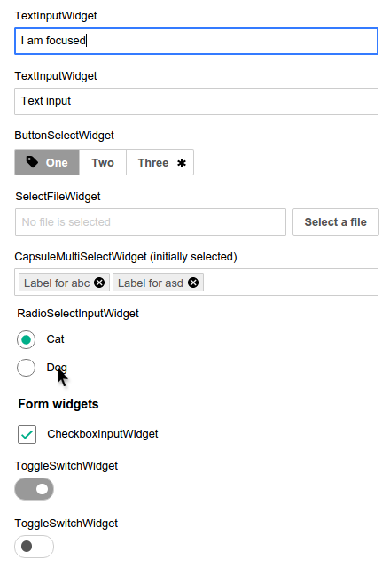
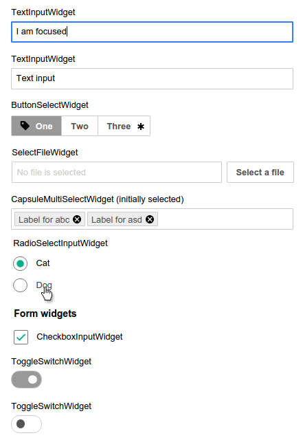
Currently the cursor on labels for checkboxes and radio buttons doesn't reflect the interactive character of the label. We should assign cursor: pointer; to those labels.
Description
Details
| Subject | Repo | Branch | Lines +/- | |
|---|---|---|---|---|
| MediaWiki theme: Give cursor:pointer for labels of checkbox, radio widgets | oojs/ui | master | +2 -0 |
Related Objects
Event Timeline
There are different opinions about adding cursor: pointer; or similar hover effect to a widget's associated label, but in general the majority of voices are pro-cause, as it "can create a stronger and more intuitive affordance for users".
@matmarex In my overview of implementations out there, the CSS class oo-ui-labelElement-label is used in too many places to be a good handle, For example in 'Page Settings' the headline is
label .oo-ui-labelElement-label {} seems to be appropriate. Would you agree? Or would you rather give the label elements a more fitting class?
The other question is, where in an OOjs UI theme does such a rule belong to? As there isn't anything like a reset or normalize included...
Yes, .oo-ui-labelElement-label is used for virtually every label for every widget everywhere, and a bunch of things one might be surprised we call labels.
It's actually rather difficult to apply styles for labels of checkboxes/radios, since it's all very generalized. You could achieve reasonable effects with some broad strokes, like .oo-ui-fieldLayout.oo-ui-fieldLayout-align-inline > .oo-ui-fieldLayout-body > .oo-ui-labelElement-label (that's one nasty selector) to match the kind of FieldLayouts usually used for checkboxes/radios (but potentially usable for any small widget) and .oo-ui-radioOptionWidget .oo-ui-labelElement-label to match radios inside a RadioSelectWidget (there is currently no similar widget for checkboxes – a CheckboxMultiSelectWidget, say – but perhaps one day there will be).
Were we to write such styles, I'd probably put them in .theme-oo-ui-fieldLayout () and .theme-oo-ui-radioOptionWidget () blocks.
As for whether we should… I'm not convinced.
Our checkboxes/radios already have increased "affordance" compared to plain ones – they are more than twice as big (by area) and have a hover effect. They are also supposed to have cursor: pointer. (But… it doesn't work. Whoops! Filed as T115234.) I'm not sure if we need more things on top of this.
Note that modern versions of both Chrome and Firefox (but not Internet Explorer) apply :hover styling of <input> elements also when their associated <label> is hovered by the user, which magically supports the biggest recommendation of the article you linked.
My opinion is that with T115234 fixed (cursor: pointer on the widgets themselves, but not labels) we'll have more than enough "affordance" on our checkboxes and radios.
I think for non-expert users it'd be a nice improvement, especially because the user doesn't have to target the pointer device over a smaller box (widget itself) to choose and it is currently per default not clear that the connected label will trigger the state.
As you've said with the associated <label> that's true only for modern Firefox and Chrome, but not for other browsers. Adding a :hover state on offers a clearer connection at a quite low development cost.
| Before | After |
It should actually be easy to implement the same behavior in OOUI for other browsers, since we usually nest the <input> inside the <label>.
		&:focus:hover + span,
		&:hover + span {
			border-bottom-width: @input-hover-border-bottom-width;
		}
Would become:
		&:focus:hover + span,
		&:hover + span,
		label:hover & + span {
			border-bottom-width: @input-hover-border-bottom-width;
}Change 285767 had a related patch set uploaded (by Jforrester):
MediaWiki theme: Give cursor:pointer for labels of checkbox, radio widgets
This is only true for the real labels, and not for the ones in which we simulateLabelClick (obviously).
@Volker_E Are those screenshots of IE?
With simulateLabelClick around, I don't think its a bad idea to implement:
- setting cursor:pointer on :hover on any label that is going to simulateLabelClick
- activating the :hover state of the widget on which it would have simulated label click
Not too sure about the second one. What do you folks think?

