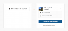
We'll have to figure out how to show the thumbnail, do we show a cropped and clipped version (booo!) or do we show it in the ratio the image actually is (where do we fit that?).
Description
Description
Details
Details
| Status | Subtype | Assigned | Task | ||
|---|---|---|---|---|---|
| Declined | dchen | T118706 Conduct heuristic evaluation of image upload and insert flow in VisualEditor | |||
| Open | None | T115858 Design improvements for mw.ForeignStructuredUpload.BookletLayout | |||
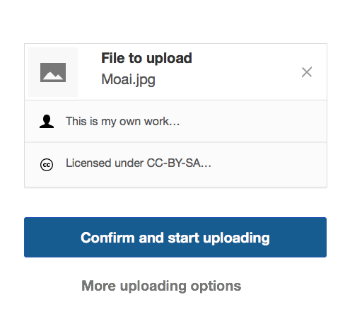
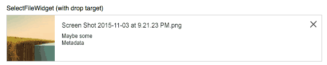
| Resolved | • Prtksxna | T115860 Show image thumbnail in both steps of mw.ForeignStructuredUpload.BookletLayout | |||
| Resolved | • Prtksxna | T124571 "Paper clip" like icon required to show that a file is attached | |||
| Resolved | • Prtksxna | T115721 Switch on showDropTarget in the SelectFileWidget of Upload.BookletLayout |
Event Timeline
Comment Actions
Awesome! Then we only need to show it in the name/description page. Maybe we can show a disabled version of the same OO.ui.SelectFileWidget?
Comment Actions
I'd suggest using more explicit controls in the first stage (clearly asking for the file first and clearly representing the file once selected):

An inviting input file (that works as a way to open the file selection but also to invite for drag&drop). Once the user selects a file, I think it is better to represent the file element itself with an option to discard it (which will turn it back into the selector).
In that case, I think it makes sense to keep the image preview as the same image element without the option to discard.
Keeping the preview of the file in the description stage allows for the user to add some details related to the image (e.g., "on the left side of the yellow box").
Comment Actions
@Pginer-WMF I like this but it is a bit disconnected from the rest of the theme. If we are going to have a specially styled control for the upload wizard that could be ok, but we should also have a generic looking control that can be used alongside existing form elements.
Comment Actions
Change 247092 had a related patch set uploaded (by Esanders):
SelectFileWidget: Show image preview
Comment Actions
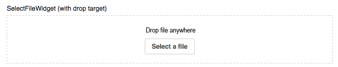
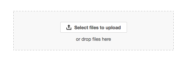
So as can be seen on the current iteration of this widget the main components are:
- A drop zone
- A 'click to browse' button
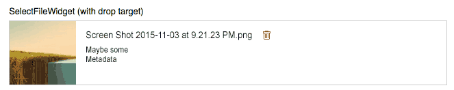
- A 'selected file info' display which contains a filename and possibly a mime type and a thumbnail (but sometimes not)
- A clear button
It is possible to merge (1) and (2) but if that is done it should be clear that the resulting control needs to be labelled and styled such that it is clear is both a clickable button and a drop target as users may have a preference/accessibility requirement for either.
With (3) it needs to be considered that mime type and thumbnail may not be available (and we won't know until the file is selected).
In the current design, the select file button & drop zone are visible at all times, whereas in Pau's design they are only available when no file is selected. We should be aware of the pros and cons of both approaches.
For reference:
Comment Actions
@Pginer-WMF I like this but it is a bit disconnected from the rest of the theme.
Just to clarify, the mockups were not trying to reflect the specific visual style, just some ideas to simplify the interaction that can be executed on whichever visual style is used. The result is expected to be consistent with the rest of the look and feel of the component. So I agree there is still some visual design iterations to be made in order to make sure the components fit well in the panel.
It is possible to merge (1) and (2) but if that is done it should be clear that the resulting control needs to be labelled and styled such that it is clear is both a clickable button and a drop target as users may have a preference/accessibility requirement for either.
Making the button bigger and clearly labelling it may work well, especially if we include the drop invite as the user drags over the file.
Note that this is intended to solve two different problems:
- Provide a clear next step. The methods are presented as alternative options (i.e., drag&drop not perceived as another field to fill for those users not used to it).
- Connecting input and output. The file is represented in the same place you dropped/selected it. Connecting input closer to output follows the principles of direct manipulation. With the current approach, acting on the drop target or the select button affects a third different element, and trying to click on the "no file selected" does not allow to add a file for it since it is just for output.
With (3) it needs to be considered that mime type and thumbnail may not be available (and we won't know until the file is selected).
For those cases a default fallback placeholder can be used (generic or specific for the mime type). For example:
In the current design, the select file button & drop zone are visible at all times, whereas in Pau's design they are only available when no file is selected. We should be aware of the pros and cons of both approaches.
I think that once a file is selected, the controls to select again just add clutter. Having a clear way to go back seems enough considering the frequency at which we expect users need to undo. And even in those cases it could me more straightforward having one clear way than three controls for such purpose (delete, select and drop) even if it takes one extra click.
I think that the above principles can be useful for any workflow involving file selection (e.g., a process to upload multiple files will also benefit from the reduction of controls as man files get added). So I think it makes sense to support it as a general file input component.
Comment Actions

For just the design of the SelectFileWidget, I don't think we need the extra textbox and button when showing a drop target, at least not in the current order. How about this:
Empty
Full
I think the actions are clear enough and it'll work for UploadWizard too.
Comment Actions

I'd consider some changes:
I'd consider a couple of adjustments:
These look good. Just some comments:
Empty
I'd consider some changes:
- Use the button as the most prominent action and the drag&drop label as a clarification. In that way the main action is clear first with the invitation to use drag&drop as an alternative shortcut to achieve it. Adjusting the language to make it clear that both are complementary actions can help (if there are i18n issues presenting the second action in that way we can look for more verbose alternatives such as "You can also drop files here" )
- Use an icon to communicate more clearly that the action is about uploading.
- Add some contrast to the dropping area. That would help to better communicate the elements inside are connected and facilitate identifying the area itself.
Full
I think the actions are clear enough and it'll work for UploadWizard too.
I'd consider a couple of adjustments:
- The discard action seems attached to the file name. If the whole element represents the media element, I'd expect the discard action to be connected to the whole thing.
- Use a discard metaphor instead of a delete one. From the user perspective the file has not been published yet, so there may not be anything to destroy. The idea of canceling the selection seems more appropriate in this context.
Comment Actions
This is starting to look remarkably like the uploads in UploadWizard. (That's probably a good thing.)
Comment Actions
@matmarex Should we be changing OO.ui.SelectFileWidget or subclass it for use in mw.ForeignStructuredUpload.BookletLayout?
Comment Actions
I really don't know. Ed's patch tried to put it in SelectFileWidget
itself, I think that's reasonable, but so is doing it in
ForeignStructuredUpload.BookletLayout.
Comment Actions
Change 265279 had a related patch set uploaded (by Prtksxna):
wip: SelectFileWidget: Show thumbnail when dropTarget is shown
Comment Actions
Change 265279 merged by jenkins-bot:
SelectFileWidget: Show thumbnail when dropTarget is shown
Comment Actions
Once the OOjs release with this patch is in core we can resolve T115721: Switch on showDropTarget in the SelectFileWidget of Upload.BookletLayout which will show the thumbnail on the first page. We can then use https://doc.wikimedia.org/oojs-ui/master/js/#!/api/OO.ui.SelectFileWidget-method-loadAndGetImageUrl to load the image on the next page.
Comment Actions
We should also start the stash upload as soon as the file is selected (as with the Commons upload wizard).
Comment Actions
Change 269978 had a related patch set uploaded (by Prtksxna):
UploadBooklet: Show image thumbnail in both steps
Comment Actions
Change 247092 abandoned by Bartosz Dziewoński:
SelectFileWidget: Show image preview
Reason:
Yeah, superseded by https://gerrit.wikimedia.org/r/#/c/265279/ .
Comment Actions
Change 269978 merged by jenkins-bot:
UploadBooklet: Show image thumbnail in both steps