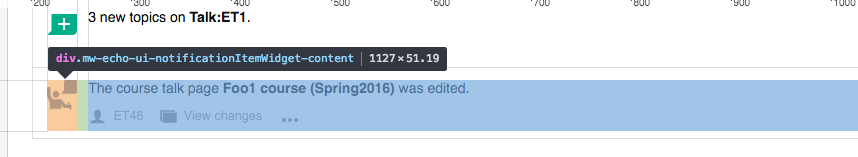
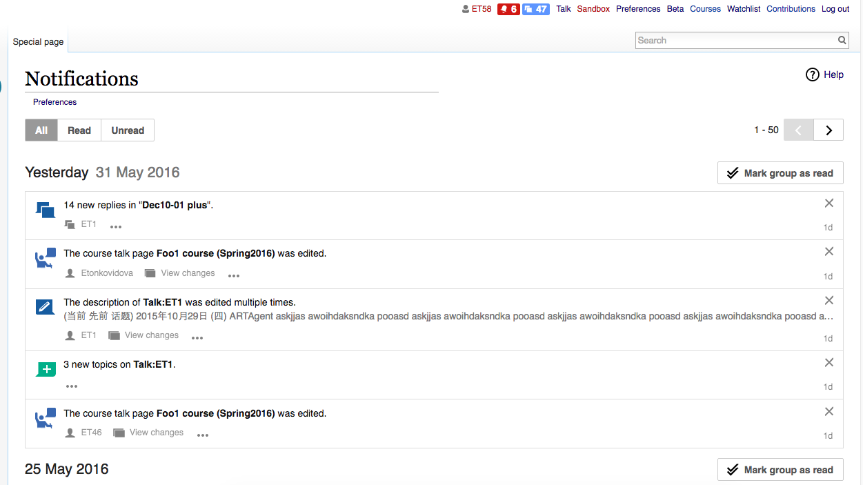
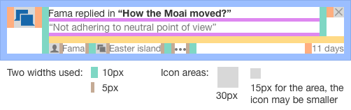
Notification items in the Notification Page don't seem to follow the layout guidelines used for the notifications in the Notification panel:
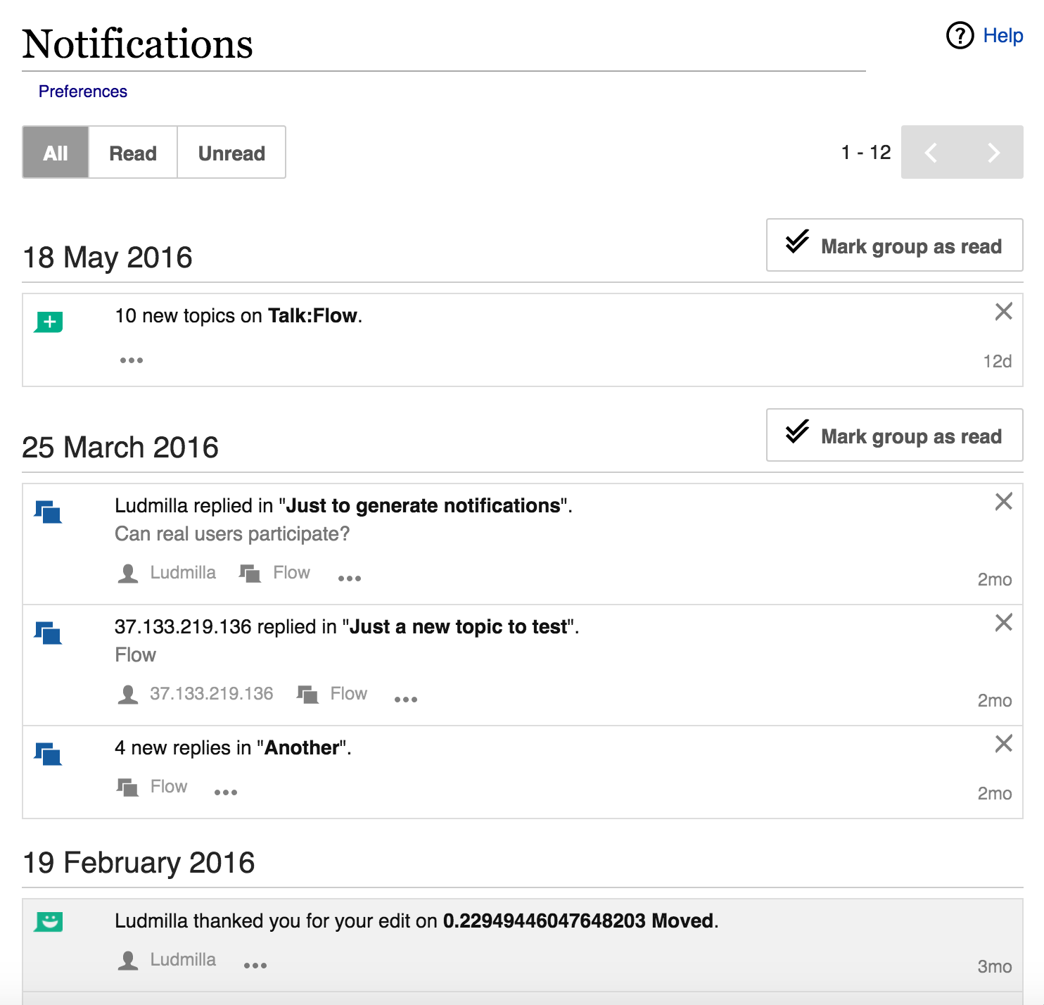
Current state:
Current state with some of the layout guidelines on top:
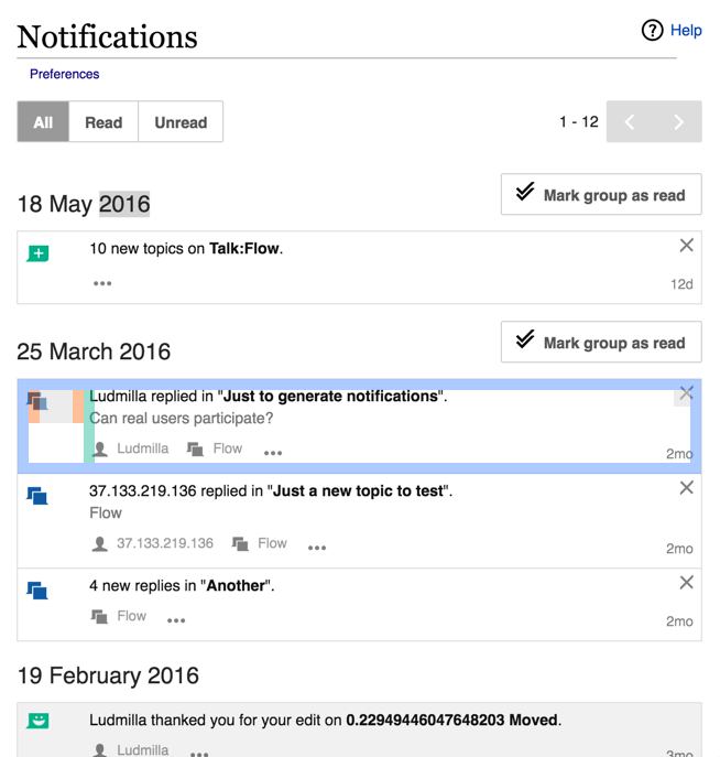
Some aspects to adjust:
- Icon size, and position.
- "X" icon position.
- Timestamp position.
- Left margin adjustments.