Page MenuHomePhabricator

Review and fix the description of autocomplete profiles (completion suggester) in the Search preference tab
Closed, ResolvedPublic

Assigned To
Authored By
dcausse
Oct 13 2016, 8:47 AM
Referenced Files
F4648536: comp_sugg_prefs_details.png
Oct 24 2016, 9:21 AM
F4648529: comp_sugg_prefs.png
Oct 24 2016, 9:21 AM
F4603990: search settings.jpg
Oct 14 2016, 7:59 PM
F4603598: Screen Shot 2016-10-14 at 10.05.14.png
Oct 14 2016, 5:10 PM
F4601412: Screen Shot 2016-10-13 at 4.06.08 PM.png
Oct 13 2016, 10:07 PM
F4600689: Screen Shot 2016-10-13 at 10.14.38.png
Oct 13 2016, 5:48 PM
Tokens
"Cup of Joe" token, awarded by RandomDSdevel."100" token, awarded by CKoerner_WMF."Like" token, awarded by Deskana.

Description

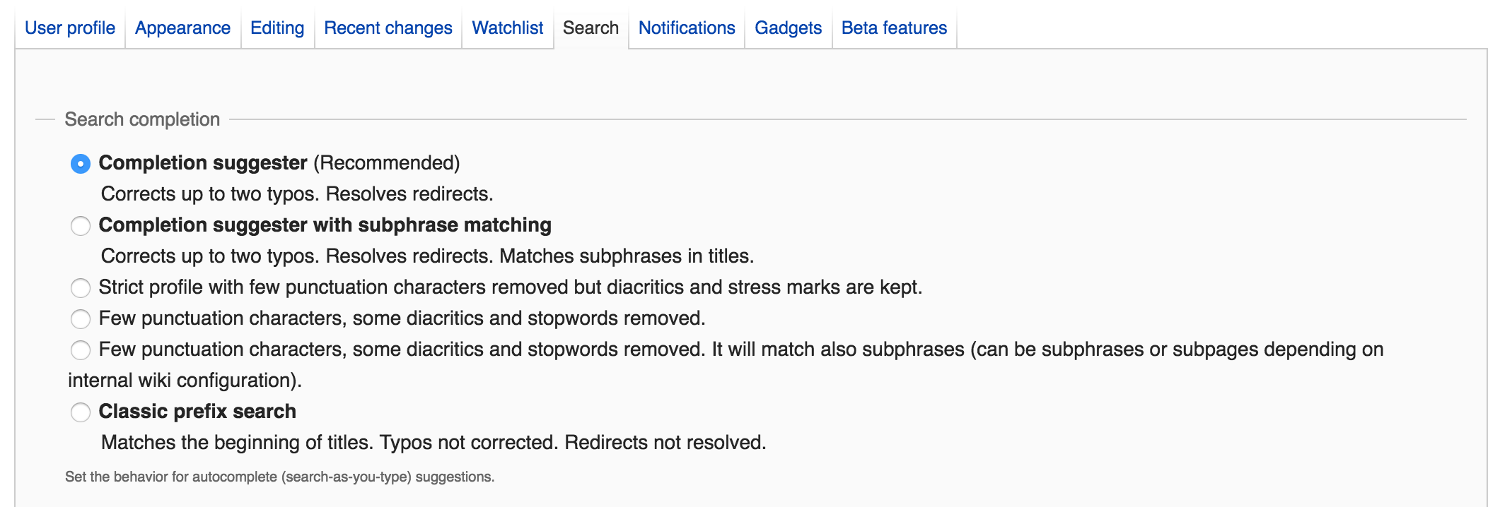
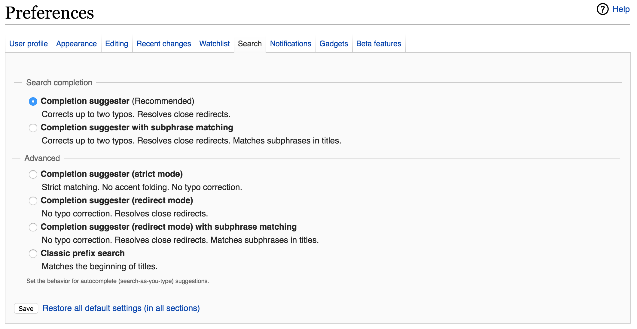
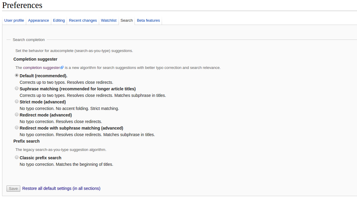
Currently the wording of the profiles available in the Search preference tab is unclear and obscure. We should come up with a better and clearer description of each behavior. This feature is available to logged-in users.

Here's the existing search profiles page:

Screen Shot 2016-10-13 at 4.06.08 PM.png (435×750 px, 74 KB)

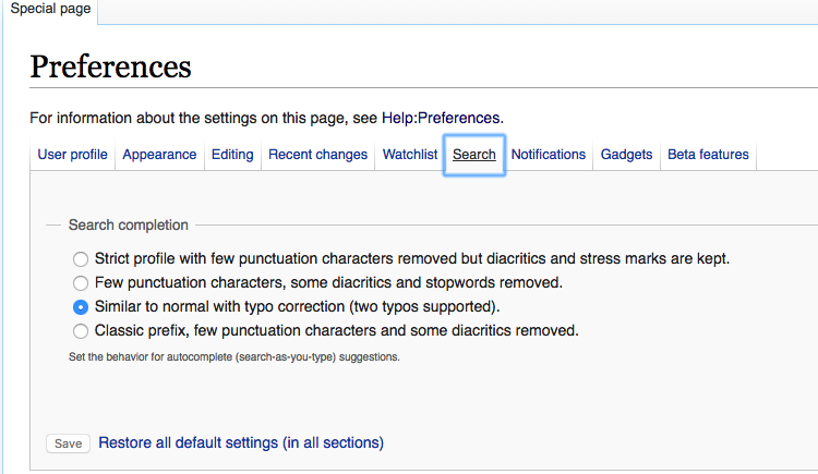
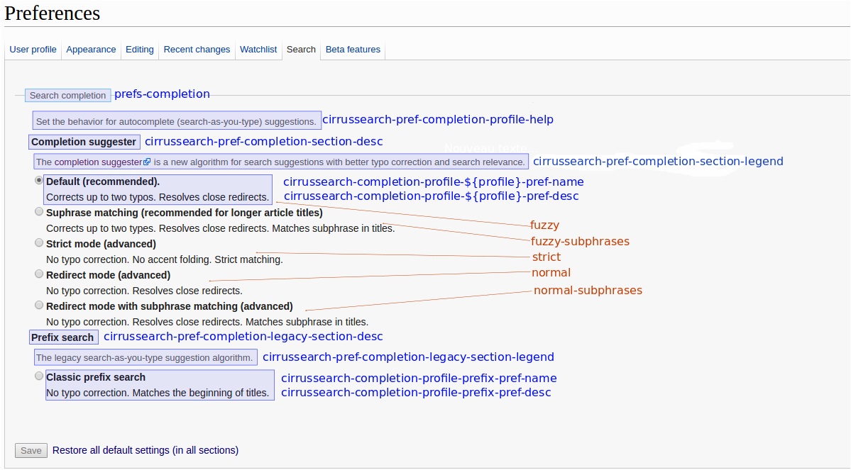
The goal is to have a clear set of descriptions for the various completion suggester behaviors. These descriptions should make it clear which option is considered best for most users, so that less technical users are clear on which option is the default. More detailed descriptions of each option can be included in the technical documentation, for advanced users.

Why not have this as part of Special:Search? The number of options prohibits easy integration with Special:Search.

Event Timeline

I'll put together a first proposal for this.

I started work on this. The general way I'm going is that descriptions should contain as little jargon as possible. That said, these are fairly technical options, so some jargon is okay. The terminology should also be consistent with previous communications; it's likely the only users that will end up on this page have read our comms, so we can use terms like "Completion suggester" to convey what's there.

But... I hit a wall. I don't understand what some of the options do relative to the others. I think the easiest solution would be for me to have a hangout with someone who does understand so we can tweak it, then present the first draft here for review.

Here's what I have so far in the first iteration.

I reordered the options so that the ones that we think are "better" are near the top, and the ones that we think are "worse" are near the bottom.

@dcausse will add some comments on here so I have what I need to write descriptions for the remaining ones.

Screen Shot 2016-10-13 at 10.14.38.png (718×2 px, 197 KB)

Note that I'm not intending that to be the final design; I found it easier to think about what text I needed if I saw it in its actual context. I'll need a consult from @Jdrewniak on how to make the design... well, designed. ;-)

debt subscribed.

I added in the existing profile page wording (see task description above)...and am wondering why we're doing more of a bullet-point structure to the updated (new) options, rather than sentences like we have now.

am wondering why we're doing more of a bullet-point structure to the updated (new) options, rather than sentences like we have now.

It's more concise, as it allows users to consume bite-size bits of information that are not necessarily related to each other. It also allows us to reuse previous terminology such as "completion suggester" and "prefix search" more easily, whilst demoting the details in importance.

I'm far from being set on us having bullet points, but I do think it helps.

Thanks for looking into this, the wording was initially designed for the API help:
See the profile param in https://en.wikisource.org/w/api.php?action=help&modules=opensearch
And the original messages sometimes refer to another one by using the profile name. Unfortunately these profile names are not visible in the user preference tab.

What we have here is 3 (or 5 when subphrases are available) variations of the completion suggester and one profile for the classic prefixsearch.

If I reuse the wording used by Dan it'd look like :

  • Completion Suggester (Recommended) - (internal name: fuzzy)

Corrects up to two typos. Resolves close redirects.

  • Completion Suggester with subphrase matching - (internal name: fuzzy-subphrases)

Corrects up to two typos. Resolves close redirects. Matches subphrases in titles.

  • Completion Suggester (Strict) - (internal name: strict)

Strict matching (no accent folding), no typo correction.

  • Completion Suggester (Normal) - (internal name: normal)

Typos not corrected. Resolves close redirects.

  • Completion Suggester (Normal) with subphrase matching - Normal - (internal name: normal-subphrases)

Typos not corrected. Resolves close redirects. Matches subphrases in titles.

  • Classic prefix search - (internal name: classic)

Matches the beginning of titles. Typos not corrected.

Examples of usage:
For the page "Le cinquième élément" on a french wiki (with french stopwords)

descqueryfuzzyfuzzy-subphrasesstrictnormalnormal-subphrasesclassic
simple queryleXXXXXX
ignore stopwordscinquXXXX
accent foldingle cinquiemeXXXXX
typo correctionle cinqiemeXX
subphraseelemXX
subphrase with typoelemntX

Some users started to customize it on enwiki:

+----------+----------+
| up_value | count(*) |
+----------+----------+
| classic  |        9 |
| normal   |        4 |
| strict   |       26 |
+----------+----------+

Thanks @dcausse! I incorporated your text here.

I played around with changing "normal" (which may hint to users that that's the default mode, which it isn't!) to "redirect" mode, which I think is clearer. Still, I don't think that's totally optimal, so suggestions are welcome!

I also tried breaking it up into "standard" and "advanced" modes so that less advanced users don't get confused or overwhelmed with the number of options.

I took a look at the other options in preferences, and none of them have any bold text in them at all. I'm reconsidering whether to use bold text, to aid with standardisation.

Here's the latest draft:

Screen Shot 2016-10-14 at 10.05.14.png (1×2 px, 235 KB)

@Deskana that's certainly miles better than the current settings :). Design wise I don't see anything wrong with sticking to simple form elements for these setting. I like how the bullet points can help group the options together, maybe putting them in the same order could work, like the "No typo correction" point first maybe?

I've taken a stab at it too, haven't changed the wording much (added a description of what completion suggester is) but the grouping is a little different: 'completion suggester' & 'prefix-search' instead of 'search-completion' & 'advanced' ... not sure which one I prefer though.

search settings.jpg (1×2 px, 312 KB)

@Jdrewniak Awesome! I like it!

I prefer the "advanced" layout from the earlier mock, but I think your mock definitely has an advantage in that it can label the preferred option as "default" rather than "completion suggester" in mine. Your method avoids a lot of redundant text.

I'll play with my mock a little and see if I can get somewhere between the two...

@Deskana, @Jdrewniak thanks!

I'm not a big fan of 'redirect mode' but I don't have better suggestions. Basically this profile is the same as the default one without automatic typo correction. normal, regular, exact would work but they seem misleading as well.

Since we are adding a link to the comp suggest help page I suppose we can add the table with some examples to help users understand the difference between those?

I'll start to work on a patch in cirrus to change the layout.

I'm not a big fan of 'redirect mode' but I don't have better suggestions. Basically this profile is the same as the default one without automatic typo correction. normal, regular, exact would work but they seem misleading as well.

Yeah, I agree that "redirect mode" is suboptimal. Calling it that somehow implies that the default does not have this feature, which of course it does. I think calling it "no typo correction" or something might be better. I'll have a think...

Since we are adding a link to the comp suggest help page I suppose we can add the table with some examples to help users understand the difference between those?

Sounds good. Adding the detailed notes to the documentation so that interested advanced users can find it is good. Then we can keep the preferences page simpler, with a link to the documentation for advanced users.

I'll start to work on a patch in cirrus to change the layout.

Great! Once that's done, we can tweak the "redirect mode" wording (based on the above discussion).

Deskana subscribed.

Reassigning to @dcausse since he says above that he's working on it.

CKoerner_WMF renamed this task from Review and fix the description of autocomplete profiles in the Search preference tab to Review and fix the description of autocomplete profiles (completion suggester) in the Search preference tab.Oct 21 2016, 3:46 PM
CKoerner_WMF updated the task description. (Show Details)

I had to use the layout suggested by @Jdrewniak, I can't have separate sections and a single preference:
It looks like

comp_sugg_prefs.png (663×1 px, 81 KB)

And here is the same image with the names of the i18n messages:

comp_sugg_prefs_details.png (663×1 px, 138 KB)

Change 316985 had a related patch set uploaded (by DCausse):
Completion suggester user pref page

https://gerrit.wikimedia.org/r/316985

Change 316985 merged by jenkins-bot:
Completion suggester user pref page

https://gerrit.wikimedia.org/r/316985