Page MenuHomePhabricator

Update Navigation Drawer color scheme
Closed, ResolvedPublic

Description

Goal
As we have updated all our products to use new color scheme M82 , we need update MobileFrontend to use these new colors. The last part of MobileFront which needs to move on to new color scheme is the navigation drawer.

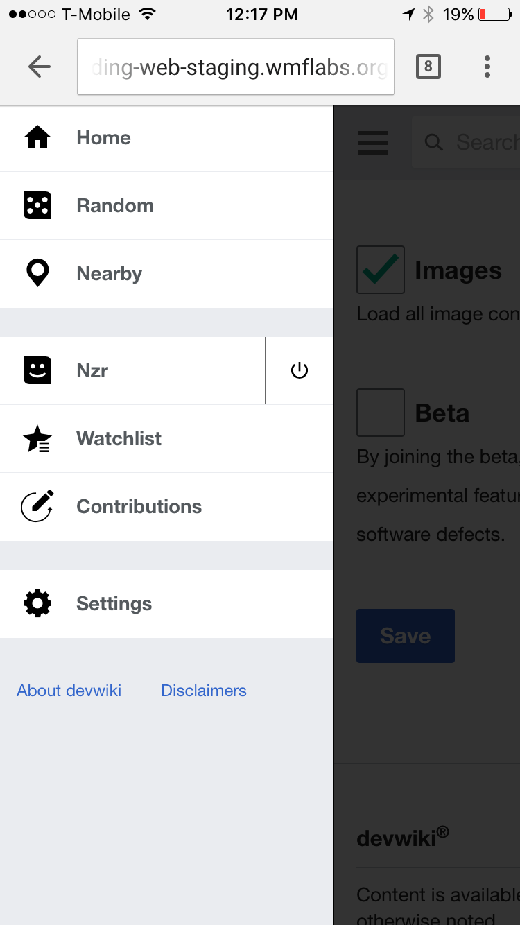
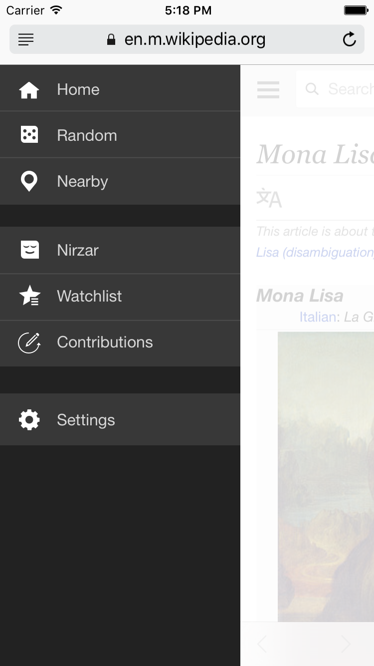
MobileFrontend navigation drawer is black and really odd. It's not on-brand for Wikipedia. Another issue with the white overlay and black drawer is that the users attention goes towards the bright white patch rather than the navigation drawer itself.

Solution
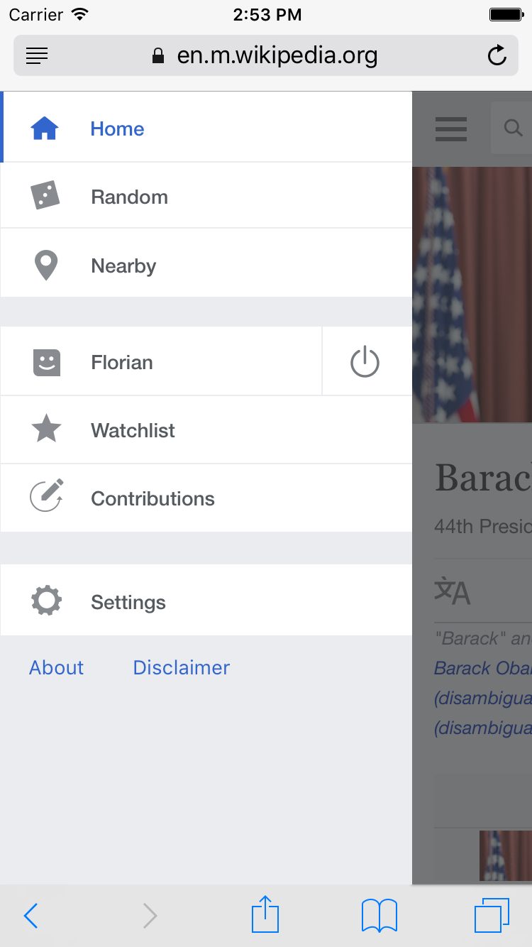
We would like to invert the color scheme to use clean and white navigation drawer for Wikipedia. it's easier to read and the selected and deselected options have much more contrast.
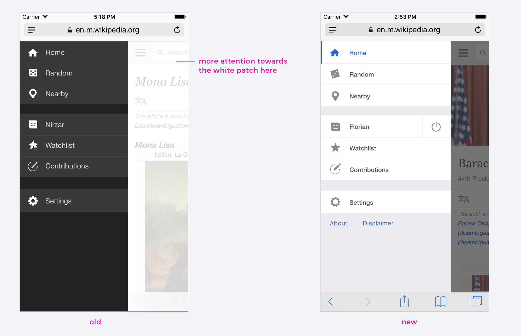
comparison-2.png (1×2 px, 430 KB)

Before

Main menu.png (1×750 px, 211 KB)

After

Main menu - new.png (1×750 px, 170 KB)

    1. Acceptance criteria
  • There should be no increase in the payload of the icon css due to the shipping of gray icon variants (e.g. we shouldn't ship all the icons twice in gray and black)

Event Timeline

From conversation with @Nirzar today, opacity for .transparent_shield should be set to 0.8 like currently with the white overlay, not 0.95 like in the layouts.

Volker_E updated the task description. (Show Details)

Change 317746 had a related patch set uploaded (by VolkerE):
Overhaul navigation drawer to better focus on navigation

https://gerrit.wikimedia.org/r/317746

@ovasileva we have a patch for this in the current sprint. Do we want to line this up for next sprint or pull it into the current sprint? Given the change is noticeable I want to make sure everyone in the team knows this is happening.

@Jdlrobson yeah if we have time? is the patch ready to merge or ready to review?

@Nirzar There's an issue with the current patch, but also open question to MobileFrontend maintainers on how to deal with the icon coloring specifically. Probably setting a meeting with @Jdlrobson as useful next step.

Waiting for @Volker_E to respond to review!
@Nirzar is this something we want to delay in beta/feature flag until the new site chrome header is ready as well?

@Jdlrobson not really. they seem to be independent elements? unless we are touching the hamburger menu which we are not.

@Nirzar @ovasileva consider bumping this to next sprint. I think it's more realistic to work on it next sprint (and maybe estimate).

Next sprint is fine. @Jdlrobson - is this still just for review?

Change 324370 had a related patch set uploaded (by Jdlrobson):
Hovering over links in menu should change icons to blue

https://gerrit.wikimedia.org/r/324370

@Jdlrobson @Volker_E

following points needs fixing

  • The icons look pure black by default. Can we use B20?
  • the animation for fadein of the black overlay on right side is jarring. can we make it smooth somehow. the earlier fading to white was the same but because it wasn't contrasting it felt smoother
  • the opacity of the black overlay seems really high. the point reversing the colors was to put more focus on the drawer and the not the overlay but looking at how dark the black is and not to mention the so much width, my attention is now at the black patch on right.
  • the vertical line for logged in is too dark, B50 or B70 perhaps

IMG_2153.PNG (1×750 px, 102 KB)

Is there any way we can increase the width of he drawer?

FYI devs the colors B20 /B50/B70 are documented on M101. I had to ask about that.

@Jdlrobson @Volker_E

following points needs fixing

  • The icons look pure black by default. Can we use B20?

I think we can set a fill of @grayMediumDark on all the svg icons... the only down side is we can't define that in one central place so it's gonna be hard to change in future.

  • the animation for fadein of the black overlay on right side is jarring. can we make it smooth somehow. the earlier fading to white was the same but because it wasn't contrasting it felt smoother

The current animation is transform 0.25s ease-in-out
what should it be?

  • the opacity of the black overlay seems really high. the point reversing the colors was to put more focus on the drawer and the not the overlay but looking at how dark the black is and not to mention the so much width, my attention is now at the black patch on right.

This refers to transparent-shield cloaked-element.
Easy to change opacity once you let us know what.

  • the vertical line for logged in is too dark, B50 or B70 perhaps

Should be easily done.
That's @grayMediumLight or @grayLight in developer terms.

IMG_2153.PNG (1×750 px, 102 KB)

Is there any way we can increase the width of he drawer?

We can but I'd recommend doing that in a follow up task as we'll need to do some extended testing on different devices and resolutions.

We can but I'd recommend doing that in a follow up task as we'll need to do some extended testing on different devices and resolutions.

sure

transform 0.25s ease-in-out

there should be a transition property on the shield element so the shield fades in while the mw-center is moving.
opacity 0.25s ease-in-out

Change 317746 merged by jenkins-bot:
Overhaul navigation drawer to better focus on navigation

https://gerrit.wikimedia.org/r/317746

Jdlrobson changed the task status from Open to Stalled.Dec 1 2016, 11:08 PM

@Volker_E is not convinced that the second patch which adds the hover effects is the right one.
I don't think it makes sense to ship additional icons for the hover states.

We should either wrap this up as is, or someone (other than me) will need to make a strong case for the current or an alternative approach.

bmansurov changed the task status from Stalled to Open.Dec 2 2016, 9:14 PM
bmansurov reassigned this task from Volker_E to Jdlrobson.
bmansurov subscribed.

Assigning to @Jdlrobson as his patch is the last in the series.

I've folded the remaining work into a separate subtask to keep this one focused. We can leave this one open until that's resolved or resolve it... I'll leave that to Nirzar and Olga.

resolving this and will double-test with the new task

Ladsgroup raised the priority of this task from Medium to Needs Triage.Dec 5 2016, 8:55 PM
Ladsgroup moved this task from Review to Done on the UI-Standardization-Kanban board.

Any reason this didn't go through the QA column? We've already found 2 serious regressions which is disappointing (broken in RTL - https://gerrit.wikimedia.org/r/326209 ) and Firefox icons T152732

@Jdlrobson, according to T148108#2847463, you moved the task to Ready for Signoff skipping QA.

In the past we've written qa tests inside the sign off column but that's not the point...

Let me rephrase the question - it seems we made a mistake here - should we get a qa plan written?

Liugev6 set Security to Software security bug.Dec 12 2016, 6:04 PM
Liugev6 added a project: acl*security.
Liugev6 changed the visibility from "Public (No Login Required)" to "Custom Policy".
Liugev6 subscribed.

@Liugev6 can you revert the visibility change? It does not seem correct and it's impacting our ability to discuss and test this cc @Aklapper ,

They can't, but I don't think they're human. These bots must have figured out OAuth and everything. I'll revert the changes.

Krenair changed the visibility from "Custom Policy" to "Public (No Login Required)".
Krenair removed a subscriber: Liugev6.