Showing the user a list of pages to select is a pattern that is useful in many different contexts.
While it makes sense for the pattern to be adjusted according to the context, it seems that current implementations have discrepancies on common aspects we may want to align.
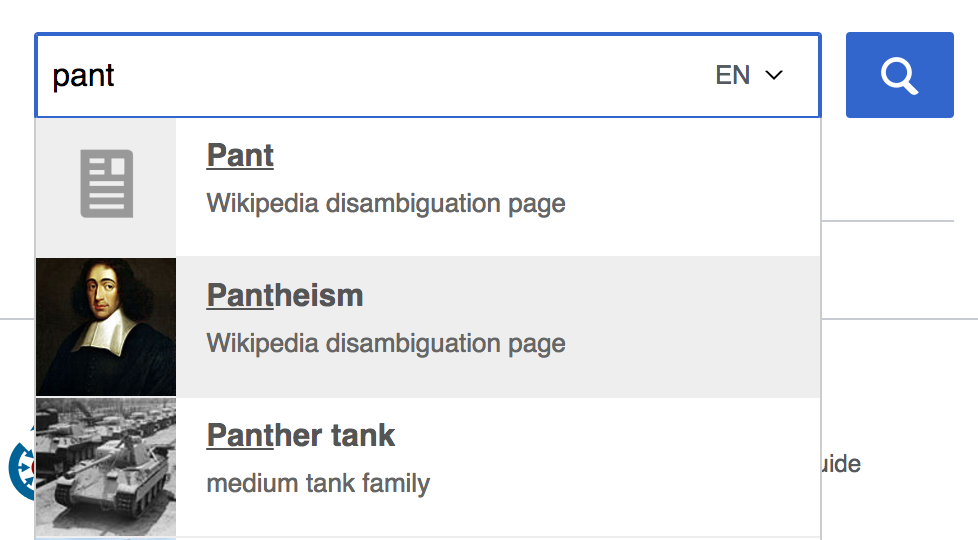
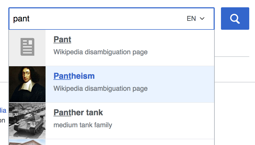
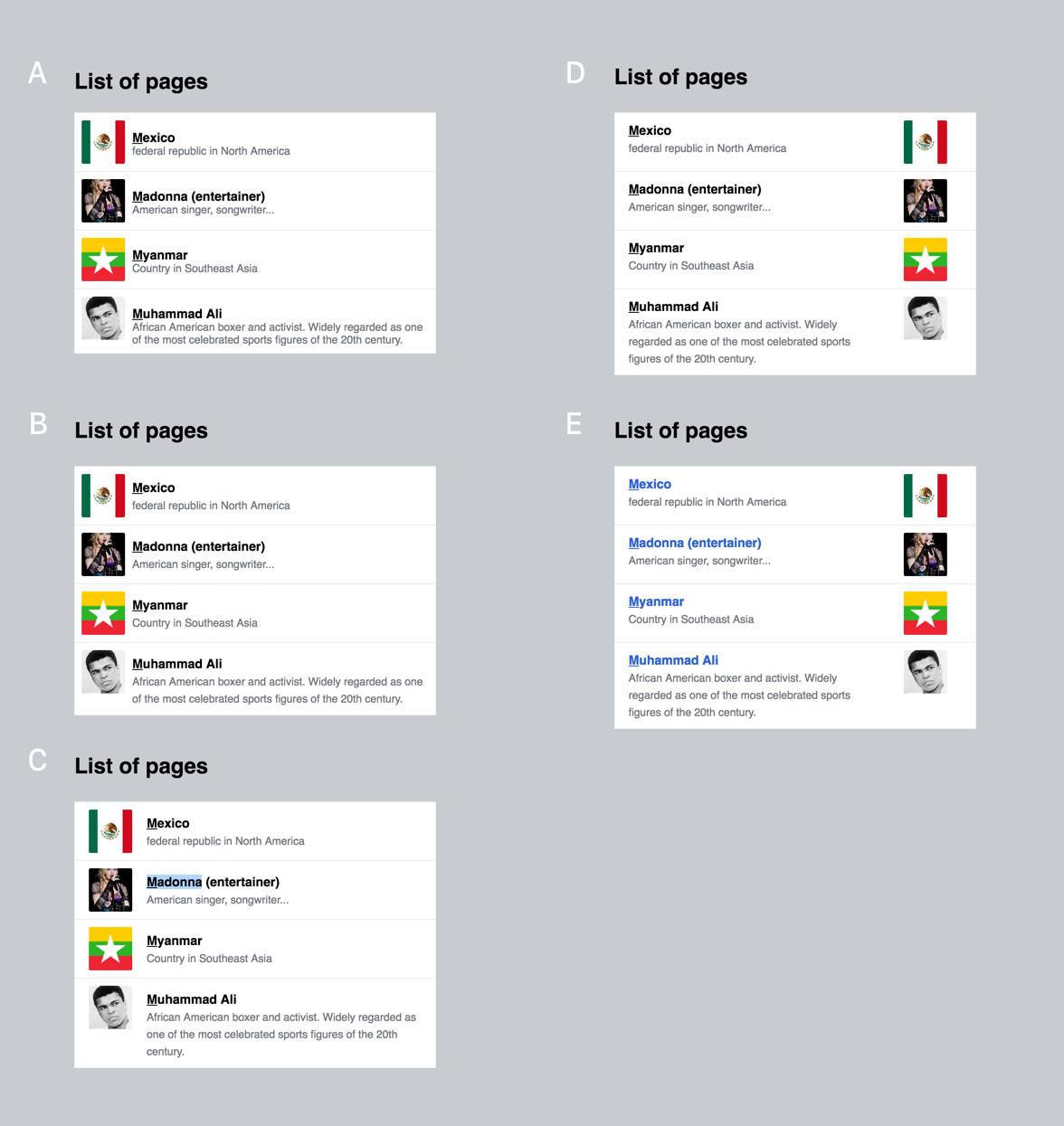
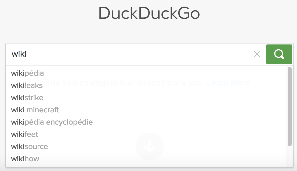
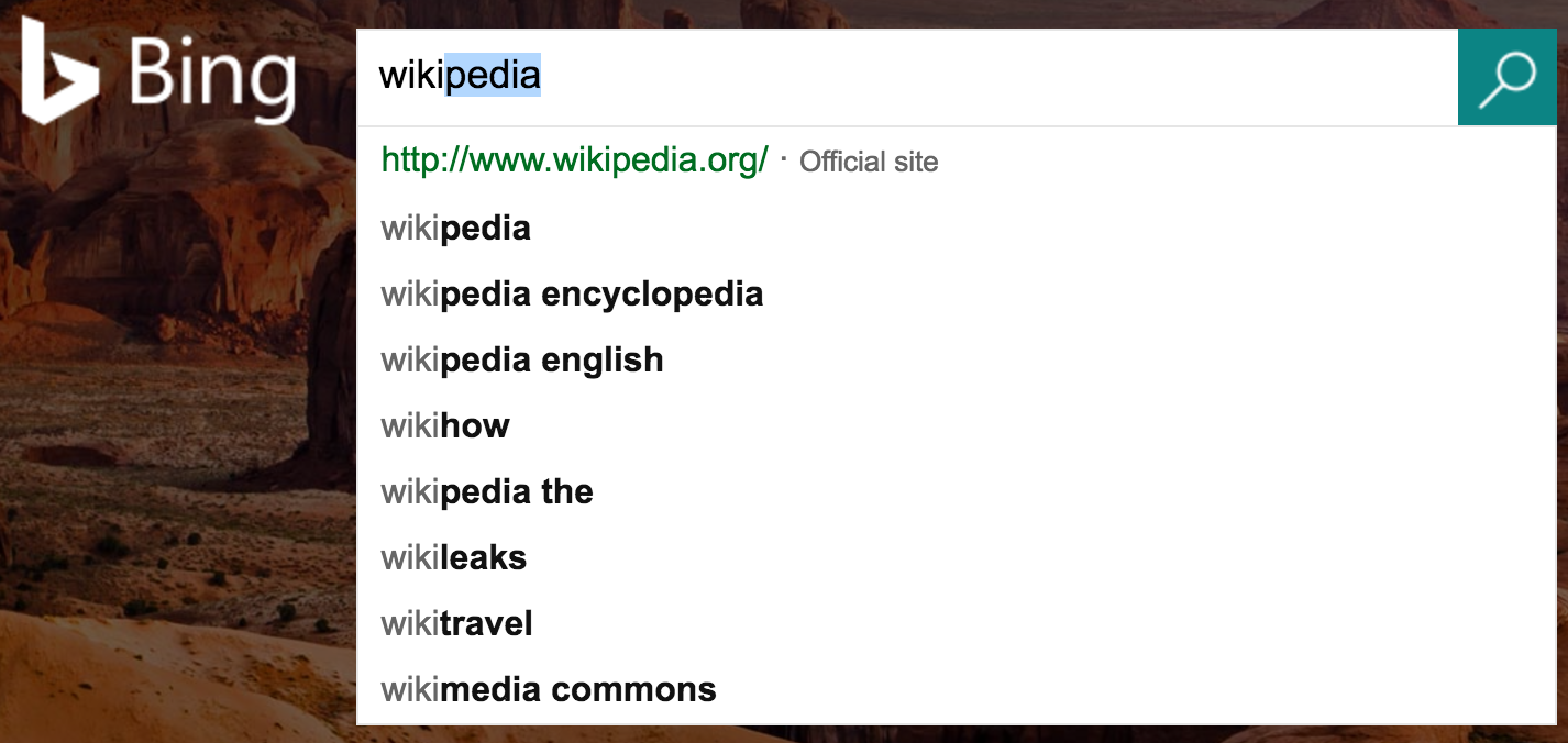
I compared the search box of Wikimedia-Portals with the link selector of VisualEditor, and these are the differences I found:
| Aspect | Portals | Visual Editor | MobileFrontend | Related Pages (mobile - Beta) | WVUI search |
|---|---|---|---|---|---|
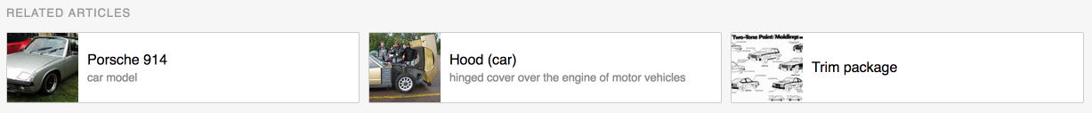
| Screenshot | 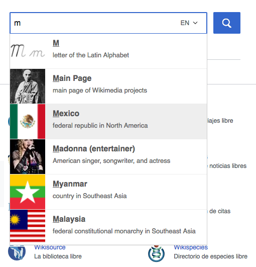 | 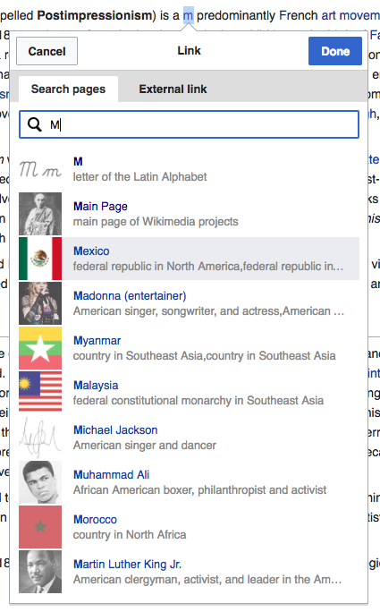 | 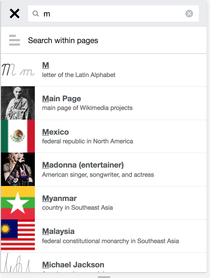 |  | 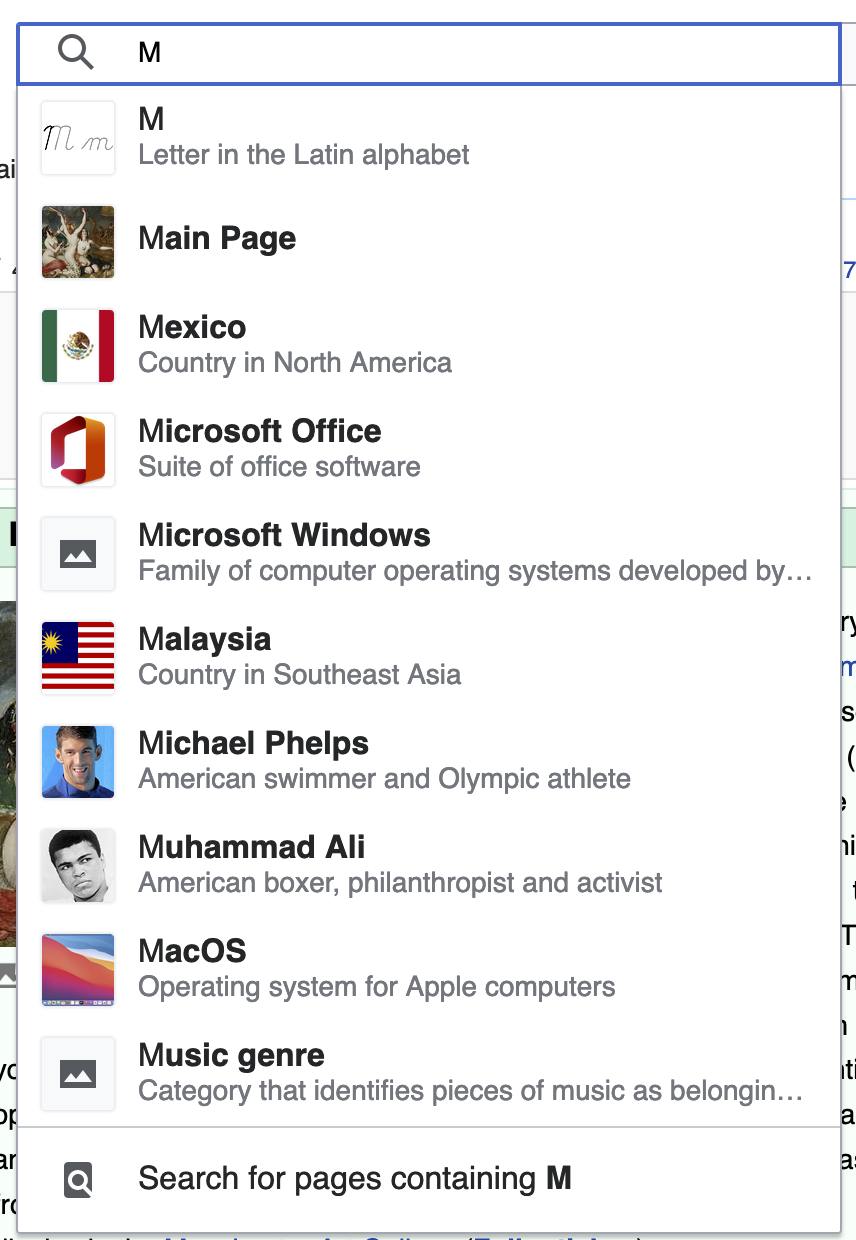 |
| Page title color | Dark grey | Blue | Dark grey | Black | Black |
| Matching part of the title | Underlined | Bolded | Underlined | N.A. | Un-bolded |
| Description text color | Dark grey | Light grey | Dark grey | Dark grey | Dark gray |
| Title and description text size | Title bigger than description | Same size for title and description | Title bigger than description | Title bigger than description | Title bigger than description |
| Description wrapping strategy | Long descriptions wrap to a new line | Long descriptions ends in '...' | Long descriptions wrap to a new line | Long description cropped and ends in '...' | Long description cropped and ends in '...' |
| Image transparency | Images are always opaque | Images are translucent (unless item is hovered) | Images are always opaque | Images are opaque | .. |
| Image size (compared to text) | More prominent | Less prominent | More prominent | Even more prominent | Less prominent |
| Background color on hover | Light grey | Light blue | No change | No change | Light grey |
| Separation between items | Thin line in light grey | Thicker white space | Thin line in light grey | Thin line in light-grey | whitespace |