Page MenuHomePhabricator

Implement 'What's This' Links on the dropdown filter panel
Closed, ResolvedPublic

Description

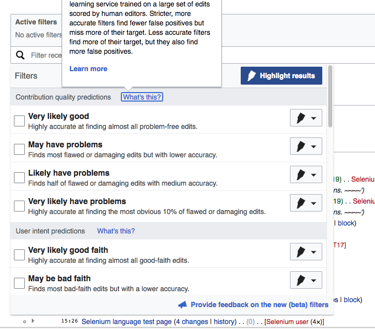
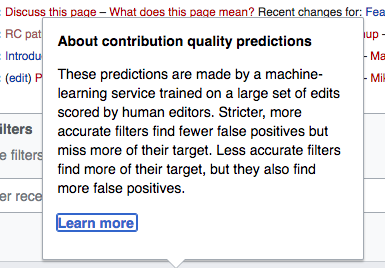
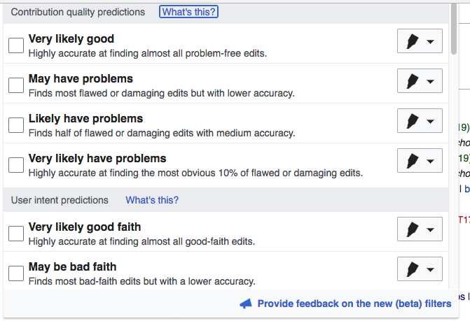
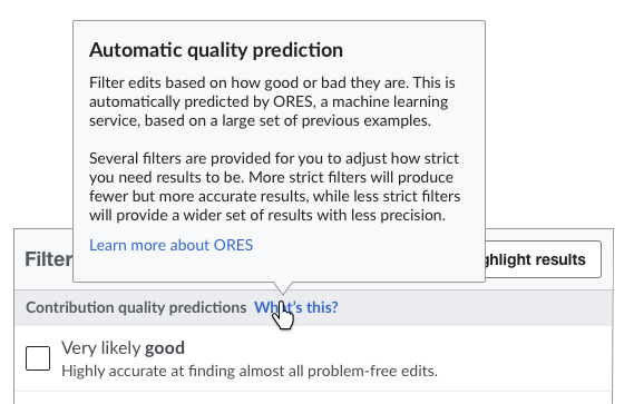
Designs for the dropdown filter panel include two "What's This?" help links next to, respectively, the headers for the filter sections Contribution Quality Predictions and User Intent Predictions. The functionality for these is as follows:

  • Clicking the link displays a popup that persists until the user clicks away from the popup.
  • Th texts displayed in the two popups can be found in T149385 under "Popup help texts (from ‘What’s This?’ links)"
  • Both texts include "Learn more" links at the bottom that go to this help page

rc-filter-panel-layout copy.png (363×569 px, 56 KB)

If you want to see these popus in action, go to the prototype.

Event Timeline

In the task description, @jmatazzoni wrote:

That help page is on mediawiki. @Trizek-WMF. should the links be going to the translated, local versions of the pages?

Help page for predictions
Help page for filtering

Use the Special:MyLanguage syntax will display the user language, if a translation is available.
Section titles will be translated and can't be used as an anchor. It it possible to add anchors if needed.

Change 343222 had a related patch set uploaded (by Mooeypoo):
[mediawiki/core] RCFilters UI: Add a 'what's this?' link to filter groups

https://gerrit.wikimedia.org/r/343222

There are various differences in the feature as implemented vs. as designed:

  • no paragraph breaks are allowed (so I will shorten the messages)
  • Gray text and gray background are apparently not consistent with OOUI standards.

@Pginer-WMF, if you want to make a case for these fine points you need to weigh in.

There are various differences in the feature as implemented vs. as designed:

  • no paragraph breaks are allowed (so I will shorten the messages)

Would it be possible to add each paragraph as a separate message (in the same way that the title and the bottom link act as different paragraphs)?
Making the text more compact seems a good idea, but I think we are trying to convey several different points that even if made shorter users would benefit from going through them in different steps.

If that is too hard, we can live with a single paragraph. However, if this is a restriction of the technology, at least I think we should create a ticket for popups to allow more complex HTML (or at least multiple <p> or <br> elements).

  • Gray text and gray background are apparently not consistent with OOUI standards.

It's ok to use the standard style the OOJS popups use. If we want to do any changes to that, those should probably be done globally.

We can probably make the i18n messages wikitext messages and deliver them to the client as parsed messages in a separate object, but it would be a bit more work.

Change 343222 merged by jenkins-bot:
[mediawiki/core] RCFilters UI: Add a 'what's this?' link to filter groups

https://gerrit.wikimedia.org/r/343222

QA recommendation: Product should weigh in.

Checked in betalabs - below are some minor UI display issues and some questions - @jmatazzoni, please review and let me know if something need to be filed as separate phab tasks:

(1) When the filter search area is clicked, the RC page automatically scrolls up (to adjust to the drop-won filter list). Then, if 'What's this?' link is clicked, the tooltip will not be fully displayed - the page does not scroll to accommodate the full view of that tooltip. So, the user will be seeing the following as a default view:

Screen Shot 2017-03-19 at 3.24.55 PM.png (661×754 px, 153 KB)

And, generally, the viewport does not take into account that the 'What's this?' tooltips are not fully visible - users will need to do some additional scrolling to view the text.

(2) Once the links are pressed, they retained the blue outline (as far as I remember, it's a sort of standard ooui behavior that we are ok with).

Screen Shot 2017-03-19 at 3.37.15 PM.png (268×385 px, 50 KB)

Screen Shot 2017-03-19 at 3.23.41 PM.png (459×671 px, 97 KB)

(3) Has the text for tooltips been reviewed by @Halfak ? Two things that may need some clarification;

Stricter, more accurate filters find fewer false positives [..]

Using 'find' in that context may imply that some deliberate action was performed to specifically find false positive. Whereas, false positive are just being returned; 'returned' is also used in https://www.mediawiki.org/wiki/Help:New_filters_for_edit_review/Quality_and_Intent_Filters (e.g. "The tradeoff here is that they return more false positives.")

Stricter, more accurate filters find fewer false positives but miss more of their target.

vs the phrasing of the same on https://www.mediawiki.org/wiki/Help:New_filters_for_edit_review/Quality_and_Intent_Filters

[...] they return a smaller percentage of their target

The latter sounds more positive (not mentioning that something is missing) and clearer of what will actually happen.

Thanks, @Etonkovidova ! Just a couple of technical comments for consideration:

(1) When the filter search area is clicked, the RC page automatically scrolls up (to adjust to the drop-won filter list). Then, if 'What's this?' link is clicked, the tooltip will not be fully displayed - the page does not scroll to accommodate the full view of that tooltip. So, the user will be seeing the following as a default view:

Screen Shot 2017-03-19 at 3.24.55 PM.png (661×754 px, 153 KB)

And, generally, the viewport does not take into account that the 'What's this?' tooltips are not fully visible - users will need to do some additional scrolling to view the text.

We have the same "problem" (if it is a problem) for the capsule item widgets' tooltips. I personally don't think it's a problem - the user can see that there's a tooltip and scroll up a bit, I don't think that disturbs the flow, especially since unlike the capsule items, this popup appears/disappears on click so moving the mouse when you scroll doesn't risk having the popup disappear, like it does in the capsule items, where the problem may be a bit more important to solve.

On top of that, it would be a little challenging to calculate the accurate height of the tooltip based on its content (which may change, or we may have other tooltips with different text, etc)

We could open the tooltip *downwards* if there's not enough space above, but that depends on a planned OOUI fix by @Catrope, if it's relevant to this case.

(2) Once the links are pressed, they retained the blue outline (as far as I remember, it's a sort of standard ooui behavior that we are ok with).

Screen Shot 2017-03-19 at 3.37.15 PM.png (268×385 px, 50 KB)

Screen Shot 2017-03-19 at 3.23.41 PM.png (459×671 px, 97 KB)

I saw this and it bugged me too - but it's an OOUI feature. I can override it (it's a little annoying to override, but probably possible) but my recommendation is to fix this upstream -- a button that is "framed:false;" should always be unframed... adding a frame to it on click/active state makes no sense to me. @Volker_E and @Pginer-WMF should weigh in here and see if we want to fix it up upstream, fix it only for our local case, or not fix it at all.

I saw this and it bugged me too - but it's an OOUI feature. I can override it (it's a little annoying to override, but probably possible) but my recommendation is to fix this upstream -- a button that is "framed:false;" should always be unframed... adding a frame to it on click/active state makes no sense to me. @Volker_E and @Pginer-WMF should weigh in here and see if we want to fix it up upstream, fix it only for our local case, or not fix it at all.

I cannot say much about how intentional that border is, @Volker_E can probably comment more on this. I know we use similar borders in components for their focus states. For links (and frameless buttons) I think it makes sense to show those borders when the user uses the tab key to move though them, but it is not clear to me we need to keep the focus state after they are pressed. Default links in a browser seem to work this way, showing an outline when the user cycles through them using tab, but not when they are pressed.