When search in the Filter Search Bar finds matches, the first result is highlighted in blue. Pressing enter will select that filter (or unselect it if it is already selected). Up and down arrows will allow to select a different filter from the list of matches. (This was split off from T149435; see that task for more detail about the Filter Search Bar.)
Description
Description
Details
Details
| Status | Subtype | Assigned | Task | ||
|---|---|---|---|---|---|
| Resolved | • DannyH | T171977 Annual Plan 2017-2018, Audiences 5: Increase current editor retention and engagement | |||
| Resolved | • DannyH | T171981 Annual Plan 2017-2018, Audiences 5, Goal 2: Give better ways to monitor contributions | |||
| Resolved | • jmatazzoni | T157642 Graduate New Filters UX out of beta on Recent Changes on ALL wikis | |||
| Resolved | • jmatazzoni | T144458 Launch ERI RC page features as a Beta Feature to all wikis | |||
| Resolved | Mooeypoo | T144448 Build all front-end elements for the new Recent Changes (RC) Page user interface | |||
| Resolved | • jmatazzoni | T149435 Build user interface for the Filter Search Bar | |||
| Resolved | Mooeypoo | T159768 Implement arrow keys in the Dropdown Filter Panel for results found by filter search |
Event Timeline
Comment Actions
Change 344997 had a related patch set uploaded (by Mooeypoo):
[mediawiki/core@master] RCFilters: Adjust to use MenuTagMultiselectWidget
Comment Actions
Change 344997 merged by jenkins-bot:
[mediawiki/core@master] RCFilters: Adjust to use MenuTagMultiselectWidget
Comment Actions
@Mooeypoo The functionality - up and down arrows, pressing 'Enter' for select/deselect works. But the blue highlighting is lost (also mentioned in T163138: [betalabs-regression] RC filters - in drop down filter panel there is no automatic scrolling to selected filter capsule ).
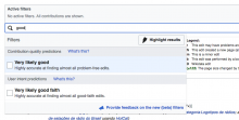
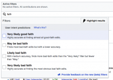
In betalabs, 'good' is a search term - and the first match is shaded.
In ptwiki, 'good' as a search term - the first match is highlighted in blue.
Comment Actions
Okay, I need @Pginer-WMF for this one
In betalabs, you have MenuTagMultiselectWidget that introduces the arrow behavior, and that introduces another background-color-changing-aspect to the mix, which we need to put everything in order and decide how to treat and paint, etc.
There are three connected concepts at play here:
- Selected item - if you clicked the 'tag'/'capsule' of the item, it will select it and scroll to it, or if you literally select, by clicking the item, same thing) -- that appears as light blue background.
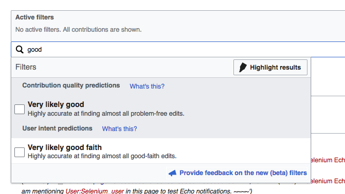
- Highlighted item - if you move the arrows, it doesn't select the item you are on, it highlights in. This is a base behavior for OO.ui.MenuSelectWidget, and currently appears in light grey (like in the image above) that is almost the same as the grey for the headings. It also does not override the selection color, so if I move with the arrows over a selected item, its background remains light blue. (This entire behavior/color is also new to RCFilters through using MenuTagMultiselectWidget and arrow-behavior, which is why you are seeing it in betalabs but not in production)
- Hovered item - If you hover over the items with your mouse, the current behavior is a very very very light grey background - and, like 'highlight' it doesn't override current selection color; so if you hover over a selected item, its background is still blue rather than grey.
All of the above are on top of the "mute" behavior (items in a group get slightly "muted" / light-grey if they're not selected or are subsets, etc)
... I think now that we have arrow behavior that added the "highlight" concept, we could use clarity in the color schemes.
I can change the colors easily. Changing the priorities (hover color overriding selection color, for example) is a little harder but should also be doable -- I just need to know what the rules should be, and I am a little confused about what to decide.
@Pginer-WMF can you help?
- What should happen to the background in each of the above cases?
- Is there a difference in color (for each case above) depending on the "state" of the filter option at all (whether it's muted or not? whether it's bolded or not? whether it's already selected? etc)
Comment Actions
I think that "selected item" and "highlighted item" states should be unified. In both cases we are emphasising an item for the user to focus on, but there should not be two separate selections.
An item can be emphasised by (a) being the first item when searching, (b) being the associated item to a tag the user selected, or (c) moving around with the arrow keys.
For example, selecting a tag emphasises the element in the list, but the user should be able to move that emphasis to the elements above/below with the arrow keys.
Given the different colors used, I think it makes sense to use the light blue for such emphasis.
Comment Actions
Change 351554 had a related patch set uploaded (by Mooeypoo; owner: Mooeypoo):
[mediawiki/core@master] RCFilters: Override highlighted background
Comment Actions
This fix corrects the highlight color to override 'muted' state.
I think the rest of the colors follow @Pginer-WMF 's instructions.
Comment Actions
Change 351554 merged by jenkins-bot:
[mediawiki/core@master] RCFilters: Override highlighted background
Comment Actions
@Mooeypoo - the blue highlighting is still missing for the case:
When search in the Filter Search Bar finds matches, the first result is highlighted in blue.
The following is DONE
Pressing enter will select that filter (or unselect it if it is already selected). Up and down arrows will allow to select a different filter from the list of matches.
To summarize:
Search for filters:
(1) Search criteria for filters is entered - the first match is not highlighted in blue
(2) Going over search matches with arrows will highlight filters in grey
(3) Clicking 'Enter' will highlight the selected filter in blue
Clicking on the filter capsule will
(1) Highlight the capsule in blue
(2) the filter drop-down panel will open and scrolls down to the capsule filter which is also highlighted in blue
(3) Using arrows will highlight the filter (over which the in grey
(3) Clicking 'Enter' will highlight the selected filter in blue
Comment Actions
When you search, the first result is highlighted. We don't select it for you until you hit "enter".
The color for highlight is grey; the highlighted is also moving with your arrows.
The color for selected is blue.
According to this, the first result shouldn't be blue unless we want to pre-select the first result (which means if it is already selected in the checkbox, both it and the tag that belongs to it will turn blue)
Also, if we pre-select the first result, it will stay selected as we move with the arrows (with the grey background) until we hit "enter" on whatever other result. This seems to me to be confusing.
Comment Actions
I took a look to the current status of beta, and it seems that selected and highlighted are still presented as independent selections.
I was proposing to get highlighted and selected states unified. Both selected and highlighted should be presented in light blue. There should be no distinction between highlighted and selected (from now on I'll refer to "highlight/select" to refer to this unified state). You can highlight/select an item either by moving the keys, or clicking on a tag from the list. Some implications:
- There should not be more than one light blue element (highligted/selected) at the same time.
- When starting searching the first element will become highlighted/selected and you can use the arrow keys to change that highlight/selection to a different one.
- When clicking a tag, the corresponding element will be highlighted/selected, and it will be possible to remove the highlight/select status from it by clicking the tag again or using the up/down keys. when using the keys, the filter and the corresponding tag won't be highlighted/selected.
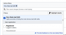
For example, the case illustrated in F7927424 where one element is highlighted and another is selected should not be possible. This is what I was referring in T159768#3189482 as "there should not be two separate selections". If it is complex to achieve we can live with the current status for now since the main goal was to make the list usable with keyboard, but let me know if the intended behaviour is not clear and I'll try to add more details/examples.
Comment Actions
This is a little more complicated than I thought it would be, so I'm going to have to see how to solve it properly.
The main issue is this:
There are two concepts in OOUI's menu: selected and highlighted. Selected is when we literally select something (and in RCFilters, we click it -- which selects the filter menu item + the tag bubble corresponding to it) and highlighted is when you move the arrows around; the idea from OOUI is that when you "walk" the items with the arrows, you didn't necessarily make a selection yet until you actively choose one.
Now, in RCFilters (after talking to @Pginer-WMF during the hackathon) there's not a lot of meaning to the distinction between selected and highlighted, or rather, there isn't a lot of meaning to show what is "selected" because "selected" is shown through the bubbles up at the top. My idea for solving this ticket, then, was to change 'setHighlightedItem' to 'setSelectedItem' everywhere (and then nullify it when you close the popup, as we do with selected items anyways) so to get the behavior requested.
However, 'highlight' item is done fairly deep inside the menu in OOUI, so overriding it is turning to be challenging. My second idea was to simply change the color of highlight to be the same as selected, so to make it so that the user won't notice the distinction - but that turned out to be less than ideal too, because 'selected' state remains (so you end up with 2 items, one selected, one moving around as you move the arrows) and you end up with a slightly different behavior when you actually select ('enter' or with clicking a tag-bubble)
I'm going to need to rethink the strategy on this one, but we might need to find a good medium. I am also wondering if this should be fixed upstream to all MenuTagMultiselectWidget and not just RCFilters - as the selection process is the same (you have the indication when the bubble is either in or out of the tag area anyways)
I'll start by trying to come up with something sustainable to RCFilters, and then considering upstreaming this to OOUI's MenuTagMultiselectWidget.
Comment Actions
Change 356170 had a related patch set uploaded (by Mooeypoo; owner: Mooeypoo):
[mediawiki/core@master] RCFilters: Unify 'highlight' and 'selected' items
Comment Actions
Change 356170 merged by jenkins-bot:
[mediawiki/core@master] RCFilters: Unify 'highlight' and 'selected' items
Comment Actions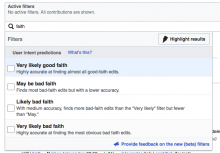
Checked in betalabs.
(1) The first suggestion is highlighted in light-blue (#eaf3ff)
(2) Moving with arrow keys among suggestions will change light-blue highlighting to light grey blue
(3) When a filter gets selected, and gets clicked from the filter capsule area, the highlight is light-blue again:

QA Recommendation: Resolve