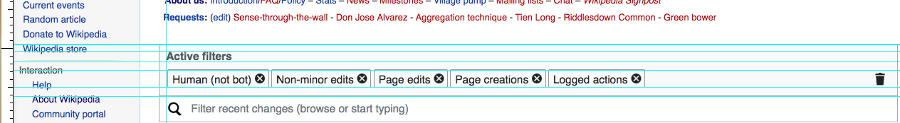
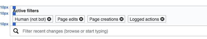
Currently the spacing around the "active filters" is unbalanced:
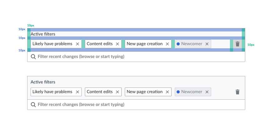
Spacing above and below the "Active filters" label should be the same (which is the same also used at the left side) as shown in the diagram below:
| Pginer-WMF | |
| Mar 8 2017, 6:24 PM |
| F6860067: Screen Shot 2017-03-22 at 10.34.29 AM.png | |
| Mar 22 2017, 5:46 PM |
| F6399702: RC-current.png | |
| Mar 10 2017, 11:19 AM |
| F6399722: RC-adjusted-layout.png | |
| Mar 10 2017, 11:19 AM |
| F6378716: rcfilters-activefilters-gap.png | |
| Mar 9 2017, 7:40 PM |
| F6378733: ve-labels-gap.png | |
| Mar 9 2017, 7:40 PM |
| F6339878: unbalanced-active-label.png | |
| Mar 8 2017, 6:24 PM |
| F6339649: active-filters-layout.png | |
| Mar 8 2017, 6:24 PM |
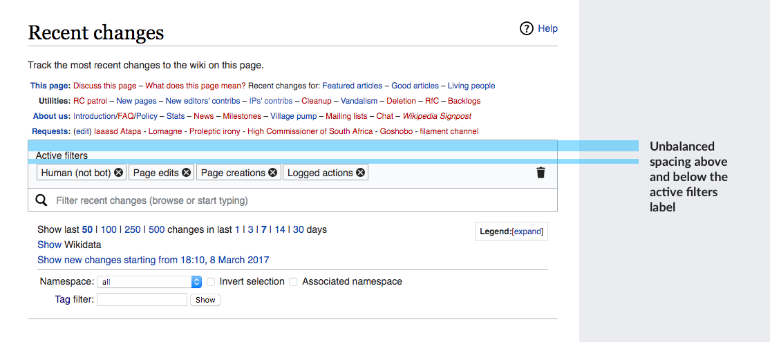
Currently the spacing around the "active filters" is unbalanced:
Spacing above and below the "Active filters" label should be the same (which is the same also used at the left side) as shown in the diagram below:
| Subject | Repo | Branch | Lines +/- | |
|---|---|---|---|---|
| RCFilters UI: Style adjustments for the FilterCapsuleMultiselectWidget | mediawiki/core | master | +10 -6 |
| Status | Subtype | Assigned | Task | ||
|---|---|---|---|---|---|
| Resolved | • DannyH | T171977 Annual Plan 2017-2018, Audiences 5: Increase current editor retention and engagement | |||
| Resolved | • DannyH | T171981 Annual Plan 2017-2018, Audiences 5, Goal 2: Give better ways to monitor contributions | |||
| Resolved | • jmatazzoni | T157642 Graduate New Filters UX out of beta on Recent Changes on ALL wikis | |||
| Resolved | • jmatazzoni | T144458 Launch ERI RC page features as a Beta Feature to all wikis | |||
| Resolved | Mooeypoo | T144448 Build all front-end elements for the new Recent Changes (RC) Page user interface | |||
| Resolved | Mooeypoo | T149391 Build user interface for Active Filter Display Area | |||
| Resolved | Mooeypoo | T159966 Unbalanced spacing above and below the active filters label |
There may be another ticket where this was mentioned, but since @Mooeypoo asked for more small-scoped tickets, I thought it deserved it's own sub-task.
I added a padding-bottom: 0.75em; to the title so it copies the same padding that the capsule widget's "handle" has all around it. (that creates 10.5px spacing, close enough, I think, to the requested 10px?)
Anyways, it doesn't look that good, though (I suspect it might have to do with the line-height? we can fix that, perhaps, with more fiddling)

However, as I was going to try and fiddle, @Jdforrester-WMF commented that this is against the general design standards, that define headings as having a larger gap above than below.
See VisualEditor, where the labels are closer to the input than they are to the previous item:
To be fair, I am personally not entirely sure this is a good comparison, because the title we're working with ("Active Filters") is inside the widget, rather than above it like the other examples in VE, but since the fix looks weird already, and the concern was raised, I shall let you both decide the solution.
Just for posterity and if anyone else implements this, I added this:
.mw-rcfilters-ui-filterCapsuleMultiselectWidget {
	/* stuff */
	&-content-title {
		/* stuff */
		padding-bottom: 0.75em;
	}
}
to mw.filters.ui.FilterCapsuleMultiselectWidget.less
This example looks a little too spacey to me. It really pushes everything down, though I suppose I'd have to see it on the page. Also, it should be considered in light of the overall section heading Pau and I talked about adding, that will say Filter Recent Changes. (That might not happen, depending on what way we decide to go.
The proposal makes the space much bigger than the ~10px reference indicates.
When measuring it over the screenshot, the distance between the label and the tags is about 17px. You can also see that the distance between the label and the tags is not the same as the distance between the tags and the bottom of the tag area.

What I proposed is the distance between elements. This can be distributed among the additional line-height of the label, margins and paddings. Those need to be taken into account when computing the total distance. In the prototype the 10px distance between the label and the tags is divided as 5px paddign on each.
I tried to play with the CSS and used a 0.6em and 0.3em as modules to balance the space:
The code I used is below:
/* A more clean overlap between search bar and tag area: */
.mw-rcfilters-ui-filterWrapperWidget-search{
margin-top: -1px;
}

.oo-ui-capsuleMultiselectWidget-handle {
	border-radius: 2px 2px 0 0;
}

/**Adjusting distances: **/

.mw-rcfilters-ui-filterCapsuleMultiselectWidget.oo-ui-widget-enabled .oo-ui-capsuleMultiselectWidget-handle {
	padding: 0.3em 0.6em 0.6em 0.6em;
  	min-height:0; /* no need for min height*/
  	margin-top:1.6em;

}

.mw-rcfilters-ui-filterCapsuleMultiselectWidget-wrapper-content-title{
	font-weight: bold;
}

.mw-rcfilters-ui-table {
	margin-top:0.3em;
}

.mw-rcfilters-ui-filterCapsuleMultiselectWidget-cell-filters .oo-ui-capsuleItemWidget {
	margin:0 0.6em 0 0;
}
In addition to balancing the space it also:
Change 342962 had a related patch set uploaded (by Mooeypoo):
[mediawiki/core] RCFilters UI: Style adjustments for the FilterCapsuleMultiselectWidget
Change 342962 merged by jenkins-bot:
[mediawiki/core] RCFilters UI: Style adjustments for the FilterCapsuleMultiselectWidget