Page MenuHomePhabricator

Adjust the personal header to align with the design styleguide
Closed, ResolvedPublic

Description

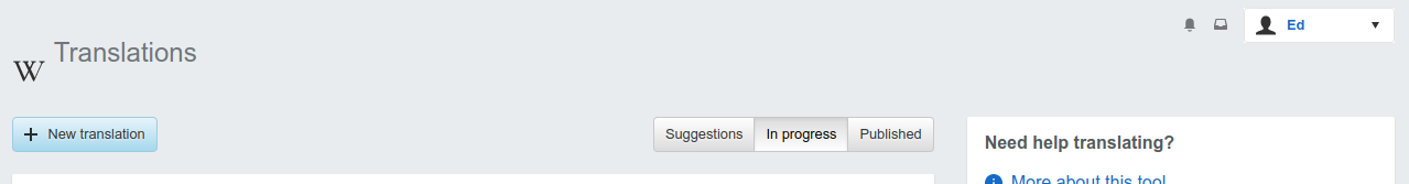
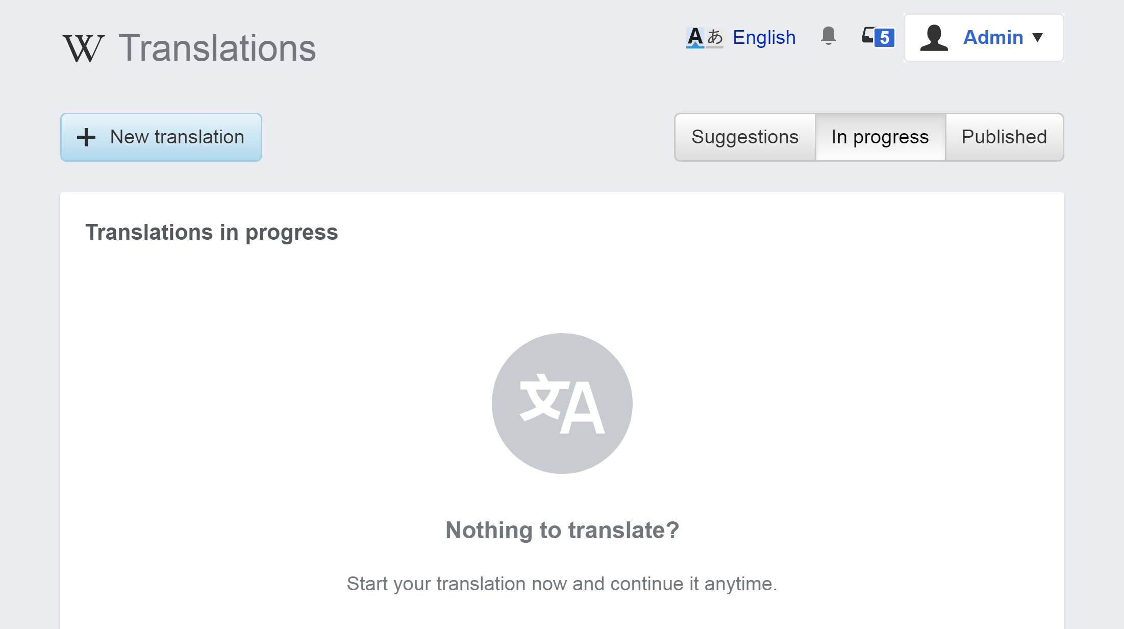
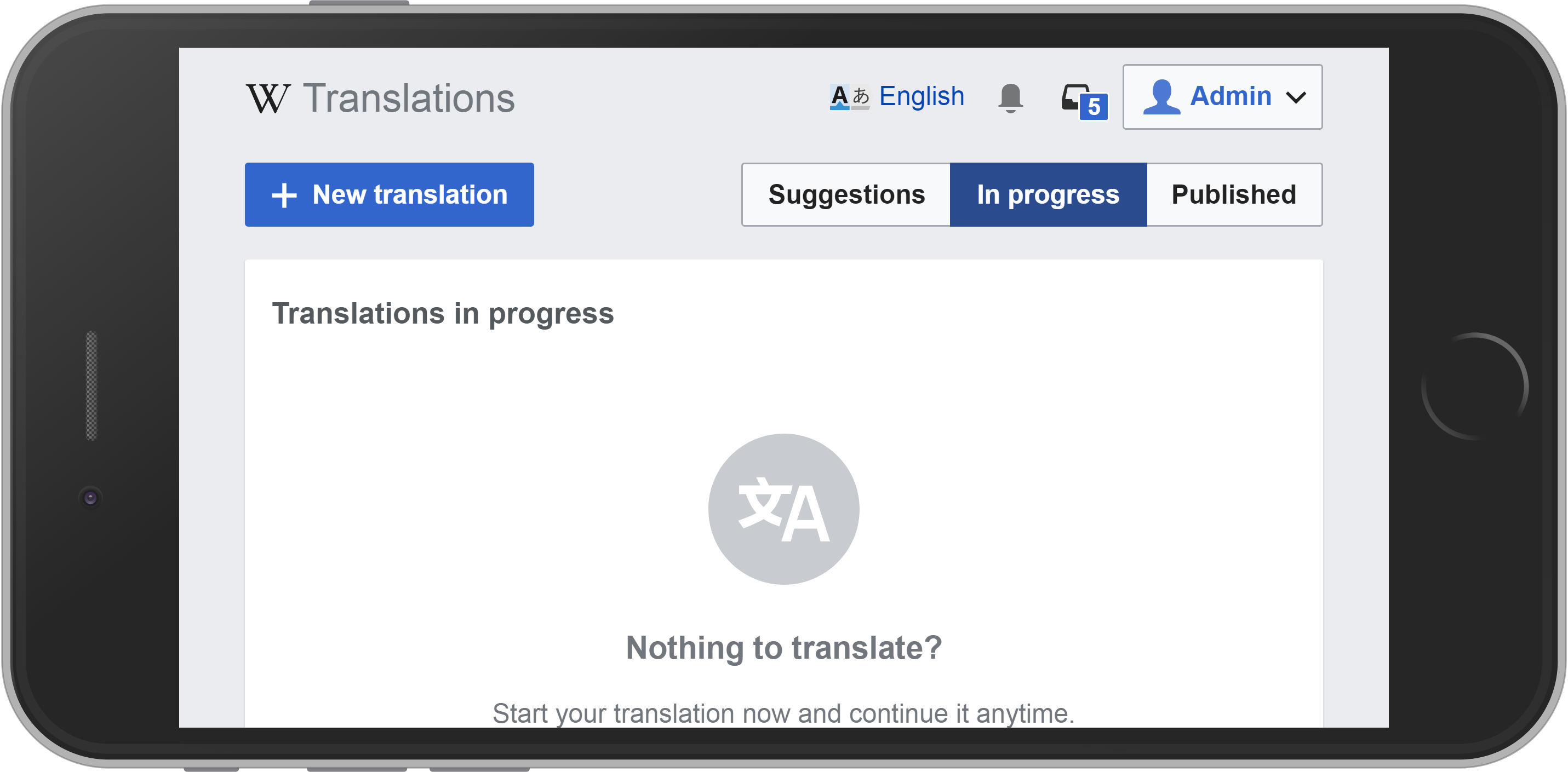
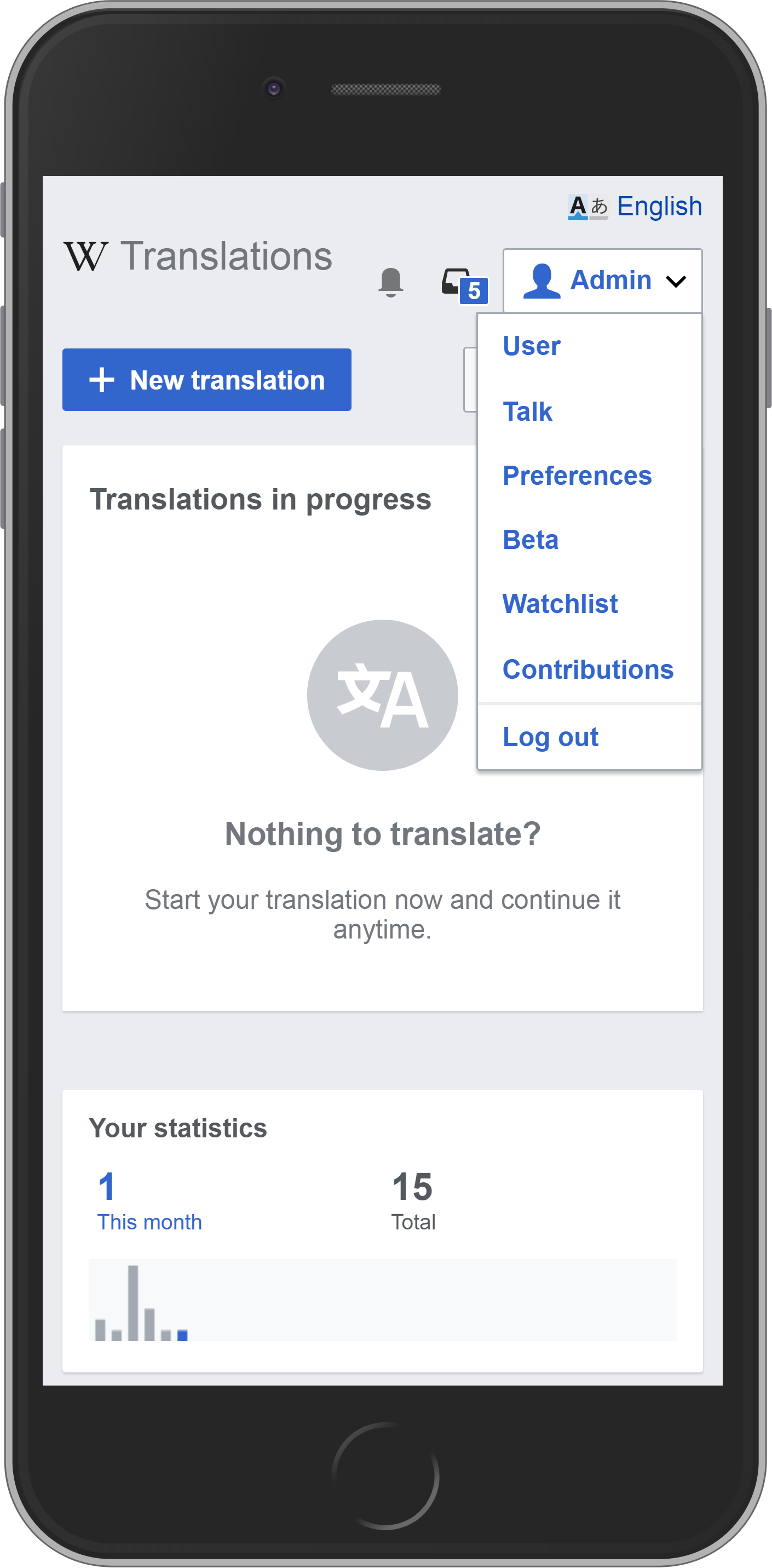
Content translation uses a custom simplified personal toolbar on top in order to allow users to focus on the task at hand. As the tool is aligned with the design styleguide (T157457), we want the options to move to the background keeping the content as the main piece of paper. This will be aligned also with the experience users get on mobile.

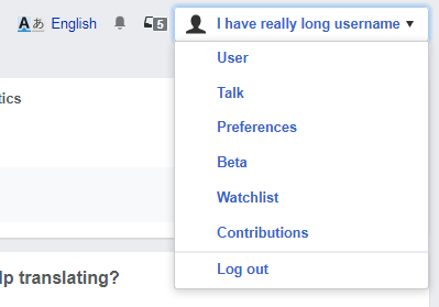
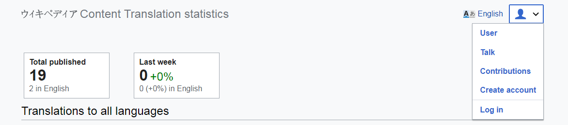
In several mockups a placeholder have been used showing only the Wikipedia icon and the user name.
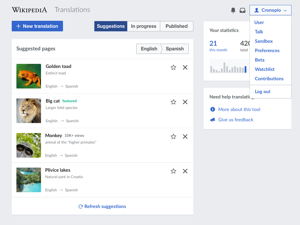
Proposed solution

  • Fade into the background. Instead of the current white, use transparent or the same grey color as the background of the page for the personal toolbar to fade into it.
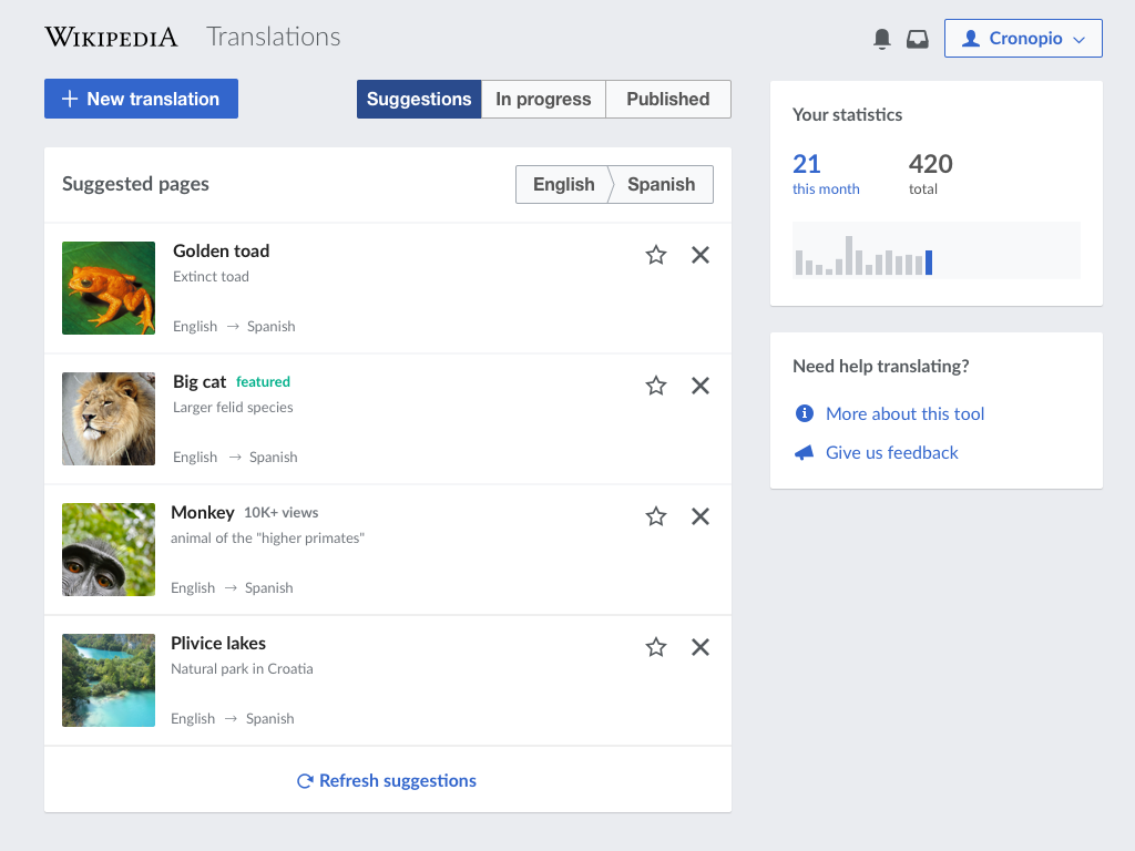
  • On the left, use the project wordmark (instead of the current W) and the tool title ("Translations") after it.
    • The wordmark will act as a link to the main page of the project.
    • The project title uses a 24px font on a light font weight.
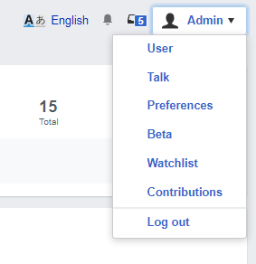
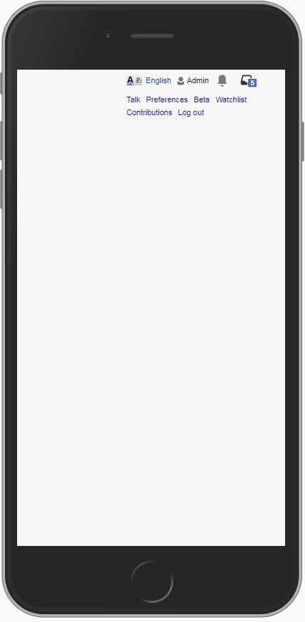
  • On the right, show notification entry points and a personal menu.
    • The menu will include all the usual links and will open on click but also on hover to reduce friction in the navigation.
    • Menu options include an option to the use talk page, and a separation before the log-out option.
cx-personal-initial.png (768×1 px, 168 KB)
cx-personal-open.png (768×1 px, 178 KB)

cx-personal-initial.png (768×1 px, 168 KB)

cx-personal-open.png (768×1 px, 178 KB)

Related Objects

Event Timeline

A possible approach would be to:

  • Use the project wordmark with the title of the tool shown after it on the left.
  • Show notification entry points and a personal menu on the right. The menu will include all the usual links and will open on click but also on hover to reduce friction in the navigation.
cx-personal-initial.png (768×1 px, 168 KB)
cx-personal-open.png (768×1 px, 178 KB)

Notifications on desktop are represented with the current two separate entry points (unlike mobile). There is a proposal to integrate notifications int o a single entry point, but that is part of a separate ticket (T142981). Another aspect to consider is whether we need to surface the exact number of notifications or just signal new activity (e.g., F6819325 ).

@Pginer-WMF In general, this looks very nicely evolved

Minor nitpicks/questions:

  • Why is the accompanying text like “Extinct toad” and second “English -> Spanish” grey? It's already a smaller font-size, I don't think it needs less contrast too. More general is, that we're already in English > Spanish, but I can see why it is useful to repeat it per page list item.
  • Is any click action bound to the statistic ”21 this month“
  • Renaming “Suggestions” to “Suggested”? To be aligned with “In progress/Published”?

A more general question remains, if we have something like a button select group (Suggestions/In progress/Pushlished) directly on chrome, do we want it to have to use Base90 as background-color or should it turn to white and Base90 on :hover

Why is the accompanying text like “Extinct toad” and second “English -> Spanish” grey? It's already a smaller font-size, I don't think it needs less contrast too.

I think only font size is not enough contrast. we use metadata in B30

A more general question remains, if we have something like a button select group (Suggestions/In progress/Pushlished) directly on chrome, do we want it to have to use Base90 as background-color or should it turn to white and Base90 on :hover…

I kinda agree with the later

Minor nitpicks/questions:

Thanks for the input. I replied in more specific tasks for each comment: T160356#3128121, T158646#3128124, and T158961#3128127

A more general question remains, if we have something like a button select group (Suggestions/In progress/Pushlished) directly on chrome, do we want it to have to use Base90 as background-color or should it turn to white and Base90 on :hover

I think the control will look better using white in this case. The question is whether that principle of adapting to the background applies to all controls and all color backgrounds. That discussion probably deserves its own ticket.

Pginer-WMF renamed this task from Adjust the personal header to align with the designstyleguide to Adjust the personal header to align with the design styleguide.Mar 28 2017, 3:43 PM
Pginer-WMF removed a project: Design.
Pginer-WMF triaged this task as Medium priority.Jun 30 2017, 9:50 AM
Pginer-WMF raised the priority of this task from Medium to High.Oct 13 2017, 9:36 AM

Change 389649 had a related patch set uploaded (by Petar.petkovic; owner: Petar.petkovic):
[mediawiki/extensions/ContentTranslation@master] Customize personal header

https://gerrit.wikimedia.org/r/389649

Shouldn't we be coming up with improvements to our existing skins to make them more responsive, rather than diverging the CX pseudo-skin even more?

Also, here's how the current patch looks in monobook:

image.png (167×1 px, 20 KB)

Shouldn't we be coming up with improvements to our existing skins to make them more responsive, rather than diverging the CX pseudo-skin even more?

We had a custom header for CX to better use the space of the default left sidebar that we removed. With this changes we are aligning it with the mobile header that @Nirzar worked on for the mobile web view, and with the design style guide (Wikimedia Design Style Guide) after a review process. I see what is proposed in this ticket as a step for convergence.

From your question it is not clear to me which would be the specific proposal you suggest. Are you suggesting that this kind of full-screen mode that hides the left sidebar should be implemented as part of Vector?

With this changes we are aligning it with the mobile header that @Nirzar worked on for the mobile web view, and with the design style

Do you have links for these?

Are you suggesting that this kind of full-screen mode that hides the left sidebar should be implemented as part of Vector?

There is some on-going work on making Vector more responsive, so there could be some overlap there. My concern is duplicating work or creating tech debt by not defining how this fits into the larger MediaWiki ecosystem.

With this changes we are aligning it with the mobile header that @Nirzar worked on for the mobile web view, and with the design style

Do you have links for these?

I was referring to the mobile vie on web (e.g.,the mobile version of English Wikipedia) where the header was changed to use grey to make it recede to the background with respect to the main piece of paper, and the full wordmark (adapted to each language) is used for more clear branding.

Are you suggesting that this kind of full-screen mode that hides the left sidebar should be implemented as part of Vector?

There is some on-going work on making Vector more responsive, so there could be some overlap there. My concern is duplicating work or creating tech debt by not defining how this fits into the larger MediaWiki ecosystem.

Regarding where the code lives I have no preference, and leave such decisions to the engineers. Regarding how broad to apply a solution, I think each approach has its benefits and limitations. On the one hand, applying an idea to a specific product in beta first allows to learn about how it works in a more controlled environment before applying the idea more widely, but generates some inconsistencies in the way. On the other hand, applying an idea to the whole MediaWiki ecosystem would avoid inconsistencies, but involves applying an idea much widely.

In any case, knowing the plans would help to better coordinate efforts. Is there any mediawiki page or Phabricator ticket describing the on-going work on making Vector more responsive that captures the intended future direction and how this fits into the larger MediaWiki ecosystem?

Also, here's how the current patch looks in monobook:

image.png (167×1 px, 20 KB)

It was one small issue, with monobook-specific padding that displaces elements to look like that. Here is how it looks after the fix:

medium-monobook.png (1×2 px, 150 KB)

We need new design for mobile-size screens

We might need to reconsider design specified in mock-ups provided in description of the ticket. All the restyling that we are currently doing on Content Translation dashboard is supposed to provide better user experience on mobile as well as on larger screen sizes. With changes we are supposed to make in design of personal header, there is still too much content to fit on one line of portrait mobile screen, even though we are putting most of the links inside the drop-down menu.
Some elements are variable in size and can take significant amount of space:

  • Wikipedia wordmark - some localized versions can be longer than English version
  • Long usernames - depends how much space we want to allow for long usernames on mobile
  • Autonym language name in ULS - can be much wider than word "English"

Here are some screenshots, illustrating how current, in progress version, looks like:

Wide screenMobile landscapeMobile portrait
wide-vector.png (487×1 px, 39 KB)
mobile-landscape-vector.png (1×2 px, 325 KB)
mobile-vertical-vector.png (2×1 px, 305 KB)

Even without full wordmark (WikipediA on enwiki) there is not enough space on mobile portrait orientation for all the content to fit one line, so I have made ULS go above.
When whole wordmark is added, it may fit whole line on mobile by itself, so I think we need new design for mobile screen size.
@Pginer-WMF, can you provide me with new mock-ups how header should look on small screens? The current version clearly doesn't cut it.

How should menu behave?

Also, there were some discussions about how wide should drop-down handle and menu be. For this one, we need to consider wide screens as well, and on mobile, some of the user's name might have to be cut-off, depending on possible future design for mobile.
I see two options:

  1. Handle and menu have same width, which is wider of the two.
  2. Handle is always wide just enough to fit username without cut-off and menu has bigger width or width equal to width of the handle.

Option number 2 is currently implemented, and here is how it looks in monobook (has a lot bigger horizontal padding around menu items than vector):

Handle wider than longest linkMenu wider than handle
handle-wider.png (279×399 px, 9 KB)
menu-wider.png (292×283 px, 8 KB)

@Pginer-WMF, how should menu and the handle behave?

Another thing to consider

Having non-customized links helps with one non-intended use case. When loading Content Translation dashboard takes a while (can happen occasionally), there is no clear indicator that page is loading. Only loaded links give user any clue something is going on (except browser loading indicators). Removing them can lead to no visual clue that page is loading, which we might want to consider adding, after customization of personal header is finished. Here is the comparison how loading of old and new personal links/tools looks like:

Old linksPersonalized header
CX-loading-old.gif (875×429 px, 69 KB)
CX-loading.gif (875×429 px, 63 KB)

Note: Don't make conclusions about load times, I have edited captured frames to cut monotonous waiting periods.

We need new design for mobile-size screens...

Thanks for the detailed comments @Petar.petkovic.

In general, I think we should follow an iterative approach. Even if there are aspects to be improved, I think the new version is already an improvement compared to the current one available in production (where links cover the "new translation" button making it hard to reach at not so small sizes). So I'd be in favour to update such version and keep working on improving further in another iteration.

Regarding the specific details:

The wordmark. We may want to use the compact version ("W") on small screens to save space.

The username. It's totally ok to set a maximum width for the username and crop it. Users should be able to recognise their username. For small screens, we can even remove the label and make the access to the user-related options to be an icon-only menu, since the user icon seems recognisable enough.

The ULS. For now, I'd leave it in the same row. I think we may want to integrate it into the user menu, but such discussion may require it's own separate ticket.

With the above changes, I think the menus should fit well in small screens as illustrated below:

cx-dashboars-small-with-menu.png (683×440 px, 128 KB)

Regarding the loading status, I think it is a good observation but I don't think that the early loading of the header is the best way to communicate it. We can explore whether to use a loading indicator, some placeholder elements or make the page load early to solve the issues. But I'd consider this a discussion for a separate ticket.

I was referring to the mobile view on web (e.g.,the mobile version of English Wikipedia) where the header was changed to use grey to make it recede to the background with respect to the main piece of paper, and the full wordmark (adapted to each language) is used for more clear branding.

So the idea is that these modifications are converging towards the Minerva design. Does that mean CX should just use Minerva? (see next comment)

On the one hand, applying an idea to a specific product in beta first allows to learn about how it works in a more controlled environment before applying the idea more widely, but generates some inconsistencies in the way. On the other hand, applying an idea to the whole MediaWiki ecosystem would avoid inconsistencies, but involves applying an idea much widely.

Experimenting with a beta product is a good idea, however my concern now is that this product is supposed to be coming out of beta, and with it we are essentially releasing another skin that lives somewhere between Vector and Minerva, but is also theoretically supposed to be compatible with Monobook (but in many cases isn't very). I think now is the time to define what these skin modifications are - should they be upstreamed to Minerva or Vector and we force all cx users to use a specific skin? Is it acceptable to users of other skins that this specific extension will only support one skin? Or should we instead try and scale back the modifications should the product co-exists more easily with other skins?

In any case, knowing the plans would help to better coordinate efforts. Is there any mediawiki page or Phabricator ticket describing the on-going work on making Vector more responsive that captures the intended future direction and how this fits into the larger MediaWiki ecosystem?

There is a Responsive-Vector project https://phabricator.wikimedia.org/project/view/1658/, but I don't think there is any agreed direction yet.

It was one small issue, with monobook-specific padding that displaces elements to look like that. Here is how it looks after the fix:

medium-monobook.png (1×2 px, 150 KB)

Great, thanks!

I think now is the time to define what these skin modifications are - should they be upstreamed to Minerva or Vector and we force all cx users to use a specific skin? Is it acceptable to users of other skins that this specific extension will only support one skin? Or should we instead try and scale back the modifications should the product co-exists more easily with other skins?

I see this as a "focused mode". When users need to focus on a specific task, this mode helps to de-emphasises secondary tools such as the sidebar, maximising the user attention to the task at hand. This pattern can be useful to other dedicated tools beyond Content Translation such as New page patrol and others where exposing extra general purpose tools can cause more distraction than help. This is not a unique concept, in other context such as ecommerce it is common to have such focused modes when doing specific tasks such as creating an account or doing the checkout, where the list of product categories that is present in other pages disappears to to avoid distractions.

This focus mode can be useful regardless of the skin and it can be available and supported in different skins (in the same way that the immersive mode used for viewing images is available). So I don't see it to be extension specific. The design is closer to Minerva because both try to follow the same principles from the design styleguide.

This focus mode is not only intended for small screens. Having less chrome helps with small screens, but the purpose is to let the user focus on the task. So the mode makes sense for larger screens too, and I'd not consider it to be only part of the responsive discussion or a mode to be used only on small screens.

Did the design take into account the fact that user can be anonymous on Special:ContentTranslationStats?
To account for smaller space on mobile screen, we have agreed to drop the username from menu handle, and just leave the avatar icon and down arrow. If we don't have username to display, should we go with such approach on all screen sizes? Here is how it looks right now (just keep in mind 'User' menu option will need to be removed):

CXStats-as-anon-user.png (259×1 px, 21 KB)

It looks off to have avatar icon displaying for anonymous. That avatar icon would be usually associated with menu (or preference) that has options specific to the user. Looks like missing the context to me.
@Pginer-WMF, how do you suggest we should proceed?

For anonymous users we want to communicate that the user is not logged in, in order to (a) avoid posting anonymously by accident, and (b) encourage them to log-in. We can follow the proposed approach but with some specific adjustments for anonymous users:

  • Use a distinctive icon for anonymous users. The "userInactive" icon from the repo is intended for such use. Note that the design of such icon will change in the upcoming icon update (M229), so I used the new one in the mockup below.
  • Make the drop-down button and icon to use the default colors instead of the accent color used for logged-in users. This helps to communicate the logged-in as the active state more clearly.
  • Show the log-in and create account options in the same group, and place them on top. For anonymous users, the actions to log-in are the most meaningful actions in the menu. Accessing to Talk and Contributions page for those with your same IP address can be a much more complex and confusing set of options.

These ideas are illustrated below for different screen sizes and states:

cx-dashboard-anon.png (768×1 px, 200 KB)
cx-dashboard-anon-open.png (768×1 px, 208 KB)
cx-dashboars-small-anon.png (683×440 px, 152 KB)

For anonymous users we want to communicate that the user is not logged in, in order to (a) avoid posting anonymously by accident, and (b) encourage them to log-in. We can follow the proposed approach but with some specific adjustments for anonymous users:

I want to point one more time that users cannot open Special:ContentTranslation without being logged in, and this is only important for anonymous users visiting Special:ContentTranslationStats. From your point that we want to avoid posting anonymously by accident and from mock ups, I conclude that it was not clear from my previous comment.
All the proposals still make sense, but you may have different opinion knowing this is only on for CXStats page.

We should update ticket description with new information about how custom header should look for anonymous users. I would do that now, but you may want to provide different mock ups, because current ones are somewhat misleading. We show user who is not logged in, but has translations in progress, statistics and suggestions tailored to the specific user. That is really minor, and showing only the header on mock ups, without rest of the page would still be acceptable for me.

Use a distinctive icon for anonymous users. The "userInactive" icon from the repo is intended for such use. Note that the design of such icon will change in the upcoming icon update (M229), so I used the new one in the mockup below.

@Volker_E, from above comment, you can notice Pau wants usage of "userInactive" icon. I want to make sure we don't have T170730 repeat again, so I ask you to add "userInactive" to Apex icons :)

For anonymous users we want to communicate that the user is not logged in, in order to (a) avoid posting anonymously by accident, and (b) encourage them to log-in. We can follow the proposed approach but with some specific adjustments for anonymous users:

I want to point one more time that users cannot open Special:ContentTranslation without being logged in, and this is only important for anonymous users visiting Special:ContentTranslationStats. From your point that we want to avoid posting anonymously by accident and from mock ups, I conclude that it was not clear from my previous comment.
All the proposals still make sense, but you may have different opinion knowing this is only on for CXStats page.

Thanks for clarifying, @Petar.petkovic. I know that right now the only CX part that can be accessed by anonymous users are the stats, but I think the approach should be more general and be able to support the scenario where users can use the whole CX anonymously in the same way they edit and create regular articles. Even if that is not possible right now.

Change 389649 merged by jenkins-bot:
[mediawiki/extensions/ContentTranslation@master] Customize personal header

https://gerrit.wikimedia.org/r/389649

@Etonkovidova, ticket description wants "The menu will include all the usual links and will open on click but also on hover to reduce friction in the navigation", but we agreed to add that feature separately.
Generally, the description doesn't include all the things necessary, you need to check comments too. There are lots of aspects to test that aren't apparent from the ticket as well, you may want to look into gerrit comments.

Checked in testwiki(wmf.16) - all functionality is in place. However, in the prototypes, except for the mobile view, 'Translations' word in the title has a lighter font weight. @Pginer-WMF - is that spec essential for the UI?

I filed two tickets related to this task.
(1) T184571: cx-header__personal-menu oo-ui-dropdownWidget displays all options as active
(2) It does not seem that monobook skin correctly accommodate the title: T184572: WikipediA and Translations are misaligned in cx-header__personal-menu

Checked in testwiki(wmf.16) - all functionality is in place. However, in the prototypes, except for the mobile view, 'Translations' word in the title has a lighter font weight. @Pginer-WMF - is that spec essential for the UI?

The font-weight can be kept as it is, but there are some adjustments in sizing and layout that may help the personal header to look more harmonious. I captured those in T184719: Layout adjustments for the personal toolbar