Where?
Likely a static site on GitHub
@Volker_E and @Slaporte were debating the pros and cons of moving over to a static site generator backed solution and Volker advises to go with an update of WordPress (plugins and development of a modern best-practices following new theme) instead as migration costs seems to outweigh advantages of static site generator.
What type of content?
(copying from Slaporte's comments)
There a few users that we should consider for the blog:
- People who love photography/monuments - We should showcase all the great photos from previous years. This is probably the biggest potential audience for the blog, and people we should consider converting into participants and/or coordinators.
- Competition participants - How do you submit your photo for Wiki Loves Monuments?
- Competition coordinators - How do you start and run Wiki Loves Monuments in your country?
- decide where the blog should go: we may want to test a static site like GitHub.
- decide what type of content to surface.
- decide what visual assets to create to make it useful for local organizers (if they decide to replicate)
- find a volunteer web developer to make it happen: Slaporte has volunteered if someone provides the design (assets)
- find an illustrator/designer for design assets. > This can be put on resolved for the blog upgrade, for further assets building on top of @Pginer-WMF's excellent work, it should be fresh calls
- backend, hosting, ... >> Similar to above, maintenance and transfer costs both speak for an overhaul of WordPress for now (< @Volker_E's estimation), which also implies, hosting can continue as is.
Priorities
*MVP*
- Replicating the basic page types of the existing site
- front page
- blog post page (with banner and support for images)
- content page with lead banner
- Responsive support for desktop, tablet, and mobile T172068
- HTTPS only T177179
*Minimal +*
- Features:
- Keep the "subscribe to blog via email"
- Twitter stream; this stopped working on the current site – T212103
- User comment widgets (that still needs definition, also who is able to register, and no unregistered comments, correct?!)
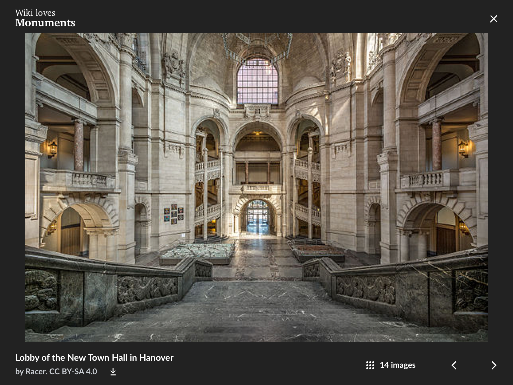
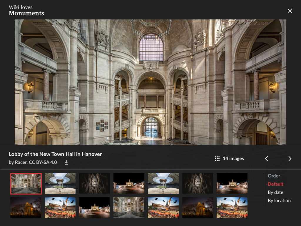
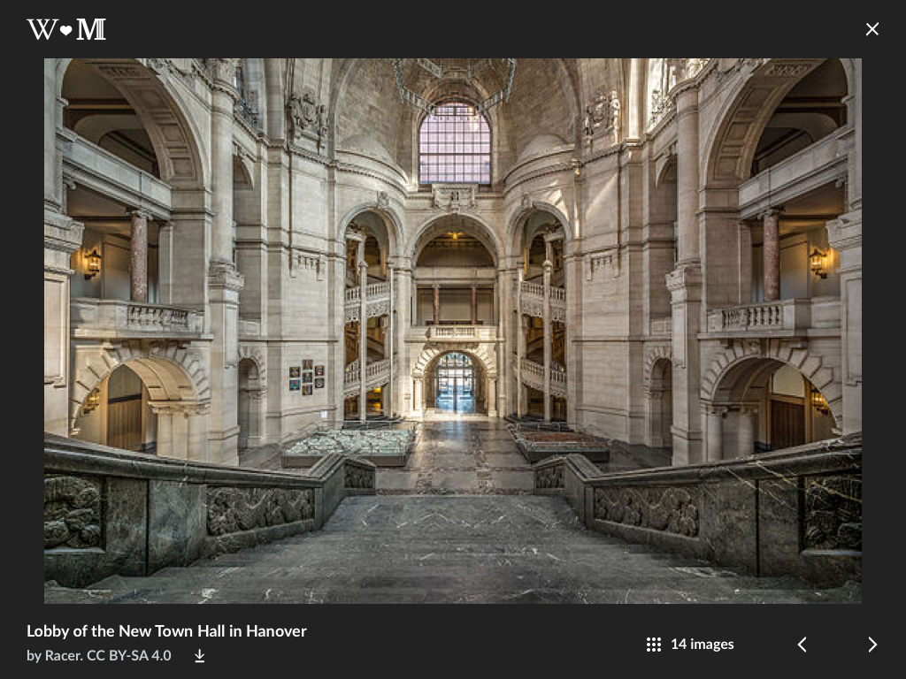
- Photo gallery – T212104
- Review performance, no regressions
Current performance audit (Google's Lighthouse):


