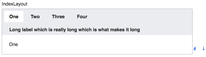
We have to handle tabs of IndexLayout that don't fit on the screen horizontally, by allowing them to scroll or wrap. Currently there's no way to access offscreen tabs (other than by keyboard navigation).

Effect of current patch:
 |  |  |
| matmarex | |
| Sep 16 2017, 12:54 PM |
| F10003953: Screen Shot 2017-10-04 at 13.48.25.png | |
| Oct 4 2017, 8:50 PM |
| F10003952: Screen Shot 2017-10-04 at 13.48.16.png | |
| Oct 4 2017, 8:50 PM |
| F10003954: Screen Shot 2017-10-04 at 13.48.21.png | |
| Oct 4 2017, 8:50 PM |
| F9580542: image.png | |
| Sep 16 2017, 12:54 PM |
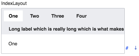
We have to handle tabs of IndexLayout that don't fit on the screen horizontally, by allowing them to scroll or wrap. Currently there's no way to access offscreen tabs (other than by keyboard navigation).
Effect of current patch:
| | |
| Subject | Repo | Branch | Lines +/- | |
|---|---|---|---|---|
| IndexLayout: Handle long lists of tabs | oojs/ui | master | +46 -19 |
| Status | Subtype | Assigned | Task | ||
|---|---|---|---|---|---|
| Open | None | T49145 Formally deprecate jQuery UI after we've stopped using jQuery UI in extensions and core | |||
| Open | None | T100270 Replace use of jQuery UI and MW UI with OOUI across all Wikimedia-deployed extensions and core | |||
| Open | None | T100161 Convert all of MediaWiki core to OOUI PHP (tracking) | |||
| Resolved | matmarex | T101480 Remove 'wgUseMediaWikiUIEverywhere' and code forks, always using the off/false path | |||
| Invalid | None | T101471 Convert core forms that use MW UI with wgUseMediaWikiUIEverywhere false to OOUI FormSpecialPage or explicit OOUI PHP | |||
| Open | None | T107037 Convert all MW core special pages to OOUI | |||
| Open | None | T64559 Redesign Special:Preferences (tracking) | |||
| Resolved | Volker_E | T180538 Improve Special:Preferences UI/UX | |||
| Resolved | Volker_E | T117781 Convert Special:Preferences to OOUI | |||
| Resolved | matmarex | T176034 Handle tabs of IndexLayout that don't fit on the screen horizontally (scrolling or wrapping) |
@Volker_E Should we make the tabs wrap, or make them scroll? (for the record, the current design for tabs on Special:Preferences makes them wrap)
Note that while my screenshot is small, this is a real concern even for normal-sized screens – with all the extensions we have installed on Wikimedia wikis, Special:Preferences can have ten tabs, and in some translations (e.g. Polish and German) they get pretty unwieldy: https://commons.wikimedia.org/wiki/Special:Preferences?uselang=de. And OOUI's design uses a larger font and wider spacing than the current one.
@matmarex We should definitely avoid horizontal scrolling of tabs.
Wrapping sounds like the minimum compromise, although it's, especially with a large number of tabs, also not a good user experience, as users might for example loose context where they are.
A possible big step forward would be to transform it into a slide-out or dropdown menu on small screens, similar to this.
Change 379309 had a related patch set uploaded (by Bartosz Dziewoński; owner: Bartosz Dziewoński):
[oojs/ui@master] IndexLayout: Handle long lists of tabs
Do we have to support this? Button groups neither wrap nor scroll, you are just supposed to design your interface around that :)
Another option would be to set max-width to (100/n)%, or use a table row layout, then ellipsis any text that doesn't fit.
If we want to use the tabs on Special:Preferences in MediaWiki, per T117781: Convert Special:Preferences to OOUI, then we have to. With a few extensions installed there are definitely enough tabs to run out of space even on medium-sized screens (1200-1400px). Unless we want to change the interface to something different in that case (let's discuss on that task if so).
That becomes a big problem with many tabs, but is already problematic on a small number without any other hint. Browsers often provide a different approach to be able to see the full list of open tabs.
While the interface with the number of tabs is provided by “us”. How would you approach this on mobile (320px width) when all tabs get truncated and all tab titles partly replaced by ellipsis…?
I don't think that's likely here, if you have so many items that lots of scrolling is required you should probably be using BookletLayout instead. On mobile I don't think long tab lists are ever a good idea.
Change 379309 merged by jenkins-bot:
[oojs/ui@master] IndexLayout: Handle long lists of tabs
@Esanders That's why I've referred to different solutions of making tabs a dropdown menu when there's not enough available screen space. That is a better solution, more satisfying on both, desktop and mobile.