Page MenuHomePhabricator

Explore how the different approaches to make filters more compact work together
Closed, ResolvedPublic

Assigned To
Authored By
Pginer-WMF
Oct 18 2017, 11:46 AM
Referenced Files
F10567482: WL-combined Copy 8.png
Nov 2 2017, 12:03 PM
F10534551: WL-combined Copy 9.png
Oct 31 2017, 11:44 AM
F10534537: WL-combined Copy 6.png
Oct 31 2017, 11:44 AM
F10534544: WL-combined Copy 7.png
Oct 31 2017, 11:44 AM
F10534546: WL-combined Copy 8.png
Oct 31 2017, 11:44 AM
F10291894: WL-combined-compact.png
Oct 18 2017, 11:46 AM
F10291836: WL-combined.png
Oct 18 2017, 11:46 AM
F10291834: RC-combined.png
Oct 18 2017, 11:46 AM
Tokens
"Doubloon" token, awarded by RandomDSdevel.

Description

Several tickets are aimed at making filters in Watchlist and Recent Changes to be presented in a more compact way (T177926, T177206, and T176395). Although specific solutions are discussed in each ticket, It would be helpful to discuss the overall approach since viewing all changes applied together will help to better understand the intended direction.

Examples

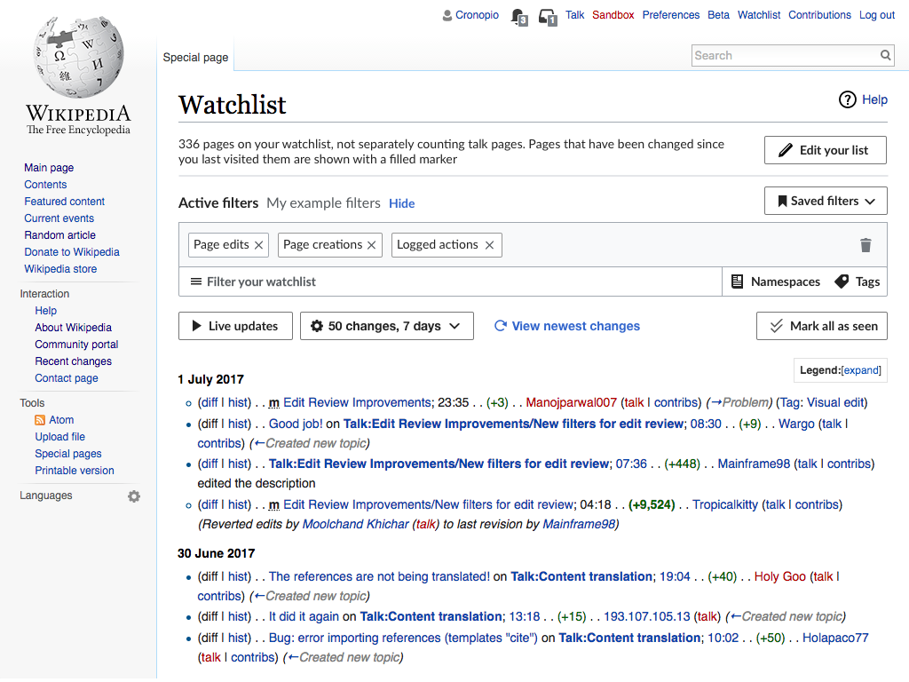
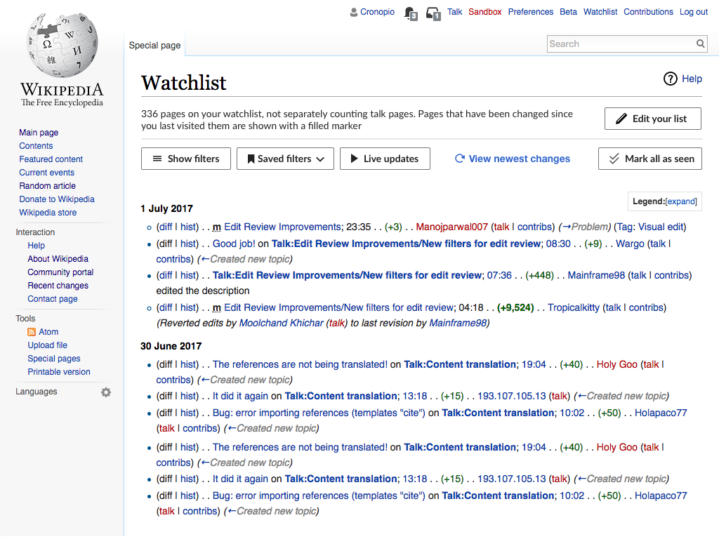
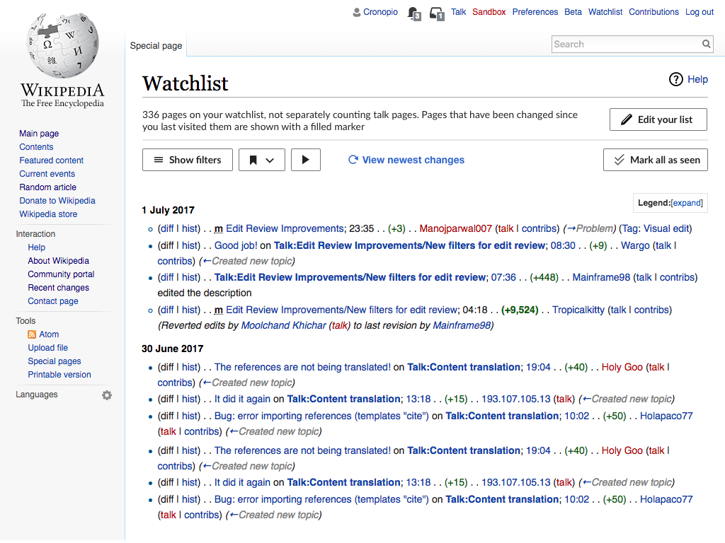
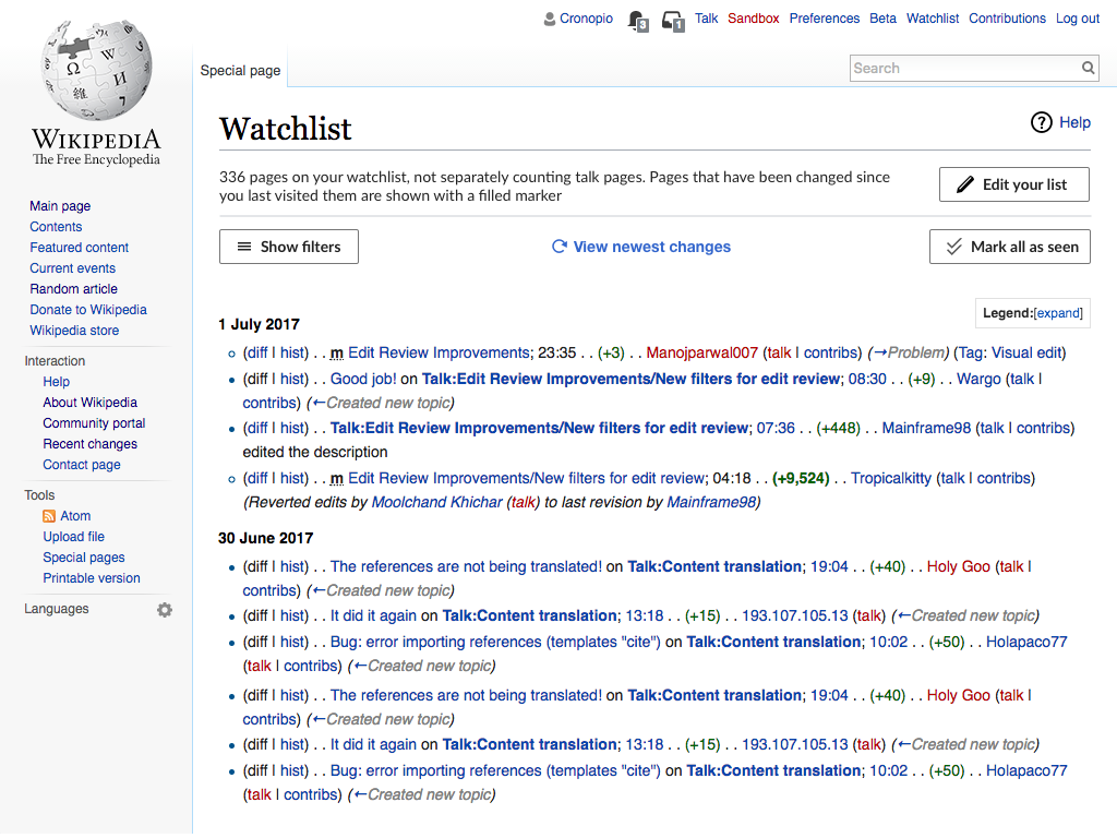
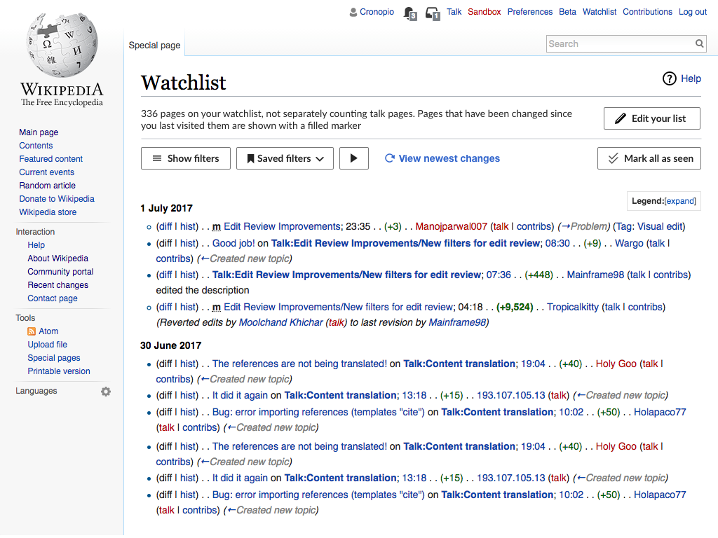
I illustrated examples below for the case with more visible elements, where the user has applied a saved filter (named "My example filters") and there are new changes ready to be displayed:

Recent changesWatchlistWatchlist (collapsed)
RC-combined.png (768×1 px, 273 KB)
WL-combined.png (768×1 px, 247 KB)
WL-combined-compact.png (768×1 px, 284 KB)

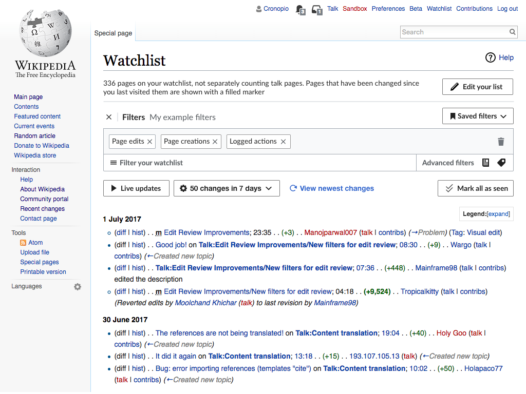
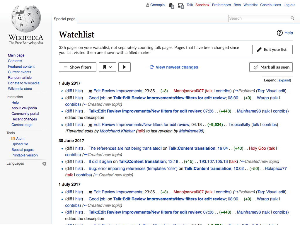
Summary of changes proposed

  • Move the former "Active filters" label out of the box to become a more general "Filters" section title, and adjust the styling of the current saved filter indicator.
    • For those cases where the filter section is collapsible (i.e., Watchlist), a close icon is provided for users to hide the filters section.
  • Combine the number of results and time selectors into one
    • Reduce the label to "50 changes in 7 days" instead of the more verbose "Show last 50 changes" + "7 days" labels.
    • Reorder the controls to show the settings at the right of Live updates.
  • Show the "View newest changes" indicator in the same row as other controls.
    • Use a refresh icon for "View newest changes" to connect with the strong association users have with refreshing the page.
  • Shorten labels to make the overall UI feel less crowded and gain space, relying on context to clarify the meaning:
    • "Edit your list" instead of "Edit your list of watched pages"
    • "Mark all as seen" instead of "Mark all changes as seen"
      • Because we've made that button label less explicit, add a tooltip to the button as follows: Mark all changes as seen.
  • In compact mode, a main entry point to access the filters is provided.
    • Compact entry points are surfaced to facilitate the access of advanced users to saved filters (shown only when the user has already saved filters) and live updates. Icon-only buttons are used since these act as shortcuts of functionality that is available through the filters.

Related Objects

Event Timeline

In Bangalore I had a meeting with @Pginer-WMF where we agreed to try a design with the following:

  • Make "Filters" at the top say "Active filters"
  • Find an arrangement that preserves the existing designs for the Live Update and Saved Filters buttons.
  • Make the Hide/Show controller more explicit/spelled out.
  • Change the wording of the numbers/days control to read as follows: 50 changes, 7 days

In addition, we decided we should add a tooltip for Mark all (because we've abbreviated the button label. I'll add that to the changes in the Description.

I made an iteration based on the feedback:

WL-combined Copy 6.png (768×1 px, 248 KB)

For the collapsed view, I still think that showing buttons with full labels for "view filters", "saved filters", and "live updates" contributes to make the main filter entry point weaker and makes the UI too complex for a collapsed state (where the ser purpose is to focus away from the filters). I provide a comparison with the icon-only shortcuts and a simpler version with just the filter entry point (keeping the default expanded filter view as the place to work with filters).

WL-combined Copy 7.png (768×1 px, 279 KB)
WL-combined Copy 8.png (768×1 px, 278 KB)
WL-combined Copy 9.png (768×1 px, 278 KB)

Thanks for the new designs @Pginer-WMF. They are looking really good. I went over them with James, who was very favorable to the ideas presented. Here is our feedback:

  • In general I prefer the design with the spelled out buttons, for the reasons we discussed. But I think we can profitably create a compromise solution on the spelled out vs. icons issue: I think we can go with the icon for Live Update since, as you say, the "play" icon is so well known. But let's keep the Saved Filters spelled out. That also will bring View Newest to a more central location, which feels right.
    • The Live Updates icon you are showing is not the one we're currently using, which includes a circle. Did you mean to use the simplified version? If so, you'll need to show what you want for the active state, with its stop icon, as well.
    • (And, if that is what you intended, do you need to make a new animation for the active state?)
  • Re. the hide/show apparatus: James says the menu icon is not the right one for "Show filters," since it doesn't really produce a menu. And we both thought the simple word "Hide" was perhaps a little too abbreviated/unspecific. What we'd suggest is this:
    • Open state: change the label to "Hide controls" and use the OOjs "collapse" icon.
    • Closed state: use the label "Show controls" and the OOjs "expand" icon.

Work for you?

  • In general I prefer the design with the spelled out buttons, for the reasons we discussed. But I think we can profitably create a compromise solution on the spelled out vs. icons issue: I think we can go with the icon for Live Update since, as you say, the "play" icon is so well known. But let's keep the Saved Filters spelled out. That also will bring View Newest to a more central location, which feels right.

Ok, we can give it a try, but we may want to check how translations to other languages contribute to crowding the area. I made a mockup below:

WL-combined Copy 8.png (768×1 px, 279 KB)

  • The Live Updates icon you are showing is not the one we're currently using, which includes a circle. Did you mean to use the simplified version? If so, you'll need to show what you want for the active state, with its stop icon, as well.
  • (And, if that is what you intended, do you need to make a new animation for the active state?)

The live updates button should be exactly the same except it will lack the label. There should be no change to the icons used between the compact and expanded versions.
The difference between the mockups and the current implementation is because the icon for play will be changed in the general icon repo as the icons are being reviewed (M229/722) but that will be updated as a separate process.

  • Re. the hide/show apparatus: James says the menu icon is not the right one for "Show filters," since it doesn't really produce a menu. And we both thought the simple word "Hide" was perhaps a little too abbreviated/unspecific. What we'd suggest is this:
    • Open state: change the label to "Hide controls" and use the OOjs "collapse" icon.
    • Closed state: use the label "Show controls" and the OOjs "expand" icon.

The use of the menu icon is intended to establish the connection with the filters menu it represents when expanded. That will help users that collapsed the filtering options in the past to identify the way back. It is showing a panel of filter options for users to select, so I don't think it will generate confusion. Which kid of confusion do you expect?

I think the hide acton can be more prominent by making the text more specific (e.g., "Hide filters"). However, I don't understant the rationale behind using a more generic term ("controls") as opposed to a more specific one ("filters"). I think that referring to filters clarify the type of controls that users will find behind the button more than just announcing they will find "some controls".

In T178486#3729229, @Pginer-WMF wrote:

... I think the hide acton can be more prominent by making the text more specific (e.g., "Hide filters"). However, I don't understant the rationale behind using a more generic term ("controls") as opposed to a more specific one ("filters"). I think that referring to filters clarify the type of controls that users will find behind the button more than just announcing they will find "some controls".

I think we had a few thoughts about that. Perhaps the most persuasive is that it looks oddly repetitive to have the line read:
Active Filters Hide filters

The chiming words here create a certain ambiguity: is "Hide filters" the name of a set of filters? The fact that the word "filters" appears many times on this page makes yet another use of the word somewhat undesirable; "filters" means so many things...

One can also argue that you're not hiding the "filters," per se—though that is debatable. Still, using a different word here seems more clear to me and doesn't raise the question of "which filters" or 'is that a filter set?" When I see this construction, I feel I know exactly what the value proposition is of clicking the link:
Active Filters Hide controls

I think we had a few thoughts about that. Perhaps the most persuasive is that it looks oddly repetitive to have the line read:
Active Filters Hide filters

Well, originally I was proposing to label the whole section as "Filters" too. Ok, going back to the idea of placing simply a "Hide" action next to the label (similar to what is done with the legend). Which issue do you expect users (especially those looking for a way to hide the filter area) would have using it?

One can also argue that you're not hiding the "filters," per se—though that is debatable. Still, using a different word here seems more clear to me and doesn't raise the question of "which filters" or 'is that a filter set?" When I see this construction, I feel I know exactly what the value proposition is of clicking the link:
Active Filters Hide controls

Using a different word creates an unnecessary contradiction for me when expanded, and is just confusing when collapsed (which controls to expand?).

I'm pretty sure that "Filters" designate the whole group of controls. Use "Filters" is the most obvious choice for the label.