Original request
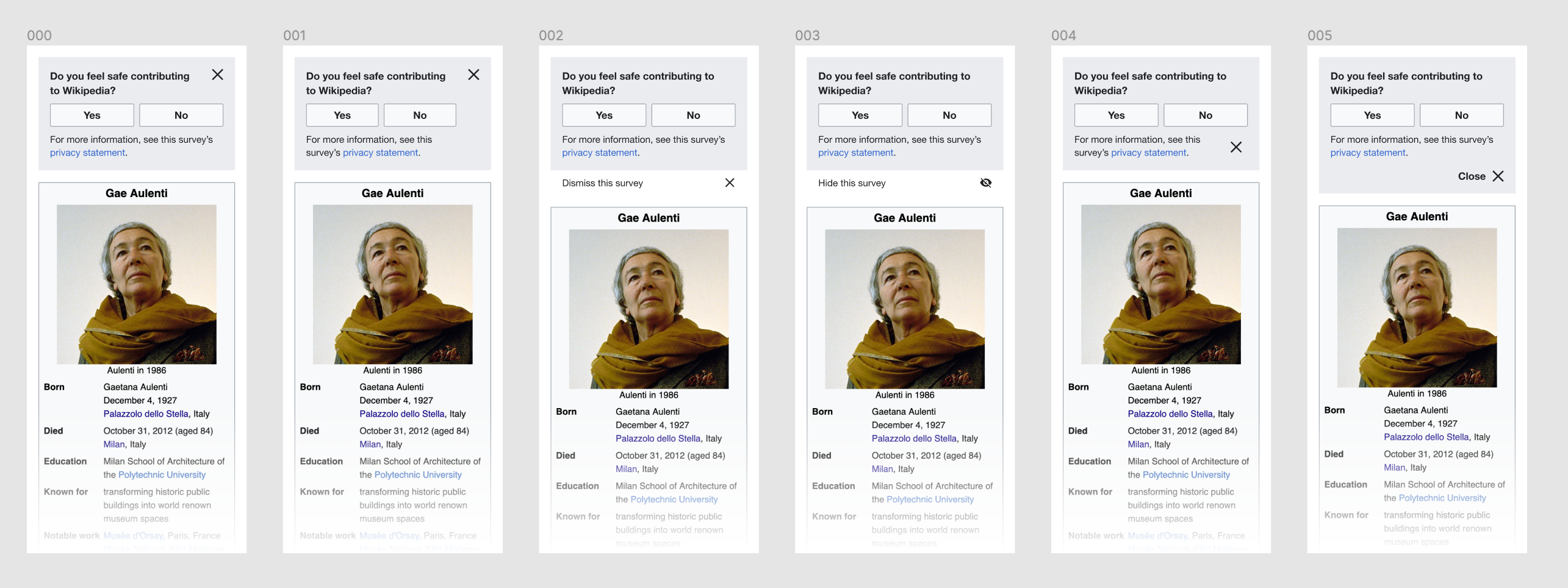
Microsurvey questions should appear instantly/when the page loads, but they should also be very easy to remove without answering. We probably want a small "Cancel" button as well as an (x) button on the box (maybe next to the privacy link), so that it will be very obvious that the box can be closed without answering the question.
Design specs
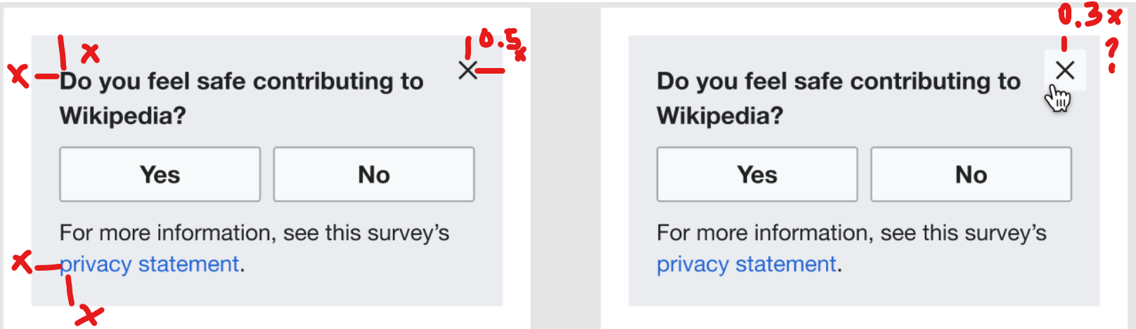
Spacing:
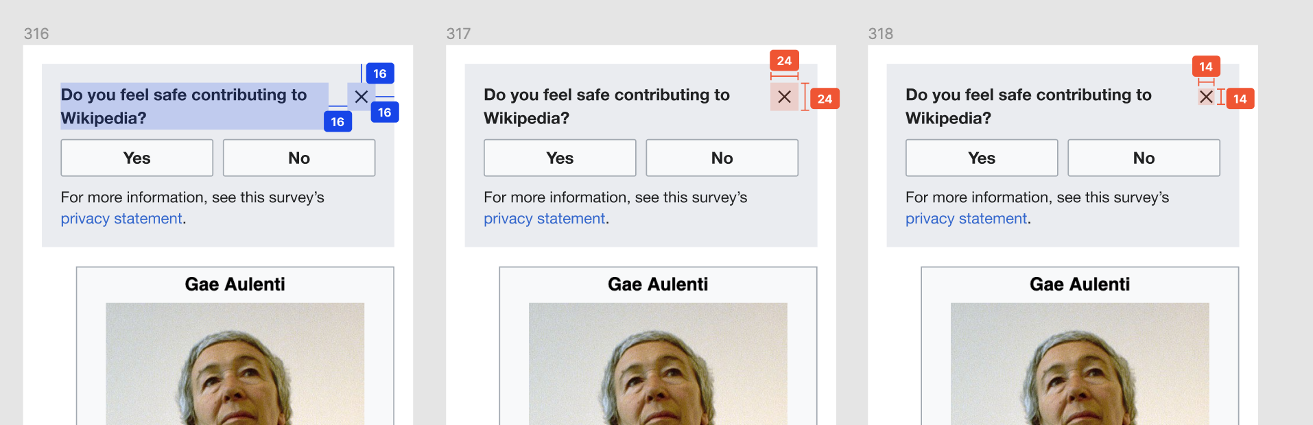
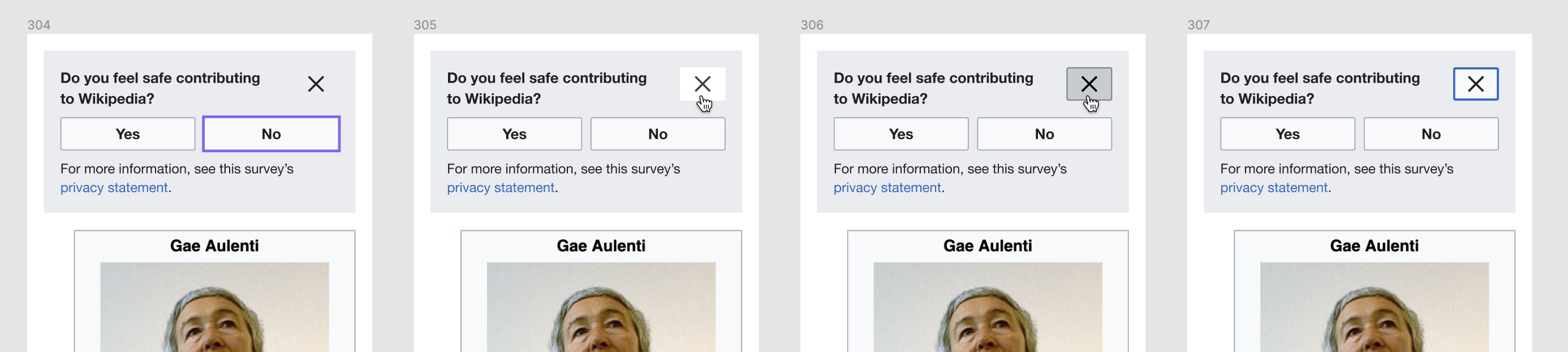
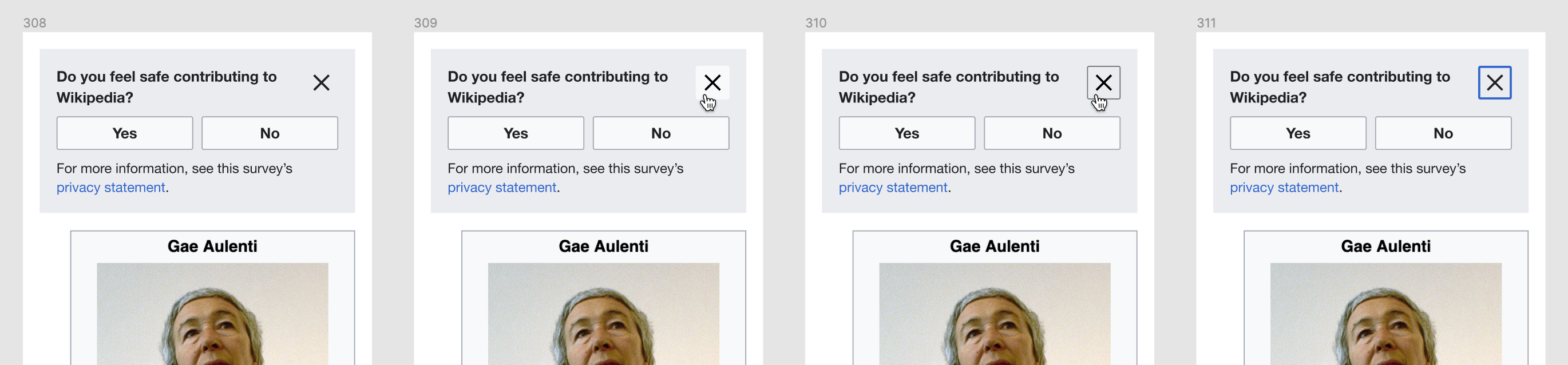
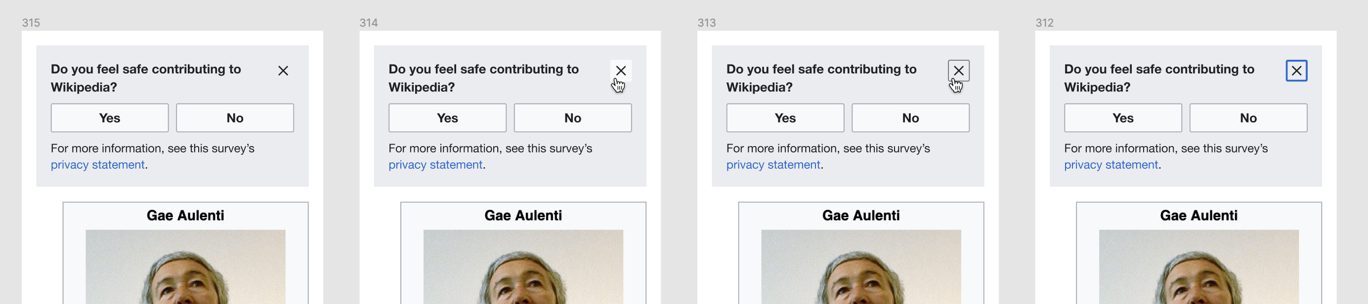
Close button:
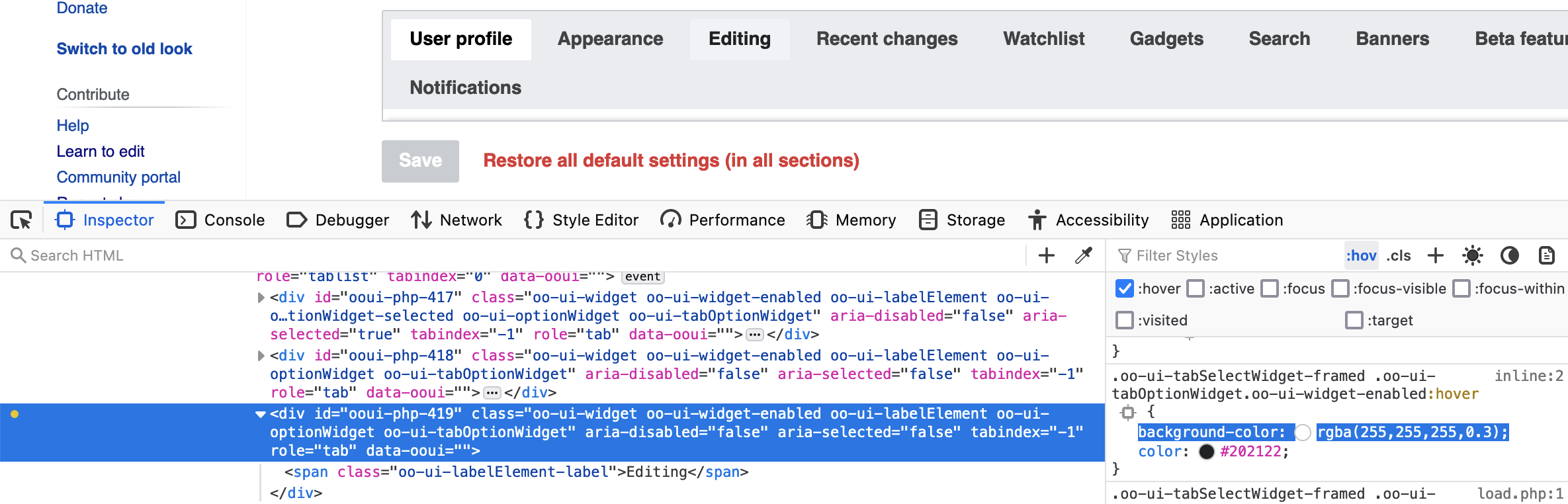
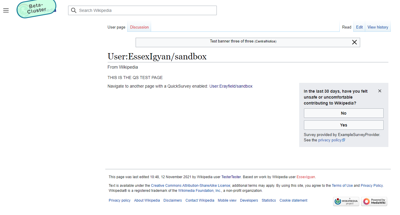
| State | Screenshot | Specs |
|---|---|---|
| Default | 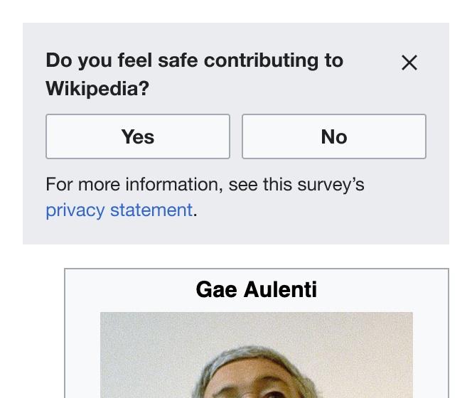 | Icon fill: Base 10 #202122. Button background: transparent. |
| Hover |  | Icon fill: Base 10 #202122. Button background: Base 90 #f8f9fa. Corner radius: 2px. |
| Active | 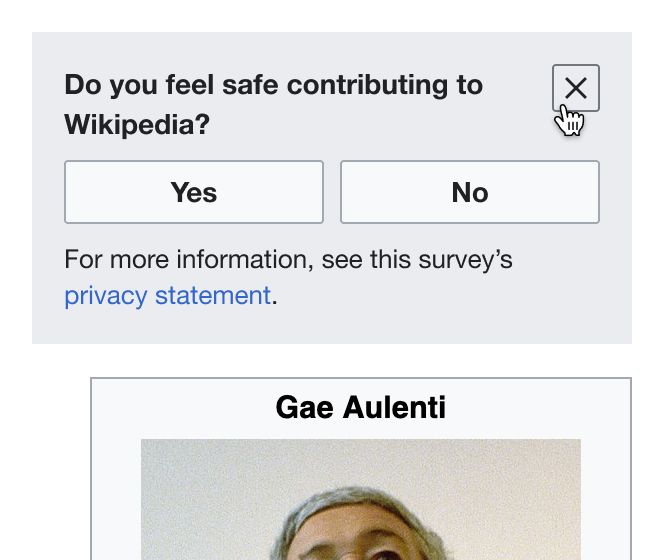 | Icon fill: Base 10 #202122. Button background: Base 80 #eaecf0. Border: Base 30 1px solid #72777d. Corner radius: 2px. |
| Focus |  | Icon fill: Base 10 #202122. Button background: transparent. Border: Accent 50 2px solid #36c. Corner radius: 2px. |
Technical information
- The dismissal behavior should be the same that the "No thanks" button has. It sets a value with the name of the survey as key in local storage and gets rid of the survey box in the same way.
- The implementation of the button should happen locally in QuickSurveys
- We can likely re-use wvui-icon with the wvuiIconClose type (docs).
Acceptance criteria
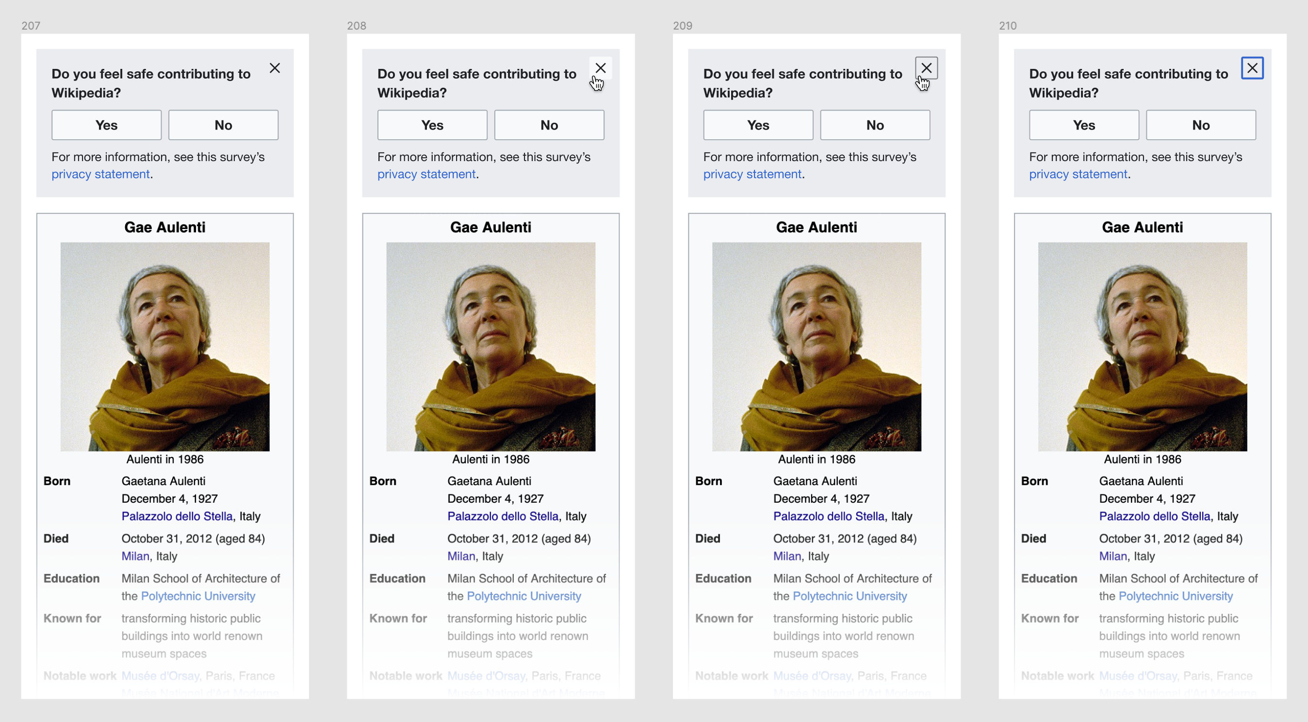
- All surveys (internal and external) show the close button
- The close button behaves as expected in the design mockups
- Clicking the close button dismisses the survey for the current session
- The dismissal behavior should be the same that the "no thanks" button has in external surveys.
QA notes
This patch is about the behavior and design of the X close button, not about the buttons or the rest of the survey box
Scenario 1
- Clear storage if the survey has been dismissed/closed before
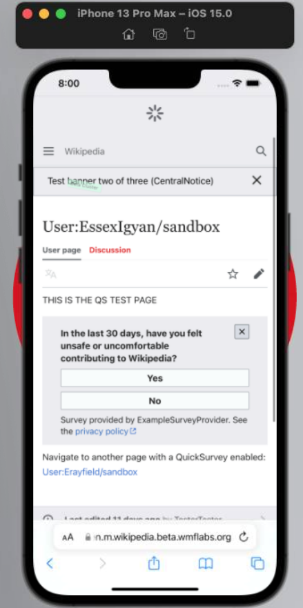
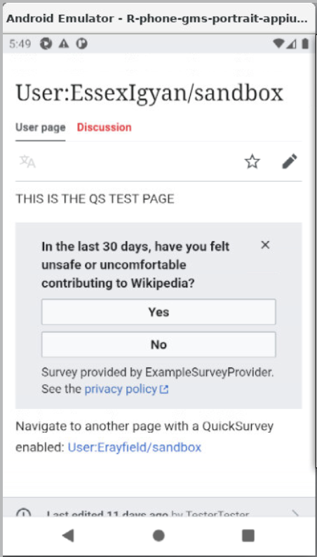
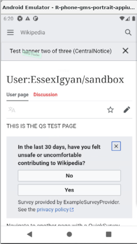
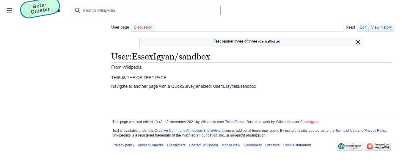
- Visit https://en.wikipedia.beta.wmflabs.org/wiki/User:EssexIgyan/sandbox
- The trust and safety test survey should show up, there should be a [x] button in the top right
- Clicking the close button removes the survey from the page
- Refreshing the page, the survey does not show up again
Scenario 2
- Clear storage if the survey has been dismissed/closed before
- Visit https://en.wikipedia.beta.wmflabs.org/wiki/User:EssexIgyan/sandbox
- The trust and safety test survey should show up, there should be a [x] button in the top right
- Clicking the close button removes the survey from the page
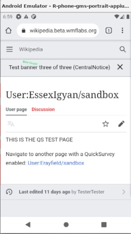
- Click the link on the page that goes to User:Erayfield/sandbox
- Once at User:Erayfield/sandbox, the survey should not show up
- Click the link on the page that goes to User:EssexIgyan/sandbox
- Once at User:EssexIgyan/sandbox, the survey should not show up