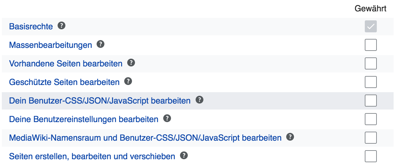
The colour combination doesn't seem to be so distinguishing *for a diverse range of screens*. For example, on a LED back-lit screen when the table is viewed from an angle ~= 75° or 115° all items seem to have the same light color. Example
| Kaartic | |
| May 11 2018, 7:49 PM |
| F18594745: image.png | |
| May 29 2018, 11:58 AM |
| F18594748: image.png | |
| May 29 2018, 11:58 AM |
| F18594656: image.png | |
| May 29 2018, 11:24 AM |
| F18170391: Screenshot from 2018-05-11 23-16-18.png | |
| May 11 2018, 7:49 PM |
The colour combination doesn't seem to be so distinguishing *for a diverse range of screens*. For example, on a LED back-lit screen when the table is viewed from an angle ~= 75° or 115° all items seem to have the same light color. Example
| Subject | Repo | Branch | Lines +/- | |
|---|---|---|---|---|
| OOUIHTMLForm: Improve HTMLCheckMatrix for further clarity | mediawiki/core | master | +10 -2 |
@Kaartic We've had a long discussion at T152532 with this solution coming into place. The problem with a darker background is, that it is resulting in a too strong visual emphasis of the zebra lines.
We could think about increasing the vertical border-spacing a bit in order to clarify grouping a tad more:

Change 435989 had a related patch set uploaded (by VolkerE; owner: VolkerE):
[mediawiki/core@master] OOUIHTMLForm: Improve HTMLCheckMatrix for further clarity
Hovering doesn't help people who use the keyboard a lot ;-) Of course, the check box gets highlighted when :focus which might help a little but I'm not sure it helps as much as the :hover effect.
@Kaartic Yeah, I'm aware of this. It's a problematic & complex UI and we go with the best compromise here. The checkbox :focus isn't helping with the visual grouping towards the label. My patch, which just got merged is improving this with whitespace a little more.
Change 435989 merged by jenkins-bot:
[mediawiki/core@master] OOUIHTMLForm: Improve HTMLCheckMatrix for further clarity