Page MenuHomePhabricator

Newcomers should be aware of the successful registration and also be acquaint with next steps
Closed, ResolvedPublic

Description

Current approach

  1. User creates new account.
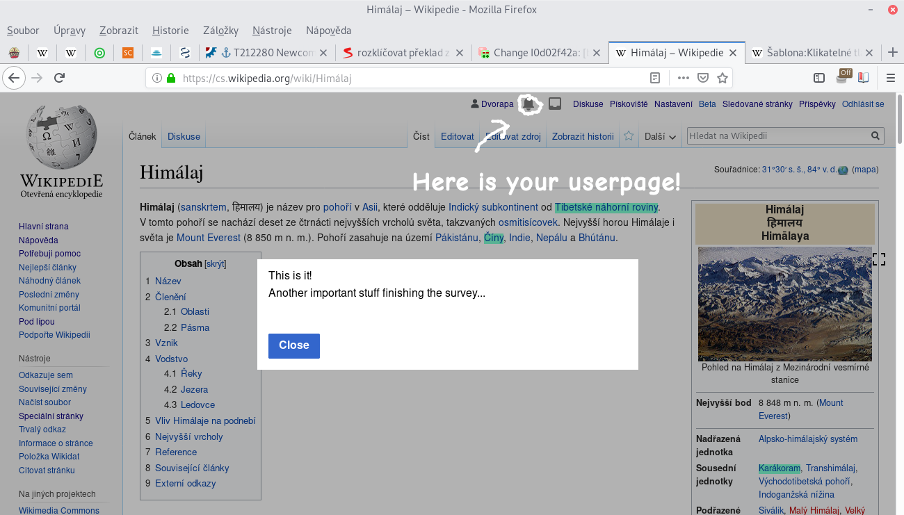
  2. A blue mark is shown to the notification icon.
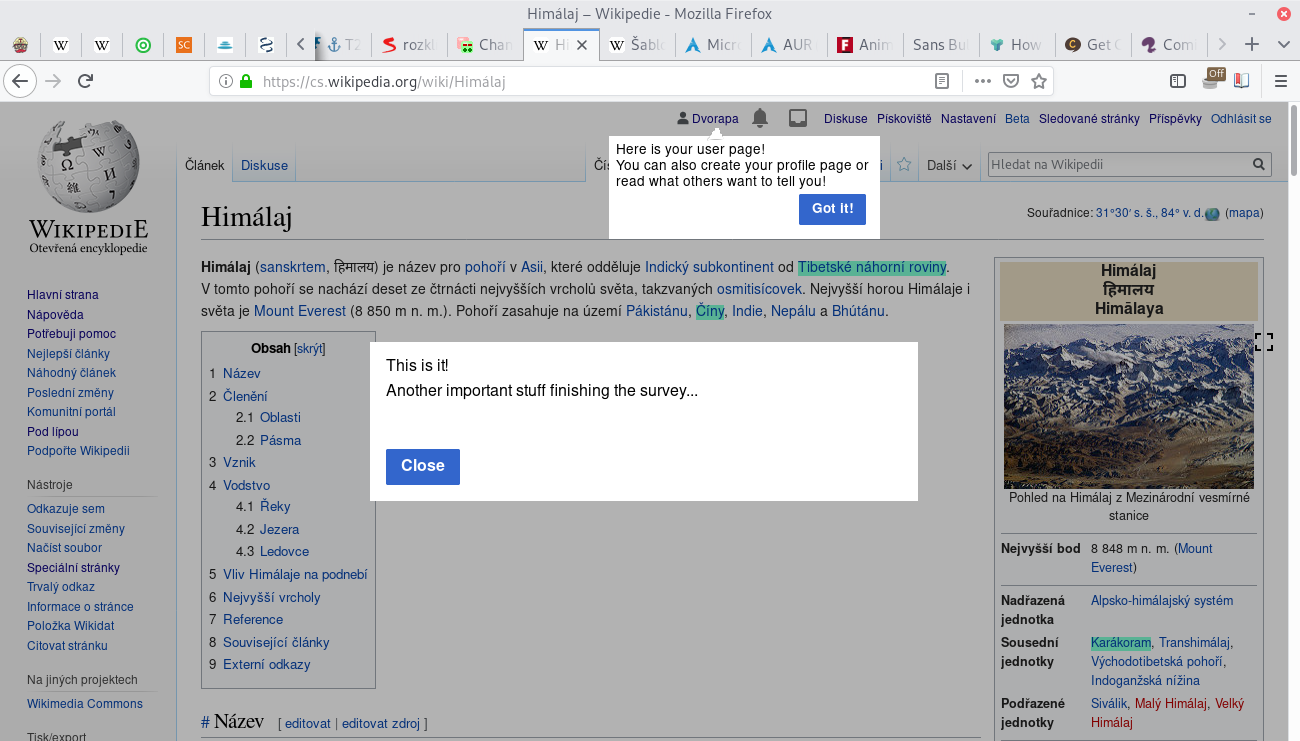
  3. If user clicks the notification icon, the "Welcome new user" notification pops up.
  4. If user clicks on the notification text, (s)he is redirected to the "Welcome new user" page.

The issues with this approach

  • The UI changes too little after the successful registration. This means newcomers have difficulty to understand they already created the account and sometimes create another one.
  • The welcoming notification is hidden by default. It would be interesting to know, how many newcomers even open the notification.
  • There is not sign or indication that the notification text is clickable. In the past the notification was not clickable, but contained a link to Welcome page. Nowadays the user must click the notification icon and the also click the notification text randomly/accidentally/out of curiosity in order to be redirected to the Welcome page.
  • There is no next steps advise. Currently it depends on how user is active (whether (s)he clicks on the notification or opens its talk page, help pages etc.) and also it depends on how community is active (if (s)he is welcomed/contacted on the talk page, what is the contents of the community Welcome page etc.)

Possible solutions
As you can see, the whole welcoming process for newcomers currently depends on too many coincidences and community/newcomer ability. Partially it is solved by the newcomer questionnare (currently in A/B testing on three wikis), but after that the user still is redirected to the main page and nothing else happens. MediaWiki should definitively be more pro-active and lead the newcomer better in first seconds after the registration.

Event Timeline

Restricted Application added a subscriber: Aklapper. · View Herald Transcript

Assuming this is about GrowthExperiments ?

I don't think so. HelpModule is not about notifications.

This comment was removed by Dvorapa.

@MMiller_WMF Hi, on Hackathon we discussed newcomers should be more aware of the successfully created account.

After the registration, only a tiny notification window pops up and it is not even obvious newcomer can click the notification and is sent to Project:Welcome page (as described here). Just attaching you here to make you know about this issue :)

What I experienced today after registration on Travis-CI forum (could something similar be achieved by GuidedTour?):

Snímek z 2019-06-13 18-25-20.png (741×1 px, 107 KB)

Dvorapa renamed this task from It should be obvious new user first notification is clickable to Newcomers should be aware of the successful registration and also be acquaint with next steps.Jun 13 2019, 4:53 PM
Dvorapa updated the task description. (Show Details)

Hi @Dvorapa -- thanks for being involved and for thinking about this. I agree that this is important, and our current strategy is to bring newcomers to the homepage as soon as we can, and that will be the moment they become confident that they've created and account and know that it's time to get started.

The main way we're doing that is with this task: T222852. The goal is for everyone who creates an account to see a GuidedTour saying where the homepage can be found. What do you think of this?

Hi @Dvorapa -- thanks for being involved and for thinking about this. I agree that this is important, and our current strategy is to bring newcomers to the homepage as soon as we can, and that will be the moment they become confident that they've created and account and know that it's time to get started.

Okay, just a quick note: Newcomer should not get the feeling he is pushed to the user homepage. If there will be a primary button at the survey finishing screen, returning to the article read there will be a popup pointing to the username link and when the newcomer opens the homepage, another popup will tell him how to get back, (s)he might get that feeling.

The main way we're doing that is with this task: T222852. The goal is for everyone who creates an account to see a GuidedTour saying where the homepage can be found. What do you think of this?

Some first impressions:

  • It seems to me newcomers could be a little bit confused about what their homepage is and how it is different from the Wikipedia main page before they open it (and why the survey, the popup and the notification is talking about the Wikipedia main page if they don't get it). I understand you may try to avoid the word "userpage", "profile" or "dashboard", but the newcomer should be able to figure out the contents of their homepage before they open it from the survey and popup. The word "homepage", or "user homepage" itself without any explanation in the popup and survey button does not seem obvious to me.
  • It seems to me there is too much duplication and between steps. Let's say newcomer finished a survey, he got the final page, then he moved to the read article, then he clicked Got it-! in the popup, the he read the article all the way through, then he openned a notification and then finally he openned a homepage. I know this is the worst case scenario, but how many times he saw the same information in this process? 4 times? How about merging these duplicate UI parts into one for this moment. How about something like this:

Snímek z 2019-06-14 01-16-43.png (741×1 px, 309 KB)

or
Snímek z 2019-06-14 00-49-51.png (741×1 px, 311 KB)

or two page scheme:
Snímek z 2019-06-14 01-11-03.png (741×1 px, 304 KB)
Snímek z 2019-06-14 01-30-50.png (741×1 px, 320 KB)

Perhaps it should be assembled from the existing UI options, but my point is: why to have dozens of things (finish screen, popup, notification), when we can have just one or two max

  • Positively I like the idea of using GuidedTour. I've created two tours for Czech wiki sandbox already and I would like to create more of them when I get more time in the future. The real advantage is that you can use wikitext inside, even the images or templates/modules. This is handy as the community can easily administer the contents (or the interface admins if restriction needed). Another advantage could be GuidedTour is aware of what page it is currently on, which can really do magic. I would like to see similar popups e.g. like this:
    • You can save the page safely on your Sandbox!
    • Click here to create a new discussion topic!
    • You can create your profile page here!
    • Check who's writing you on this page!
    • You know you can register?

But it should be noted that the user should not be cluttered by too many popups. Less is sometimes better.

Thanks for these detailed thoughts and drawings, @Dvorapa. I think you bring up several good potential ideas for the future. The overall strategic thinking with bringing newcomers to the homepage is that there are many potential things we think newcomers might want to do, but those things are spread out all over the wiki. We see in our research that newcomers wander around being confused about where to start. We think that the homepage can be a clear place that leads them to the right places for them to get started. That's why we want to make sure all newcomers know about the homepage: because it can be the place where we show them many other things to do. For instance, we hope that a newcomer might discover a good portal or WikiProject from their homepage, if we put the right one in front of them.

Why do you think that it's important that newcomers don't feel they are being pushed to the homepage?

There are a few other things I want to bring up:

  • Under the plan in T222852, we are trying to make sure that all newcomers have two things: (1) an opportunity to visit their homepage, (2) knowledge of how to get to their homepage. The task lays out different experiences depending on whether the newcomers has taken the welcome survey or not. Basically, if someone has completed it, they get an option to go to their homepage, and if they go there, they see a GuidedTour saying how to get back. If someone does not complete it, they just get one GuidedTour saying how to get there. So newcomers would either get one or two messages about the homepage when they create their account. When we build this experience, you can try it out in Test Wikipedia by creating several new accounts, and you can see if it feels right.
  • There are a couple other places that we want to bring people to their homepage: after email confirmation (T222848) and if you look at your contributions page when you have no contributions (T225328). We want to do this because we know a lot of newcomers experience these paths, but end up at a dead end.
  • Regarding the name of the homepage, this has been a difficult thing to figure out, because we know that the word gets translated in different ways in different languages. For instance, @Urbanecm told me that the translation you're using in Czech is more like "dashboard". I think that's fine -- whatever makes sense in your wiki. In the future, our team does want to work on the "profile" part, helping newcomers to build their userpage. In our user tests, we definitely saw that people are a little confused between homepage and userpage, and so we will need to address that in the design. Do you think it could be good to help newcomers build their userpage by providing them some structure?

@MMiller_WMF That used to be the translation, I've changed it before the experiment started.

We see in our research that newcomers wander around being confused about where to start. We think that the homepage can be a clear place that leads them to the right places for them to get started. That's why we want to make sure all newcomers know about the homepage

Completely agree

Why do you think that it's important that newcomers don't feel they are being pushed to the homepage?

Perhaps it is only our national thing here in my country (perhaps historically based, maybe people from some repressive countries have the same behavior), but if we get the feeling we are pushed to do something, we might back up as quickly as possible even if we would profit from that. I agree to direct the newcomers to the user homepage as quickly as possible and from several places like e-mail or contributions page, but just don't overdo it please :)

In our user tests, we definitely saw that people are a little confused between homepage and userpage, and so we will need to address that in the design. Do you think it could be good to help newcomers build their userpage by providing them some structure?

It is acceptable and I like you are trying to address this issue in your future designs. It could be even better than a User Sandbox basic edit GuidedTour like we have on the Czech Wikipedia, because newcomer has the oportunity to actually create something (the profile page), not just blindly test bold and italics buttons without any actual goal. He can insert a user profile template, write his/her interests and language skills into it, write his/her "bio" underneath, add some categories in communities supporting it etc. And finally has a good feeling about it, because (s)he created it with a purpose, not just randomly tested buttons.

Just two other things: Communities usually have their own thorough tutorial (en:Wikipedia:Tutorial, cs:Wikipedie:Průvodce), which is usually not about editing itself, but more about community rules, copyright principles, etc. For example the Czech community has a really bad experience with vandalism, so it is too unyielding in this and the overall opinion is to push the users to this rules-tutorial first and after that let them edit. I'm fighting against it, created a welcome page trying to push newcomers to edit, but there was created another welcome page by others, which is the complete opposite, oriented to rules. To make those people satisfied, there should be some possibility to navigate newcomers to the rules-tutorial after they try to first edit an actual article or something. Please think about how, where, in which way to incorporate community rules link for article writing/edits into your design.

The other thing is, what will happen with the current community maintained welcome pages and tours. I've already mentioned Project:Tutorial, Project:Welcome, community GuidedTours, but also things like Template:Welcome etc. Have you thought about how much these things become unnecessary after your team future work and what will happen to them? I don't mind archiving some of these things on Czech wiki, but some communities perhaps have great interconnected help or special manual approach, that is not as easy to archive or incorporate into the Growth future products.

MMiller_WMF claimed this task.

Hi @Dvorapa -- thanks for adding more thoughts to this task. This week, we're going to release some of those features to help newcomers discover their homepage, specifically:

  • GuidedTour after account creation (T222852)
  • Link to homepage from Special:Contributions (T225328 and T227575)
  • Redirect from Special:ConfirmEmail (T222848)

So please keep an eye out for those, and let us know anything you think.

Regarding tutorials, welcome pages, and tours -- our team's general approach right now is to build the places where communities can put those materials. The homepage, for instance, has a button for a tutorial, and it's up to your community which tutorial you place behind that button. But in the future, I can imagine us working with several communities in developing tours that work really well, and then encouraging other communities to translate and adopt them.